It wouldn’t be unfair if we say – “Marketing works upon color psychology, everything else just goes along.”
Though there goes a lot into digital marketing, it all starts with the great color combination, proper layout choice, high-quality graphics, illustrations & brilliant text display. No matter if it is just an Instagram post, a well-purposed social media flyer, a Facebook advertisement, or anything else; a little attention is all you have to give in. We’re about to take a round-up with the popular flyer design terms often used as a staple for social media marketing.
If you’re graphic design-savvy, you may know many of them already. Let’s see what you’re up to.
25 Flyer Design Terms You Should Be Aware Of!
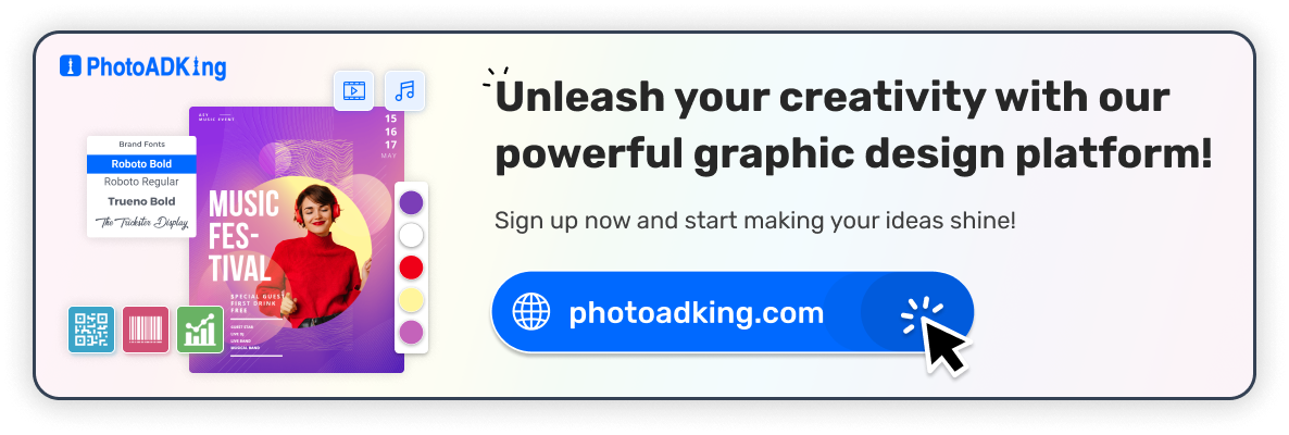
Flyer design is a key element in your overall marketing and advertising strategy, and, most importantly, how to design flyers that drive results for your business. Here PhotoADKing gives you an easy guide on how to develop an engaging flyer within just a matter of minutes!
The flyer design terms you’re about to discover are the ABCs that’ll ease your social media marketing & flyer template designing efforts. In other words, if you know the basics so well, there is nothing that can stop you from customizing a professional look & feel flyer in minutes.
We’ve broadly categorized the graphics & flyer design terms into colors, design, typography & branding. Keep reading & explore each of them.
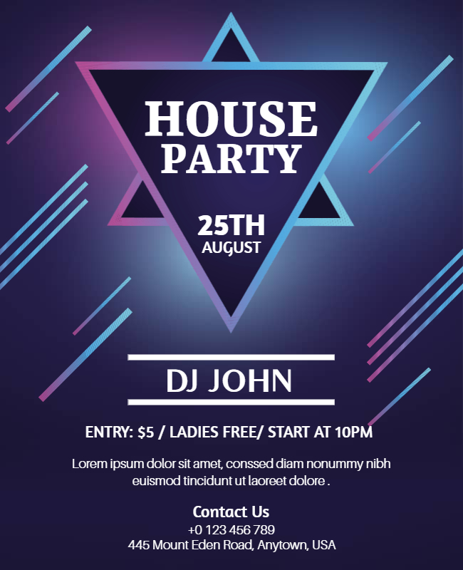
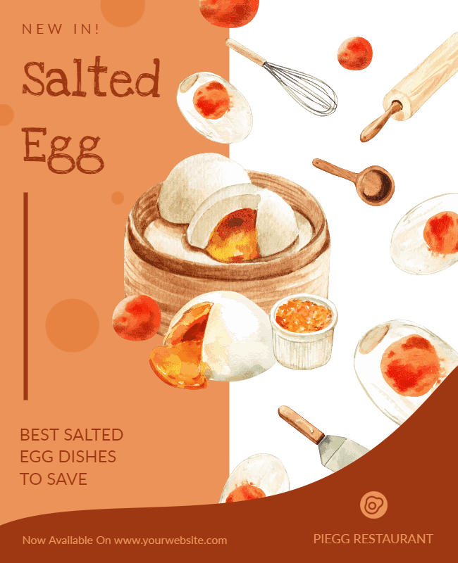
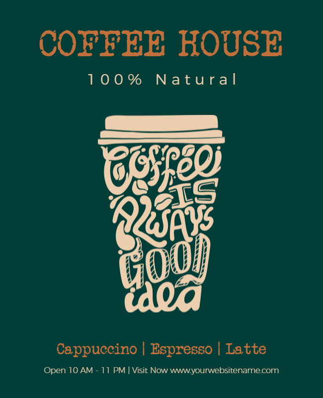
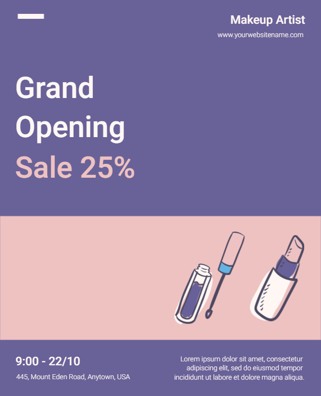
Snapshot
Flyer & Graphic Design Terms Relating Colors
1. Saturation
The intensity & vividness of color is termed saturation. The crisp color tones & vibrant pictures that you see on social media platforms are gifted by saturation. It’s impossible to make any picture look so imposing without a saturating touch. Now you know how professional photo editors make raw pictures appear breathtakingly beautiful.
2. Gradient
Do you remember the Instagram logo? Yes, we’re talking about the mishmash gradient effect that makes the logo more noticeable. You can use our flyer maker for a modern & futuristic look & feel. Also, you don’t need to stick to a single color for gradients. That’s the best part we guess.
3. Monochrome
When you cannot decide which colors will look best together or you don’t want to scratch your head to find contrasting colors, go Monochrome. After all, Monochrome is the latest & one of the most sustainable color trends that are here to stay. Be it for outfits or social media promotions, monochrome is a big hit.
4. Pantone
Pantone is nothing but a matching system that defines colors via numbers.
If you’re creating a flyer to get it printed, you may need a Pantone color code for the same for identify each hue with precision.
5. Warm & Cool Colors
The colors we know as red, orange, yellow, and pink belong to the warm gang while cool colors are from the blue, green, and purple families. Depending on the marketing concept, you can utilize these tones to trigger equivalent emotions.
6. Complementary
Complementary colors are the ones situated opposite the color wheel. They create “POP” when used together. For instance: blue & orange, yellow & purple, etc.
7. Color Theory
If you don’t know, colors are powerful enough to trigger emotions. This is the reason different colors are used in different scenarios to reflect distinct energies. For instance, pastels are soft hues while sharp tones evoke intense feelings.
Additionally, if you looking to add a touch of vibrancy to your flyer? Check out our 8 Creative Color Schemes for some inspiring ideas on how to infuse colors into your flyer.
Flyer & Graphic Design Terms Relating Design
As you have had a closer look at colors, it’s time to move on to the design terms for flyers.
Looking forward to flyer design ideas is another way to get in-depth knowledge for designing a flyer for your business.
8. Contrast
Contrasting is the oldest yet evergreen designing approach that never fails. Just divide your design horizontally or vertically as 50-50 & you’re all set to contrast it with color, shape, texture, or typeface.
9. Balance
To keep the overall aesthetics of the design aligned, balance it. This covers the entire contents of your flyer: text, graphics, color schemes, etc. The way you place each element together defines the balance of your flyer design & it has the power to attract or give unprofessional feels to your target audience.
10. Negative Space
Negative space is nothing but the breathing room you leave around your design to make it look less congested. This mostly happens when you’ve got too much to put up on a single flyer but you’re smart enough to add some negative space for a clutter-free look. You may often find negative space being pointed out as white space too.
11. The Rule Of Thirds
Be it a flyer, photograph, webpage, or any other graphic, the rule of thirds defines how your design will stand out among competitors. The simplest way to achieve this is to divide the total visual space into thirds or use a grid overlay. It will help you to place important visual elements in places that will draw attention. This is what most professional graphic designers are taught.
12. JPG & PNG Images
Image extensions mean more than just a file type. If you’re used to downloading stock images, you already know what it is like to download a JPG & PNG means. For people who want to download & share images on social media, JPG supports a plethora of colors. On the other hand, PNG is best for high-quality photos or print-quality ones for logos where you want to preserve image quality.
13. Vector Images
If you constantly worry about the blurring of images, go for vectors. It promises an image quality with great precision that you won’t lose the image definition regardless of how much you scale it.
Flyer & Graphic Design Terms Relating Typography
14. Lorem Ipsum
Commonly placed as dummy text, this is what you see in almost all readymade templates on the web today. So, don’t be surprised as to what it means to describe. Just replace it with your actual text.
15. Typefaces
The typeface is an entire family of fonts. For instance, what you know as Times New Roman, Cambria, or Ariel are typefaces.
16. Leading
Leading is nothing but the line height. The space between the two lines of text is known as ‘leading’.
17. Typographic Hierarchy
It’s a responsibility of a graphic designer to use text in a flyer, brochure, social media post, or anything else with ease of readability. The way our eyes scan & read the text should fall easy.
18. Widows
A term that has gone quite a slang – Widow – means a one-liner that ends the paragraph. It is usually separated in the next column for ease of readability.
19. Power Letters
The words that draw attention, highlighted in bold or popping fashion are the power letters of your flyer. They are essential for any graphic design.
Additionally, if you learn more about typography design, then you can check out our article on creative typography design trends to get more ideas on typography trends.
Flyer & Graphic Design Terms Relating To Branding
20. Brand Identity
Flyers that are purposed for self-promotion must have peculiarities of vision, mission, and details that outline the brand identity. For instance, a brand that just stepped into the market will want its target audience to know about it.
Your flyers & offline promotional materials go hand in hand synchronized with your brand color, emotions, logo & aesthetics.
21. Logo Type
Brands need to have their logo on flyers. We usually refer to it as a logotype where the logo is mentioned without fail.
Check Out These Posts
Avoid These Marketing Design Mistakes
22. Logo Mark
There are instances when brands choose to use a watermark logo or a signature part of their logo instead of mentioning the logo as a whole. This is called a logo mark in the design world.

23. Grid
Brands with a specific format for designing promotional materials go with grids. For instance, they have predefined spots on flyers, brochures, posts, stories, etc. where they’ll place a logo, text, or use an image. This makes it easy for brands to accomplish any graphic design with accuracy.
24. Trademark
If you’re promoting products you’ve trademarked, mention the TM symbol so that everyone else knows that they’ll have to pay for the infringement.

25. Mood Board
People who consider the mood board’s usage is limited to New Year’s resolution, it’s time to rethink. You would surely like to put things together that resemble & reflect your brand at its best. It could be pictures, concepts you hold in your mind, any graphics and illustrations, and color schemes.
Furthermore, we greatly appreciate your presence on our blog and your interest in its content. If you are enjoying our blog, you might also be interested in exploring our other blogs that cover a wide range of topics.
Also Read:-
- Instagram Post Sizes
- Social Media Post Design Ideas
- Tips for Creating Successful Advertising Strategy For Social Media
- Top Social Media Trends to Consider
- Black Friday Marketing Ideas
- Boost Your Restaurant’s Social Media Marketing
- Social Media Image Sizes Guide
- Guide For Social Media Designing
- Social Media Storytelling
- 10 Ways To Use Social Media Videos to Boosting
- 10+ Thanksgiving Post Ideas and Examples for 2023
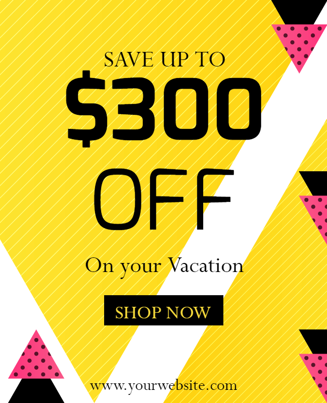
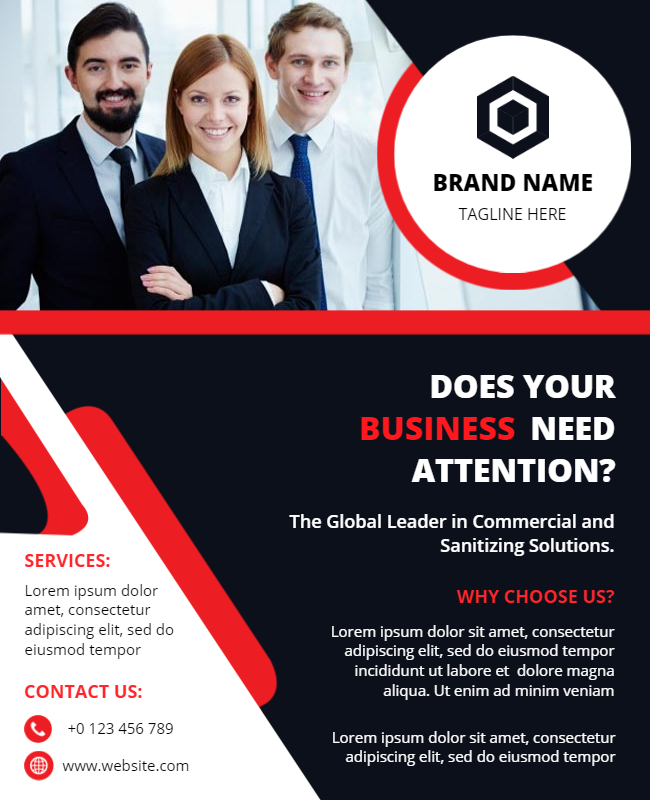
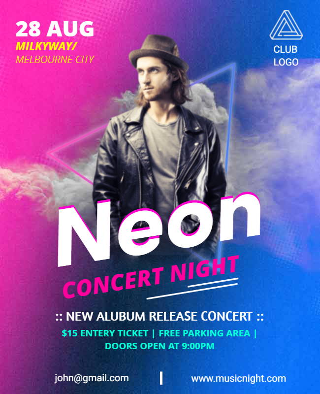
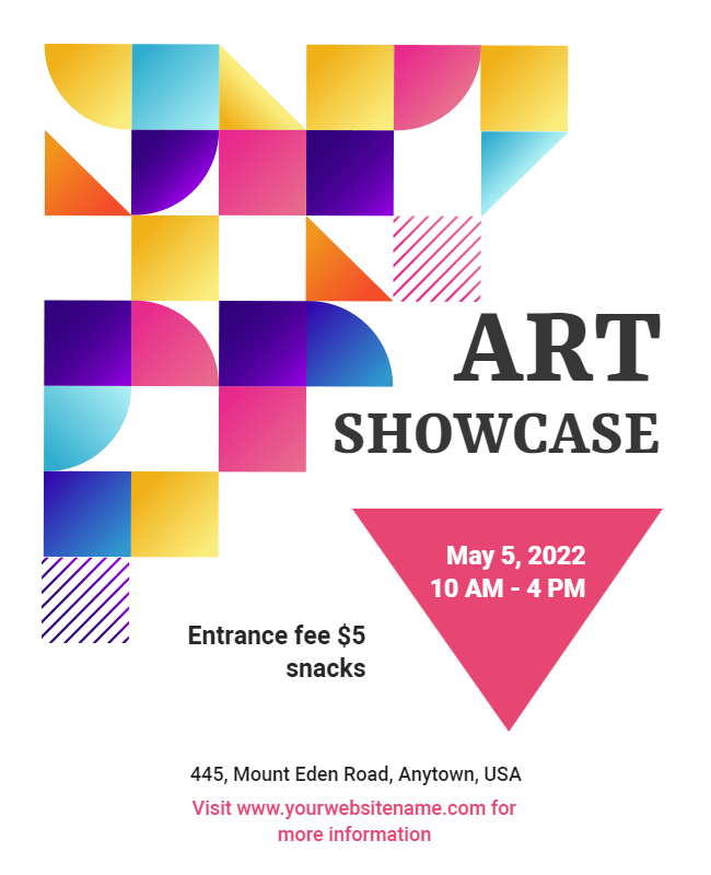
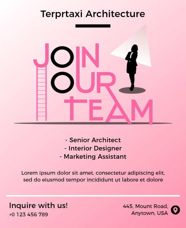
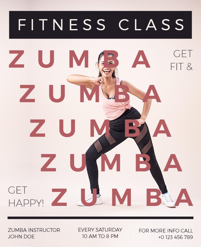
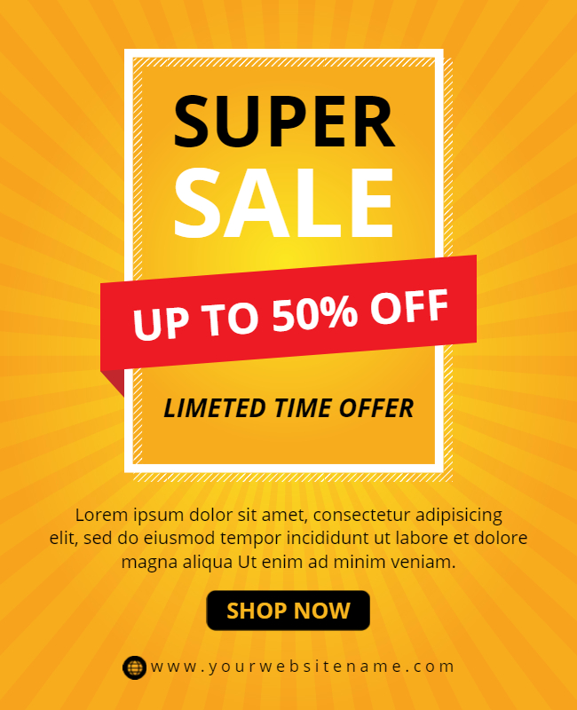
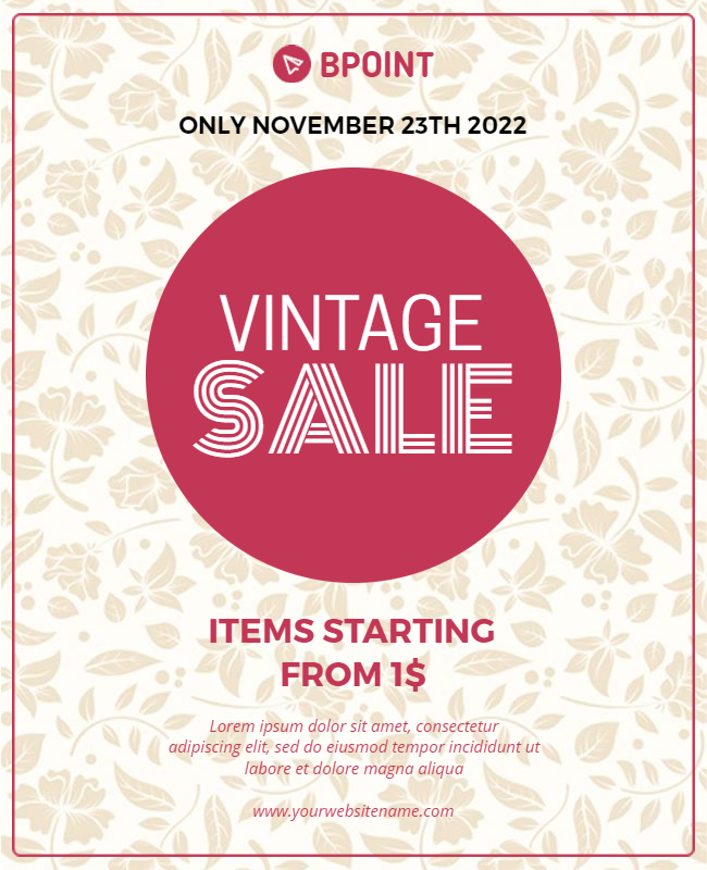
Designing Social Media Flyers that Engage & Convert
As you’ve explored the basics, we’re sure you must have bagged some amazing things for your flyer advert on social media platforms. Isn’t it? Let’s have some hands-on practice with PhotoADKing’s DIY social media flyer templates.
You can design highly engaging, fully editable & instant downloadable social media marketing flyer graphics in a few steps only. Here is what you should do.
Step #1: Browse PhotoADKing’s Flyer Templates for Social Media
Step #2: Select a flyer template. Let’s suppose you are planning to design a business flyer And you’ll be taken to the editor tool where you’ll find all the awesome elements, stock images, graphics, illustrations, frames, collage options, and whatnot!
Step #3: Replace the default elements with the elements of your choice from our resource library. You may upload pictures from your computer if required.
Step #4: Zoom your design & see if it needs any finishing touches.
Step #5: Download your flyer in the desired file format. If you want to share it without leaving the tool, use the “Share” button visible in the navigation bar.
Step #6: Your designing process is successfully finished. Have a seat & watch your creation trending on social media platforms.
Still, confused about creating a flyer? Here is the full guide to clear your doubt. check out our blog on how to make a flyer, where we share step-by-step guidance to help you create a stunning flyer.
I hope you found it helpful and learned something new. If you’d like to read more articles, please feel free to check out our other informative article.
- 100+ Creative Flyer Examples
- Flyer Background
- Flyer Design Tips
- Beginner Guide on Flyer Design
- Flyer Layout Ideas
- Flyer Samples For Different Industries
- Different Types of Flyer Designs
- Flyer Marketing Strategy
- Flyer Purpose
The Takeaway
Kudos! You now have all the must-haves to get started with flyer designing. Why don’t you start creating one today with PhotoADKing? Our professional designers are working hard so you don’t have to. Don’t forget to scroll through our exciting range of freshly-designed flyers for social media. Feel free to edit & make them yours. Also, don’t forget to check out flyer design ideas to enhance your flyer visual appeal and effectiveness.