Designing a flyer is like creating a beautiful picture that speaks to the people you want to reach. Everything you choose, like pictures and fonts, works together to make a great design. Out of all these choices, gradient colors are really important. They can make you feel certain ways, show what you want to say, and make people look at your flyer.
Whether you’re promoting an event, product, or service, the skillful use of gradient colors can elevate your flyers. A flyer maker is here to help. It makes turning these cool ideas into awesome designs super easy. So, let’s jump right into the fascinating world of gradient color schemes for flyers – it’s going to be a fun ride!
In this blog, we’ll show you how to choose the perfect gradient color scheme for your flyers. We’ll explore various gradient types and share valuable tips to make sure your colors blend beautifully and convey your message just right.
Table of Content
- What is a Gradient?
- Why Gradients Matter for Flyer Design?
- How to Choose Gradient Color for Flyer
- Types of Gradients in Flyer
- Tips for Designing your own Gradient Flyer
- To Sum Up
- FAQs
Before we dive into the exciting world of gradients and how they can enhance your flyer designs, let’s take a moment to understand the basics.
What is a Gradient?
A gradient shows a smooth transition from one color to another, creating a visually pleasing blend. It’s like when you see a painting where the colors seamlessly flow into each other, creating a sense of depth and movement.
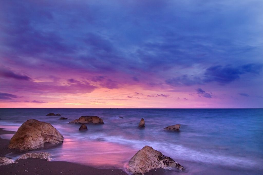
Imagine a beautiful sunset where the sky changes from deep blue near the top to shades of orange and pink as you look toward the horizon. This gentle blending of colors, where one color fades into another, is what we call a gradient. It’s like a colorful gradient rainbow where the colors melt into each other instead of having clear lines between them.
Why Gradients Matter for Flyer Design?
Gradients are undoubtedly essential in contemporary design, primarily due to their ability to seamlessly merge colors. This results in a mesmerizing fusion that exudes elegance and grabs attention effortlessly. Incorporating gradients into your flyers not only adds a touch of style but also evokes emotions, establishing the perfect ambiance for your event and emphasizing crucial particulars.
Now that you understand the significance of gradient color schemes in flyer design, let’s delve into the steps of selecting the perfect color combination to create stunning and impactful flyers.
How to Choose Gradient Color for Flyer
Choosing the right gradient color for your flyer can greatly enhance its visual appeal and effectiveness. Here’s a step-by-step guide on how to choose a gradient color for your flyer with PhotoADKing:
Step 1- Sign-up or Log-in PhotoADKing
If you don’t already have an account, sign up on the PhotoADKing or log in if you have an existing account.
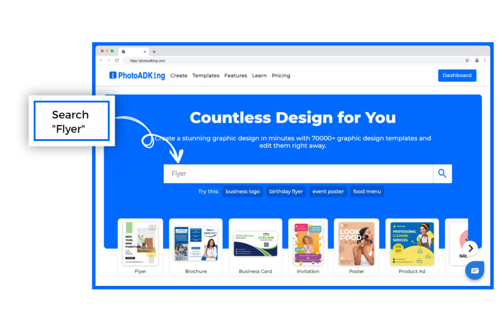
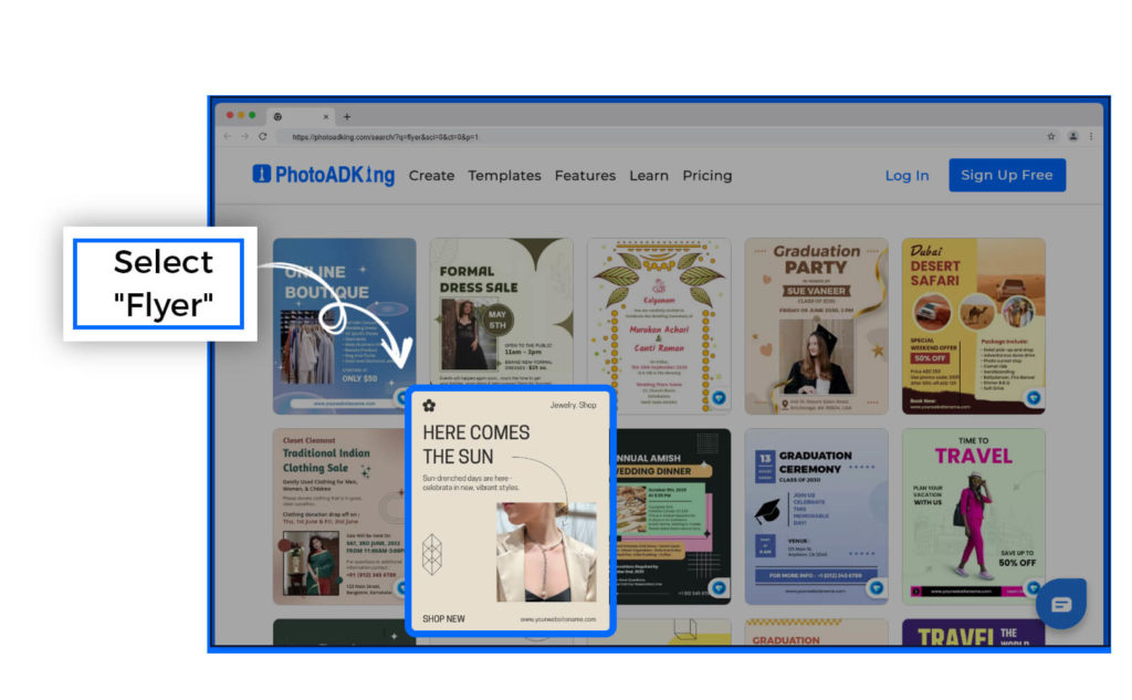
Step 2 – Search “Flyer” in the search bar
After you’ve signed in, write “Flyer” in the search bar. This will show you many different designs for flyers that you can pick from.
Step 3 – Choose Your Flyer Template
Select a flyer template that catches your eye from our diverse collection of colorful and creatively designed options.
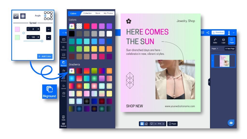
Step 4 – Customise the Flyer Design With a Gradient Color
- Click on the background of the flyer design.
- Then, click on the background color option.
- Select the “Gradient” option to apply a gradient color effect.
Add Text with Gradient Color:
- Choose the text, you want to add a gradient color
- Select the text color option and apply a gradient color to the text.
Step 5: Save and Download
After customizing the flyer design with the gradient color, make sure to save your work. Use the “Save” or “Download” option to save the flyer to your computer in your preferred format (such as JPEG or PNG).
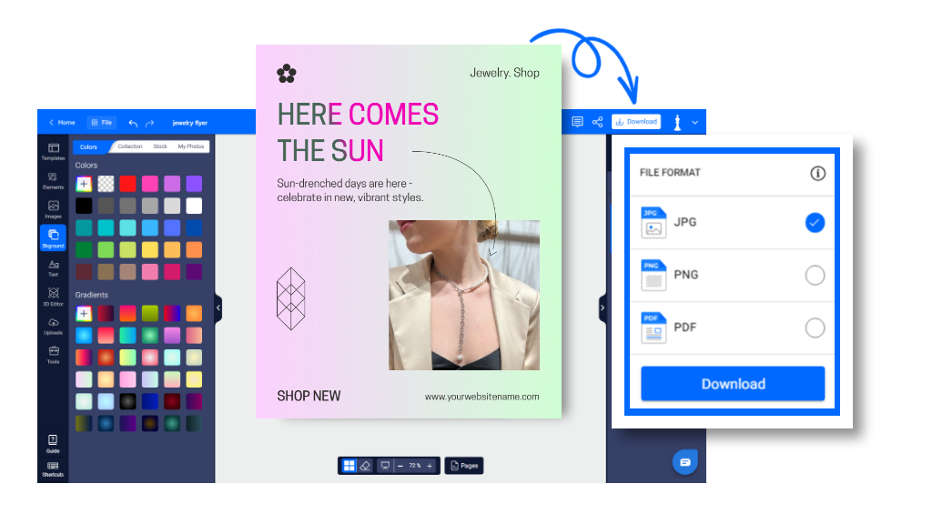
By following these steps, you’ll be able to create a visually appealing flyer with a gradient color scheme using PhotoADKing.
Types of Gradients in Flyer
There are several types of gradients commonly used in design and art to create different effects. Here are a few:
Linear Gradients
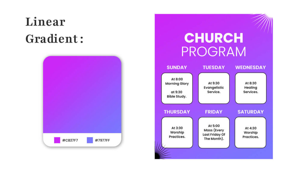
The linear gradients flyer showcases a harmonious blend of colors and creativity, embodying the essence of smooth transitions and visual elegance. With a captivating play of hues fading seamlessly from one to another, this design encapsulates the concept of gradual progression.
Radial Gradients

Radial gradients can be a captivating addition to your flyer design. By placing colors in a circular or radial arrangement, you can create an engaging focal point that draws the viewer’s attention. Imagine a vibrant burst of color emanating from the center and gently fading out towards the edges, adding a sense of depth and dynamism.
Angle Gradients
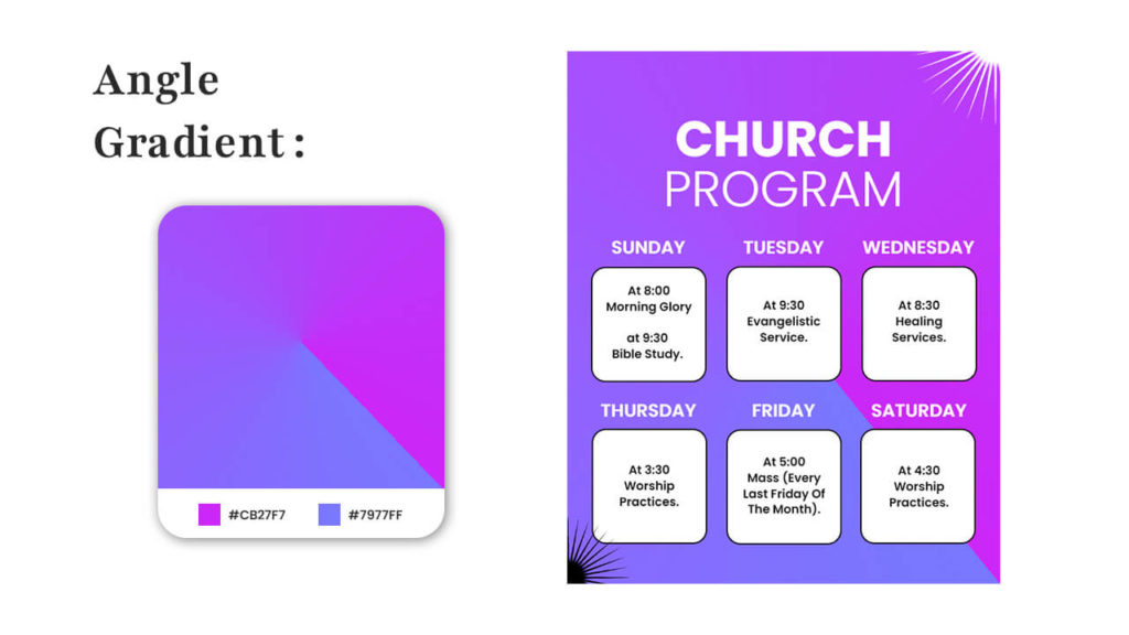
Utilizing angle gradients in a flyer design can indeed add a captivating and dynamic element to your visuals. By incorporating colors that seamlessly blend at a specific angle, you can introduce a pronounced sense of movement and depth to your layout. Consider envisioning a flyer for a beach party, wherein the colors smoothly transition from vibrant blue to golden yellow diagonally across the page.
Reflected Gradients
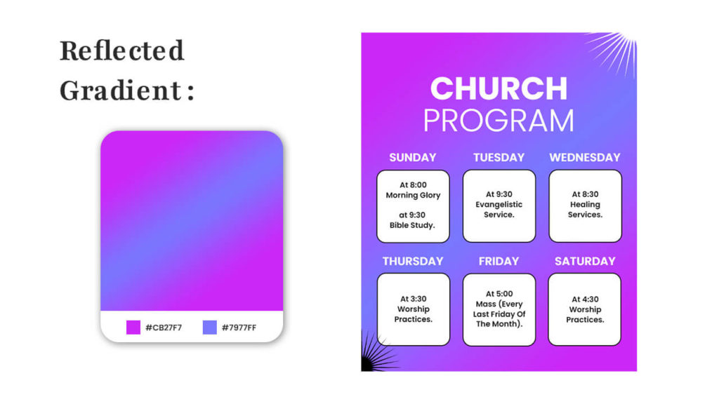
To escalate the refinement of your flyer’s design, contemplate integrating reflected gradients. By duplicating the hues across a central axis, you can craft an optical impression of symmetry and equilibrium, thereby adeptly seizing the observer’s focus.
Diamond Gradients
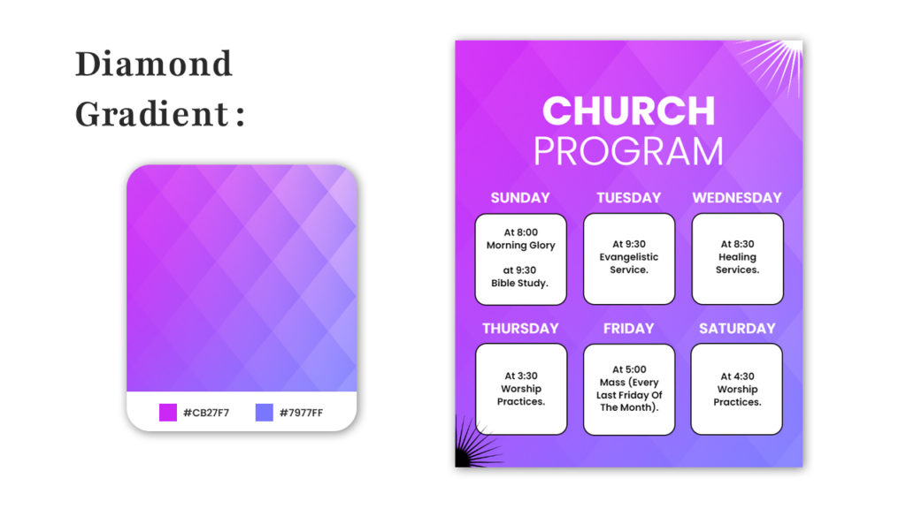
When designing a flyer, incorporating diamond gradients can add a touch of uniqueness and modernity to your layout. A diamond gradient, where colors smoothly transition along diagonal lines, creates an intriguing visual effect that captures attention.
Smooth Gradient
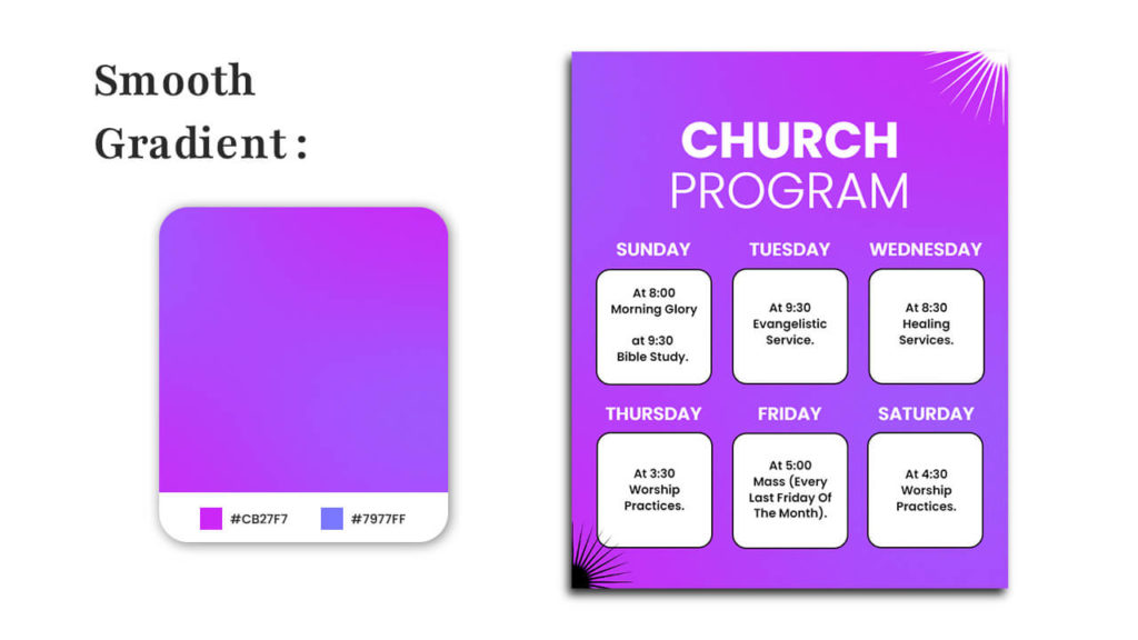
A captivating blend of colors and elegance in a flyer that will make your event stand out. With a seamless transition from one shade to another, this flyer exudes a sense of sophistication that’s hard to ignore.
Tips for Choosing a Gradient Color Scheme for Flyers
Creating an effective gradient color scheme for flyers involves a mix of creativity and design principles. Here are tips to help you choose the right gradient color scheme for your flyers:
Consider the Theme and Message
To begin, let’s identify the theme and message of your flyer. Are you promoting a cheerful event, a professional service, or a serious cause? The colors you choose should align with the emotions and associations you aim to evoke.
Limit the Color Palette
While gradients can be visually appealing, using too many colors can overwhelm the design and make it less cohesive. Stick to a limited color palette, ideally 2-3 colors, for a harmonious and balanced look.
Also Read: How to Choose a Color Palette for Flyer
Use Color Harmonies
Choose colors that work well together using color harmonies. Complementary, analogous, or triadic color schemes can create a pleasing visual effect. Online color scheme tools can help you find colors that naturally complement each other.
Contrast for Readability
Ensure that your text remains readable against the gradient background. High contrast between text and background colors is crucial for readability. Dark text on a light gradient or vice versa tends to work best.
Test for Accessibility
Be mindful of accessibility considerations. Ensure that your color choices meet accessibility guidelines for color contrast to make the flyer usable for individuals with visual impairments.
Aim for Consistency
Maintain consistency in your color choices throughout the flyer. The gradient should flow smoothly and transition gracefully between the chosen colors. Avoid sudden shifts that might disrupt the visual appeal.
Remember, the goal of your gradient color scheme is to enhance the overall visual appeal of your flyer while effectively conveying the information. Play around with different color combinations, test them out, and gather feedback before finalizing your design.
In addition, there are more articles related to flyer design that you can learn and explore to create your own flyer.
Recommended Reads:
Flyer Design Ideas
Flyer Samples For Different Industries
How to Make a Flyer
What Is A Flyer? – Definition, Purpose, & Components
100+ Creative Flyer Examples
Flyer Background
Flyer Design Tips
Beginner Guide on Flyer Design
Flyer Purpose
Flyer Marketing Strategy
Different Types of Flyer Designs
Flyer Layout Ideas
25 Flyer Design Terms
The Golden Ratio in Flyer
Flyer vs Poster
How to Create Flyers With AI Flyer Maker Tools
How to use Format Painter in PhotoADKing
How to Add Blur Effect on Image in PhotoADKing
How to Create Flyers Using AI Flyer Maker
Flyer Style
How to Make Christmas Cards in 5 Easy Steps
To Sum Up
Choosing a gradient color scheme for your flyers can elevate your design, making it more visually appealing and engaging. By understanding the message, audience, and context of your flyer, you can select gradient colors that convey the right emotions and capture attention effectively. Furthermore, remember to maintain harmony, balance, and contrast in order to create a stunning gradient flyer that stands out
So, are you ready to take your flyer design to the next level with captivating gradient colors? Explore creative flyer templates and let your creativity flow to craft stunning flyers that leave a lasting impression.
FAQs
Can I use multiple gradients in one flyer design?
While using multiple gradients can add complexity to your design, it’s important to maintain cohesion. Make sure the gradients complement each other and contribute to the overall message.
How can I choose the right gradient color for my flyer?
To choose the perfect gradient color for your flyer, follow these steps:
- Choose your flyer template
- Click on the background of the flyer design.
- Click on the background color option.
- Select the “Gradient” option to apply a gradient color effect.
- Save and Download
What are some benefits of using gradient color schemes in flyers?
Gradient color schemes make flyers visually appealing, convey emotions effectively, create a modern look, and help in highlighting key information.


