Color palettes play a pivotal role in flyer design, wielding the power to evoke emotions, enhance communication, and create a lasting impression on the audience, making them a crucial element for effective promotion.
Elevate your promotional game effortlessly with our revolutionary flyer maker template. This ingenious tool streamlines the design process, sparing you precious hours and hard-earned money. Craft stunning flyers for any occasion without the hassle of starting from scratch or hiring expensive designers.
With our flyer template, you’re in control, customizing every detail to suit your vision. Embrace convenience and professionalism seamlessly, giving you more time and resources to invest where it truly matters.
In this blog, we’ll take you on a journey through the art of using the perfect color palette in flyers also we’ll delve into the emotions behind colors, their importance, the techniques to choose a color palette for a flyer, and which color palette you need to use in the flyer. So, let’s dive into the world of hues, shades, and tones and unlock the true potential of your flyer designs.
Table of Contents
Importance of Color Palettes in Flyer Design
Colors Evoke Emotions and Convey Messages
Steps to Use Color Palette in Flyers
Color Wheels and Types of Color Combinations
Which Color Palettes You Need to Use in Flyers?
Importance of Color Palettes in Flyer Design
- Branding: Consistent use of brand colors in flyers reinforces brand identity and recognition. This cohesion builds trust and familiarity among the audience.
- Communication: Different colors convey different messages and moods. Carefully chosen colors can align with the flyer’s purpose and effectively communicate its content without relying solely on text.
- Highlighting Information: Strategic use of contrasting colors draws attention to key information, such as headlines, calls to action, or important details, making it easier for readers to quickly grasp the flyer’s purpose.
- Emotional Associations: Colors have cultural and emotional connotations. A well-chosen color palette can evoke specific feelings, attitudes, and associations that resonate with the target audience.
- Readability: Proper color combinations enhance text legibility. High contrast between text and background ensures that information is easily readable, preventing eyestrain and ensuring a smooth reading experience.
Have you ever thought about what the emotions of color have? Well, yes, color also has emotions. Colors have a profound ability to stir emotions and communicate messages without words, harnessing a visual language that resonates deep within us. Let’s take a look.
Colors Evoke Emotions and Convey Messages
- Red: Passion, energy, love, and urgency.
- Blue: Calmness, trust, serenity, and reliability.
- Yellow: Joy, happiness, optimism, and warmth.
- Green: Growth, freshness, harmony, and nature.
- Purple: Royalty, creativity, luxury, and spirituality.
- Orange: Enthusiasm, vitality, creativity, and encouragement.
- Pink: Affection, playfulness, innocence, and sweetness.
- Black: Power, elegance, mystery, and sophistication.
- White: Purity, simplicity, cleanliness, and clarity.
- Brown: Earthiness, stability, warmth, and reliability.
- Gray: Neutrality, balance, professionalism, and formality.
- Gold: Wealth, luxury, prestige, and success.
- Silver: Modernity, sleekness, technology, and sophistication.
We discussed the importance and emotions associated with colors, which may be useful when designing flyers. We’ll now look at the process of choosing a color palette for a flyer.
Steps to Use Color Palette in Flyers
Step 1- Sign-up or Log-in PhotoADKing
Firstly, sign up or log in to PhotoADKing to access a powerful and user-friendly platform for creating stunning graphics, designs, and visuals with ease.
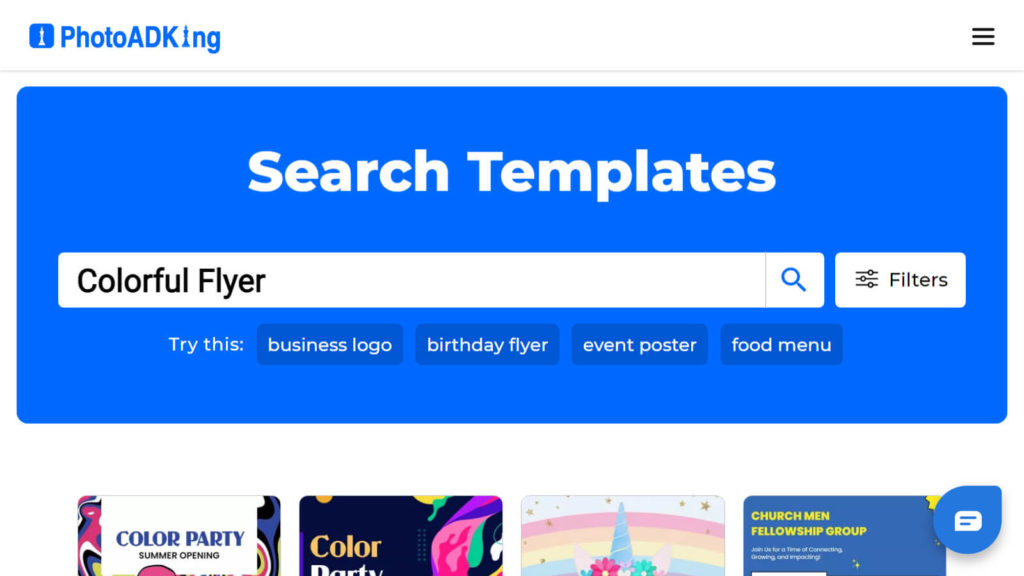
Step 2- Search “ Colorful Flyer” In the Search Bar
Proceed to the search bar and type in “Colorful Flyer” to explore a diverse collection of professionally crafted flyer templates.
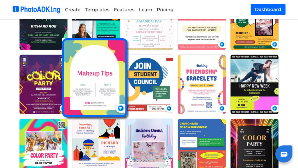
Step 3- Choose Your Flyer Template
Choose your flyer template to add a new color palette from our wide range of colorful flyer templates to create visually captivating and informative promotional material for your event or business Also with various styles and layouts to choose from, you’ll find the perfect template to suit your needs.
Step 4- Customize the Flyer Design With New Color Palettes
After selecting the flyer template, you can add your favorite color palette to your flyer, you can also take the help of a color hunt to choose new and attractive color palettes. Start creating an eye-catching and visually appealing flyer that captures users’ attention and conveys your intended theme effectively.
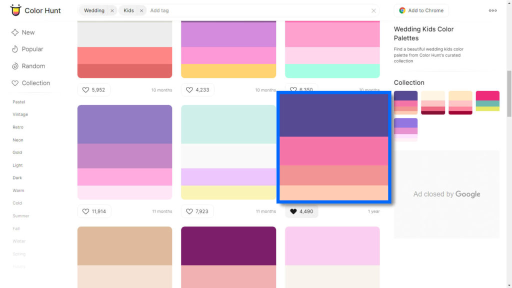
However, Color Hunt gives you different and new ready color palettes, which you can simply copy and paste into the flyer design.
You can take the help of color hunt to choose the color palettes
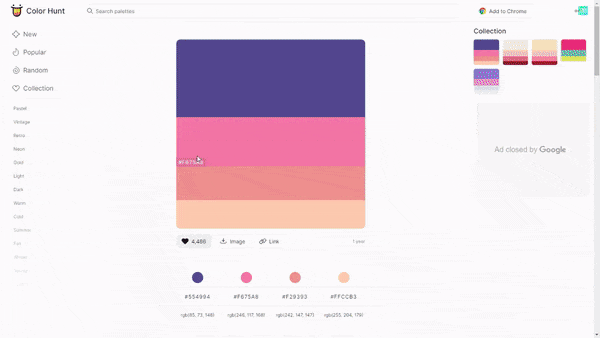
Choose Your Color Palette From Color Hunt
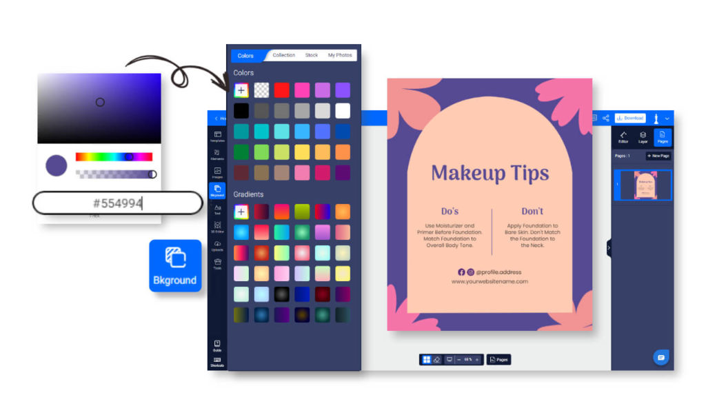
Choose any color palette from the color hunt that is suitable for your flyer, copy the color code, and paste it into the editing flyer element.
Paste Your Color Code
Select the element and go to the right-hand side section to paste the color code you want to add from the color hunt palette
Add Background Color
For the background, go to the left-hand side, select Background,” and paste the color code you want to add.
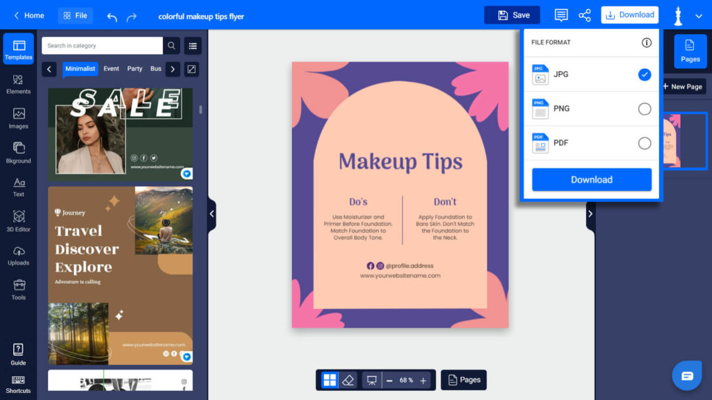
Step 5- Download and Share Flyer Design
Lastly, once you’ve perfected your flyer design, simply click the download button on PhotoADKing to obtain high-quality files of your creation. However, with your customized flyer in hand, you can confidently share and showcase your brand across various platforms. There you go!
Finally, we have completed the process of creating flyers according to the color palettes. It’s an easy way to edit the flyer with the help of a color hunt. Now, it’s your turn to design the flyer, but before that, you might be confused about which color palette would you choose for your flyer. For that, we will look further into which color palettes you need to use in your flyers.
Color Wheels and Types of Color Combinations
Primary Colors
Firstly, the primary colors are red, blue, and yellow, and these are the essential hues from which all other colors are derived.

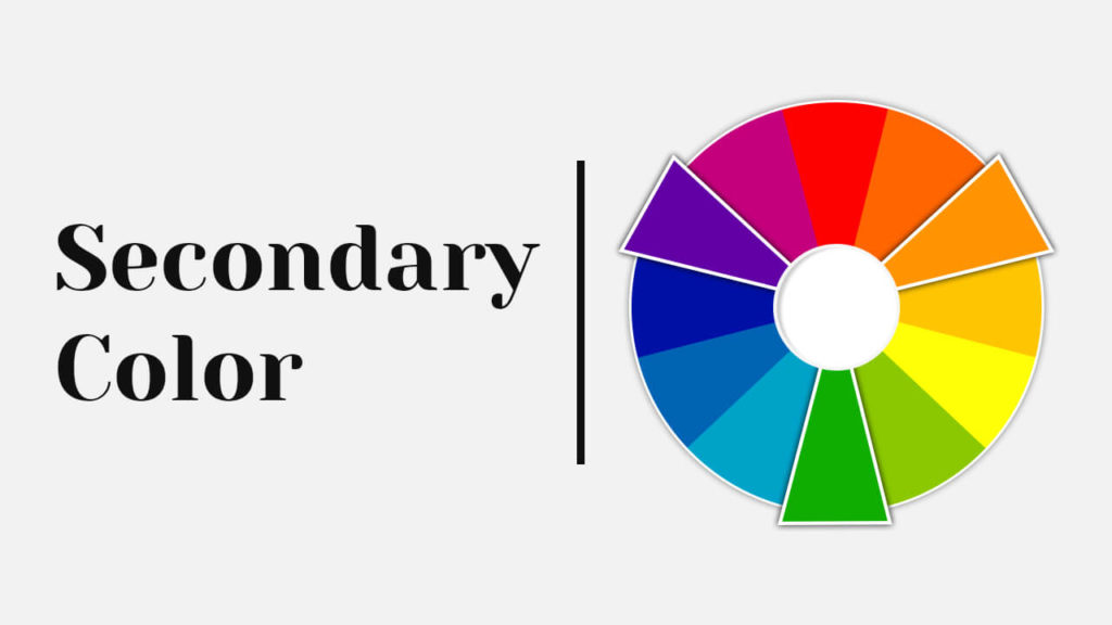
Secondary Colors
When combined in various ratios, they produce secondary colors: orange, green, and purple.
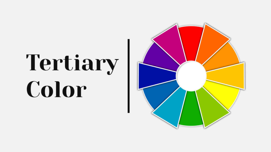
Tertiary Colors
Tertiary colors, on the other hand, emerge by blending primary and secondary colors.
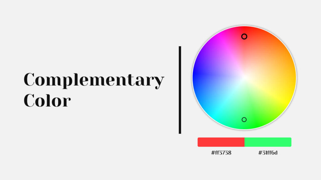
Complementary Colors
Tertiary colors, on the other hand, emerge by blending primary and secondary colors Also they are pairs of hues positioned opposite each other on the color wheel, creating a striking visual contrast and enhancing each other’s intensity when placed side by side.
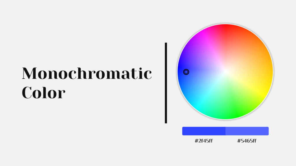
Monochromatic Colors
These colors refer to a color scheme derived from a single base hue, varying only in shade, tint, and or intensity also approach offers a harmonious and subtle aesthetic, allowing for nuanced design and artistic expression within a restricted color range.
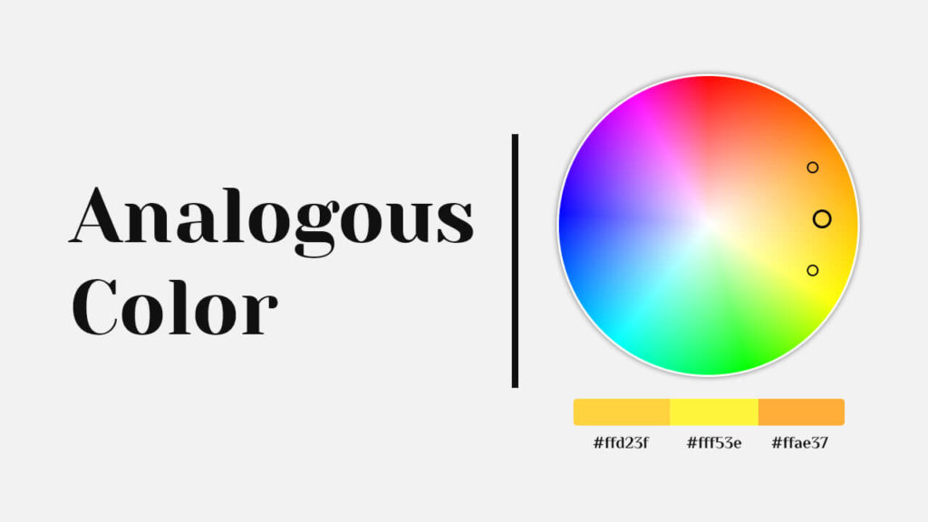
Analogous Colors
These colors are neighboring hues on the color wheel that share similar undertones, creating a pleasing and coherent color palette when used together.
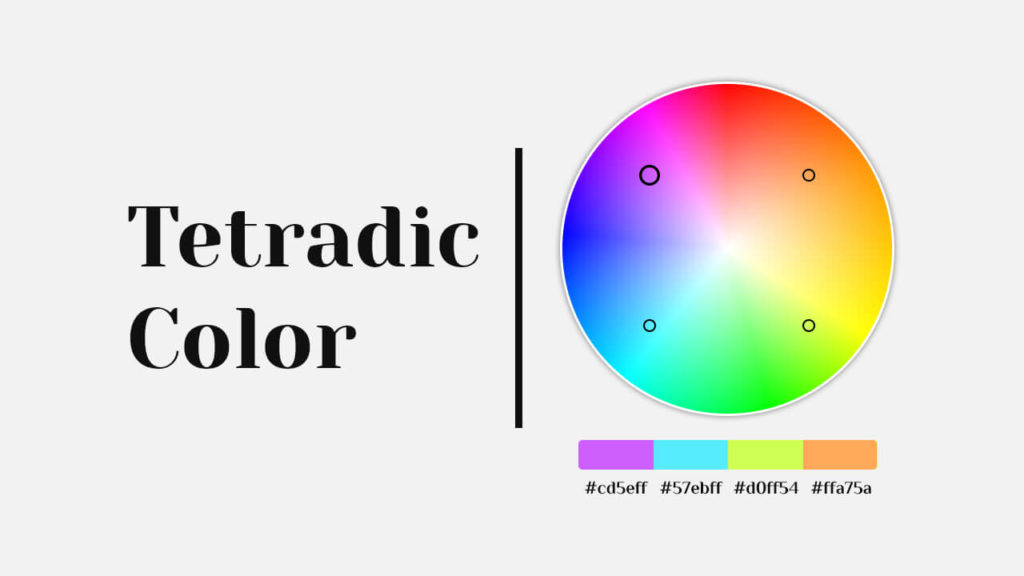
Tetradic Colors
Tetradic colors, also known as double complementary or rectangular colors, consist of two pairs of complementary hues arranged in a rectangular shape on the color wheel.
Which Color Palettes You Need to Use in Flyers?
However, there are many color palettes that you can use in your flyers.
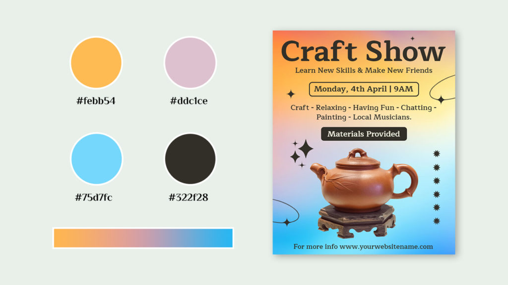
Cyan and Light Orange Harmonious Palette
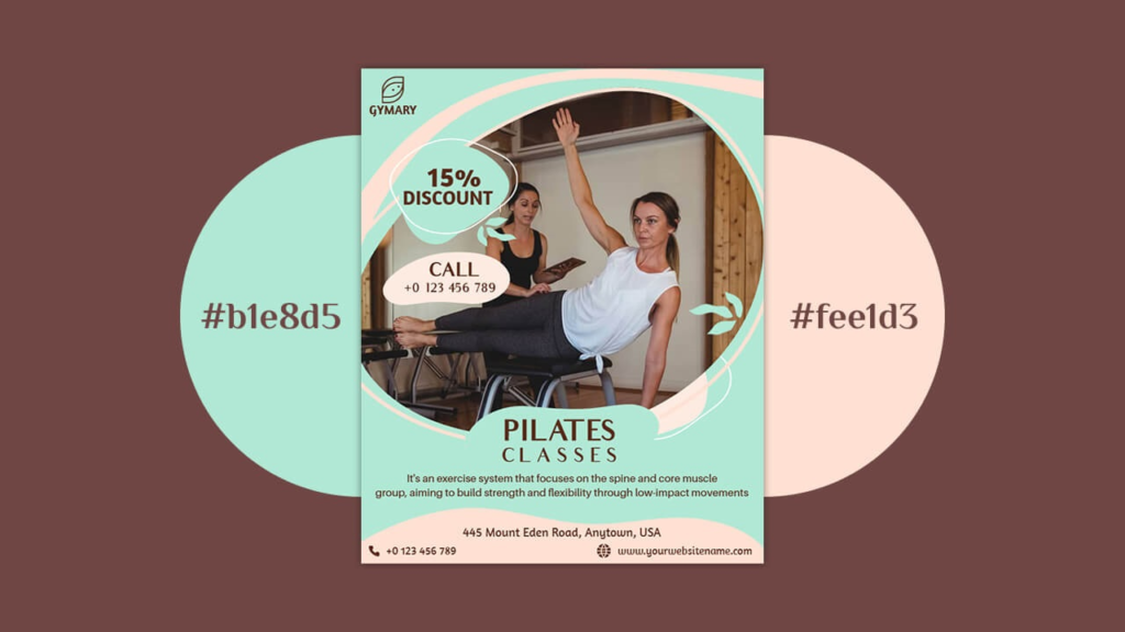
Use harmonious senses with a blend of Cyan and Light Orange in your flyer to create an experience that combines creativity and warmth.
Red, Brown, and Orange Autumn Palette

It’s an autumn color palette, that featured a captivating blend of red, brown, and orange hues that evoke the essence of the season and also elevate your style and embrace the rich and vibrant tones that will leave you feeling both cozy and chic.
Pastels Color Palette
Experience a world of serene beauty and subtle elegance with our pastel-themed art exhibition also capture the essence of tranquility, inviting you to explore a realm of gentle emotions and graceful creativity.
Pink Shades Pastels
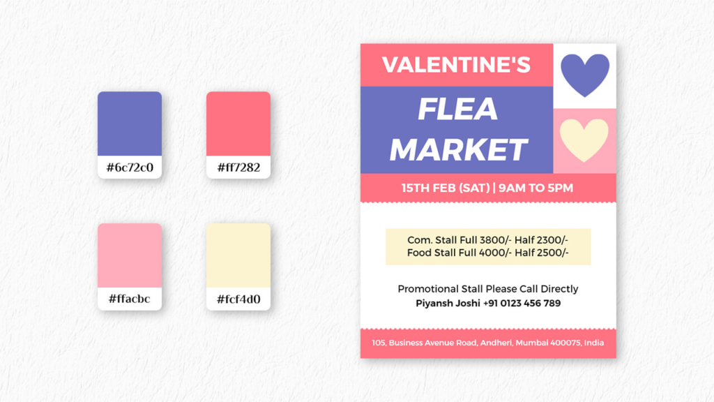
Use a dreamy palette of pink shades that embody grace and charm also indulge in the soothing ambiance and treat yourself to a truly rosy experience that will leave you feeling pampered and rejuvenated.
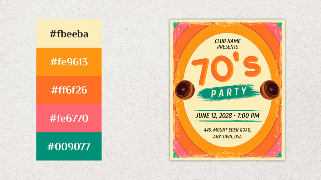
Yellow and Orange Colors Palette
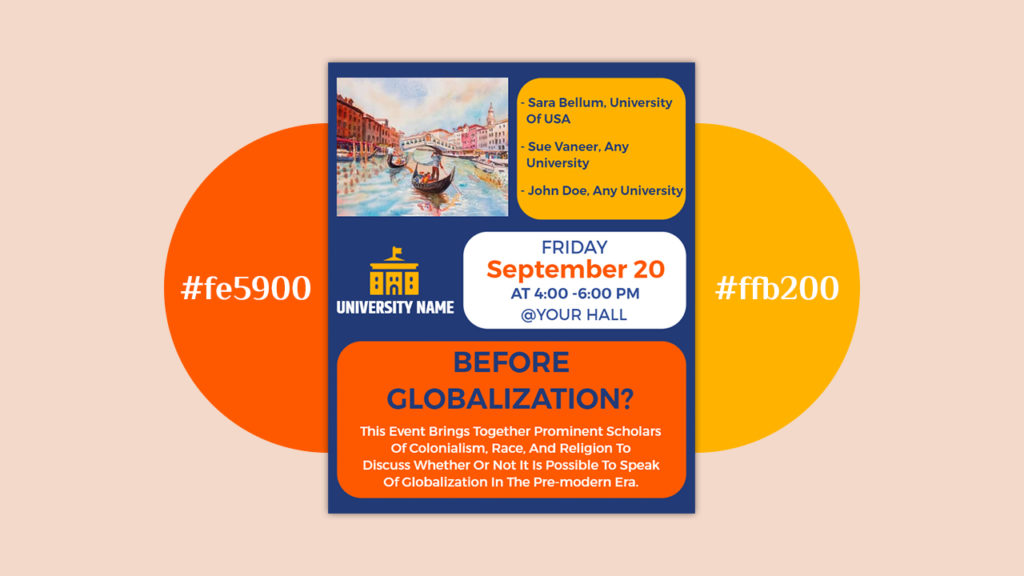
The combination of yellow and orange colors creates a vibrant and energetic palette that evokes feelings of warmth, enthusiasm, and creativity also often used to capture attention and convey a sense of positivity and optimism in various design projects and artistic endeavors.
Green and Red Gradient Palette
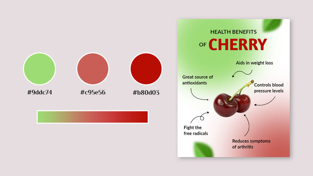
These gradients combine revitalizing green with passionate red, creating a balanced palette that signifies harmony and energy in design.
Green, Brown, and White Color Palette
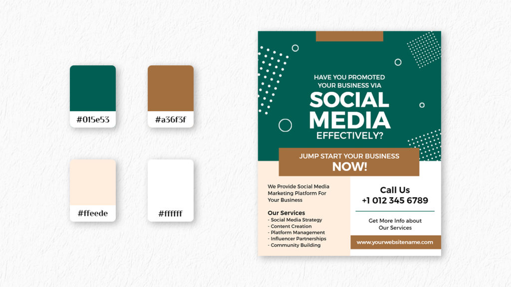
The fusion of colors forms a natural and earthy palette, reflecting the tranquil essence of nature Also combination evokes a sense of organic beauty and grounding, making it a versatile choice for designs that aim to convey a serene and inviting atmosphere.
Blue and Yellow Color Palette
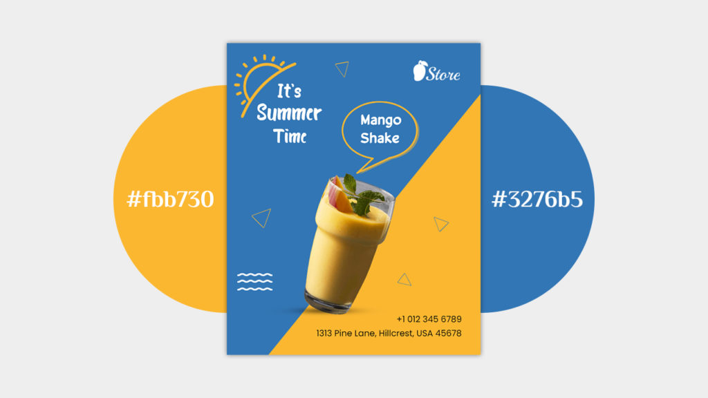
The pairing of blue and yellow colors forms a vibrant and complementary palette that captures the essence of a clear sky meeting a sunlit landscape also combination exudes a sense of positivity and brightness, making it a popular choice for designs seeking to convey a cheerful and uplifting ambiance.
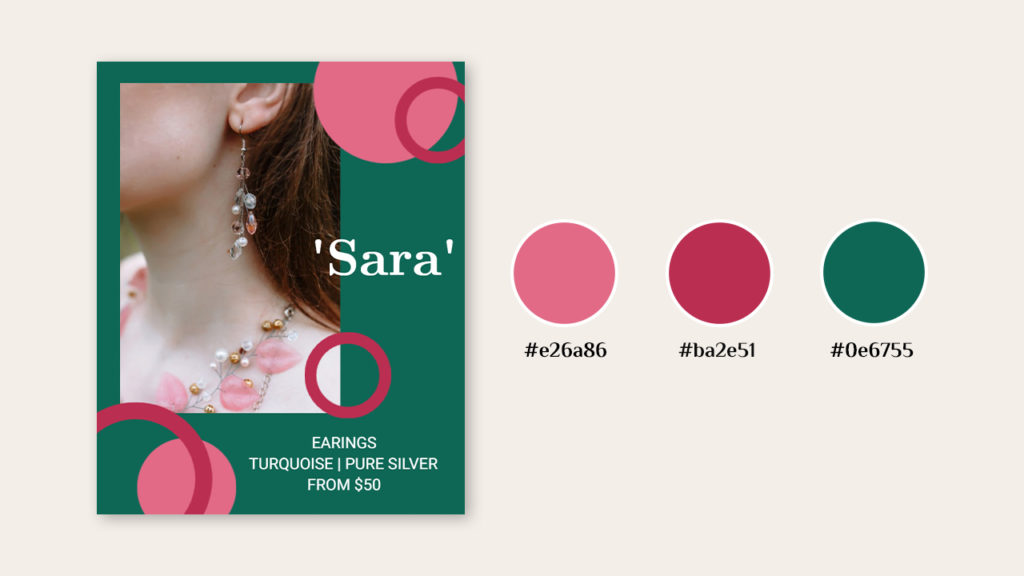
Contrasting Color Palette
When you put pink, yellow, blue, and black together, you get a palette that’s full of life and looks different also a mix of gentle and strong colors that make things feel playful and up-to-date. This works well for designs that want to show creativity and youthful energy.
Sunset Shades Palette
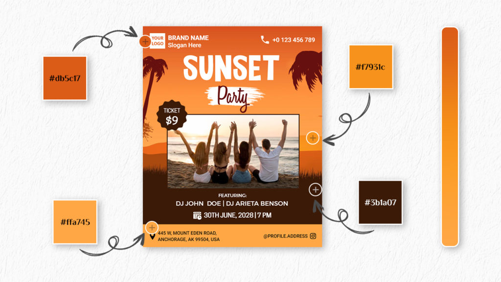
The sunset colors palette shows the beautiful colors of the sun setting also it mixes warm oranges, yellows, and reds to make you feel calm and amazed, just like when you see a beautiful sunset.
Tri-Color Palette
The three-color palette uses a lot of red to create a design that looks really interesting also use the strong red color to make you feel strong emotions and pay attention to the design.
Soft Pastel Palette
The soft pastel colors are gentle and quiet, like soft colors also make things look calm and nice. This is a popular choice for designs that want to make you feel relaxed and elegant with a touch of subtle beauty.
Vibrant Color Palette
A lively color palette is full of bright and energetic colors like green, pink, and orange also colors make things feel energetic and fun. This is a great choice for designs that want to grab your attention and make you feel energetic and lively.
Christmas Color Palette
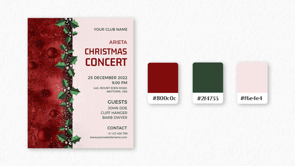
The Christmas color combination uses traditional red and green also colors stand for warmth, togetherness, and celebration. This makes the palette a lasting option for making joyful and welcoming designs.
Triadic Color Palette
Finally, a triadic color palette is made up of three colors that are equally far apart on the color wheel. This gives a balanced but exciting look to designs that catch your eye.
Recommended Blog
Creative Color Schemes 2023
Types of Graphic Design
Tumblr Graphics Designs Ideas
Graphic Design Flyer Ideas
Graphic Design Trends
How to Make a Flyer
What Is A Flyer? – Definition, Purpose, & Components
Creative Flyer Examples
Flyer vs Poster
Flyer Samples
Flyer Background
The Golden Ratio in Flyer
How to Add Blur Effect on Image in PhotoADKing
Flyer Style
Conclusion
In the world of flyer design, the choice of a color palette is a paramount decision that can make or break the effectiveness of your promotional material, and the colors you select go beyond mere aesthetics they also evoke emotions, convey messages, and establish a strong connection with your audience.
In this blog, we’ve delved into the process of selecting a flyer color palette, grasped its importance in design, explored emotional connections to colors, and acquired a step-by-step approach using tools like PhotoADKing and resources such as Color Hunt. Now, feel free to explore diverse color combinations and craft resonant flyers for your desired audience.
FAQs
Colors do many important things. They make you feel certain ways, tell you things, help you read easily, show what a brand is, point out important stuff, and make you feel a connection.
Different colors have specific emotional associations. For example, red represents passion and urgency, while blue conveys calmness and trust. By choosing the right colors, you can align your flyer’s message with its intended emotional impact.
When you choose colors that look good together, your design appears attractive and organized. These colors make the flyer look better and more interesting to the people who see it.
Using different sets of colors can be done, but it’s usually a good idea to use the same set of colors to make things look nice together. Mixing too many colors can lead to a cluttered and confusing design.