
Color Schemes often aliased as the color palette and color combinations, are one of the techniques to influence the mind of viewers.
Never underestimate the power of a great color scheme, it has much to do with people’s moods. There is a color for every mood & it just hits the emotions right. You can never go wrong in passing the message using the appropriate color combination.
Color combinations are inspired by the giants of the industry. As the new year sets in, a fresh list is revealed by paint companies.
8 Trending Color Combinations that are Waves of Freshness
We are going to dig deep into trending color combinations that will take breaths away!
You may use this list as your cheat sheet and define a sizzling color palette for your work. Trust me, it will be amazeballs for your clients and you’ll be in awe of your new-try captivating design.
1. Neon is the New Ins
Neon colors that are happily welcomed by millennials are not yesterday’s thing. It is inspired by retro themes. The word neon itself brings a thought of glowing and unique colors. No matter if the said colors are fluorescent and blinding, its get-up hugs our eyes because of the luminous effect.
Neon takes us back to the 80s. It pays tribute to cassette tapes, video game consoles, vintage computers & pinball machines.
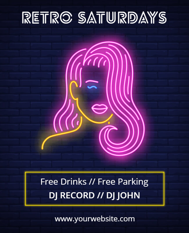
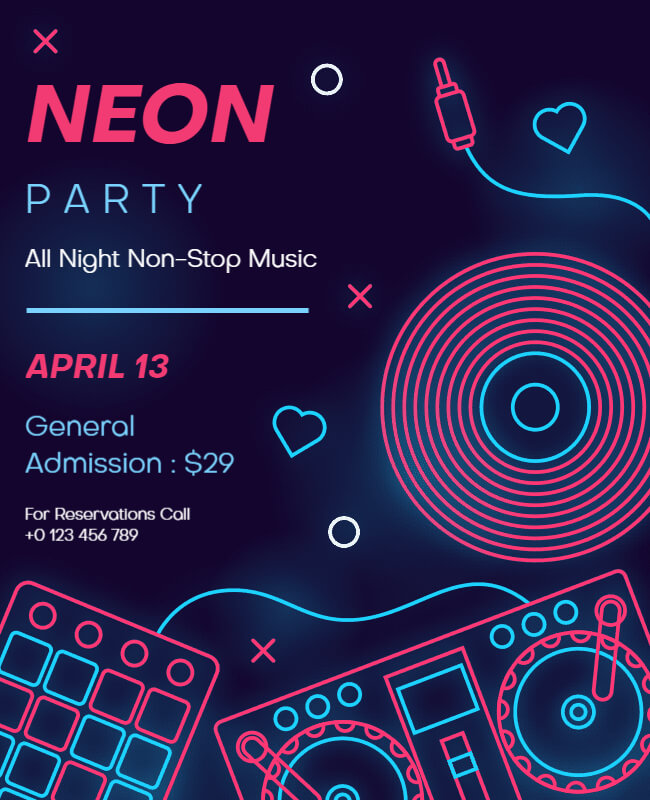
P.S. Doesn’t this seem perfect for a DJ’s flyer template? No wonder why we are so obsessed with neon colors. Its pop-color effect defines funky and creatively outstanding meaning that fits well with offbeat niches.
If you love this idea, feel free to use the flamingo light for book covers and logos too. They will look more dashing than ever!
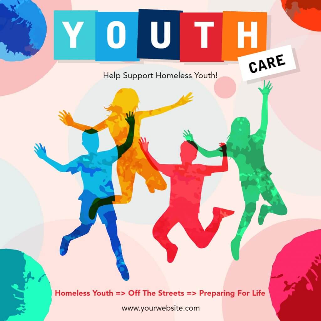
2. Transparent Overlays for Magical Color Effects
Color trends aren’t just cyclical but evolutionary too. The overlay effect is derived from the past for sure but the new addition is what we have seen as filters on social media. The point is to create a deep and visually intriguing appeal that reflects a lightweight and subtle tone.
Beauty of color overlay effect lies in the blend of shapes or figures with background, text that highlights both in a balanced way.
The layered colors or transparent overlay effect seems interesting and viewers are compelled to see what’s inside with attention. However, it could be complex for novices but the right implementation could be iconic.
It seems to be made for Poster Design Ideas, Music Album Covers, Book Covers & Movie Posters.
3. ‘Spark to Life’ Color Schemes
There are instances when choosing lightweight colors makes a false impression. When you opt to be bold and brave, go for futuristic color schemes as we see with innumerable designs with PhotoADKing.
The 3D impact can be made easily with futuristic color combinations. They are bright and lively and bring a spark to our lives. Many IT websites have started implementing them and the user interface looks realistic in saturated blues, blazing pinks, and rich purples.
It is the best visual treat when all you want to share is a multi-dimensional and fresh-feeling design. The glowing aesthetics brings tomorrow today.
4. Evergreen Vintage
Who says Vintage is out of fashion? That feeling you get after dusting off an old book from your shelf or taking out your teenage diary is priceless.
There is much to learn from Vintage styles. Remember the old movie posters, the graphics, bright and pastel colors, and classic typefaces. We see some brands that still carry forward the vintage themes and never find themselves awkward.
Vintage Color Combinations is like tasting new wine from an old bottle; keeps getting better in new times. It’s still a legit choice for product packaging and a popular pick with free logo maker.
5. Express it with a hint of “Dark”
What we call dark isn’t always haunting. It’s an inverted viewing experience for users i.e. light fonts and dark backdrop. It is undoubtedly popular in web and app designs.
How can we forget the dark mode feature of Instagram? Without affecting readability, it gives a distinctly wonderful user experience. Another reason for it being chosen time and again is the stress-relieving nature of the dark and light colors brought together.
Dark color schemes are easy on the eyes, energy-efficient and least harsh in low-lighting environments.
Designing has come far from using dark themes for websites to opting for them as banner designs. These themes for websites not only enhance the aesthetic appeal but also improve readability. With banners, the low-light background will give space to bring the text to focus. This is what we call color-play.
6. Go Monochrome
To those who think of finding the latest color combinations as a headache, go monochrome.
Inspiration is something you can get from unusual places. We just need to span our vision. We are listing monochrome here for obvious reasons in 2020. You may take this as a celebrity-inspired color palette as we see Priyanka Chopra, Deepika Padukone, Kareena Kapoor Khan to Heena Khan opting for monochromic appeal.
You’ll enjoy creating harmony with monochrome palettes with splash screens for mobile apps, product packaging, business cards, book covers, and whatnot.
The magic created by light-to-dark shades of the same color family is worth crushing over! It will get to be a timeless trend making people step away from black and white color contrasts.

Achieve a neat and tidy design for wedding invitation cards to brochures without thinking of a hundred colors. The 1D splash of color is a win-win for any design arena.
7. Cherish the Classic Blue
Pantone reveals this color of the year & you will enjoy incorporating it in your designs. Classic Blue belongs to the blue color spectrum, somewhere between mid-tone and deep blue. Let’s see what Pantone has to say about Classic Blue:
“We gravitate to colors that are honest and offer the promise of protection. Non-aggressive and easily relatable, the trusted Pantone 19-4052 Classic Blue lends itself to relaxed interaction.”

That’s true. Color psychology labels classic blue as a representation of intelligence, trustworthiness, and maturity. We have often seen these kinds of colors as an inevitable part of branding material design. This is because they have always made the design look more presentable.
8. Pop the Pastels
Google ad banners are a different case in pairing up colors. The reason is they should not mix up with website backgrounds that are mostly white, cream, or light. Pastels work great for text and image composition. Illustrations blend well with the pastel-colored vibe.

Taking inspiration from this, pastels are on our list. It features an exciting emotion that is nothing but an amazing experience for the eyes.
In the design world, trends change and repeat over time. Thus, we keep wondering what to implement.
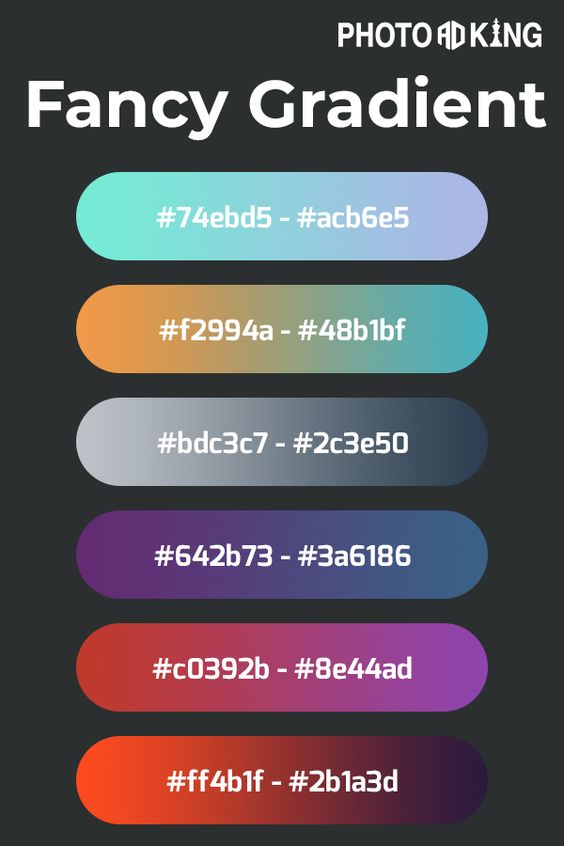
For more information about the color combination learn color palettes in flyers
As you have undergone many sassy color combinations, you must be curious to scroll through banner making strategy, best logo color schemes, and more. Welcome to PhotoADKing’s DIY graphic designing world.


One Comment on “8 Creative Color Schemes 2023”
Comments are closed.