Ever wondered what makes a business flyer truly stand out in a sea of marketing materials? The answer lies in the art of business flyer layout!
Whether you’re a seasoned marketer or a small business owner just starting, mastering the art of flyer layout can be a game-changer for your brand’s success. Understanding the principles of flyer layout is the key to making your promotional materials shine.
In this blog, we’ll dive deep into the art of business flyer layout, exploring the essential elements and design principles that will help you craft stunning and impactful business flyers.
Table of Contents:
- What is a Layout in Business Flyer Design?
- Business Flyer Layout Elements
- Importance of Effective Flyer Layout in Business Flyer
- Conclusion
- FAQs
What is a Layout in Business Flyer Design?
In business flyer designing, a layout is like a plan that decides where everything goes on the flyer. It’s where we put words, pictures, and colors so that the flyer looks good and tells people what we want them to know. The layout helps make the flyer easy to read and understand, so people can quickly get the message.
Think of it as the map that guides how the business flyer should look and how it should work to catch people’s attention and share information effectively. By carefully considering factors like typography, image placement, whitespace, and color schemes, a well-crafted layout ensures that the flyer is visually engaging while also being easy to read.
Here, we will explore the important elements of business flyer layout.
Business Flyer Layout Elements
Creating an effective business flyer layout is crucial for grabbing the attention of your target audience and conveying your message clearly. Here’s a step-by-step guide to help you design a professional business flyer layout.
Choose a Size and Orientation:
Selecting the right size and orientation for your business flyer is a crucial decision in creating an effective marketing tool. The choice of size, whether it’s a standard letter size, a smaller handout, or a larger flyer, depends on your target audience and the purpose of your flyer. Likewise, the orientation, whether portrait or landscape, can impact the overall design and how information is presented.
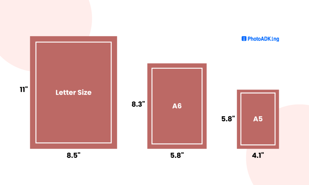
A portrait orientation often works well for text-heavy flyers, while landscape can accommodate more visual elements. By carefully considering these factors, you can ensure that your flyer not only looks professional but also effectively conveys your message to your intended audience.
Select a Color Scheme:
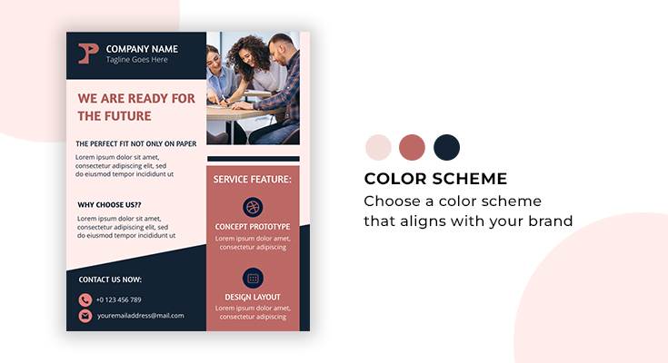
When it comes to designing a business flyer, selecting the right color scheme is paramount. Choose a color scheme that aligns with your brand or the theme of your flyer. Stick to 2-3 main colors for a cohesive look.
Bold and vibrant hues can grab attention and infuse energy, while subtle, muted tones can evoke professionalism and sophistication.
Add Branding Elements:
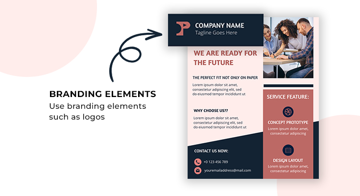
Incorporating branding elements such as logos, color schemes, and consistent typography reinforces your brand’s identity. These elements help establish brand recognition and trust among your target audience, ensuring that your flyer effectively represents your business.
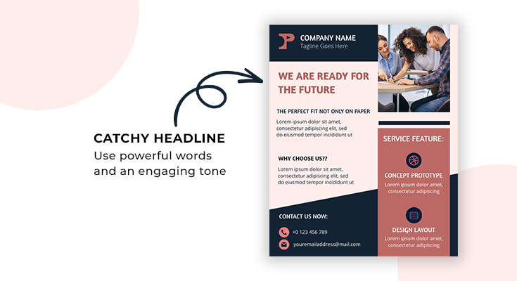
Create a Catchy Headline:
To captivate your audience and ensure your business flyer stands out, it’s essential to create a catchy headline. Employing powerful words and an engaging tone can pique curiosity while also encouraging potential customers to delve deeper into your flyer’s content, ultimately boosting its effectiveness in conveying your message and driving action.
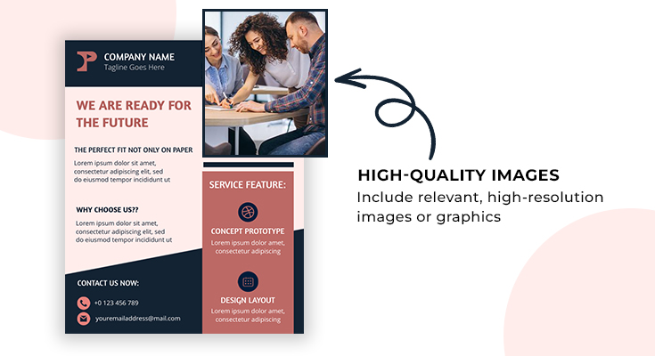
Use High-Quality Images:
When transitioning from the concept to the execution of a business flyer, it’s crucial to use high-quality images. High-resolution visuals seamlessly integrate with your design, enhancing overall aesthetics and professionalism. Include relevant, high-resolution images or graphics that support your message. Ensure they are properly sized and of good quality.
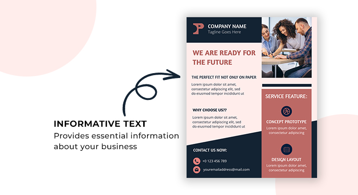
Add Informative Text:
Well-crafted text complements the design, providing context and details that clarify your message. Write concise and persuasive copy that provides essential information about your business, product, or event. Furthermore, use bullet points or short paragraphs to make the text easily scannable.
Include Contact Information:
Display your contact details prominently, including phone number, email, website, and physical address if applicable. Moreover, providing clear contact details allows potential customers to easily reach out and engage with your business.
Furthermore, this essential information serves as a bridge, facilitating direct communication and potentially converting interest into meaningful interactions.
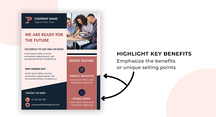
Highlight Key Benefits:
When creating a business flyer, it is essential to strategically highlight key benefits to capture your audience’s attention. Emphasize the benefits or unique selling points of your product or service to entice potential customers.
By showcasing the advantages of your product or service, such as cost savings or enhanced convenience, potential customers are more likely to be intrigued.
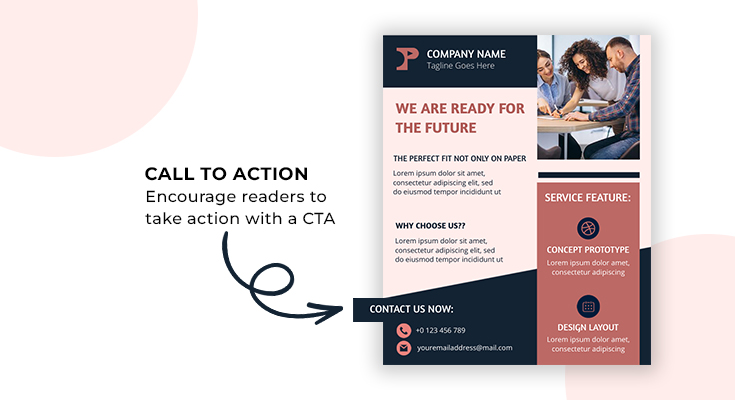
Call to Action (CTA):
In crafting a compelling business flyer, incorporating a well-placed Call to Action (CTA) is crucial. Encourage readers to take action with a clear and compelling CTA such as “Call now,” “Visit our website,” or “Visit our store”.
Ultimately, a thoughtfully crafted CTA ensures that your flyer motivates readers to take the desired steps.
Use Fonts Wisely:
Carefully select fonts that align with your brand’s identity and message. Begin by selecting fonts that align with your brand’s identity and message. Additionally, consider factors like font size and spacing to ensure readability. By doing so, you can create a harmonious and engaging text layout.
Maintain White Space:
In your flyer design, maintaining white space is essential. Ensure proper spacing between elements to avoid a cluttered look. Adequate spacing between elements creates a clean and organized appearance, making it easier for readers to focus on the key information. It also enhances the overall visual appeal of your flyer.
Testimonials or Reviews:
To build credibility and trust, consider including testimonials or reviews from satisfied customers. These serve as social proof and can influence potential customers’ decisions positively. Well-placed testimonials can reinforce the value of your products or services.
Design Hierarchy:
Create a visual hierarchy by using different font sizes, colors, and formatting to guide readers through the flyer. Use visual cues like size, color, and positioning to highlight the most important information, ensuring that your audience grasps your key message quickly and easily.
Remember that the key to an effective business flyer is to keep it simple, visually appealing, and focused on your audience’s needs and interests. Tailor your design to your specific business and marketing goals by using our customizable business flyer templates.
Importance of Effective Flyer Layout in Business Flyer
Having an effective business flyer layout is really important because it helps the flyer do its job well. It’s like the recipe that makes the flyer work well. A good layout organizes all the important information, like what the business does, its contact details, and special offers, in a way that’s easy for people to see and understand. When the layout is clear and appealing, it makes the flyer more likely to catch the eye of potential customers. This means more people might be interested in the business, which could lead to more sales and success. To see these principles in action, take a moment to explore our business flyer examples, showcasing a well-crafted flyer layout that can make a significant impact on your promotional materials.
So, in simple terms, a great layout in a business flyer helps get the business noticed and can bring in more customers.
Recommended Blogs:
How To Make a Flyer For a Business
Business Flyer Samples
Business Flyer Background
Logo Ideas for Business
10 Branding Designs To Business Start-Up
Standard Business Card Size
Business Card Examples
Business Card Ideas
How To Create A Business Cards
What Is A Flyer? – Definition, Purpose, & Components
Flyer Design Ideas
Flyer Samples
How to Make a Flyer
How to Create Flyers With AI Flyer Maker Tools
Flyer Background
Flyer Design Tips
How to Choose a Color Palette for Flyer
10 Basic Flyer Design Principles
Beginner Guide on Flyer Design
Flyer Purpose
How to Choose a Gradient Color Scheme for Flyers
Flyer Marketing Strategy
Different Types of Flyer Designs
How to Add a QR Code to a Flyer
How to Choose Right Typography for Flyer
Conclusion
In conclusion, the layout of a business flyer is a critical component of its success. It shapes the reader’s perception of your brand, conveys information clearly, and influences their decision-making process. By carefully considering the key elements such as typography, color schemes, imagery, and content organization, you can create a flyer that effectively communicates your message and captivates your target audience. Utilizing a user-friendly flyer maker can greatly simplify the design process. Remember to keep it clear, concise, and visually appealing, while also ensuring that it aligns with your brand identity.
So, invest time and effort into creating a layout that speaks to your audience and resonates with your brand’s identity.

FAQs:
The standard size for a business flyer is often 8.5 x 11 inches (letter size) in portrait orientation, but it can vary depending on your design and distribution preferences.
To choose a color scheme, consider your brand colors and the emotions you want to evoke. Use a tool like a color wheel to find complementary or contrasting colors that catch the eye without overwhelming them.
Include your company logo, brand colors, and any recognizable symbols or taglines that represent your brand identity.
Make your headline concise, attention-grabbing, and relevant to your message. Use strong action verbs and emphasize the value or benefit you’re offering.
Keep the text concise and focused on key points. Use bullet points, short paragraphs, and headings to make it easy to read. Less is often more on a flyer.


