In today’s super busy world, where we’re surrounded by lots of information all the time, designing an effective flyer is an art that can’t be underestimated. A well-crafted flyer can captivate your audience’s attention and convey your message clearly and persuasively. Whether you’re promoting an event, announcing a sale, or sharing important information, it’s really important to know the flyer design principles.
Introducing the flyer maker tool by PhotoADKing. This tool is designed to simplify the design process and help you create stunning flyers effortlessly. With a wide range of templates, and customizable elements, this tool takes away the confusion of flyer design, helping you create stunning and effective flyers effortlessly.
In this comprehensive guide, we will delve into the 10 basic flyer design principles that will elevate your flyer designs from ordinary to extraordinary.
Flyers are like mini posters that share information with others. They’re used to tell people about events, activities, or important messages. To make a flyer that stands out, you need to follow some design principles.
10 Basic Principles of Flyer Design
Here are the 10 basic flyer design principles you should consider when creating a flyer:
1. Make It Clear and Simple
Designing an effective flyer involves striking the right balance between clarity and simplicity. Hence, it’s crucial to prioritize clear and concise language over complex jargon. This approach ensures easy understanding by a broad audience and eliminates confusion, thus encouraging better comprehension.
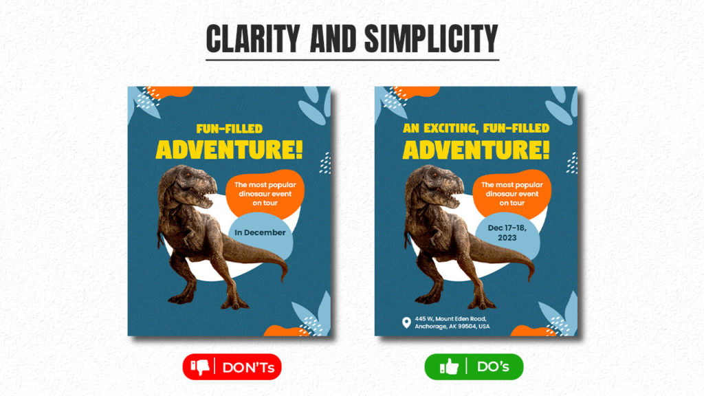
An overloaded flyer with excessive images, colors, and text can obscure the message. Hence, whitespace is vital, offering visual breathing space and highlighting key information. Furthermore, clear hierarchy through font, bolding, and placement directs focus, thus ensuring easy understanding for all readers.
2. Use Color Scheme
Color scheme plays a crucial role in flyer design. The choice of colors can greatly impact the overall look and feel of the flyer, thus influencing how people perceive the message. By selecting complementary colors, the flyer can be more visually appealing and engaging.
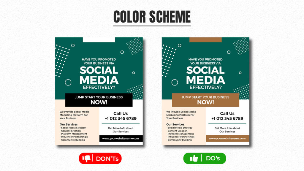
Moreover, using consistent colors helps establish brand identity and recognition. In fact, studies show that colors can evoke specific emotions and associations in viewers, making it essential to choose colors that align with the intended message.
If you’re creating a flyer for a company, incorporating the brand’s colors can enhance recognition and association with the brand. In addition to that, using gradient colors throughout your flyer can create a cohesive and visually pleasing design, making the flyer more appealing to the audience.
Also Read: How to Choose a Color Palette for Flyer
3. Utilize Contrast
Flyer design uses contrast to grab attention and convey messages effectively. By combining different elements like color, size, and font, flyers can stand out and communicate their purpose clearly.
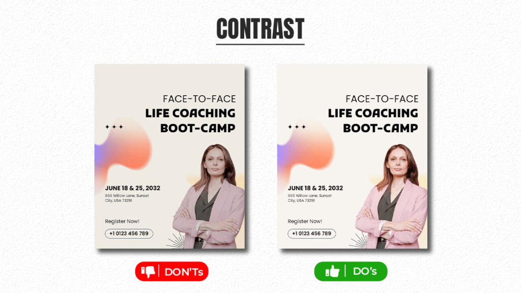
For example, using a bold font for the title and a simple font for the details creates contrast, making the title pop. Moreover, contrasting colors like black and white, or complementary colors, enhance visibility and readability. Hence, contrast helps guide the viewer’s eyes to important information.
4. Use High-Quality Images
Creating an engaging flyer involves skillfully integrating captivating images that convey messages effectively. Images serve as focal points, making your flyer visually appealing and memorable.
Whether it’s an event, product, or cause, incorporating relevant images instantly communicates information and emotions that words alone may struggle to express.
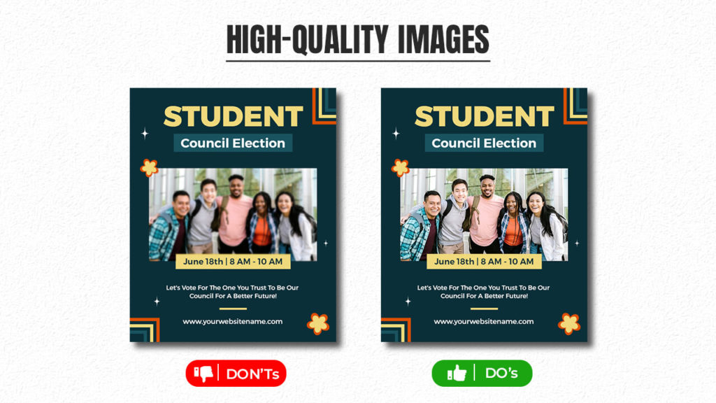
For example, promoting a food festival becomes more enticing with mouthwatering dish images, conveying the event’s deliciousness effortlessly.
5. Present in Visual Hierarchy
Creating an appealing flyer involves utilizing the design principle of visual hierarchy. This guides the viewer’s gaze, aiding comprehension and action. It’s akin to a roadmap, achieved through various factors.
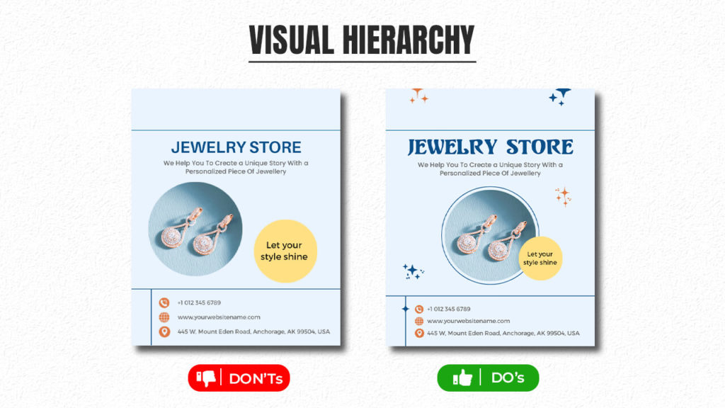
Essential data deserves top priority. Bold fonts and sizable headings underscore the primary message. Color contrast matters too; vibrant, differing colors grab attention, highlighting key elements. Strategic placement in the upper half also captures focus, as it’s the initial focal point.
6. Utilize Whitespace
Creating an impactful flyer design goes beyond aesthetics and content. Strategic use of whitespace, or negative space, is equally essential. Purposeful whitespace enhances readability, making the flyer more effective.
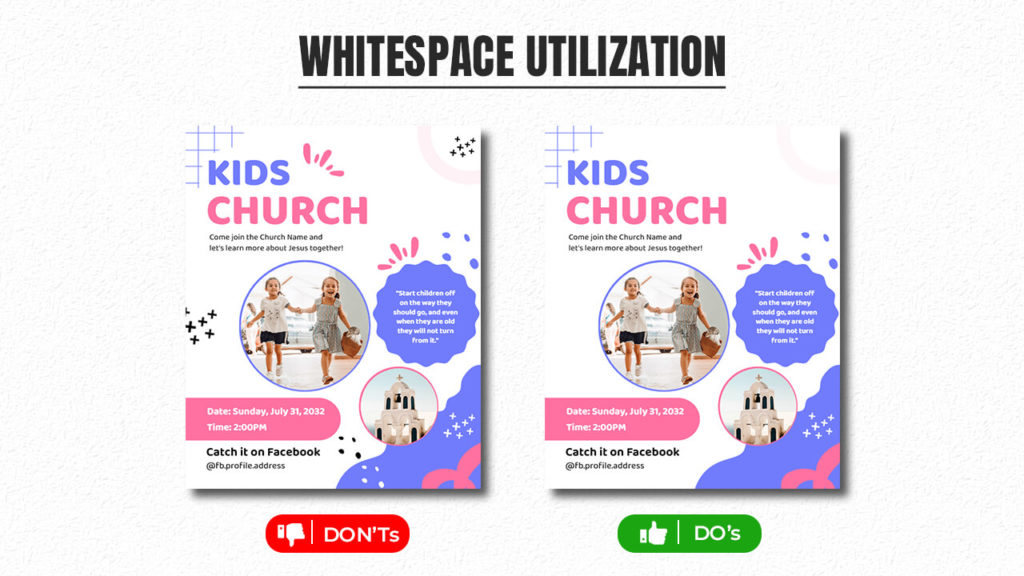
Whitespace’s power should not be overlooked. It creates breathing space around elements and visual breaks, improving comprehension. Designers must harness whitespace to boost readability and overall design impact.
7. Master The Typography
Mastering typography is crucial for crafting captivating and informative flyers. Font choice sets the tone; hence, elegant fonts are chosen for formal events, thus creating a sense of sophistication. For casual gatherings, playful fonts are preferred; so, a more relaxed and lighthearted atmosphere is established. Furthermore, this alignment of message and mood fosters a harmonious visual language.
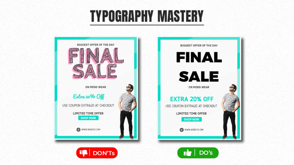
Establishing a hierarchy guides viewers through content. Varying font size, weight, and spacing highlight key info versus supporting details. Bold or italic styles draw eyes to specific elements, enhancing overall effectiveness.
Typography expertise shapes effective flyers. Font selection mirrors event vibes, while hierarchy, through size and style variation, ensures smooth information absorption.
Also Read: Types of Fonts
8. Repetition
Repetition in flyer design is crucial. It impacts how information is conveyed and absorbed. It involves using consistent design elements—colors, fonts, shapes, and images—throughout the flyer. This creates unity, making it visually appealing and easy to understand.
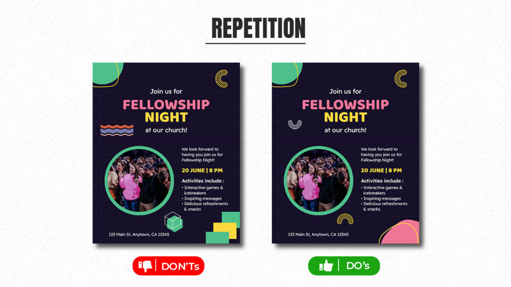
Repetition reinforces the key message or theme. It ensures the flyer is memorable to the audience. By using repetition, you establish coherence and enhance the overall impact of the design.
9. Balance Text and Images
Designing a flyer necessitates balancing text and images effectively. Too much text overwhelms, while only images might omit crucial info. Use concise sentences, headings, and bullet points for clarity.
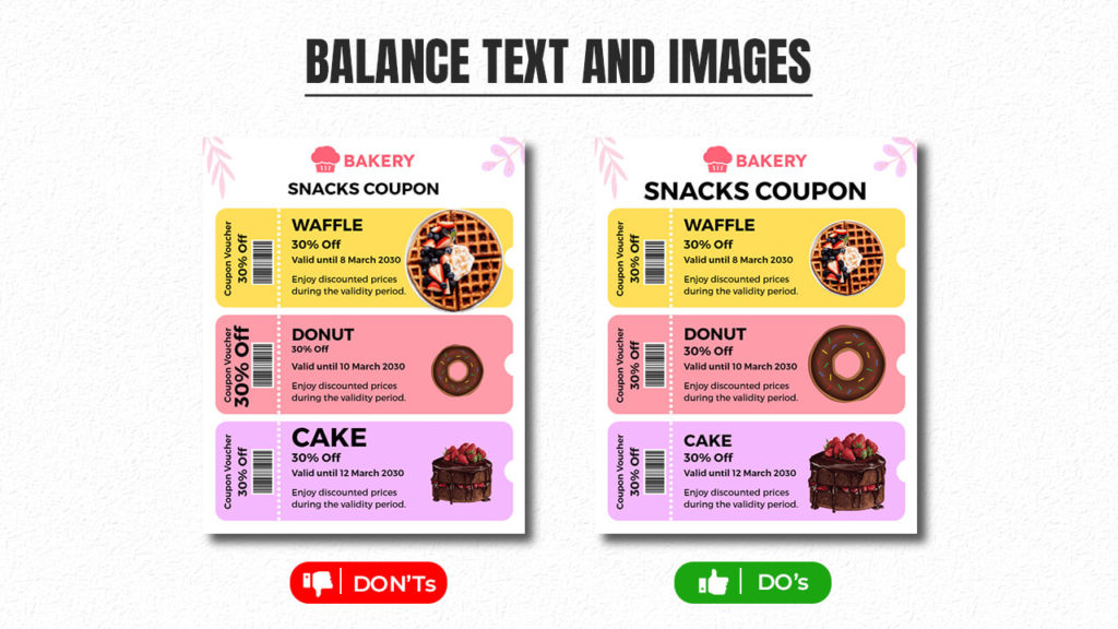
Striking the right text-image balance in flyers is vital. Excessive text overwhelms, hence relying solely on images excludes key info. Thus, it’s important to deploy concise sentences, headings, and bullets for clarity.
10. Be Consistent in Branding
Consistent branding in flyer design is vital for a professional impression. Hence, elements like colors, fonts, and logos should match your brand. Moreover, they should reflect qualities like modernity or elegance accurately.
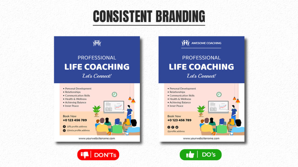
A uniform brand strategy fosters recognition and trust. Instant recognition builds engagement and reinforces core values, making your message memorable.
In addition, there are more articles related to flyer design that you can learn and explore to create your flyer.
The Last Line
Designing captivating flyers that resonate with your audience requires a delicate balance of creativity and adherence to design principles. By following these 10 basic flyer design principles, you’re well-equipped to create visually stunning and engaging flyers that captivate your audience’s attention and convey your message effectively. So go ahead and let your creativity fly high!
Ready to revolutionize your flyer-making process? Stop waiting! Explore a set of expertly crafted flyer templates and begin making amazing flyers that stand out.
FAQs
Flyer design principles are crucial because they determine how effectively your message is communicated to your target audience. Following these principles ensures that your flyer is visually appealing, easy to understand, and capable of capturing your audience’s attention.
While you can use different fonts, it’s recommended to maintain consistency for a professional and cohesive look. Using too many fonts can create visual clutter and make the flyer hard to read. Stick to a maximum of two or three fonts that complement each other.
While using images isn’t mandatory, they can significantly enhance the visual appeal and impact of your flyer. Relevant and high-quality images can help convey your message more effectively and engage your audience.
Typography influences how easily your content can be read. Choosing readable fonts and maintaining a consistent typography style throughout the flyer enhances legibility and complements the overall design.