When it comes to designing effective flyers, typography for flyer plays a crucial role in conveying your message and capturing your audience’s attention. The right choice of fonts can enhance the visual appeal of your flyers and help communicate your brand’s personality.
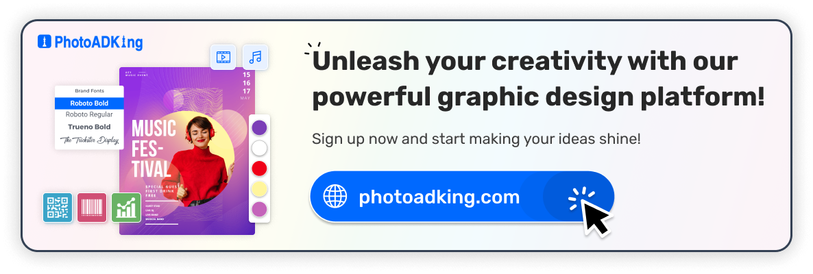
Craft stunning flyers for your events, businesses, or personal endeavors has never been this streamlined. With our user-friendly tools and an array of professionally designed templates, you can now create eye-catching typography flyer templates that leave a lasting impression. Whether you’re a design novice or a seasoned pro, our flyer maker is the ultimate solution for all your flyer design needs.
In this article, we’ll explore the essential steps to help you choose the right typography for your flyer design, and will also suggest the best-trending fonts for flyers. Let’s get started.
Table of Contents
Guide for Choosing the Right Typography for Flyers
The Best Flyer Typography Fonts Trending Now!
Recommended Blog
Conclusion
FAQs
Guide for Choosing the Right Typography for Flyers
Consider Readability First
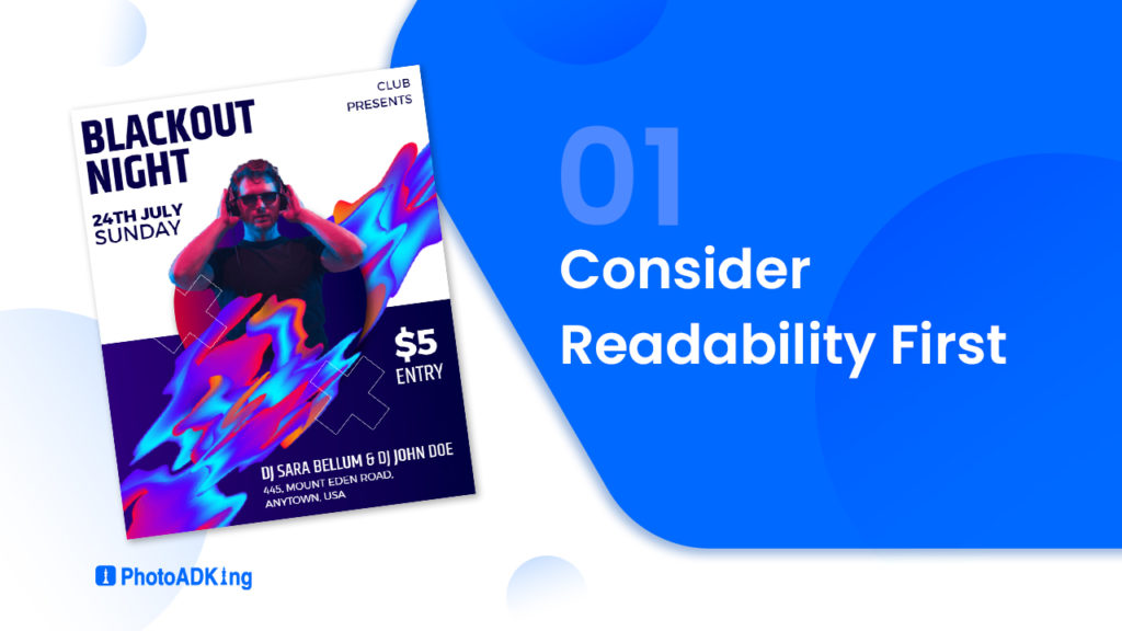
When you make a flyer, it’s really important that people can easily read and understand it. To do this, use simple and short sentences. Arrange everything on the flyer neatly. This way, lots of different people can understand what you’re saying. Use big titles, lists with dots, and pictures to explain things that might be a little hard to understand Also this will make the flyer look nice and catch people’s eyes, making them want to know more.
Fancy scripts may look attractive but can hinder readability so, make it easy to read
Typography Hierarchy
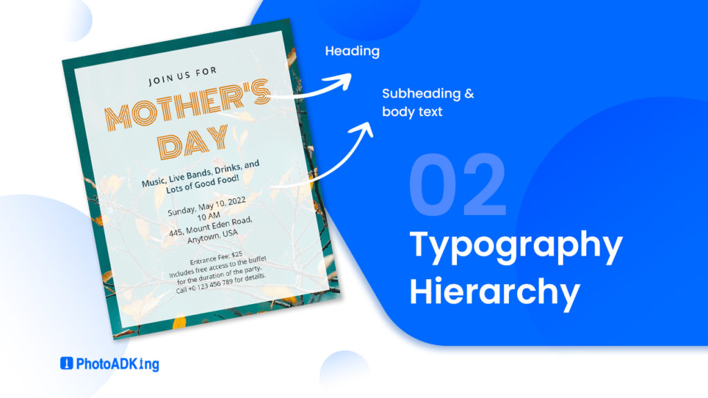
Create a clear typography hierarchy in your flyer by using bold headlines to capture attention. Add informative subheadings to provide context, and use legible body text for detailed information. This structure ensures your message is communicated effectively and engages the reader.
Important elements like headlines should be larger than supporting text
Pairing Fonts Thoughtfully
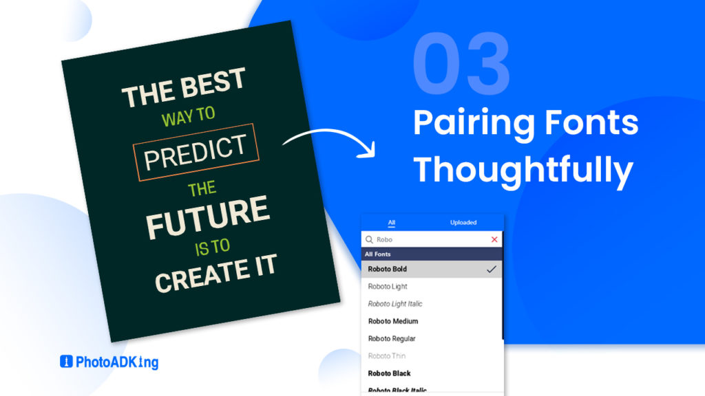
Thoughtful font pairing is crucial for effective design. When combining fonts, consider the overall aesthetic and readability. Choose fonts that complement each other in style, such as pairing a clean sans-serif with an elegant serif font.
Consistency in font pairings across headings, subheadings, and body text creates a harmonious visual appeal, enhancing the overall impact of your design while maintaining a professional and balanced look.
Consider Whitespace
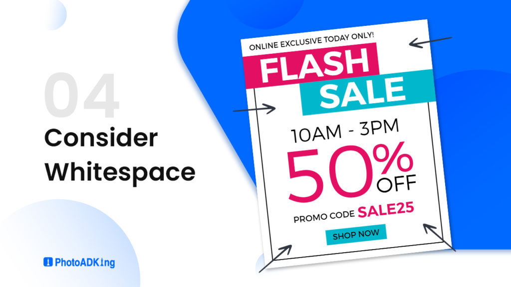
Don’t overlook the importance of white space in flyer design. Proper spacing around your typography enhances readability and prevents overcrowding. It also gives your design a clean and professional look.
Embrace white space to give your typography room to breathe
Those are some guidelines to assist you in selecting the ideal typography for your flyer design. Keep these recommendations in mind as you make your typography choices. Now, let’s proceed to explore the currently popular fonts for flyers.
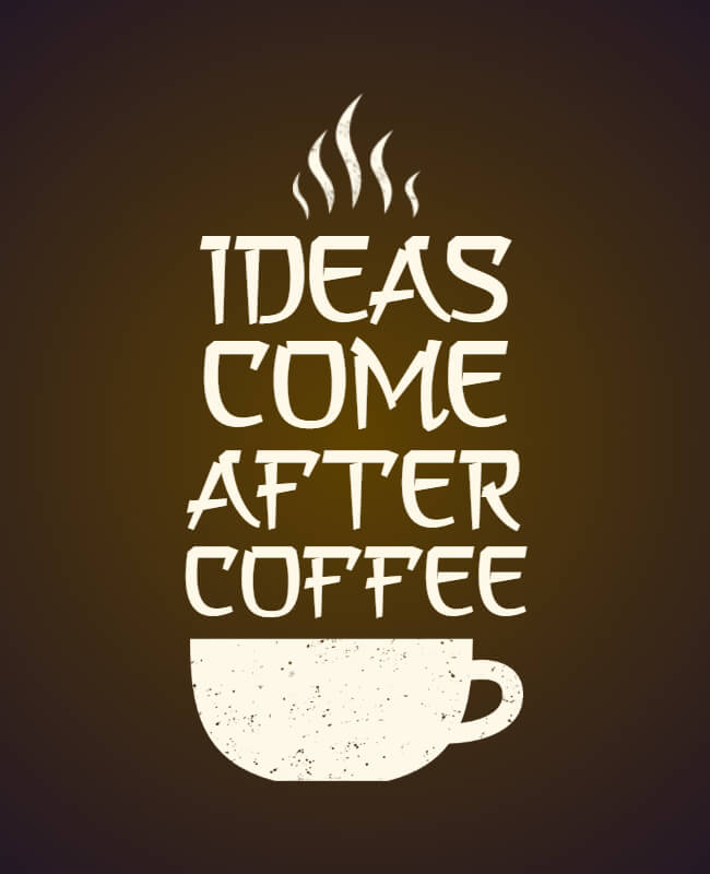
The Best Flyer Typography Fonts Trending Now!
Montserrat Font
Montserrat is a widely used sans-serif typeface that exudes modernity and simplicity. Designed by Julieta Ulanovsky, this font draws inspiration from the urban typography of Montserrat, a neighborhood in Buenos Aires. Its clean lines, balanced proportions, and extensive range of weights make it a versatile choice for both print and digital design projects, ensuring excellent readability and visual harmony.
Lumberjack Font

Lumberjack is a rustic and rugged typeface that captures the essence of outdoor adventure and handcrafted authenticity. With its bold and textured letterforms, Lumberjack, created by Aleksei Kalinin, brings a touch of wilderness and vintage charm to design projects. This font is often chosen for projects that aim to evoke a sense of nostalgia, such as signage, apparel design, and branding materials, where its strong character and woodsy vibe can add a distinct visual appeal.
Volute Font
Volute is an elegant and classical typeface that draws inspiration from calligraphic scripts of the past. Created by Sabina Chipară, this font exhibits graceful curves and fine details that exude a sense of refinement and timelessness. Volute is a favored choice for projects seeking a touch of vintage or formal elegance, making it well-suited for invitations, certificates, and upscale branding where a sense of tradition and sophistication is desired.
A Asian Hiro Font
Hiro is a cool and modern style of writing that’s influenced by Asian art. It looks really special and catches your eye. By mixing old-fashioned handwriting with new ideas, Hiro makes a nice blend of the past and the present. It can be used for lots of different design projects, like logos and labels, big signs, and things you see on screens. It’s great when you want to mix Asian culture with modern design
Tooney Noodle nf Font
Tooney Noodle NF, designed by Nick Curtis, exudes playful whimsy. Its uneven strokes and hand-drawn feel make it perfect for projects seeking childlike charm. However, this informal font is a popular choice for children’s books, posters, and designs aiming for a cheerful, relaxed atmosphere.
Here are more trending fonts for flyers that you can use to infuse your designs with creativity and stylish flair. Now is your chance to integrate these popular fonts into your flyers.
Recommended Blog
Creative Typography Design Trends
Best Meme Fonts
Types of Fonts
How to Choose the Right Typography
Best Fonts for Invitation
What Is A Flyer
How to Make a Flyer
Flyer Format
Best Brochure Fonts
The Ultimate Guide to Choosing the Perfect Certificate Font
Gift Card Font
Best Fonts for Invitation
The Top Menu Font Styles
How to Make Christmas Cards in 5 Easy Steps
Conclusion
Choosing the right typography for flyer design requires a balance between aesthetics and functionality. Your selected fonts should not only look visually appealing but also effectively convey your message and align with your brand’s identity. By following the steps outlined in this article, you can create compelling and effective flyers that capture attention and drive the desired action.
FAQs
The size depends on the importance of the text; headlines should be larger, while body text should be easily readable.
Readability should always come first. Choose fonts that balance style and legibility.
Yes, you can definitely mix different fonts in a single flyer. Mixing fonts can add visual interest and help emphasize different sections or elements of your flyer.
whitespace plays a crucial role in enhancing readability, organizing content, and creating a balanced and aesthetically pleasing layout.