The menu is an essential element of a restaurant’s branding and marketing. It is often the first thing customers interact with when they enter your establishment. Therefore, it is crucial to make a lasting impression by designing a menu that stands out. Typography plays a vital role in the design of a menu. It can convey the personality of your restaurant, set the tone for the dining experience, and help customers navigate the menu easily.
In this article, we will guide you through the process of choosing the right typography for your restaurant menu. We will cover the importance of typography, factors to consider when selecting typography for your menu, and tips to make your menu visually appealing and easy to read. Additionally, you can save time and effort by using professionally designed restaurant menu templates. These templates can provide you with a starting point for your menu design, and you can customize them to fit your restaurant’s branding and style. Let’s get started!
Importance of Typography for Restaurant Menu Design
Typography is the art and technique that arranging type to make written language legible, readable, and appealing when displayed. It involves choosing the right font, size, color, spacing, and alignment to convey the message of the text effectively.
In a restaurant menu, typography is important because it affects how customers perceive the food, the ambiance, and the overall dining experience. A well-designed menu with appropriate typography can entice customers to order more food and drinks, while a poorly designed menu can turn them off.
Factors to Consider When Choosing the Right Typography for Restaurant Menus
Choosing the right typography for your restaurant menu can be a daunting task. With so many options available, it can be challenging to decide which font to use. The following factors will help you choose the right typography for your restaurant menu.
Consider Your Restaurant’s Branding
Your typography should align with your restaurant’s branding. The font you use should complement your restaurant’s logo and other branding elements. For example, if your restaurant has modern branding, using a sans-serif font can be the best choice. Similarly, if your restaurant has a vintage theme, a script font might be a good option.
Choose a Readable Font
As mentioned earlier, legibility is crucial for a restaurant menu. You should choose a font that is easy to read, even in low-light conditions. Avoid using fonts that are too small or too thin, as they can be difficult to read. Some fonts that are commonly used in restaurant menus include Helvetica, Arial, and Times New Roman. Check out our article on the top menu font style. If you can’t decide which font is right for your menu.
Use Hierarchy to Emphasize Important Information
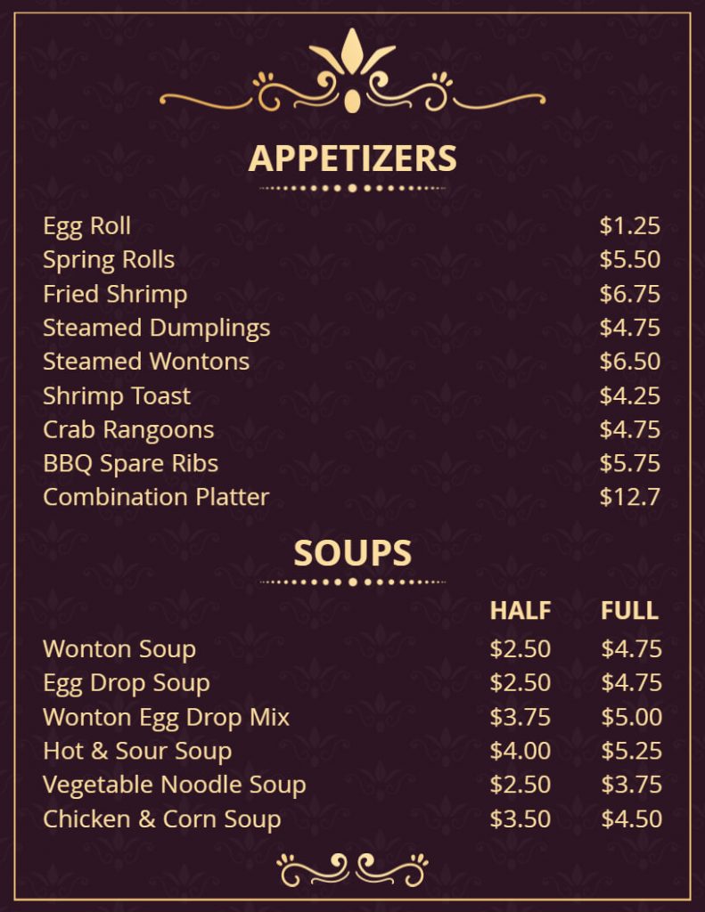
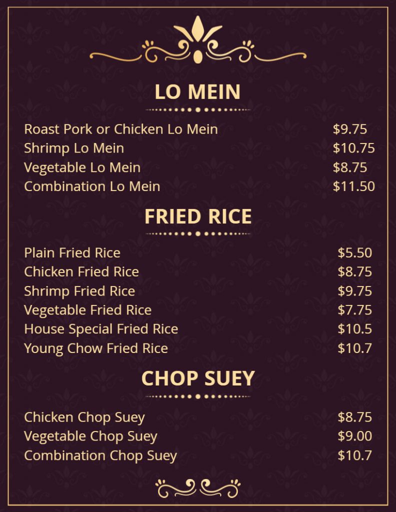
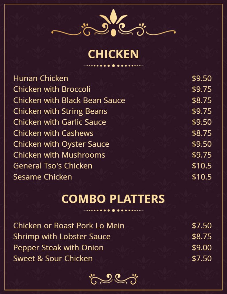
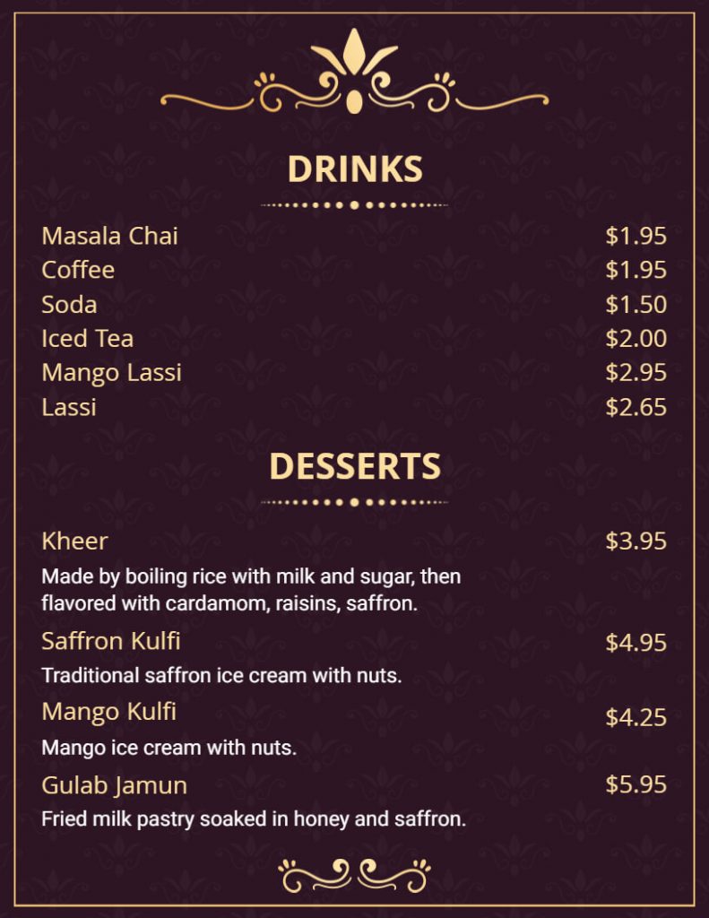
Hierarchy is the arrangement of elements in order of importance. Using hierarchy in your typography can help you emphasize the most important information on your menu, such as the dish name, and price. You can use different font sizes, styles, and colors to create a visual hierarchy that guides the customer’s attention to the most critical information.
Choose a Color Scheme
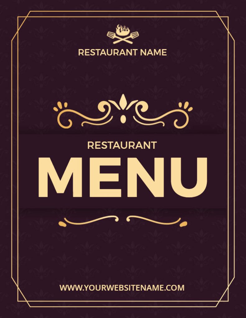
Choosing a color scheme for your menu can also enhance its visual appeal. You can use colors that complement your restaurant’s branding or the type of cuisine you serve. For example, if your restaurant serves multi-cuisine, you can use brown and golden colors.
Match Your Menu Style
The typography you choose should match the style of your menu. If you have a multi-page menu with many sections and items, you want to use a more classic and traditional font that is easy on the eyes. On the other hand, if you have a smaller menu with fewer items, you can experiment with more modern and playful typography. If you’re having confusion selecting the most suitable style for your menu, check out our menu style ideas article.
Also read: Typography of Flyer
Tips for Choosing the Right Typography for Restaurant Menu
- Keep it Simple: Use a maximum of two typefaces on your menu. Using too many fonts can make the menu look cluttered and confusing.
- Use Contrast: Use high contrast between the text and the background to enhance legibility. For example, use a white font on a dark background or a dark font on a light background.
- Avoid Distracting Fonts: Avoid using decorative or overly stylized fonts for the body of the menu. They can be difficult to read and distract from the food.
- Consider Accessibility: Consider the needs of visually impaired customers when selecting typography. Use a larger font size and high contrast to enhance legibility.
- Use hierarchy: Use different font sizes and styles to create a hierarchy and draw attention to important menu items.
- Think about spacing: Ensure that there is enough space between letters and lines to make the text legible.
Conclusion
In conclusion, choosing the right typography for your restaurant menu is crucial to its success. Your typography should reflect your brand identity, be easy to read, and strike a balance between style and functionality. It should match the style of your menu, choose a color scheme, and use hierarchy and emphasis. Above all points, you can create a menu by using a menu maker tool that enhances the dining experience for your customers.
After all, reading this blog post on the right typography for a restaurant menu will help you discover all the details needed to make the ideal restaurant menu. Moreover, you can discover some amazing restaurant menu tips here if this isn’t enough.

