
As a restaurant owner, you want to make sure that your menu not only accurately reflects the dishes you serve but also looks visually appealing and professional. One of the most crucial aspects of menu design is the font style used. Choosing the right font style can make a huge difference in how your customers perceive your menu and ultimately influence their purchasing decisions. In this article, we’ll explore the top menu font styles for restaurant menus and provide tips on how to use them effectively. Whether you’re designing a new menu or revamping an existing one, these font styles will help make your menu stand out.
Top 7 Menu Font Styles for Restaurant Menu
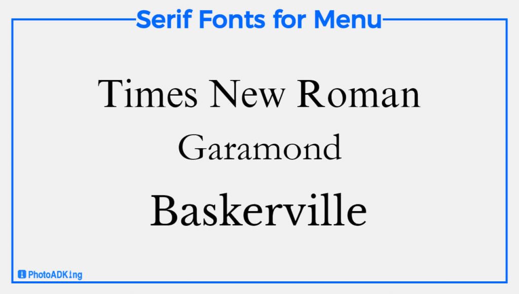
Serif Font styles
Serif fonts are one of the most popular and classic fonts used for menus. They are easy to read and have a traditional look and feel that is perfect for upscale dining establishments. Serif fonts have small decorative flourishes at the ends of each stroke, which make them look more elegant and refined. Examples of serif fonts include Times New Roman, Garamond, and Baskerville.
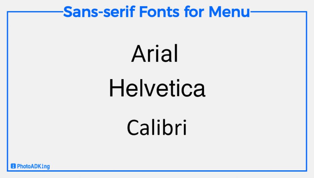
Sans-serif Font styles
Sans-serif fonts are another popular choice for restaurant menus. They are modern, clean, and easy to read. Sans-serif fonts are perfect for casual and contemporary dining establishments. Examples of sans-serif fonts include Arial, Helvetica, and Calibri.
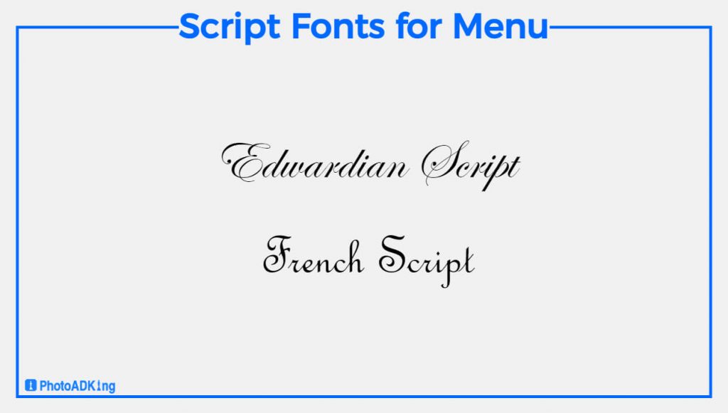
Script Font styles
Script fonts are a great choice for fine dining and upscale restaurants. They have a cursive, handwritten look that adds a touch of elegance and sophistication to your menu. Script fonts are perfect for highlighting menu items such as wine lists or dessert options. Examples of script fonts include Edwardian Script and French Script.
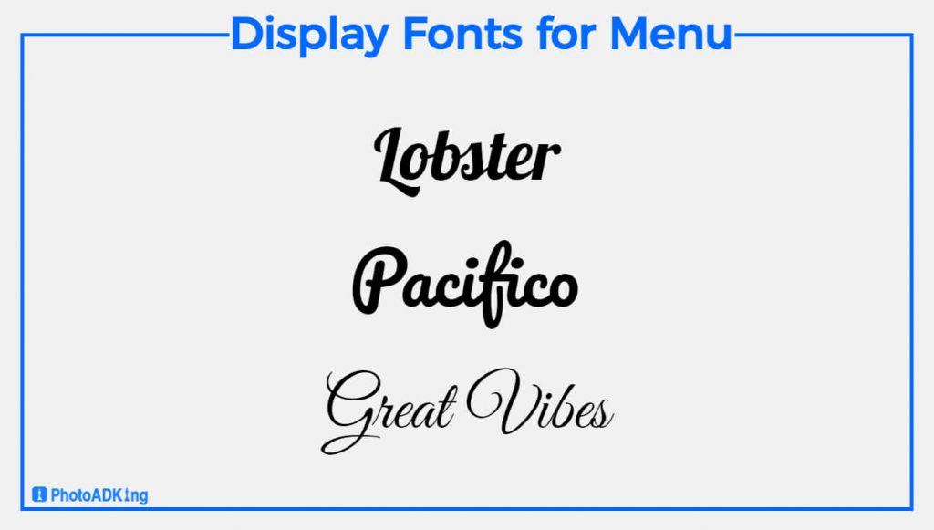
Display Font styles
Display fonts are perfect for making a bold statement on your menu. They are larger than other font styles and have unique shapes and designs. Display fonts are best used for highlighting headlines or menu sections, but they can also use for entire menus if used correctly. Examples of display fonts include Lobster, Pacifico, and Great Vibes.
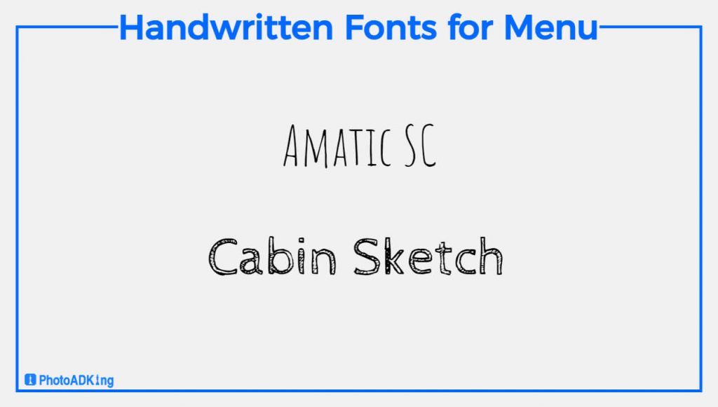
Handwritten Font styles
Handwritten fonts are a popular choice for menus because they add a personal and authentic touch. They can be used for entire menus or specific menu items. Handwritten fonts are perfect for cafes, bakeries, and other casual dining establishments. Examples of handwritten fonts include Amatic SC and Cabin Sketch.
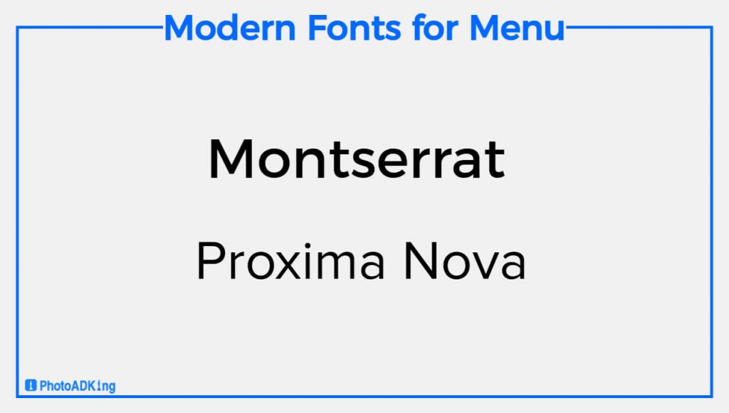
Modern Font styles
Modern fonts are a popular choice for contemporary dining establishments. They have a clean and sleek look that is perfect for highlighting menu items. Modern fonts have a minimalist appearance, and they are usually sans-serif fonts. Examples of modern fonts include Montserrat and Proxima Nova.
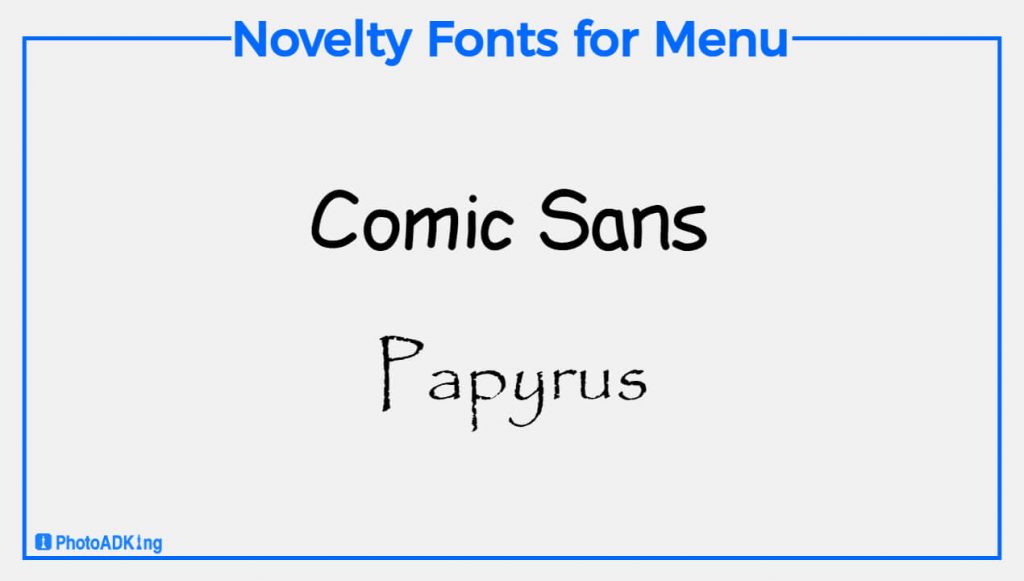
Novelty Font styles
Novelty fonts are a fun and playful way to add personality to your menu. They are usually used for highlighting specific menu items or for section titles. Similarly, Novelty fonts come in a variety of styles, from retro to futuristic. Examples of novelty fonts include Comic Sans and Papyrus.
Also read: Typography of Flyer
Tips for Menu Font Styles for Restaurant Menu
Now that you know the top menu font styles for restaurant menus, here are some tips on how to use them effectively:
Keep it Simple
When it comes to menu design, simplicity is key. Choose one or two font styles and stick with them throughout the menu. Using too many font styles can make your menu appear cluttered and confusing.
Use Contrast
Contrast is an essential aspect of menu design. Use contrasting font styles to create visual interest and make important information stand out. For example, you might use a serif font for headings and a sans-serif font for body text.
Prioritize Readability
Above all, your menu should be easy to read. Use legible font styles in a size that is easy to read. Avoid using decorative fonts for large blocks of text as they can be difficult to read and may turn customers off.
Don’t use too many font styles
Using too many font styles can make a menu look cluttered and difficult to read. Stick to one or two font styles for a clean and cohesive look.
Use unique font styles
If you want to make your menu text more appealing and interesting. So, try to use a font generator that provides unique font styles with cute emojis and symbols that fit your needs.
Conclusion
In conclusion, By choosing the right font style for your restaurant menu can make a big difference in how your customers observe your menu and ultimately influence their purchasing decisions. By using the top menu font styles and following these tips for effective use, you can create a menu that not only accurately reflects your dishes but also looks visually appealing and professional. To learn more, check out these excellent coffee menu design ideas to boost your template.
Above all, you can use a menu maker to build a menu that not only looks good but also enhances your customers’ entire dining experience. Additionally, If you’re looking for a more creative restaurant menu, take a look at our pre-design restaurant menu templates.