
Are you tired of using the same old certificate fonts for your important documents? Also, do you want to make your certificates stand out from the rest? If you’re looking for a way to make your certificates look more professional, then you’ve come to the right place!

Choosing the right font for certificates is crucial as it can convey the tone and mood of the document. With the right font, you can create a sense of formality, prestige, and sophistication for your certificates.
In this blog post, we will provide a comprehensive guide to choosing the perfect certificate font that will enhance the elegance and style of your certificates. Additionally, we’ll also discuss various certificate templates that can complement your chosen font and add to the overall aesthetic of your certificate.
The Different Types of Certificate Fonts
There are various types of certificate fonts to choose from, including serif, sans-serif, script, and decorative fonts. Serif fonts are formal and traditional, while sans-serif fonts are modern and minimalistic. Script and decorative fonts are more elegant and elaborate. This guide will be helpful in Choosing the perfect certificate font to convey the tone and style of the document. Below are some of the most attractive certificate fonts that you can use to make your certificate stand out.
Serif Fonts
Serif fonts are characterized by small decorative lines or flourish at the ends of the letter strokes. They are frequently associated with a traditional, formal, or classic look and are commonly utilized in print media like books, newspapers, magazines, and certificates. Some popular examples of serif fonts include Times New Roman, Georgia, and Baskerville.
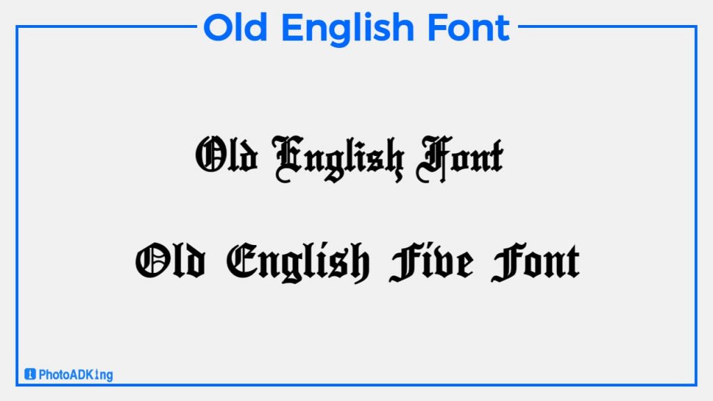
Old English Font
Old English fonts are often used in certificate designs to give a traditional and classic look. These fonts have a vintage feel and convey a sense of sophistication and elegance, making them ideal for formal documents such as diplomas, awards, and certificates. When choosing an Old English font for a certificate, it’s essential to ensure that it is easy to read and complements the overall design.
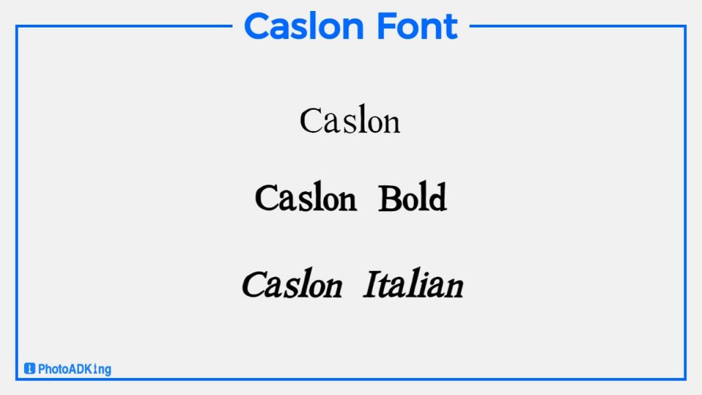
Caslon font is a serif typeface that is commonly used in certificate designs. Its elegant and refined appearance makes it a great choice for formal documents, and its readability ensures that the text is easy to read and comprehend. The font’s timeless design gives certificates a sense of tradition and authenticity.
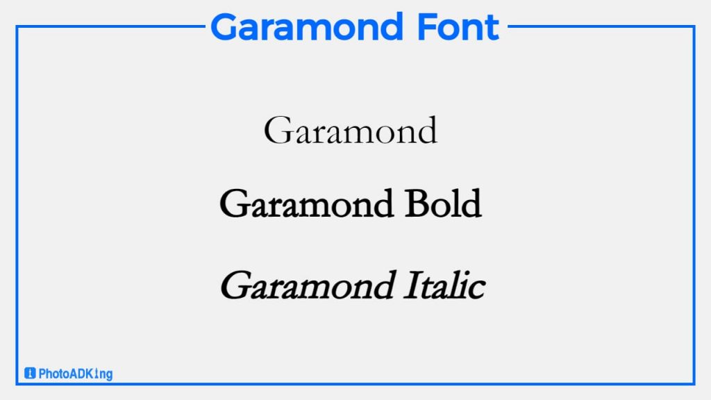
Garamond Font
Garamond is a popular serif font that is often used in certificate designs due to its elegant and traditional appearance. Its clean lines and sophisticated style make it a great choice for formal documents and awards.
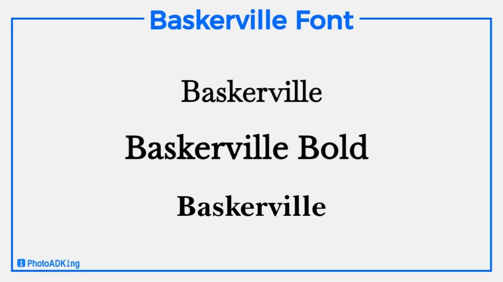
Baskerville Font
Baskerville font is a popular serif font that is often used in certificate designs. Its classic and elegant appearance makes it a suitable choice for formal documents such as diplomas, awards, and certificates. The font’s sharp and clean lines make it easy to read, and its timeless appeal gives certificates a sense of longevity and importance.
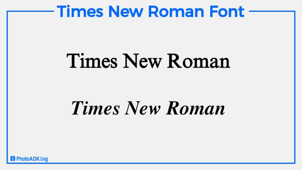
Times New Roman Font
People commonly use the font Times New Roman for certificates because of its classic and elegant appearance. To emphasize and establish a hierarchy for important information on the certificate, people often pair it with bold or italic variants.
Sans Serif Fonts
Sans serif fonts are a type of font that does not have small lines or flourishes at the ends of each letter stroke. Their modern, clean, and minimalistic style makes them popular for headings and titles in digital media. Some popular examples of sans serif fonts include Arial, Futura, and Gotham.
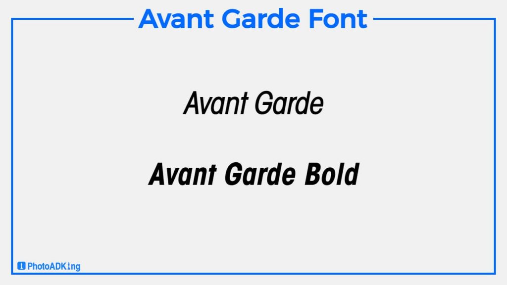
Avant Garde Font
Avant Garde font is a modern sans-serif typeface that is not typically used in certificate designs due to its unconventional and unique style. While it may not be suitable for formal documents like awards, and certificates, it could be a good choice for contemporary and creative certificates where a non-traditional design is desired.
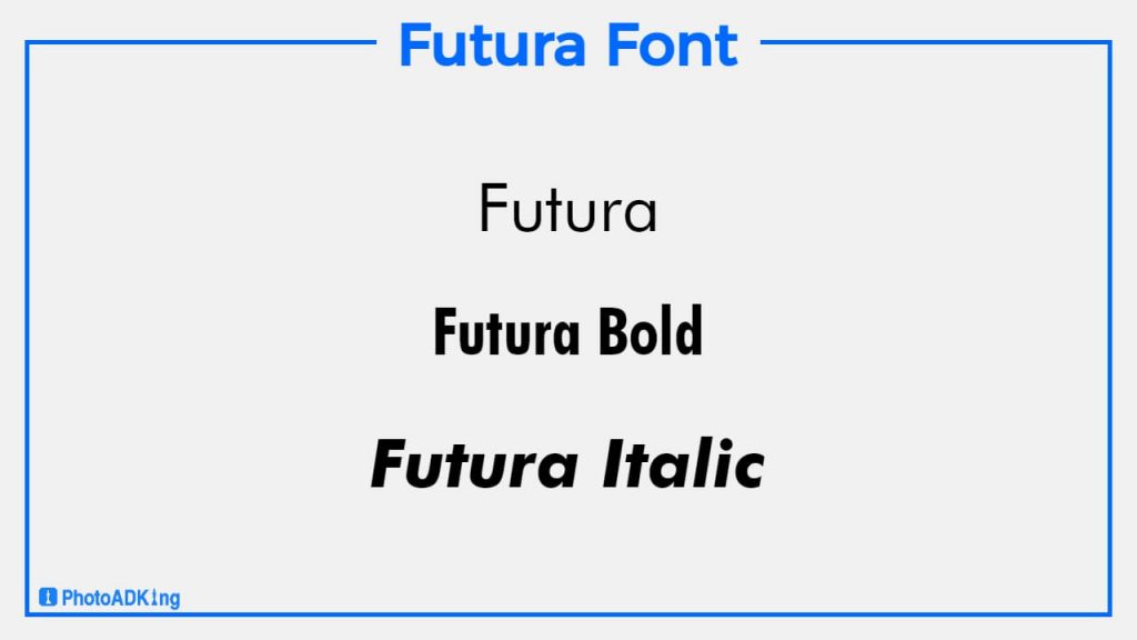
Futura Font
The last and most used certificate font name is Futura font. Futura font is a modern and clean sans-serif typeface that can work well for certificate designs that require a contemporary and minimalist aesthetic. Its simple yet elegant design makes it easy to read and suitable for formal documents. However, it may not be the best choice for certificates that require a traditional or classic look.
Avoiding Common Certificate Font Mistakes
Overly Ornate Fonts
When designing certificates, it’s important to prioritize readability over ornate aesthetics. While decorative fonts may look impressive at first glance, they can be difficult to read at smaller sizes or from a distance, making it harder for recipients to understand and appreciate the award they’ve received. Therefore, it’s essential to consider readability and legibility when deciding how to make a certificate.
Too Many Fonts
Certificates should have a clear hierarchy of information, with a focus on the recipient’s name and the award they’ve earned. Using too many different fonts in a certificate design can create confusion and detract from the importance of this key information. Limiting the number of fonts used can help keep the focus where it belongs.
Inconsistent Font Styles
Consistency is key when creating professional-looking certificates. Mixing multiple font styles (such as going back and forth between serif and sans-serif fonts) can make your design appear haphazard and unprofessional. Instead, choose a cohesive set of fonts that work well together and stick with them throughout the design.
Clashing Font Colors
When making a certificate, it’s important to choose colors that look nice together and are easy to read. You don’t want the writing to blend in with the background or look weird. So, pick colors that go well together and make sure you can easily read what it says.
Avoid Overusing Bold or Italics
Using bold or italic text can help make important information on a certificate stand out, but using it too much can make it hard to read and understand. So, it’s best to use them only when necessary.
Example of Great Certificates with Fonts
Trueno Font
Trueno is a modern font style that looks neat and elegant. It’s great for certificate designs because it looks professional and sophisticated. You can use it for any type of certificate design, whether it’s traditional or modern. Overall, Trueno is a good option for making certificates look nice and professional.

Roboto Font
Roboto font is a popular choice for certificate designs due to its modern and professional look. Its clean and legible lines make it easy to read important details such as the recipient’s name and award information. When used appropriately, Roboto can enhance the overall aesthetic of a certificate and give it a polished finish.
Aileron Font
Aileron font is a great choice for creating elegant and modern certificates. The stylish design adds sophistication, while the clean lines make it easy to read any certificate. With its range of weights and styles, Aileron can be used to create a visually appealing hierarchy of text and emphasize important details on the certificate.
Times New Roman Font
People choose this type of certificate font based on their elegance and formality to emphasize the importance and significance of the certificate. Times New Roman is a popular certificate font due to its classic and timeless appearance. Its clear and readable design also makes it a practical choice for certificates that need to be easily legible.
Also read: Typography of Flyer
Conclusion
Choosing the perfect certificate font may seem like a daunting task, but it doesn’t have to be. By considering factors like certificate font readability and style, you can narrow down your options and choose a font that will make your certificates look professional and polished. So, the next time you’re creating a certificate using certificate maker, take the time to follow our guide to choosing the perfect certificate font and select a font that will make your document stand out from the rest. With the right font, you can elevate the look of your certificates and leave a lasting impression on your recipients.