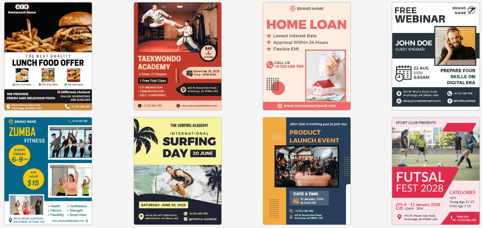
Only the best fonts for flyers can make a difference. Why are we starting this with so much confidence? Well, if a flyer sells your products/services like hotcakes then don’t forget that fonts are the heroes here. Never underestimate the power of the best fonts for flyers.
If you think any font could do then go ahead and make the wrong choice. You’ll get the answer!
In a nutshell, settle for nothing but the best fonts for flyers. Be it for heading or sub-text, font choice & combination should be on-point. This blog is dedicated to the importance of fonts for your flyer marketing campaign. Also, you can create a flyer that stands out and grabs people’s attention by discovering the best fonts for flyers in our latest blog post.
Why Choose The Right Fonts for Flyers?
Choosing the right fonts for flyers is a big responsibility. Imagine a flyer design with a non-readable cursive heading and mismatching body text. Would you even bother to read what the flyer is all about?
Fonts are powerful design elements. They can make or break it if you don’t make the right choice. Even your HD stock images or professional flyer theme cannot do the needful if fonts are not chosen well.
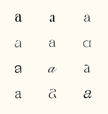
You know you’ve made the right font choice if the header and body fonts belong to the same font family. Even if they’re from different font hierarchies, they’ll not seem odd when combined. In short, the best fonts for flyers are those that don’t make it feel like a chore to read the flyer.
It’s all about the reader’s comfort and needs that you should keep in mind from choosing font style to font colors. Besides this, the fonts you choose should glorify your brand image too. Today, we have innumerable font choices as free fonts are available for download online. Moreover, graphic maker tools are also offering a wide library of fonts to choose from. Overall, you’ve got the resource. It’s all about making better choices.
Best Fonts for Flyers = Impactful Brand Image

One major thing to keep in mind while choosing fonts is this design element has a direct impact on your brand image. You never know the headache it is for graphic designers, marketers & print companies to keep up with consistency. Even the customizable flyer templates available on the web are finalized after a lot of research on the fonts that fit well with the design.
Fonts reflect brand consistency. Whether it is your business visiting card, letterhead, brochure, product package, billboard, POS sign, or leaflet, everything should be aligned with brand identity. For instance, you may run many marketing campaigns throughout the year, but none of them should be designed in a way that represents a false brand image. We can say that the best fonts for flyers are
a must-have to communicate the right brand values.
What if you want to go unconventional? It should not alter your brand image! At least to say, the most successful flyer campaigns have decent default fonts you and we use regularly. No extra effort & no experimentation with fonts can make it the top performer.
Expert Tips on Choosing The Best Fonts for Flyers
You shoulder the responsibility of an epic flyer design by choosing the best fonts for flyers. The following expert tips will light your path as you design a stunning flyer.
Prioritize Readability
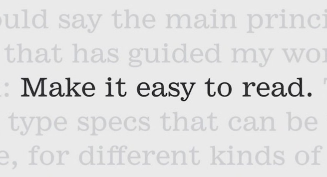
As stated above, readability is the first thing that should come to your mind while choosing fonts. It feels thrilling to go overboard and try decorative fonts that you haven’t used before. But, it’s all in vain if it minimizes your flyer’s readability.
At the end of the day, your flyer should be readable to your target audience. And so, you should not mind using everyday default fonts if they’re performing well.
Fonts like Helvetica, TT Norms, Full Sans, Futura Round Medium, etc are the best font for flyers providing maximum readability. The logic is – Simpler the fonts, the clearer the readability.
Another thing about readability is adding the correct font size. For instance, your flyers should have a noticeable difference between the header and body fonts. You can further enhance your font choices by getting inspiration from the promotional material fonts running in the market.
Align Your Font Choice with Brand Identity

Every brand holds a unique identity and it can be easily differentiated via fonts. From logo fonts to taglines and marketing material fonts, it speaks a lot about brand image. For example, a Vintage style baseball event can be better represented with Vintage fonts for newspaper flyer design. On the other hand, the quirky brand image is well represented by playful font styles. These are just to be mentioned as a few.
Your focus element should be brand identity while designing any given promotional materials. The fonts you choose to make for a sophisticated, formal, modern, bold, or fun brand identity. Go with the one that feels right for a consistent brand impact.
Are They Appealing to Your Target Audience?
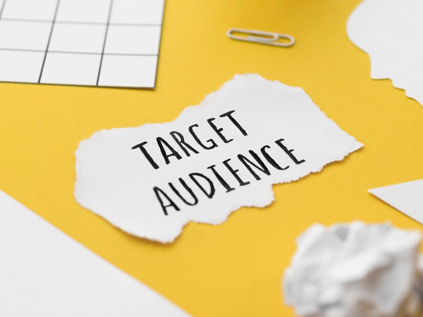
Fonts have a mood. The best fonts for flyers is handpicked keeping several aspects in mind. One of those is thinking about them from the reader’s perspective.
You may go the extra mile by researching the target audience’s preferences for choosing fonts they find attractive. For instance, an adult diaper package would have simple fonts as compared to baby diapers. The latter is friendly & fun just like kids. Similarly, high-end services have fonts with an elegant tone so that they make a statement when promoted.
The moral of the story is your fonts should be decided to keep your brand as well as your target audience at the center.
Match Your Fonts with The Overall Flyer Theme
It’s very easy to bring your target audience into the zone with the best font for flyers. Simply put, match your font style with the overall flyer theme. The font style should be in sync with the tone you’re sitting with your poster. For example, a blood donation appeal flyer will not have jolly fonts while a nursery admission open flyer needs such light fonts.
Ask Yourself If It Makes Your Flyer Unique
After all the designing efforts, what output do you seek? Does your creation match the original idea? Is it unique in all aspects? It’s extremely important to critique your flyers. Judge all the design elements, including fonts, and see if they justify your marketing campaign. If necessary, you may change the features you feel necessary and then assess again.
Also Read: Types of Fonts
Top Suggestions for The Best Flyer Fonts Trending Now!
You must be curious to find out some hottest trending fonts these days, right? We’re sharing a few of them while you may find hundreds online.
Hilton Serif Fonts
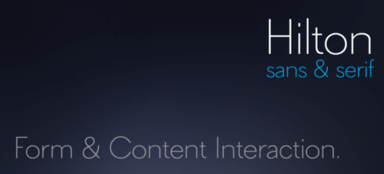
If you have a thing for thin fonts then Hilton Serif Fonts are for you. These elegant fonts are distinctly legit for any given promotional material. They’re the best font for flyers, banners, magazine covers, signage, and whatnot!
The Whiskey Font Collection
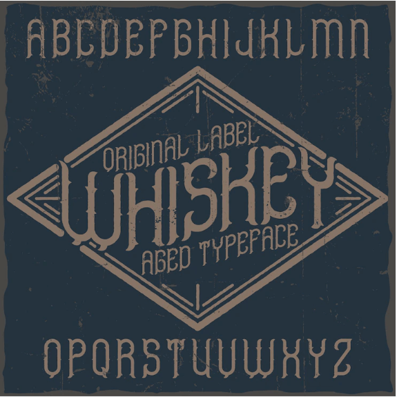
As compelling as its name, The Whisky Font Collection drives inspiration from Vintage style typefaces. You may find them similar to the ‘wheat’ and ‘barley’ typefaces. You’ve got many variants to choose from – regular, rough & aged. Bring the Western European Characters to life with this best font for flyers. The best part is they’re readable and extravagant, just as you dream about.
Full Sans
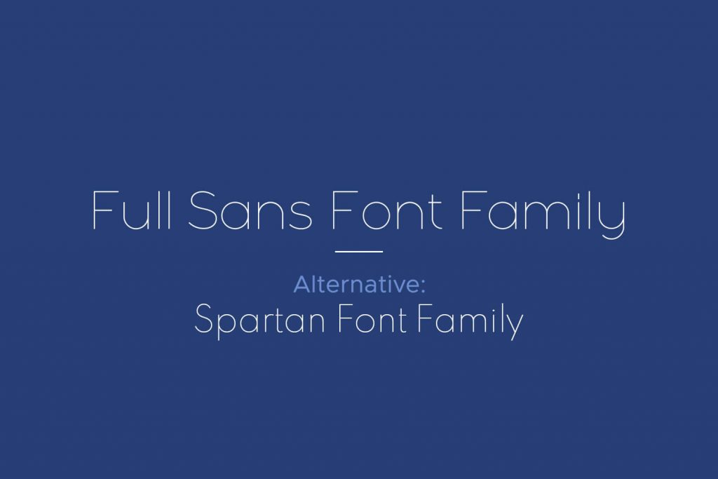
Full Sans seems like an extended version of Futura and Avant Grade typefaces. They’re the best font for flyers, brochures, social media images, and any advert materials. You get extended support for fractions, small caps, old-style figures, and more.
Futura Round Medium
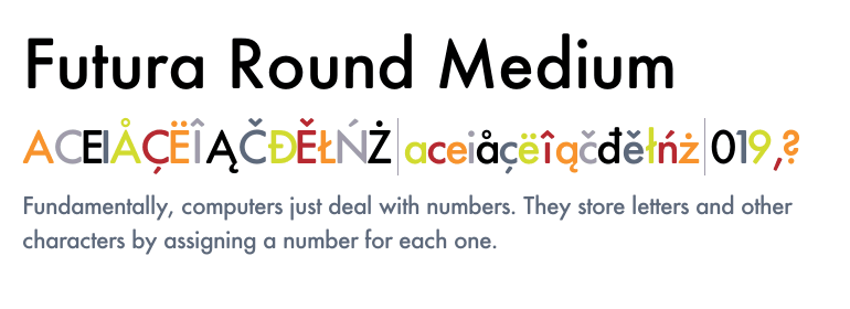
This typeface is a modern face of posters, headlines, and display texts. It is better known as the iconic font type for both TTF and OTF font styles. Futura Round Medium makes for one of the best font choices for brochures and flyers for reflecting versatility. They give a sophisticated look and feel to your professional promotion materials.
Wavehaus Serif Typeface
This geometric sans serif font family variation comes in six different weights. From book to semibold and classic, you’ve got it all to choose from. It works best in both uppercase and lowercase characters, special characters & numerals. Luckily, you can blend this typeface with any kerning pair seamlessly.
Recommended Blogs
Best Meme Fonts
Best Fonts for Invitation
20 Best Brochure Fonts
Types of Fonts: Exploring the World of Typography
Flyer Design Ideas
Flyer Design Terms
How to Make a Flyer
Flyer Example
Flyer Marketing Strategy
Type of Flyer Design
Flyer Sample
Flyer Size Guide
Best Fonts For Flyer
Flyer Purpose
Best Fonts for Flyer
Flyer Design Inspiration
How to Add a QR Code to a Flyer
Flyer Format
What Is A Flyer?
Flyer Tips
How to Use the Golden Ratio in Flyer Designs
How to Choose a Color Palette for Flyer
Types of Geometric Shapes to Use in Flyer
Flyer Mood Board Ideas
How to Create Flyers With AI Flyer Maker Tools
100+ Creative Flyer Examples