Gym brochure design is an important aspect of promoting your gym and attracting new members.
A well-designed brochure can showcase the services and facilities offered by your gym, as well as the benefits of becoming a member.
In this article, we will discuss the elements of brochure design and provide some ideas and tips to help you create a brochure that will stand out.
Whether you’re a small local gym or a large fitness center, a brochure can help you reach new customers and promote your brand.
So let’s get going and see how to create a compelling gym brochure.
Core Elements of Gym Brochure Design
High-quality images
The use of high-quality images is crucial in gym brochure design as it helps to showcase the gym’s offerings and atmosphere.
This can include images of people working out on different equipment, group classes in progress, and facilities such as locker rooms and saunas.
These images can help potential members visualize themselves using the gym and make it more appealing to them.
Bold typography
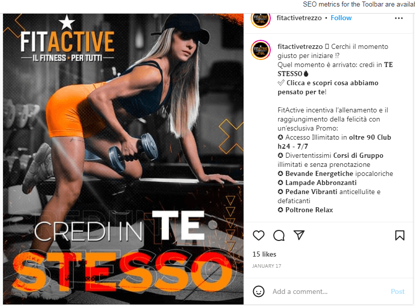
Bold and easy-to-read typography is essential in gym brochure design as it helps to emphasize important information.
Such as membership rates, class schedules, and contact information.
This makes it easy for potential members to quickly find the information they need and make a decision about whether or not to join the gym.
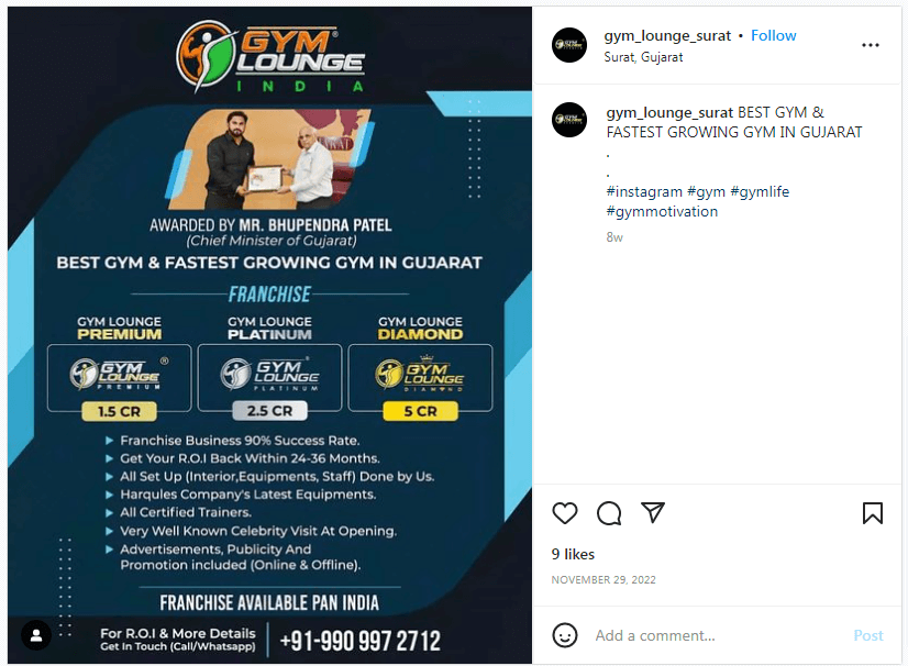
Clear layout
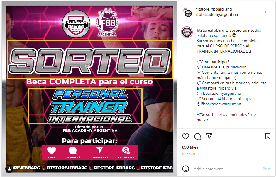
A clear and easy-to-navigate layout is important in gym brochure design as it helps to organize the information in a way that is easy for potential members to understand.
This can include sections for different offerings such as personal training, group classes, and amenities.
Breaking the information down into sections makes it easier for potential members to find the information they need and make a decision about whether or not to join the gym.
Call-to-action
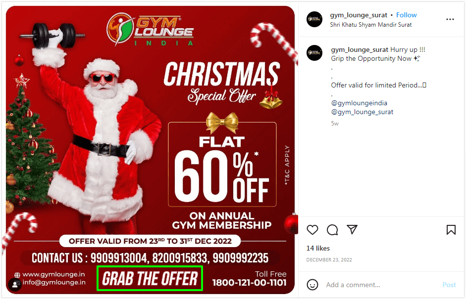
A clear call to action is an essential element of gym brochure design as it encourages potential members to take action.
This can include phrases such as “Sign up today” or “Visit us for a free tour.”
By including a call-to-action, it makes it easy for potential members to take the next step and join the gym.
Color scheme
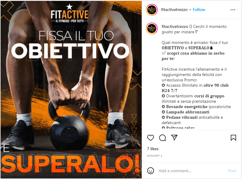
A consistent color scheme throughout the brochure is important in gym brochure design as it helps to create a cohesive and professional look.
This can include using the gym’s branding colors or using colors that are commonly associated with fitness and health.
Using a consistent color scheme, makes the brochure look more professional and can make it more appealing to potential members.
Branding
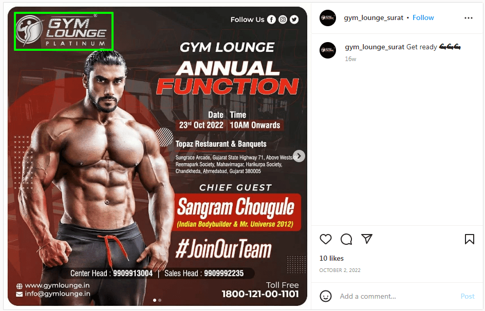
Incorporating the gym’s branding elements such as logos and colors is an important element of gym brochure design as it helps to ensure consistency and recognition.
This can include using the gym and fitness logo on the cover of the brochure and throughout the brochure.
Incorporating the gym’s branding elements, makes the brochure look more professional and can help potential members to recognize the gym.
Gym Brochure Design Helpful Ideas and Tips
Keep the design clean and minimalistic
Avoid using too many colors or graphics, as this can make the brochure look cluttered and overwhelming. Stick to a few key colors and simple graphics that complement the overall design.
Testimonials
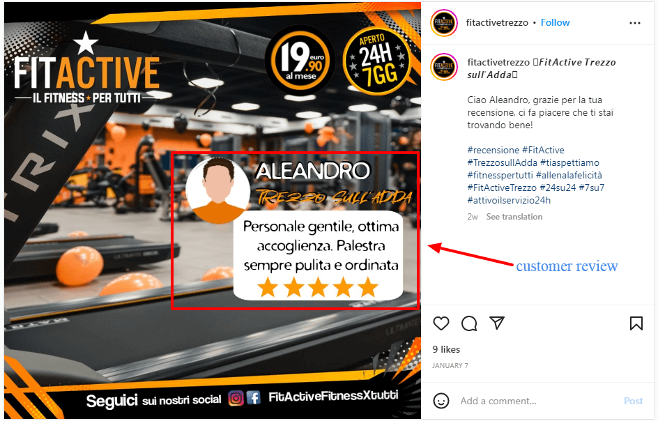
Including testimonials from satisfied members is an important element of gym brochure design as it helps to build credibility and trust.
These testimonials can include statements from members about
- how the gym has helped them reach their fitness goals
- how they enjoy the facilities and classes.
Including testimonials, helps to build trust with potential members and make the gym more appealing to them.
Highlight the gym’s unique features
Make sure to highlight any unique features or services that the gym offers, such as personal training or specialized classes. This can help set the gym apart from competitors.
Clear and concise language
Use clear and concise language in your brochure content. Avoid using jargon or technical terms that may be difficult for the average person to understand.
Digital Gym Brochure Design Using PhotoADKing
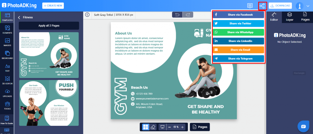
Go to the PhotoADKing website and sign up for an account.
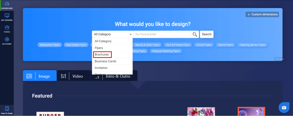
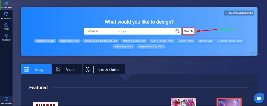
Once logged in, go to your dashboard and select the “Brochure” option from the category. Enter your niche “Gym” in the text box beside the category dropdown and Press Enter.
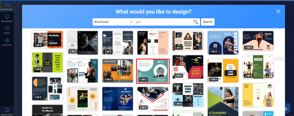
Choose the “Gym” brochure templates from the available options.
Customize the template with your own text, images, and logo.
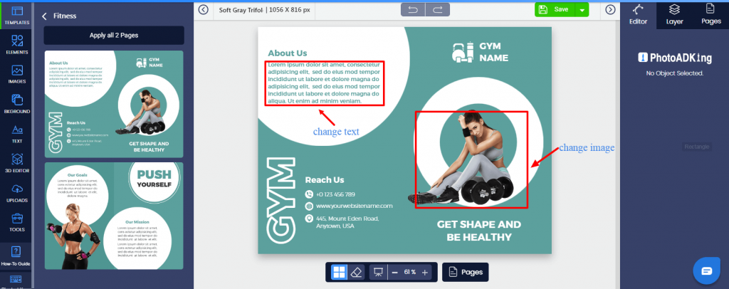
Use the editing tools to change the layout, font, and color scheme to match your gym’s branding.
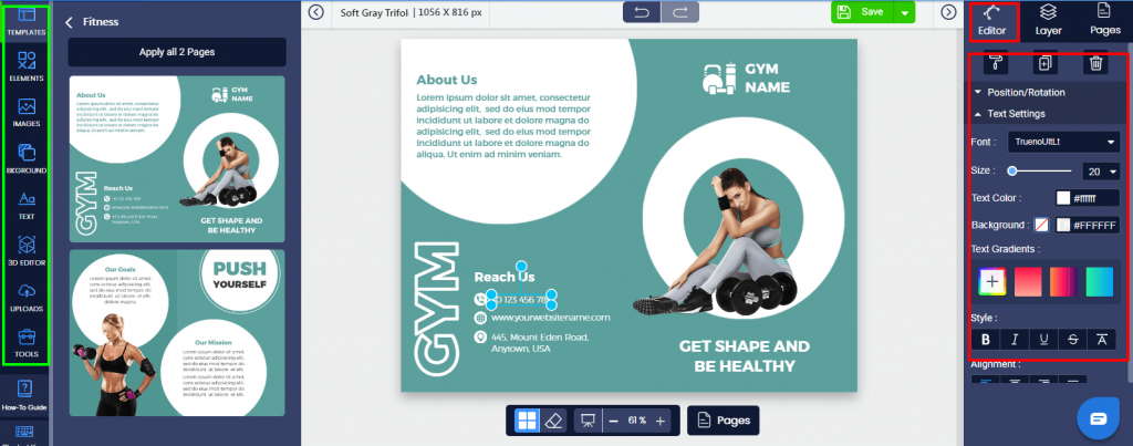
Preview your design and make any necessary adjustments.
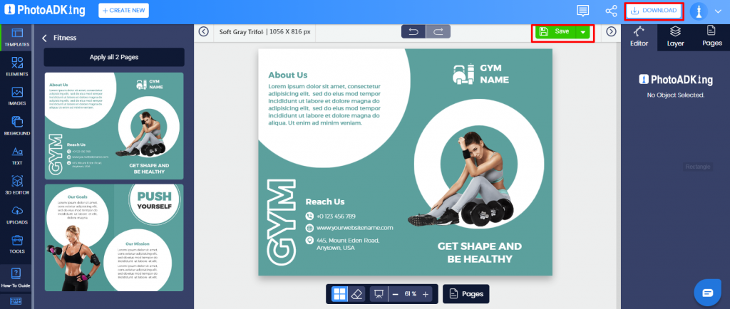
Once you are satisfied with the design, so now save, and download.
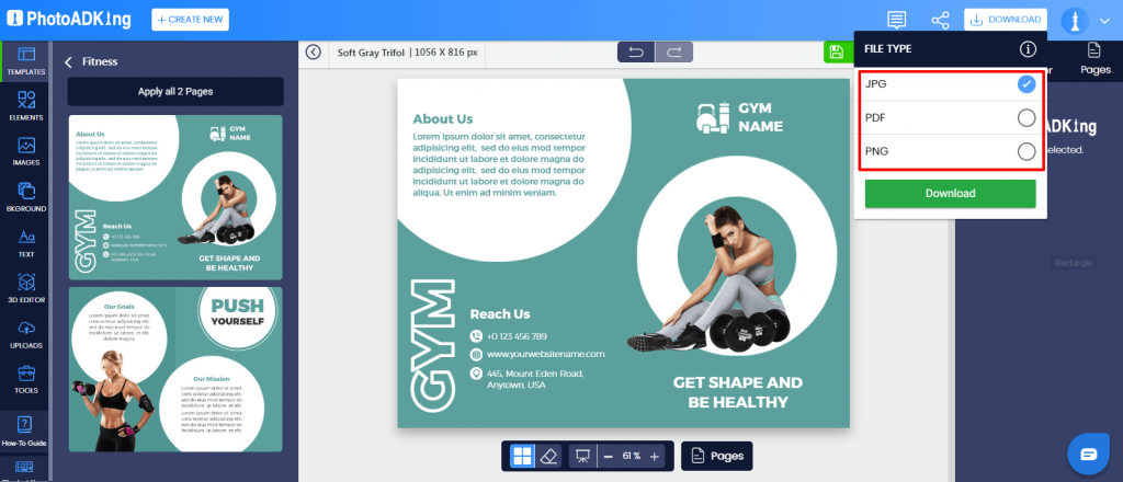
After downloading export the brochure in the desired format (PDF, JPG, PNG).
Print the brochure or share it digitally with your audience.
Recommended Blogs:
Gym Poster Ideas
Gym Logo Ideas
Fitness Logo Ideas
Gym Flyer Ideas
Brochure Design Ideas
Brochure Layout
Types Of Brochure
Brochure Background
Brochure Example
Best Brochure Fonts
Tri-fold Brochure Design Ideas
Fashion Brochure Design Ideas
Education Brochure Design Ideas
Creative Brochure Design Ideas
Real Estate Brochure Design Ideas
How to Make a Tri-fold Brochure
Conclusion
In summary, gym brochure design is a crucial element in promoting your gym and attracting new members. By focusing on high-quality images, informative content, and a clean and modern design, you can create a brochure that is both effective and attractive.
With the right design and layout, your gym brochure can help you stand out and attract new members to your gym.


