Brochures are an essential part of marketing and advertising. They help you to convey their message to customers in a visually appealing way. A brochure background is one of the most crucial elements of brochure design. Also, it sets the tone for the entire brochure and can make or break its impact on the audience. A good brochure background can grab the attention of the reader and create a lasting impression. To make the process of designing brochures easier, you can use the brochure maker tool that offers a variety of templates, and designs. Also, customization options to create a professional-looking brochure.
In this blog, we’ll discuss everything you need to know about types of brochure background design, color choices, and tips to make your brochure stand out.
Table of Content
- Creative Brochure Background Design
- Why is a Brochure’s Background Important?
- Color Choices for Brochure Backgrounds
- Tips for Choosing the Perfect Brochure Background
Creative Brochure Background Design
There are several types of brochure background designs to choose from depending on their brand personality, target audience, and the message they want to convey. So, here are some of the most creative background designs:
Gradient Brochure Background
These types of brochure backgrounds feature a gradual blend of colors that smoothly transition from one hue to another. Also, they create a modern and dynamic look. That can add depth and visual interest to your brochure.

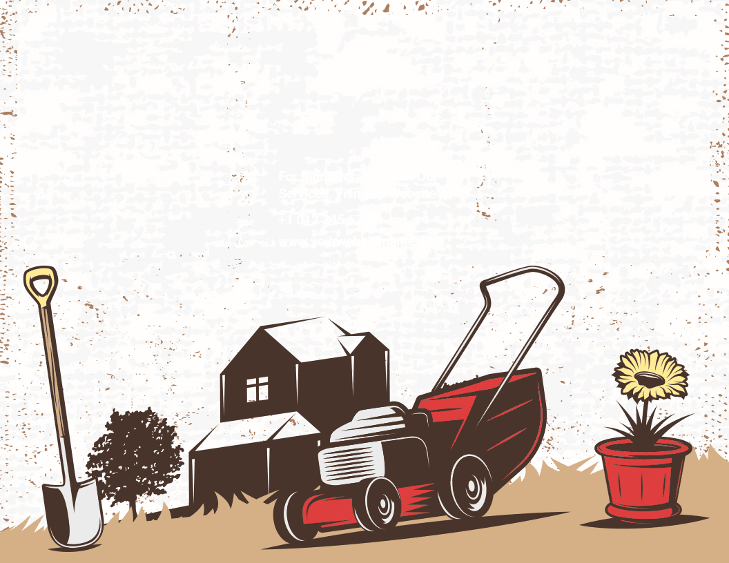
Nature-Inspired Brochure Background
These brochure backgrounds include natural elements such as trees, leaves, and flowers, which create a calming and peaceful atmosphere. They are perfect for brochures that promote activities and services, such as outdoor activities, nature-based products, or eco-friendly services.

Geometric Patterns Brochure Background
These brochure backgrounds consist of repeating geometric shapes such as triangles, squares, and circles. Also, they create a modern and organized look and work well for businesses that want to convey a sense of structure and efficiency.

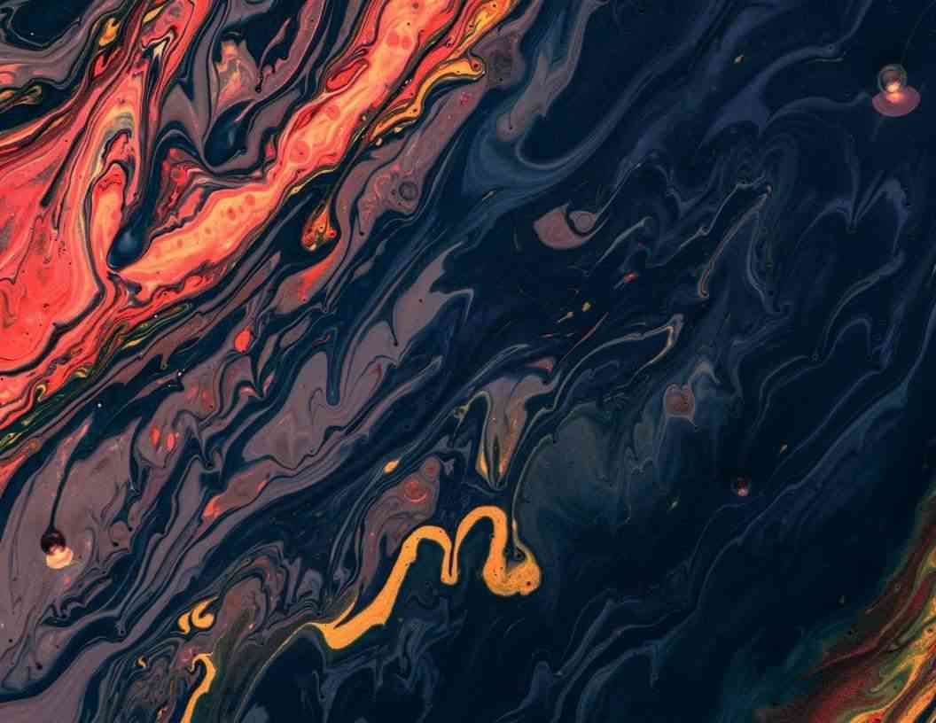
Watercolor Brochure Background
These types of brochure backgrounds feature a soft and visible look that evokes the flow and texture of watercolor paint. They are great for creating a delicate and artistic vibe that can be suitable for a range of industries.

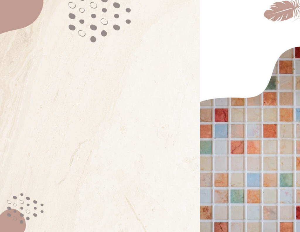
Texture Brochure Background
These brochure backgrounds feature various textures such as marble, concrete, or fabric. They add depth and tactile appeal to your brochure, making it more authentic and inviting.
Minimalist Brochure Background
These brochure backgrounds are simple and understated, using only one or two colors and minimal design elements. They are ideal for businesses that want to convey a sense of elegance, sophistication, and clarity.

Abstract Brochure Background
These brochure backgrounds feature non-representational and experimental designs that convey a sense of creativity and imagination. Also, they are suitable for businesses that want to express a more artistic and avant-garde image.
Vintage Brochure Background
These brochure backgrounds feature design elements that create a nostalgic and old-fashioned feel. They work well for businesses that want to create a retro or classic vibe, such as vintage stores or heritage brands.
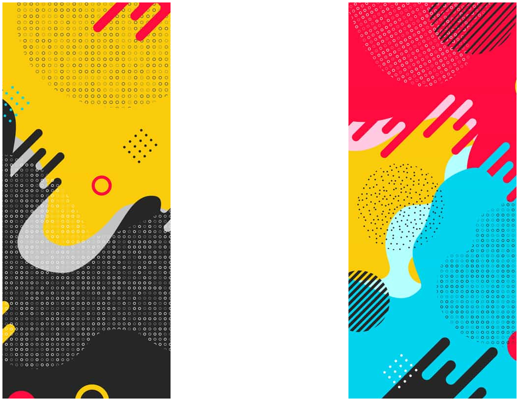
Bold and Bright Colors Brochure Background
These brochure backgrounds feature bold and vibrant hues that can make your brochure stand out and grab attention. They are ideal for businesses that want to convey a sense of energy, excitement, and boldness.

Monochromatic Brochure Background
These brochure backgrounds use different shades of one color to create a subtle and harmonious effect. They are great for businesses that want to convey a sense of sophistication and subtlety.

Grunge Brochure Background
These brochure backgrounds feature a rough and worn-out look, using design elements such as distressed textures and graffiti. They are suitable for businesses that want to convey a rebellious and edgy image.
Black and White Background
These brochure backgrounds use only black and white tones, creating a classic and timeless effect. They are ideal for businesses that want to convey a sense of elegance and simplicity.
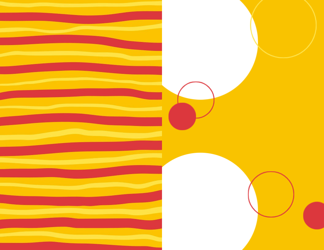
Patterned Brochure Background
These brochure backgrounds feature repeating patterns such as stripes, dots, or chevrons. They create a sense of rhythm and consistency and can work well for businesses that want to convey a sense of order and reliability.

Pop Art Background
These brochure backgrounds feature vibrant colors and graphic design elements that evoke the iconic style of pop art. They are suitable for businesses that want to convey a sense of fun, creativity, and youthfulness.
Photography Brochure Background
These brochure backgrounds use high-quality photographs as the main design element, creating a visually stunning effect. They are ideal for businesses that want to showcase their products or services in a realistic and engaging way.

Illustration Brochure Background
These brochure backgrounds use hand-drawn illustrations or digital graphics to create a unique and personalized effect. Also, it is suitable for businesses that want to convey a sense of creativity and imagination.

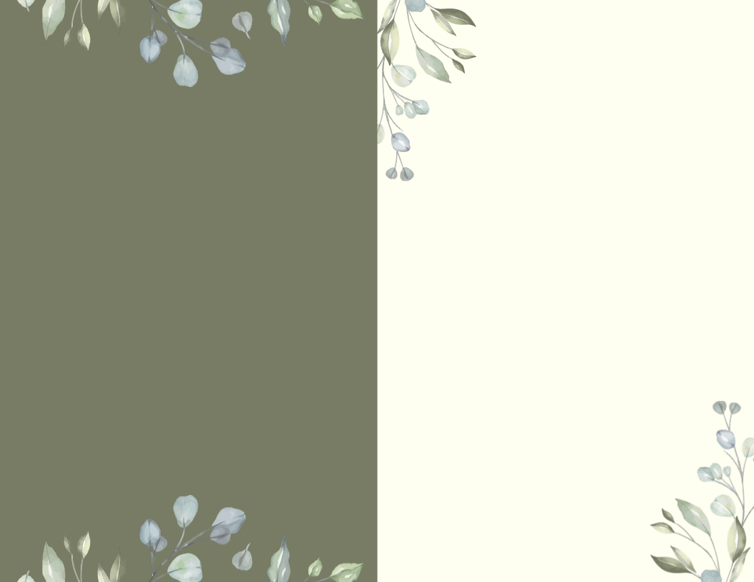
Floral Brochure Background
These brochure backgrounds feature floral designs and patterns, creating a romantic and feminine atmosphere. They are perfect for businesses that sell a product or services, such as beauty products, wedding services, or gift items.
Above all is the brochure background design, if you are confused about which font is best for your brochure, then check out our article on the best brochure fonts that help to create a brochure.
Looking for more specific content? read Halloween card backgrounds
Why is a Brochure’s Background Important?
The background of a brochure is important because it sets the tone for the entire design. A well-chosen background can enhance the overall visual appeal and professionalism of the brochure. It can also help to convey the message or theme of the brochure, making it easier for readers to understand and engage with the content. Additionally, the right background can make the text and images stand out, making the brochure more memorable and effective.
Color Choices for Brochure Backgrounds
Colors play an important role in the background color. The right color can create emotions and set the tone for your message. So, here are some popular color choices for brochure backgrounds and the emotions they convey.
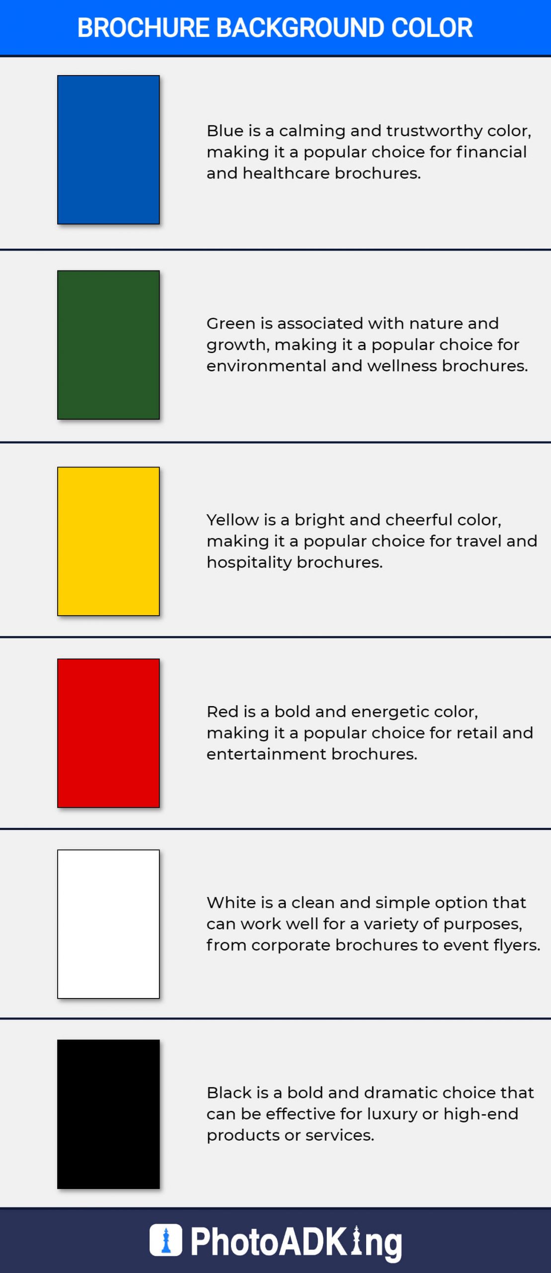
- Blue: Blue is a calming and trustworthy color, making it a popular choice for financial and healthcare brochures.
- Green: Green is associated with nature and growth, making it a popular choice for environmental and wellness brochures.
- Yellow: Yellow is a bright and cheerful color, making it a popular choice for travel and hospitality brochures.
- Red: Red is a bold and energetic color, making it a popular choice for retail and entertainment brochures.
- White: A clean and simple option that can work well for a variety of purposes, from corporate brochures to event flyers.
- Black: A bold and dramatic choice that can be effective for luxury or high-end products or services.
Tips for Choosing the Perfect Brochure Background
Choosing the perfect brochure background can be challenging, but here are some tips that can help you make the right decision:
- Know your brand personality: Your brand personality should guide your choice of background design. If you have a modern, innovative, and tech-savvy brand, then a gradient or geometric pattern background can work well.
- Consider your target audience: Understanding your target audience’s preferences, tastes, and interests can help you choose the right background design. For example, if your target audience is young and adventurous, then a bold and bright color background can work well.
- Keep it simple: A cluttered background can distract from the main message of your brochure. Stick to a simple design with a clear focal point.
- Use contrast: Contrast between the background and the text or images can create visual interest and make the brochure more engaging. For example, a dark background with light text can be easier to read than a light background with dark text.
- Use high-quality images: If you choose to use images in your background, make sure they are high-resolution and don’t appear pixelated or blurry.
Conclusion
In conclusion, brochure background is an essential element of brochure design that can make a significant impact on the audience’s perception and engagement. Choosing the right background design requires careful consideration of brand personality, target audience, and message. One way to ensure a cohesive design that aligns with the brand is to use a brochure template. By using a brochure template, you can easily incorporate their brand elements and messaging while also taking advantage of pre-designed layouts and graphics. By following the tips mentioned above and using a brochure template, you can create an effective and engaging brochure that grabs the attention and creates a lasting impression.