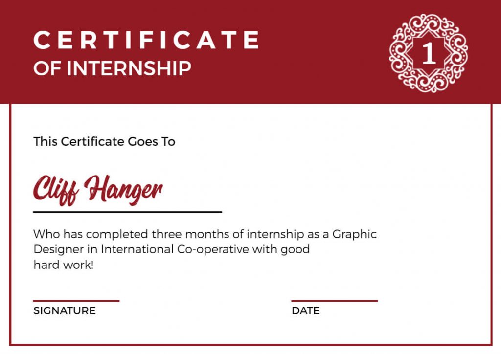
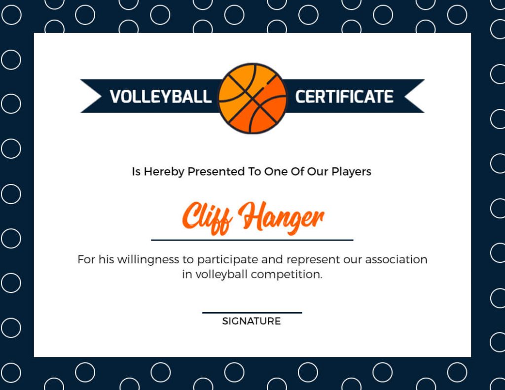
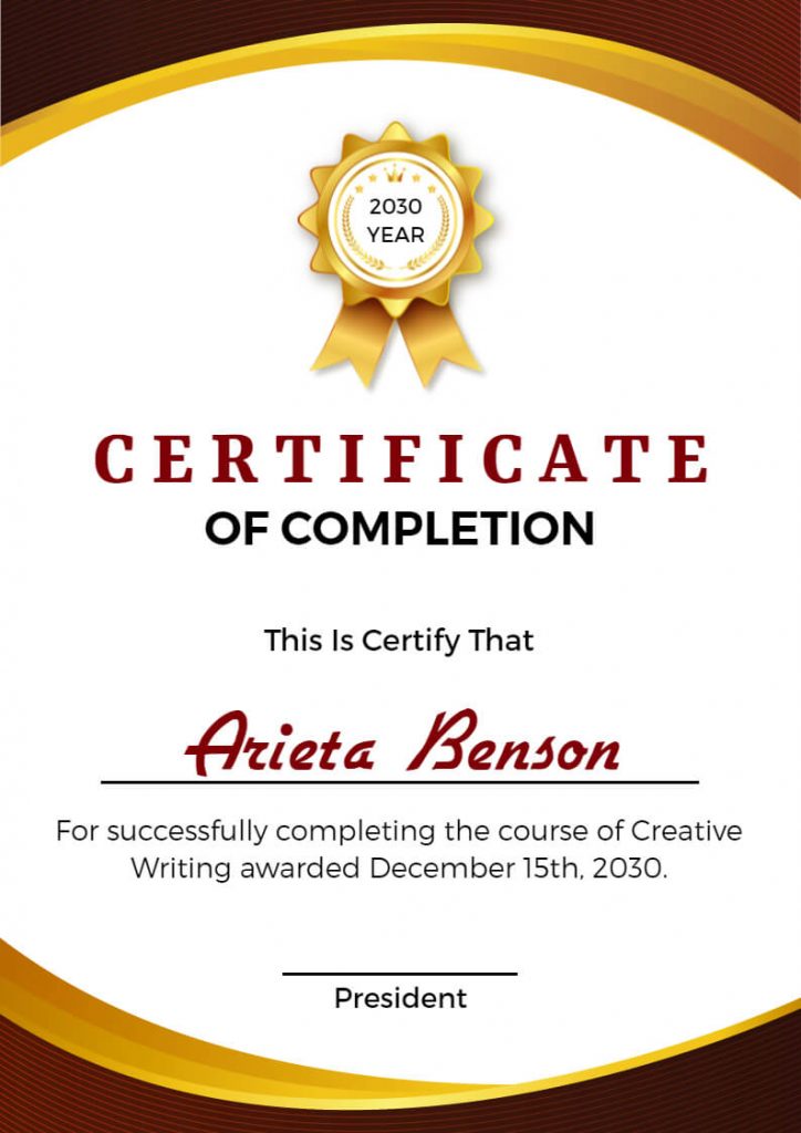
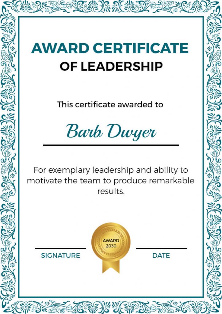
Certificates are often given as a recognition or reward for achieving a milestone or goal. The design of a certificate is also important as it reflects the value and importance of the accomplishment. A well-designed certificate can also boost morale and motivate the recipient.
Designing a certificate layout from scratch can be daunting. But fret not, with the use of pre-designed certificate templates, you can easily create professional-looking certificates.
In this article, we will discuss the best certificate layout design ideas that you can use to create a visually appealing and impactful certificate.
Table of Content
Different Certificate Layout Design
Examples of Certificate Layout
How to Choose the Right Layout
Conclusion
FAQs
Let’s dive into certificate layout designs, where creativity meets formality.
Different Certificate Layout Design
Certificate designs can vary widely depending on the purpose, style, and the organization or event they are being created. Here are some common types of certificate layouts:
Minimalist Certificate Layout
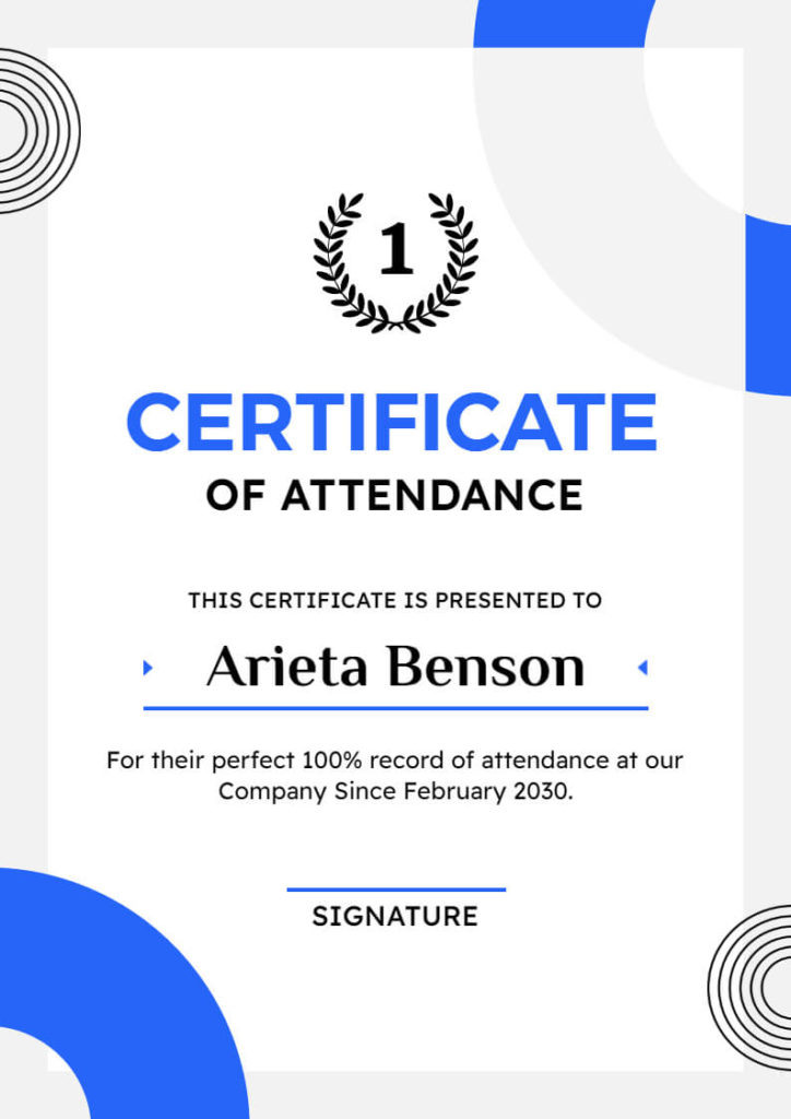
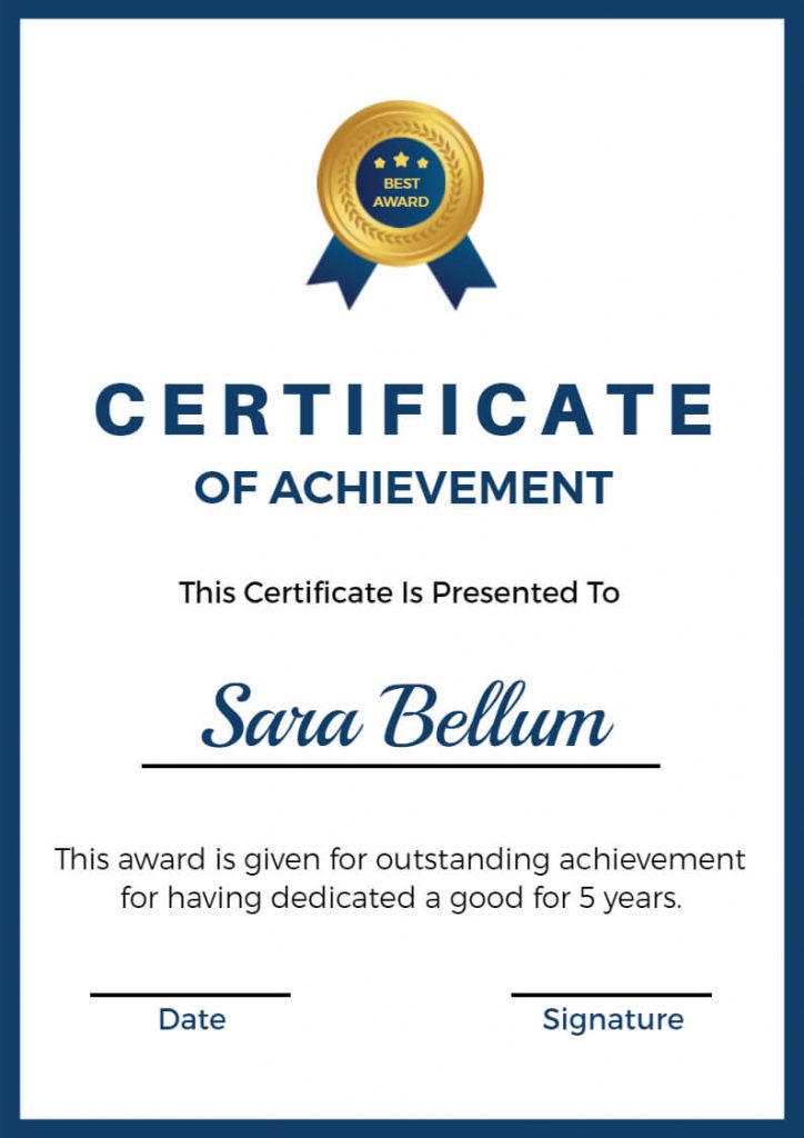
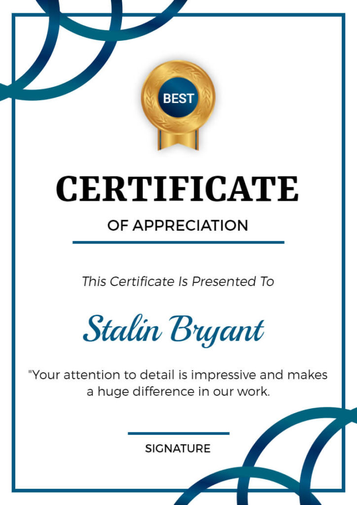
As the saying goes, less is more, and the minimalist layout embodies that principle. It’s a clean and simple design that focuses on the essential elements of the certificate, such as the recipient’s name, the reason for the award, and the date. The minimalist layout is perfect for a modern and professional look, and it’s easy to read and understand.
Modern Certificate Layouts
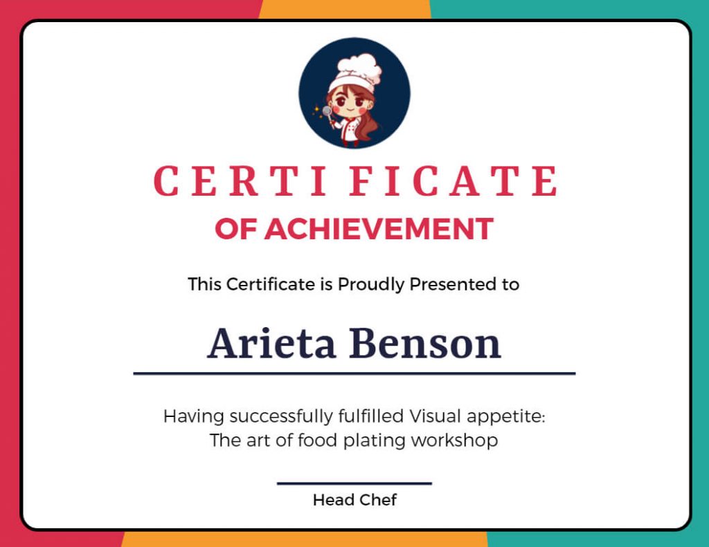
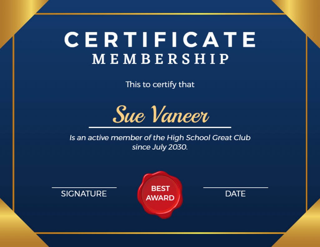
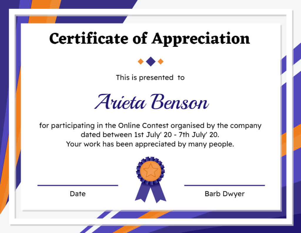
The modern layout incorporates bold colors, unique fonts, and creative graphics to make it more visually appealing. This type of layout is especially perfect for businesses or organizations that want to make a statement and showcase their brand’s personality. The modern certificate templates is eye-catching, and it can make the recipient feel special and appreciated. When we talk about modern certificates, we first think about something special. So, you can consider our gift certificate ideas guide, which helps you to design a special certificate.
Creative Certificate Layout
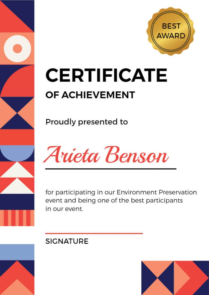
The creative layout is all about being unique and original. This type of layout also uses unconventional designs, interesting shapes, and playful colors to create a one-of-a-kind certificates. The creative layout is perfect for awards that celebrate creativity and innovation, such as art or writing competitions. It’s a fun and exciting way to recognize someone’s unique talents.
Formal Certificate Layout
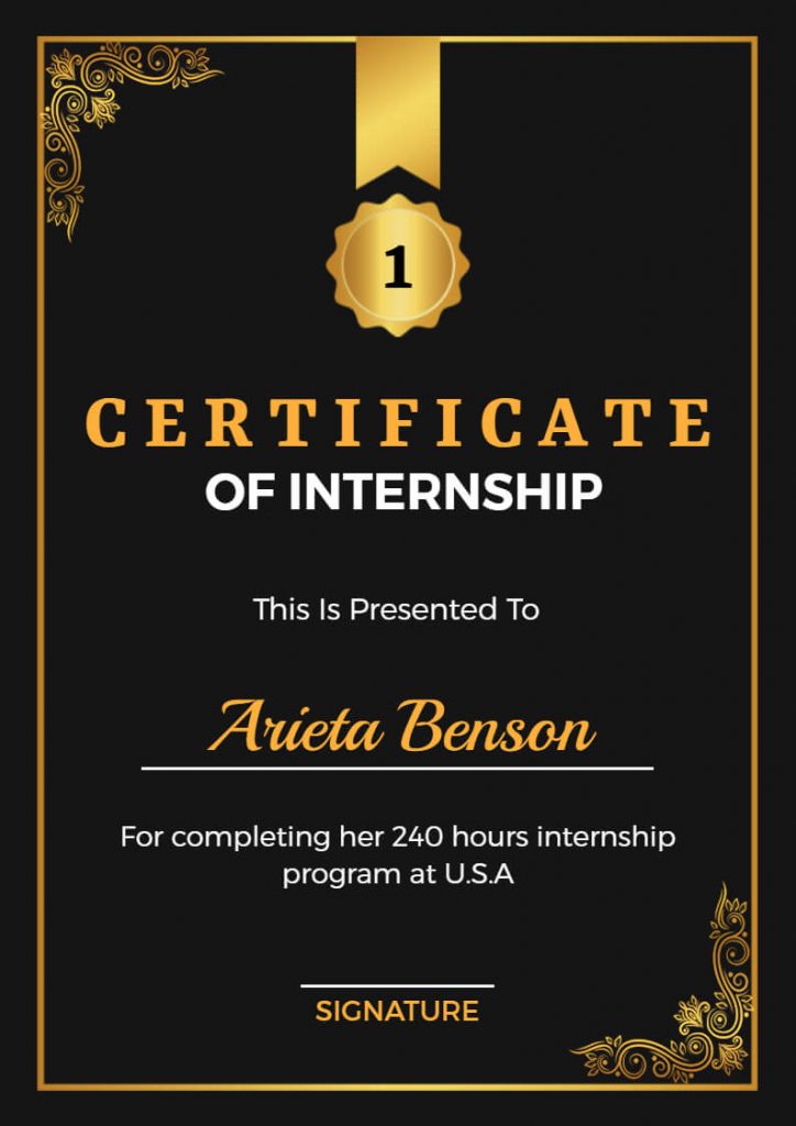
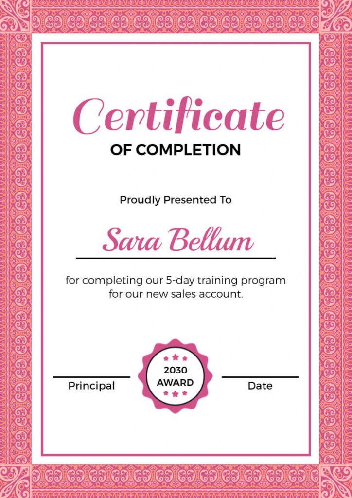
The formal layout is all about being traditional and classic. This type of layout uses classic design elements, such as ornate borders and calligraphic fonts, to create a timeless and sophisticated design. It is perfect for certificates that need to convey a sense of importance and prestige.
Bold Certificate Layouts
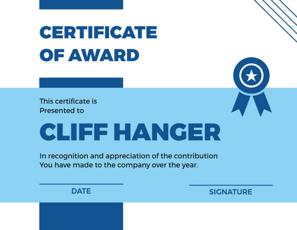
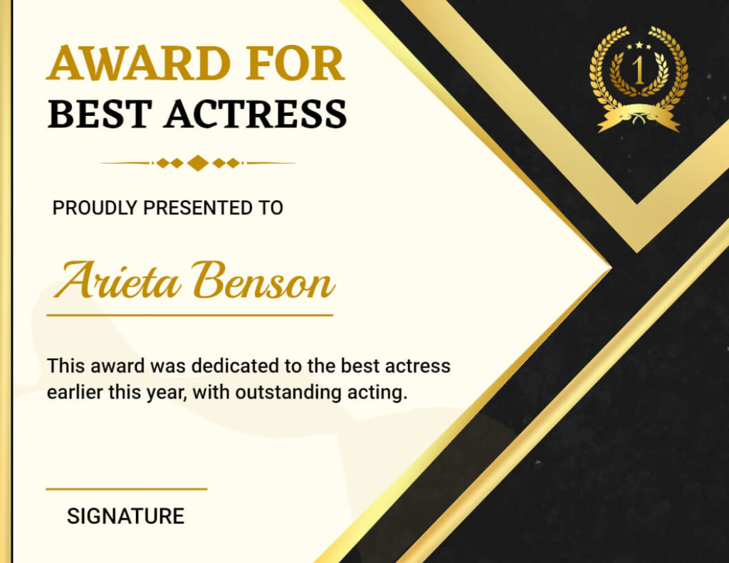
The bold layout is all about making a statement. It’s a design that uses big fonts, bright colors, and striking graphics to create a certificate that’s impossible to ignore. The bold layout is perfect for certificates that celebrate extraordinary accomplishments, such as winning a championship or breaking a record.
Classic Certificate Layout
The classic layout is a timeless design that never goes out of style. It typically includes a simple border, a standard font, and a straightforward design. This layout is perfect for professional settings such as academic or corporate recognition. The classic layout is versatile and can be easily customized to meet the needs of any event or occasion.
Border Certificate Layout
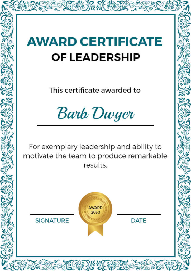
The border certificate layout is similar to the classic layout, but it features a more decorative border around the certificate. This type of layout adds an element of elegance and sophistication to the certificate. The border can be intricate or simple, depending on the type of certificate. Border layout certificates are commonly used for achievement awards or recognition certificates. If you want to create only an awards certificate, then you can also consider this award certificate design ideas guide. This blog helps you to create your unique certificate.
Wave Certificate Layout
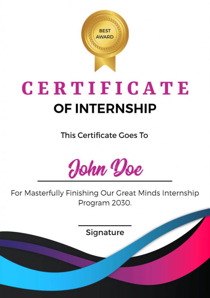
The wave layout is a modern and dynamic certificate layout that features curved lines and wave patterns. It creates a sense of movement and flow, also making it an excellent choice for certificates related to sports, fitness, and other dynamic activities. The wave layout is also suitable for certificates related to the ocean, water, and other aquatic themes.
Scalloped Certificate Layout
The scalloped layout features a scalloped edge design around the certificate, creating a unique and distinctive look. It is an excellent choice for certificates related to awards for leadership or training completion. The scalloped layout can also be used for certificates related to cooking, baking, and other culinary activities.
Creating a well-designed certificate can make a positive impact on the recipient and the overall impression of the accomplishment. By using these best design ideas, you can create a certificate that is not only visually appealing but also meaningful and memorable. For guidance on how to make a certificate must read the How to Make Certificate online article.
Now, let’s explore some examples of certificate layouts.
Examples of Certificate Layout
Certificate layouts can vary widely depending on the purpose of the certificate and the organization creating it. Here are examples of certificate layouts:
Award of Appreciation Certificate Layout
When designing an Award of Appreciation certificate, it’s essential to create an elegant and visually appealing layout. Thus, incorporating ornate fonts and decorative borders can enhance its aesthetic appeal. Furthermore, consider using a subdued color palette to convey a sense of sophistication.
Also Read: How to Make a Certificate of Appreciation
Award Certificate Layout
Award certificates should exude prestige and significance. To achieve this, a balanced layout that effectively utilizes white space is key. Moreover, using high-quality paper or cardstock can lend an air of authenticity. In addition, choosing a font that conveys formality and importance is essential.
Also Read: Award Certificate Design Ideas & Examples
Employee Of The Month Certificate Layout
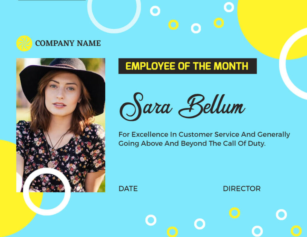
To recognize outstanding employees, a layout that incorporates the company’s branding elements, such as logos and colors, is recommended. Furthermore, including a photo of the employee can add a personal touch.
Also Read: Employee of the Month Certificate Sample
School Certificate Layout
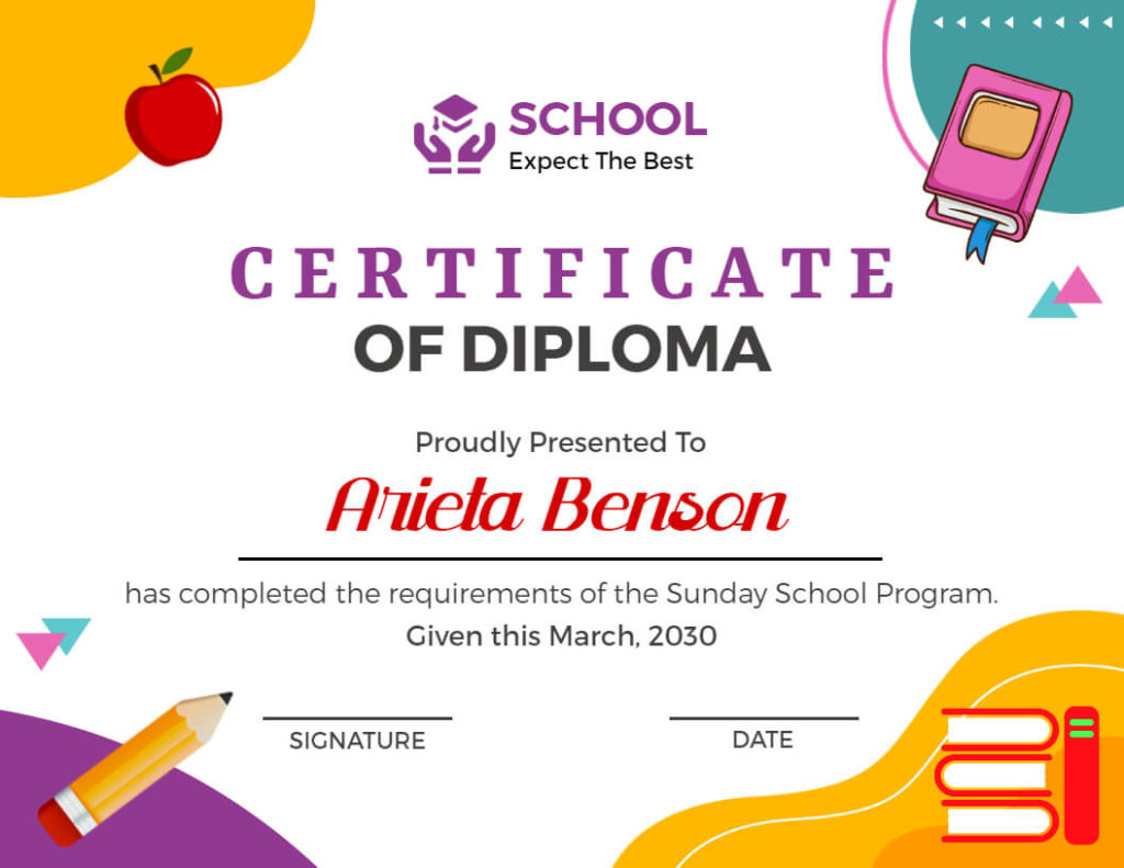
School certificates often involve academic achievements, so a layout that balances formality with a touch of creativity can be engaging for students. Moreover, including the school emblem and a place for the principal’s or teacher’s signature enhances authenticity.
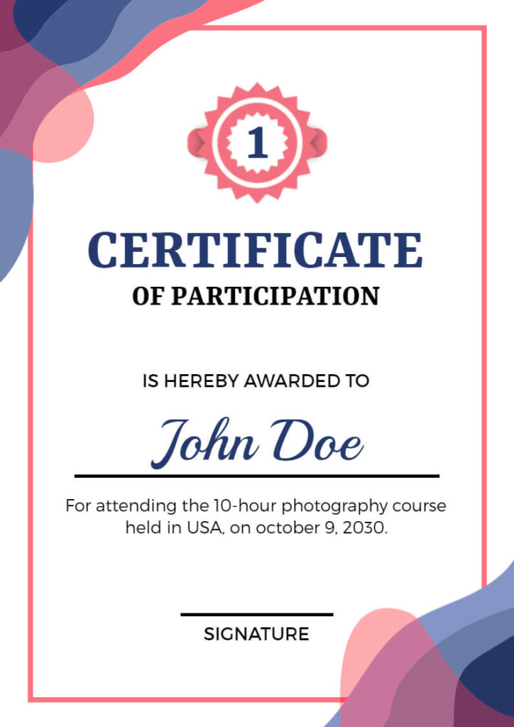
Participation Certificate Layout
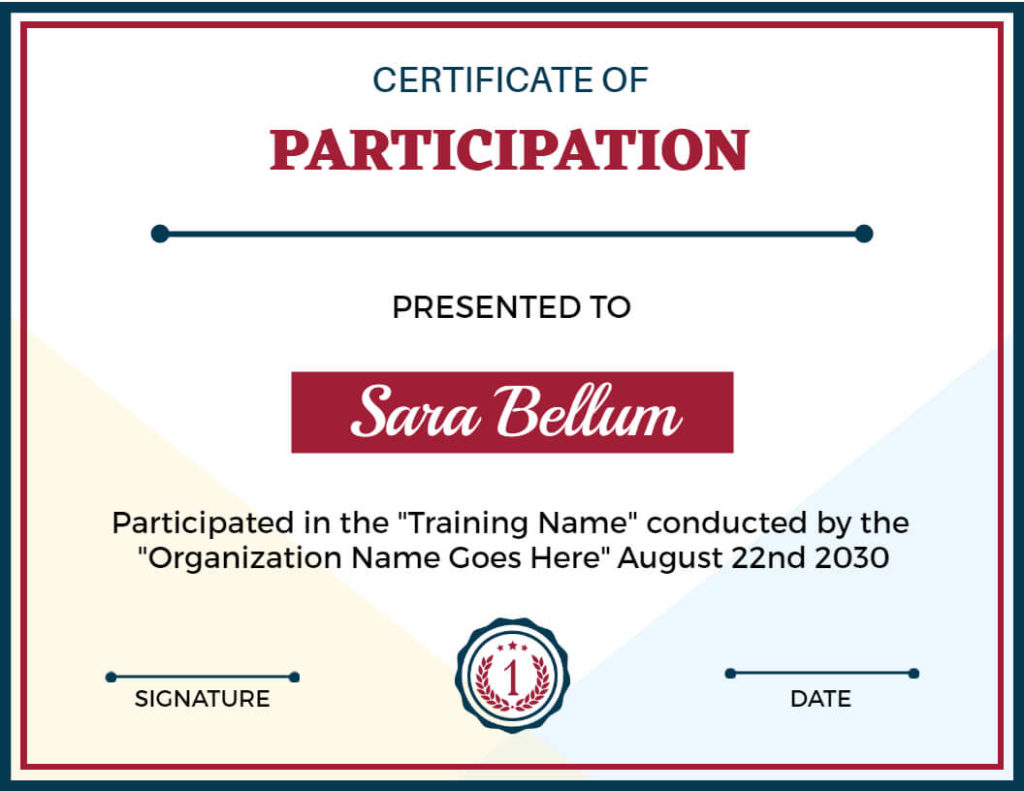
Participation certificates are typically given for various events and programs. In addition, using a flexible layout that allows customization with event details and participant names is practical and efficient.
Also Read: Participation Certificate Sample
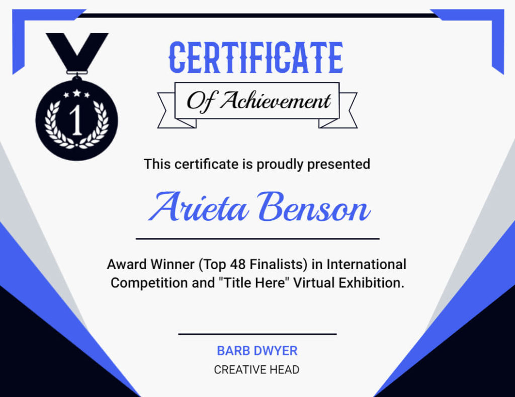
Certificate of Achievement Layout
Achievements deserve recognition, and a certificate layout should reflect the significance of the accomplishment. Indeed, an ornate design with space for the recipient’s name, achievement description, and a decorative border can make it special.
Also Read: Participation Certificate Sample
Certificate of Recognition Layout
Certificates of recognition should be elegant and formal. As a result, a balanced layout with a subtle design, a prominent title, and space for details about the recognition can convey importance.
Also Read: How to Make a Certificate of Recognition
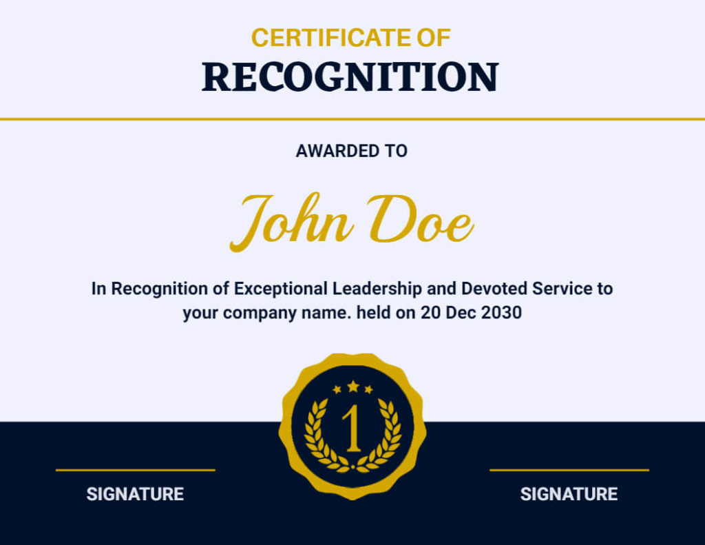
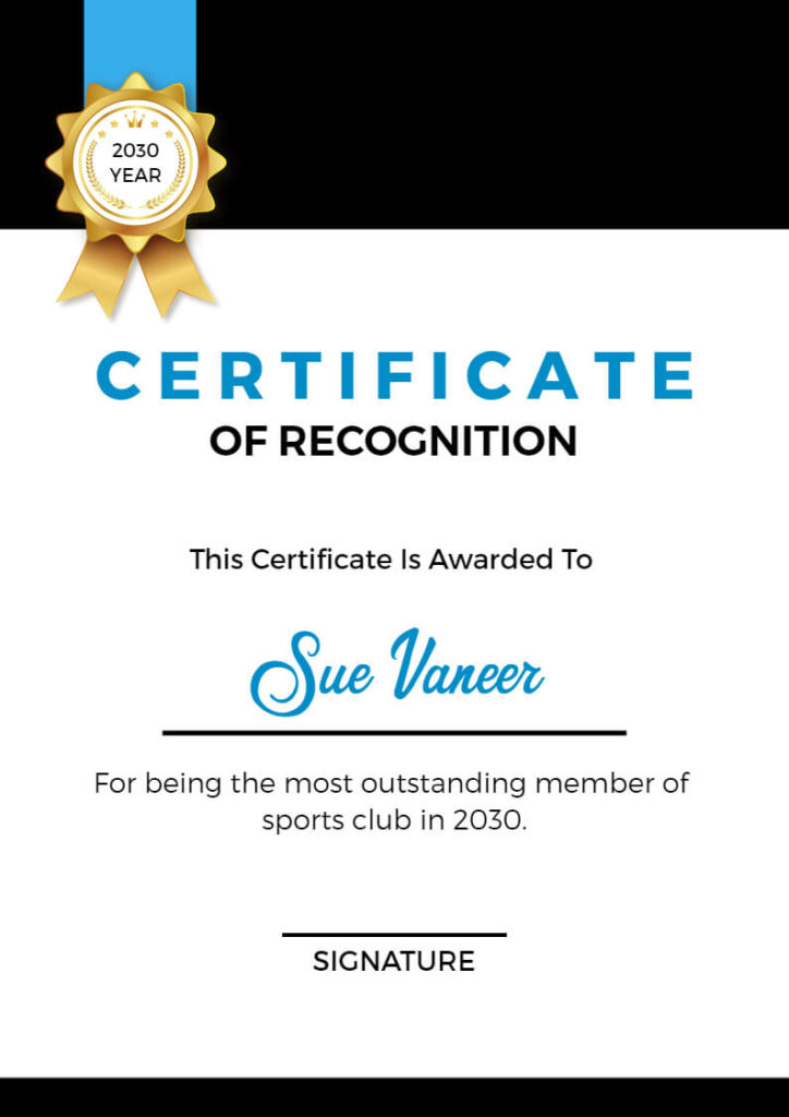
These examples should give you a good idea of how certificate layouts can vary. Now, let’s learn how to pick the perfect layout for your certificate.
How to Choose the Right Layout
When choosing a certificate layout, consider the purpose and audience of the certificate. Think about the message you want to convey and the emotions you want to evoke. If you’re creating a certificate for a formal event or professional occasion, the classic or border may be more appropriate. Creating a professional certificate can be daunting, especially if you are unfamiliar with graphic design or lack experience in designing.
If you’re recognizing a personal achievement or a creative endeavor, the wave or scalloped layout may be more fitting. It’s also essential to consider the content of the certificate, such as the text, font, and color scheme. Make sure the layout complements and enhances the content rather than overshadowing it.
If you like what you read on our blog, you might also be interested in checking out some of our other blogs.
Recommended Blogs
How to Make a Certificate Online
Certificate Size
Certificate Examples
How to Choose the Right Certificate Size for Your Design
What Are the Different Types of Certificates?
The Ultimate Guide to Choosing the Perfect Certificate Font
Certificate Samples
The Importance of Certificate Format
Certificate Border Design Ideas
How To Use Certificates For Marketing Your Business
Certificate Background Design Ideas
Best Strategies and Practices to Promote Certificates
Conclusion
Certificates are a symbol of achievement and recognition, and a well-designed certificate can make it even more special. By incorporating these best certificate layout design ideas, you can create a certificate that is not only visually appealing but also reflects the value and importance of the accomplishment. Remember to personalize it, experiment with standard certificate size and dimensions, use high-quality paper stock, and incorporate visual elements and branding.
However, dealing with complicated certificate design software can be frustrating and time-consuming. That’s where “Certificate Maker” comes in! Our user-friendly platform makes it effortless for anyone to create a stunning certificate in just a few clicks. You also use this tool to make it easy to design certificate layouts.
FAQs
The layout of a certificate is crucial as it conveys professionalism, authenticity, and the significance of the achievement. It also ensures that the information is presented clearly.
Yes, you can customize the layout to suit various occasions or achievements, such as academic degrees, employee recognition, or participation in events.
Choose legible and professional fonts for the certificate text. A combination of serif and sans-serif fonts can provide an aesthetically pleasing look.
Borders are not mandatory but are often used to frame the certificate. They can enhance the overall design, but their use depends on personal preference.

