Designing an appealing flyer involves more than creativity; it requires a deep understanding of design principles that resonate with human aesthetics. Therefore, one such principle is the Golden Ratio, a mathematical concept that can elevate the golden ratio in flyer designs to a new level.
Wave goodbye to design headaches. Our user-friendly flyer maker lets you create tailored, stunning flyers in a snap, whether it’s for business, events, or personal projects. With customizable flyer templates, high-quality graphics, and intuitive editing, your perfect flyer is just moments away. You can save both time and money while creating flyers using the flyer maker.
In this article, we’ll explore what the golden ratio is, its types, and how we can apply the golden ratio to flyer designs, therefore, which include layout composition, text placement, and image placement.
Perception is everything. Let’s get started.
Table of Contents
What is the Golden Ratio?
How to Apply the Golden Ratio to Flyer Designs
Recommend Blogs
Conclusion
FAQs
What is the Golden Ratio?
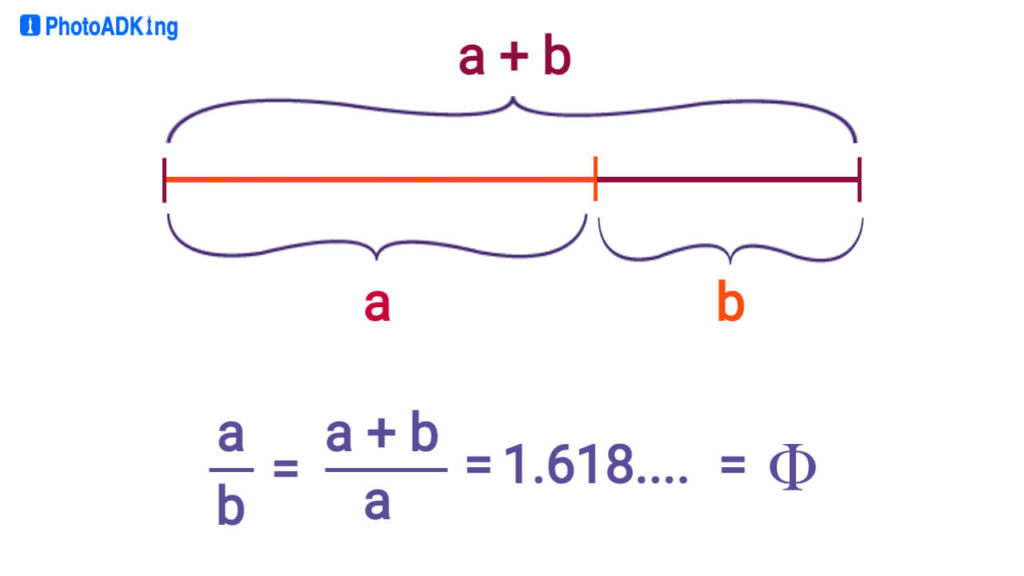
The Golden Ratio, often denoted by the Greek letter phi (φ), is a mathematical concept that manifests in nature, art, and design. The golden ratio is also called the Golden Mean or Divine Proportion and also goes by several other names. The golden ratio can be defined in a few different ways, but the most common definition is as follows:
If the ratio of two quantities, a and b, is the same as the ratio of their sum to the larger of the two (expressed as (a+b)/a), then these quantities are considered to be in the golden ratio. This mathematical relationship can be represented as follows:
i.e. φ = (a + b) / a = a / b
Leonardo Di Pisa, a mathematician, discovered how to evaluate the ratio the other way around in 1200AD. He calculated a series of numbers that is now known as the Fibonacci sequence.
The sequence looks like this: 1, 1, 2, 3, 5, 8, 13, 21…
The numbers start with 0 and 1. To get the next number in the list, you just add the two previous numbers together. As you go further in the list, the ratio between these numbers gets closer and closer to a special number called the Golden Ratio, which is about 1 to 1.618.
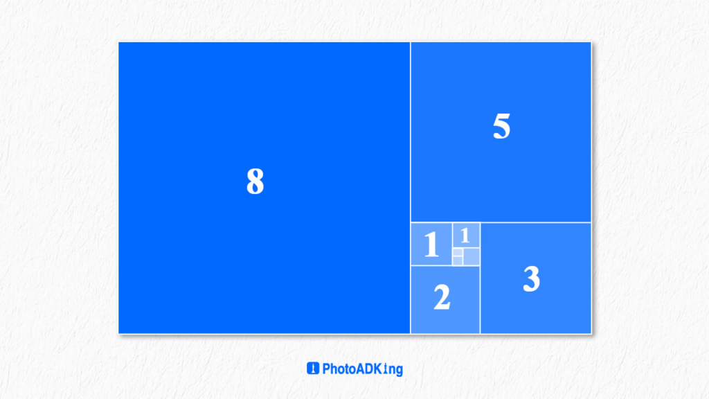
However, you can include a square with sides that match the length of the rectangle’s longest side. If you repeatedly divide the golden ratio rectangle to create smaller squares within it, these progressively smaller squares will form the golden ratio spiral.
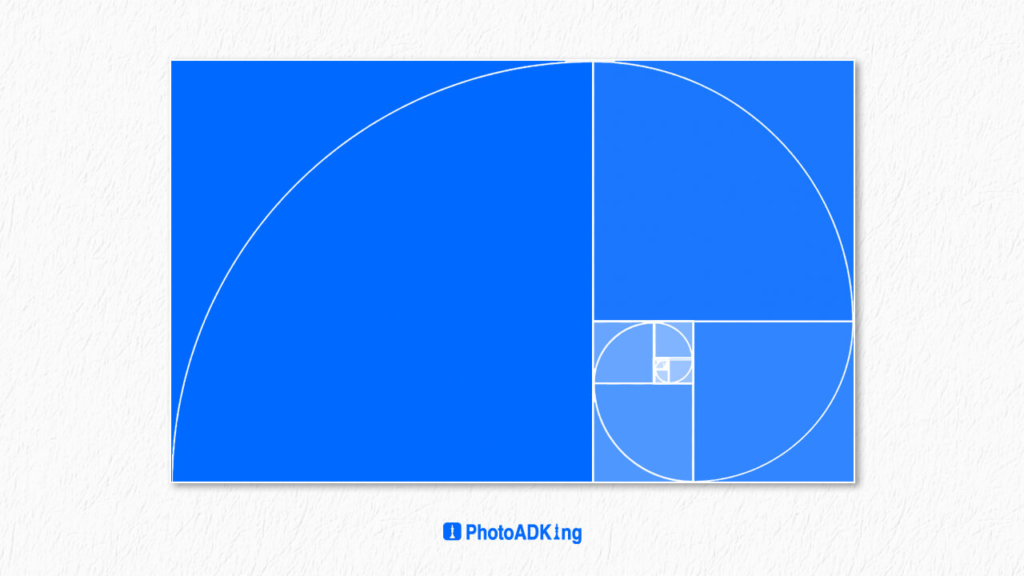
The golden section occurs only when the formula of an equation is equal to the number phi, which is equal to 1.618.
The Golden Triangle
This method may seem a little bit more complicated than using a golden rectangle but this 1.618, is a unique number found by dividing a line into two parts in such a way that the ratio of the whole line to the longer segment is the same as the ratio of the longer segment to the shorter segment. In a golden ratio triangle, if you draw an arc connecting the midpoint of one side to the opposite corner, it creates a smaller triangle and a larger triangle that also shares the golden ratio proportion.
The Golden Circle
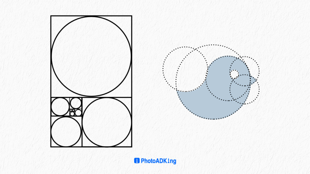
The golden circle is mainly used in creating logos. When applied to the construction of a circular logo, the Golden Ratio ensures a harmonious and visually pleasing composition. By aligning the circle’s diameter and the center-to-edge distance with the Golden Ratio, a visually pleasing balance is achieved, captivating the human eye.
Once you have a clear understanding of your brand’s essence and logo design preferences, incorporating the Golden Ratio can bring a sense of balance and proportion to your logo’s aesthetics.
However, you must be thinking about how you will use these golden ratios in your flyer designs. Worry not, will explore the section that includes how you are going to apply the golden ratio to your flyers. Let’s dive in.
How to Apply the Golden Ratio to Flyer Designs
Layout Formation with Golden Ratio
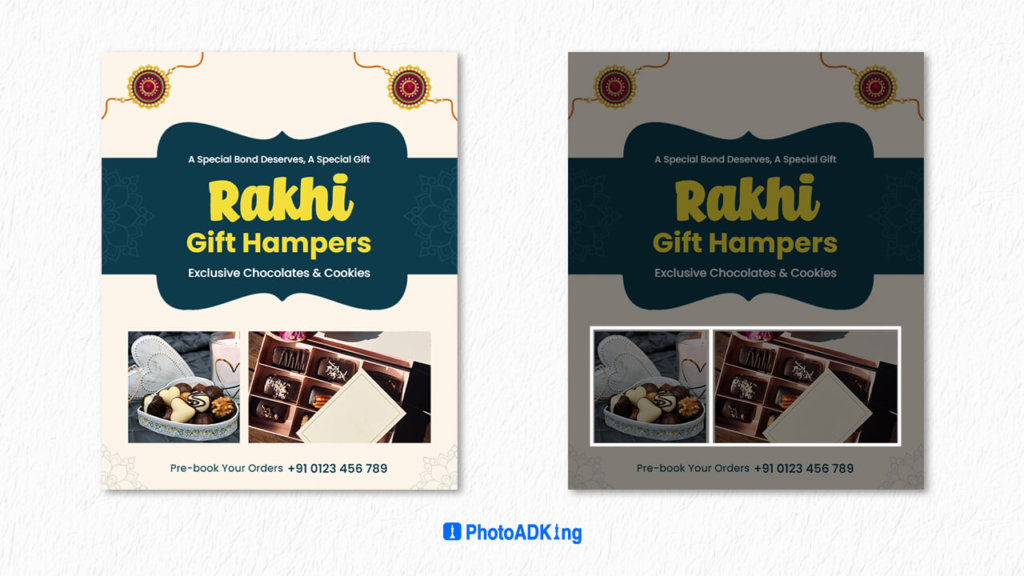
Firstly, start by determining the dimensions of your flyer. You can apply the Golden Ratio to the overall dimensions or to individual sections within the design.
However, let’s say you have a standard flyer size of 1000 * 1500px. You can use the Golden Ratio to divide these dimensions into more visually pleasing proportions.
The length 1500px divided by phi (1.618) gives you approximately 927, and the width 1000px divided by phi gives you approximately 618. These new dimensions can be used as the basis for your flyer’s proportions.
Now, divide your layout into two columns using the Golden Ratio. This will help your design follow the pleasing proportions of the Golden Ratio within these two shapes.
Text Placement in Flyer
Utilizing the golden ratio for text placement can greatly enhance its visual appeal also by strategically placing text elements along the points of the golden ratio grid, typically found by dividing the design into sections according to Phi.
For example, Select a measurement for your main body text, and then multiply that measurement by 1.618 to determine the appropriate size for your headline.
Therefore, if your main body text size is 15pt then multiply by 1.618, and you will get 24.27. You can round it up to 20 or 25 will yield the desired harmony effortlessly.
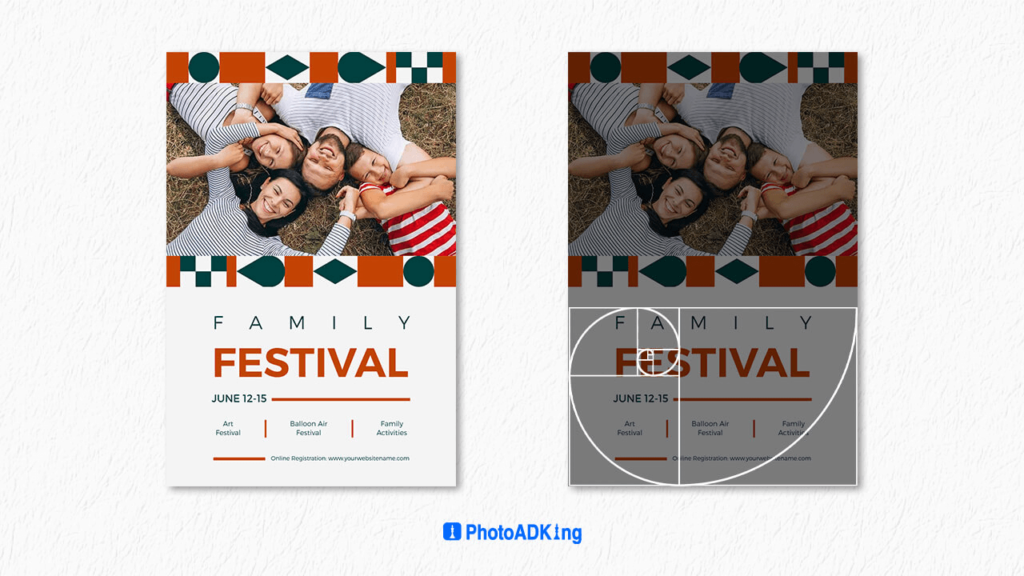
Image and Graphic Placement
Lastly, using the golden ratio (about 1.618) enhances visual harmony also aligning elements with its divisions creates balance, guides the viewer, and ensures effective communication.
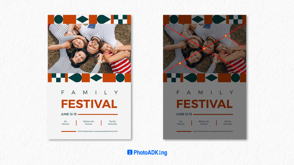
For the rule of thirds, arrange both the vertical and horizontal lines according to a 1:1:1 ratio, ensuring uniform and balanced spacing. whereas, placing significant elements of the image near the corners of the central rectangle for optimal alignment.
The phi grid offers an alternative approach to considering proportions in photography, resembling the rule of thirds but without dividing the frame into completely equal sections. This grid employs a ratio of 1:0.618:1 instead of the typical 1:1:1, resulting in center lines that are more closely spaced together.
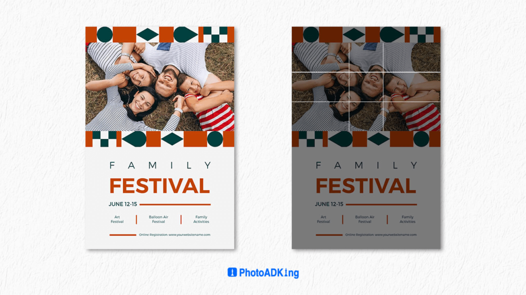
This is how the golden ratio is applied in flyers to make the process easy to create the flyers.
Recommend Blogs
What Is A Flyer? – Definition, Purpose, & Components
Flyer Design Principles
How to Choose a Color Palette for Flyer
How to Choose a Gradient Color Scheme
Create Flyers With AI Flyer Maker
Flyer Examples
How to Make a Band Logo
How to Make a Flyer
Flyer vs Poster
Graphic Design Flyer Ideas
Graphic Design Trends
Flyer Style
How to Make Christmas Cards in 5 Easy Steps
Conclusion
Incorporating the golden ratio into your flyer designs enhances aesthetic appeal and harmony. Understand and apply this mathematical concept to create designs that evoke balance and beauty in human perception.
Experiment with the Golden Ratio in flyer designs, letting its magic transform them into captivating visual art.
FAQs
The Golden Ratio is a mathematical concept that’s often found in nature and art. In flyer designs, using the Golden Ratio can create a sense of balance and aesthetic appeal, making your flyers more engaging and attractive to your audience.
The Golden Ratio is approximately 1.618. To apply it to your flyer designs, you can divide the layout into sections where the ratio between the larger section and the smaller section is 1.618. For example, if you have a rectangular flyer, you could divide its height and width in a way that the smaller part is to the larger part as the larger part is to the whole.
You can apply the Golden Ratio to various elements of your flyer, such as the placement of text boxes, images, and other design elements. For instance, you might position your main headline and key image along the Golden Ratio lines to create a visually pleasing focal point.


