Designing a brochure can dive into an intricate stream of possibilities. Also, it becomes essential for a brochure to play its part in the targeted audience. Reach out to them in a certain way that fits the branding purpose. Make your brochure in accordance with a free brochure maker to get a hold of high-end design benefits. Here’s a breakdown of some practical yet valuable tips that can ease out your brochure designing process to the least. east.
Illustrate Using Shapes
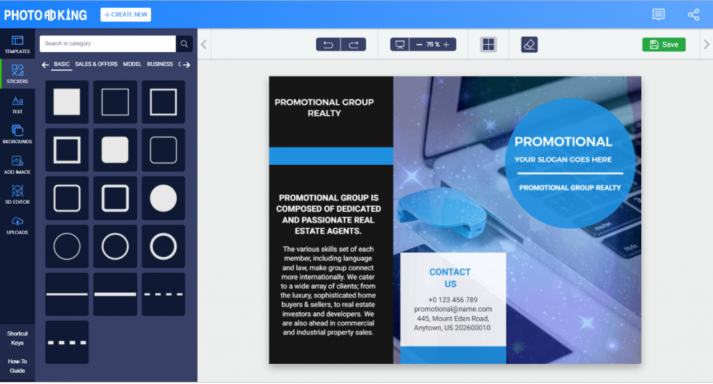
Shapes as a design component are used to add interest to a piece of art. They can help redefine the text structure. You can use it frequently to emphasize a particular portion of the page. Browse in rectangles, ovals, squares, and circles to entail abstract stories. Take the help of it to intend users to focus on different areas of interest.
Catch Your Audience Straight
You can approach it differently with your fellow audience. Direct communication is statutory to promote your brand. While you can also speak it off indirectly like: Contact us to know more. Your brochure design should convey the right message. Make use of organic keywords which any reader would call for.
Cook it Interesting
Awesomeness is to be felt in your advertising material. Many businesses worldwide invest in brochures, but do all of them get noticed? You need to be unique in representation; engagement is the key, and design alone doesn’t make it interesting. Try to make use of graphics along with the text that goes well together. Come up with something vivacious that is talked about.
Take Charge of Integrity
Honesty is what counts when it comes to establishing a brand and being preoccupied in consumers’ minds. Try to earn trust from your customers; now the question arises HOW? Ensure quality through your service, Validate whether their needs are fulfilled; making it easy to cultivate integrity. Work on brand consistency and possess strong moral importance.
Less is More
Just when you are presenting your material to an unknown audience. Make sure you keep it simple in every aspect. Overdoing it can sometimes track to messy and indecisive opinions. Remember simplistic design with the least content volume always looks simplified and provides ease to read. Avoid your brochure’s illusion like a confusing jumble.
Play On with Typography Styles
Typography refers to the craft of arranging content type. A well-structured content always pays off with a mass of engagement. Good typography allows focussing on the context instead of focusing on poor mechanics. By trying on different typography styles you can add drama to the printed matter and make it look more visually appealing.
Emphasize Where Needed
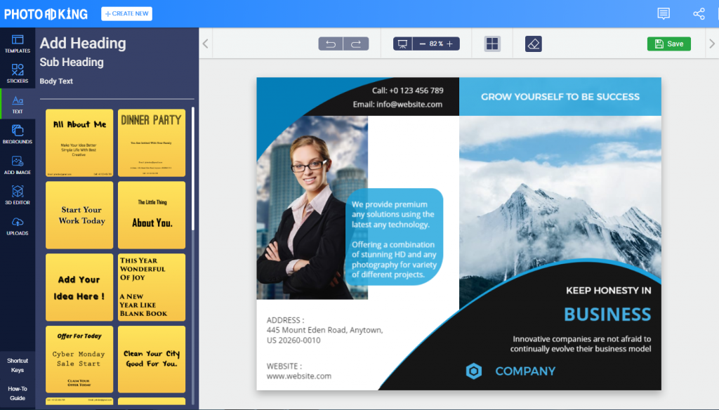
Firstly, try to determine the actual purpose of your brochure. Having a particular purpose can be more effective than having a generalized brochure. Emphasize what makes your business unique. Highlight your headline with different color usage or bolder font envisage. Reiterate call-to-action phrases to remind actions of purchase. Make your text bold to get it noticed.
Bring Impact with Stickers
The most vital sticker in use is when you introduce a sale or a certain amount of discount on any purchase. You might have come across some funky stickers on advertising materials. That is all available, readymade, and you just have to pin it based on marketing specs. Replace the text with a sticker to add impact to your brochure design. Stickers are not just decorative — they can serve as powerful marketing tools that increase brand awareness with sticker printing and leave a lasting impression on your audience.
Walk Parallel to Your Brand
If you have just started your brand, initially consider planning your marketing process. First, you can get a customized logo built and all of your branding stuff for offline marketing. Then once your business takes off, plan out a promotional strategy via brochures for your brand product. Continuous brochure marketing will bear fruit one day.
Keep it All Balanced
As we revolve around the color scheme it becomes crucial that we also talk about what proportion of color in your business brochure design is healthy and how much will seem overdone. If your background color theme is high then lower the tone of graphics and text aspects to colonize.
Pinch in a 3D Perspective
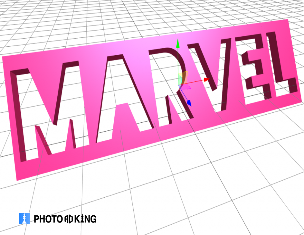
Keeping up with the trend never goes wrong. Brochures have now entered with a 3D approach. Possibly you have to grab a 3D brochure template to add up for a different perspective of vision. Make it customized all by yourself within mere minutes which is of great visionary experience.
Represent Worthy to Lay Money on
Now, why do you have to be worthy enough? Your business brochure determines for a reason and that causes the ground to entrust money in you. Would it be real to your customers who credited faith in you don’t perceive the service beyond their expectations? Take a stand on this consideration today.
Charge Up Through Suitable Images
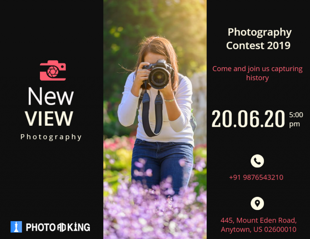
A practical survey reveals that the chances of people taking a brochure in hand for reading purposes are lesser than those for taking a glance over the graphics. A single glance can change minds, recognize brands, and whatnot. Any leaflet template would furnish you with enough graphics supporting the type. Replace text with graphics to increase legibility.
Tell a True Story
It’s not the text or designs you a layout that matters, a story outlined prospers the deeds. On top of that, if you are detailing your product, you need to make sure it is filthy to drive trust within. Create strong loyalty to let your customers feel invested in your brand. Know your audience, put it well. Seek out good stories that will never lie.
Address Your Audience Well
Firstly analyze your audience type, who would be willing to take your service home. Know what they are expecting from your brand. While representing your brand don’t forget to model the user benefits rather than selling product features. Make use of enough pictures that resonate with your audience.
Settle for Contrasting Colors
Why it gets essential to contrast the colors, is because plain on plain is boring. Meaning if you go light on the background color theme then the text placed upon it should be dark enough to pop out. Use attention-capturing colors for the heading and sub-content. Having a single color favors an ignorant factor in your marketing material.
Rethink Brochure Folds
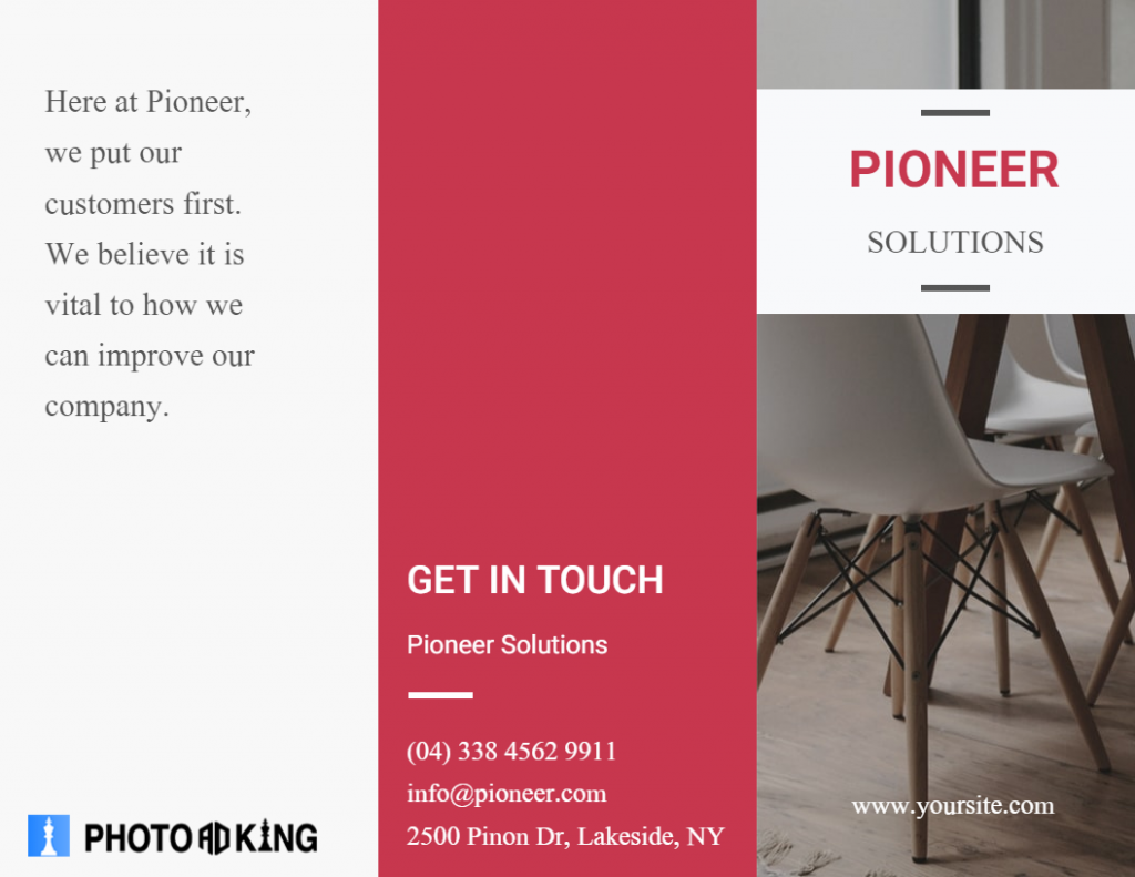
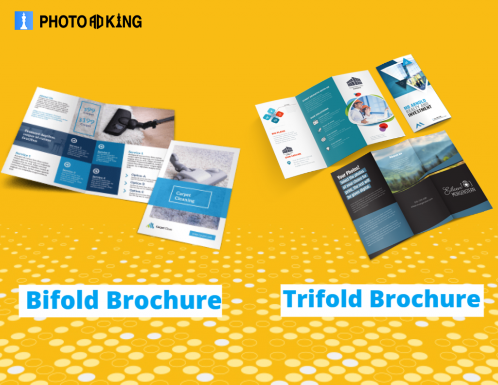
Beyond the content and brochure design ideas consider the brochure itself. Understand what fold you would prefer: a Bi-fold brochure or a Tri-fold brochure. For both folds, the information is divided into respective rectangular sections. Bi-fold usually includes product guides and comparisons. Tri-fold is preferably more compact, easy to read, and comprising of more visuals.
Create Some Interest
Interest can be drawn in several ways. Figure out where you can create a focal point whether it is through design or some text that is catchy and drives a thought of consideration. Usually, a great design is something that draws viewers in. Have a unique typeface that conveys your content. Try to cultivate little suspense in your product theory that gets them to you.
Go Big With Fonts
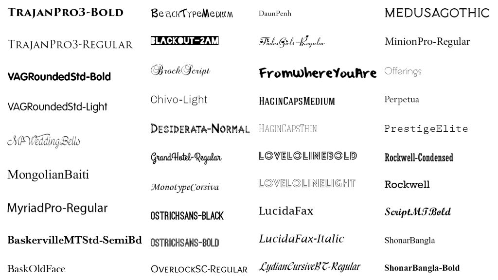
Do I have the need to explain the importance of big fonts? There is no specific law to your choice of fonts in marketing material. You can make use of distinctive ones that matches your brand identity. Bold fonts help catch a peculiar text area at the very first glance. Modern fonts have the purpose to serve a cleaner and neutral look.
Importance of Brochures
Brochure Design Tips
Best Brochure Fonts
Brochure Examples
Brochure Background
Brochure Layouts
Brochure Design Ideas
Create Brochure Design Ideas
Standard Brochure Size
Types of Brochures
Master The Art of Belief
This is a matter of concern in order to maintain a strong customer relationship. You need to present what makes the readers believe. When your prospects form little trust in you, they are more likely to buy your service. Develop a buyer persona before crafting a brochure to bring value to clients.
If you are more interested in the design a brochure, we can help to create it in 5 minutes. Just click the highlighted text.


