
Crafting a poster isn’t just about throwing text and images together. From a marketing perspective, a poster can become an effective medium to grab attention and communicate a clear message to your audience and customers. But you need the right techniques to do so. If you aim to elevate your design skills, the steps below can guide you on how to transform poster into a masterpiece.
Creating stunning visuals is easier than ever with the innovative poster maker tool at your disposal. Design, customize, and bring your ideas to life with a user-friendly experience that requires no design skills.
In this blog, we will go through the steps to transform a poster into a masterpiece, and you will get to know what the key points are to keep in mind while making creative posters. let’s dive in.
A Guide to Transform a Poster Into a Masterpiece
Understand Your Target Audience

At its core, a poster is a communicator. But for effective communication, one must first understand who they’re addressing. This process is more intricate than merely identifying a demographic. It delves deep into the intended audience’s psyche, lifestyle, habits, preferences, and emotions.
If you’re designing a poster for an art exhibition targeting connoisseurs, your approach will differ significantly from that of a music concert aimed at teenagers. The former might appreciate subtlety, sophistication, and perhaps even abstractness. They’ll value rich textures and thoughtful typography. They may even enjoy deciphering hidden symbolism or metaphors. On the other hand, the latter group would resonate more with energy, vibrancy, boldness, and directness.
So, you must know your audience first. Conduct surveys, hold focus group discussions, or simply observe and interact with potential viewers. For instance, if your audience comprises fitness enthusiasts, visit gyms or health clubs. Understand their motivations, their challenges, and their aspirations. By immersing yourself in their world, you grasp what visuals might appeal to them and discern the deeper messages that will strike a chord.
Choosing The Right Design Software

In the intricate art of poster creation, selecting the right design software is fundamental. Think of this platform as your digital photo canvas—a space where your creative poster ideas come alive. While many tools make alluring promises, it’s crucial to opt for a platform tailored to the unique intricacies of poster design.
But you might be one of those who fret over the daunting emptiness of a blank canvas. If that’s the case, then the true power lies in customizable templates. Instead of starting from scratch, imagine being handed a professionally designed blueprint, ready to adapt and evolve.
For those seeking a blend of expert design and personal touch, PhotoADKing’s poster templates offer an array of templates, ensuring your poster starts on a strong note and ends as a masterpiece. Utilizing templates not only streamlines your design process but also imbues your work with professional flair right from inception.
Choose A Focal Point

The human eye is a wanderer. Hence, creating a magnetic focal point is necessary—a dominating element that immediately captures attention. This focal point serves as an anchor, drawing the viewer in and guiding them through the rest of the design. But how does one decide on this critical element?
Begin by determining the single most critical message or emotion you want to convey. If you’re advertising a summer sale, the focal point might be a vibrant sun, signifying warmth and discounts. For a charity event, it could be an evocative image of the cause you’re supporting. It may be children, animals, or nature.
Once chosen, your focal point shouldn’t just be placed haphazardly. Consider its positioning using principles like the Rule of Thirds. This principle, borrowed from photography, suggests that an image can be divided into nine equal segments by two vertical and two horizontal lines.
The critical elements of your poster should then be placed along these lines or at their intersections. The result? A balanced, harmonious design where the focal point reigns supreme, guiding the viewer’s gaze and emotions in the desired direction
Harness The Power Of Colors
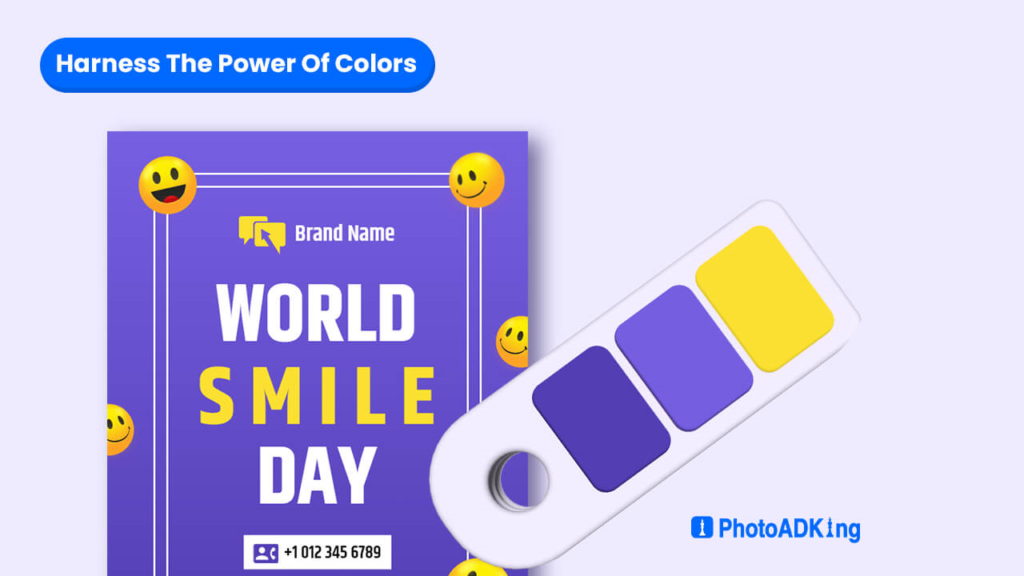
Colors possess an intrinsic ability to evoke emotions, memories, and perceptions. This isn’t merely an artistic sentiment. It’s rooted in psychology. Brands across the globe spend extensive resources understanding color psychology to employ it effectively in their marketing materials. Your poster should be no exception.
Consider the feelings you aim to evoke. Do you want the audience to feel serene and peaceful or energetic and motivated? For instance, blues and greens often instill feelings of calmness and trust. In contrast, reds and yellows are vivacious, dynamic, and full of life—this triggers feelings of urgency, excitement, or sometimes even caution.
You should also consider color combinations. Harmonious color combinations can create a pleasing visual rhythm, making your poster visually cohesive. On the flip side, contrasting colors can be used strategically to make specific elements pop and capture attention.
Plus, don’t just limit yourself to popular color associations. Break conventions when necessary. For example, if you want your eco-friendly initiative to scream for attention, maybe electric blues and fiery oranges will serve you better than earthy greens and browns.
Incorporate Effective Imagery
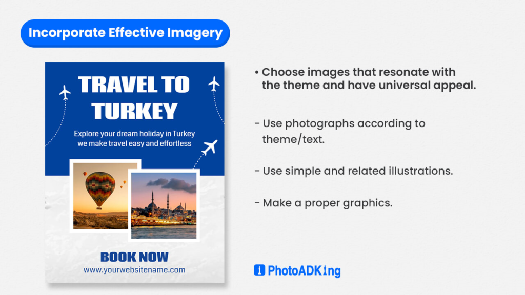
This age-old adage holds especially true for posters. The visual elements, be they photographs, illustrations, or graphics, form the crux of your poster’s appeal.
Choose images that resonate with the theme and have universal appeal. A poster for a travel agency might showcase a pristine beach or a snowy mountain peak—images that instantly evoke wanderlust in most viewers.
Remember that when selecting or creating images, ensure they are of high resolution. Grainy or pixelated visuals can detract from the poster’s appeal, making it less appealing. The image quality directly correlates to the perceived quality of what you’re promoting.
However, the magic often lies in the details. Incorporating layers, shadows, and gradients can add depth, making your images jump off the page. Combining multiple images or playing with photo manipulations can result in a unique visual narrative that sets your poster apart.
Remember, the goal is not just to create an appealing poster but to have an image that beautifully tells your story.
Prioritize Typography
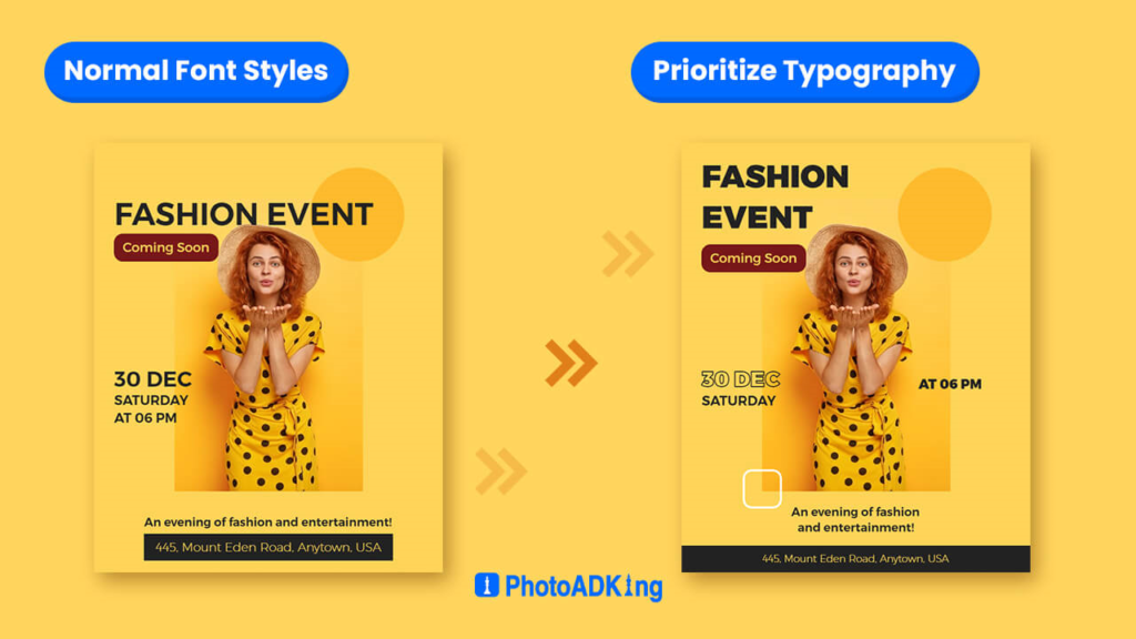
Transitioning from the captivating realm of imagery to the realm of silent yet compelling communication, typography stands as a cornerstone in design. Amidst the artistry of poster design with your message, fonts emerge as indispensable tools for encapsulating the very essence of character, tone, and mood within your visual narrative.
For instance, a poster announcing a rock concert will lose its essence if rendered in a delicate cursive font. Similarly, a calligraphy exhibition would seem out of touch if its details were presented in bold, blocky letters.
Selecting the right font requires introspection. Understand the soul of the event or message you’re promoting. Next, sift through fonts to find those that resonate with that essence. However, clarity should never be compromised. Your font should be readable from a distance, guaranteeing that your poster’s message is accessible to all.
You can also play with font sizes, weights (bold, regular, and light), and styles (italic, uppercase, and lowercase). Experiment with letter spacing (kerning) and line spacing (leading) to ensure that the text doesn’t feel cramped or disjointed. When used strategically, these tweaks can lead to typography that doesn’t just speak but sings.
Engage With Composition And Layout
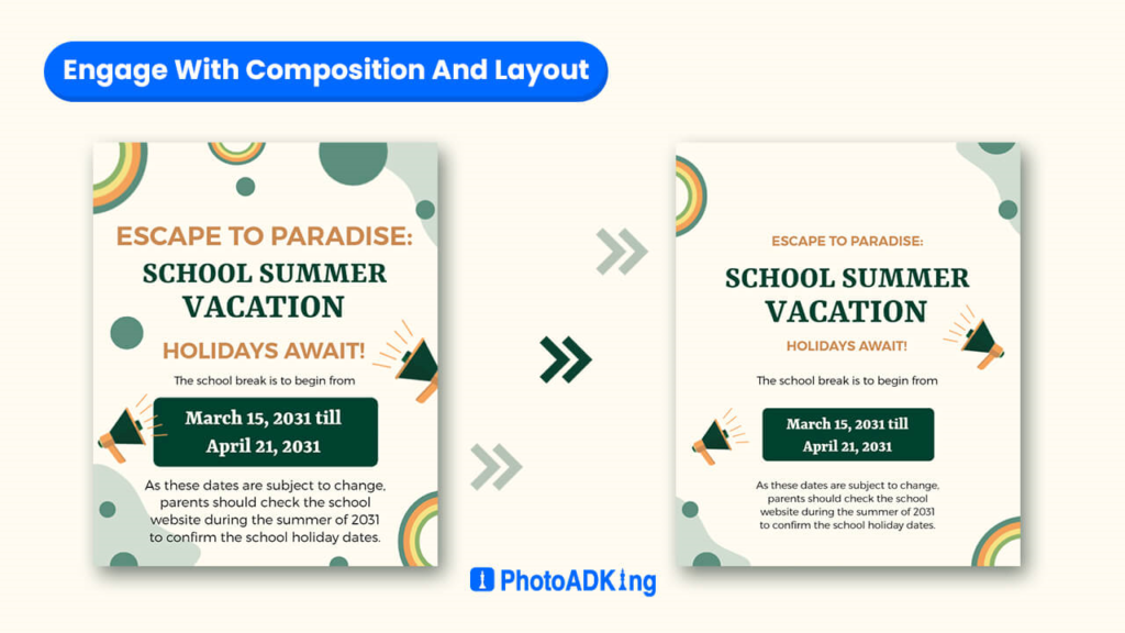
Every element in a poster—be it text, image, or whitespace—holds the viewer’s gaze in a visual ballet. The composition and layout of these elements guide where the viewer’s eyes dance next.
You must take note that whitespaces, or negative spaces, aren’t merely empty spaces. It provides room for the viewer’s eyes to rest, ensuring the poster doesn’t feel cluttered.
Plus, be mindful of your poster’s flow. Guide the viewer’s eyes in a Z-pattern. Start from the top left, move horizontally to the top right, then diagonally to the bottom left, and finally horizontally to the bottom right.
Alternatively, use an F-pattern. Begin at the top left, move horizontally to the top right, then down, and move horizontally again. These patterns mimic natural reading habits, ensuring ease of information consumption.
Users often start reading horizontally across the top of the text area.
Invoke Emotion With Effects And Filters
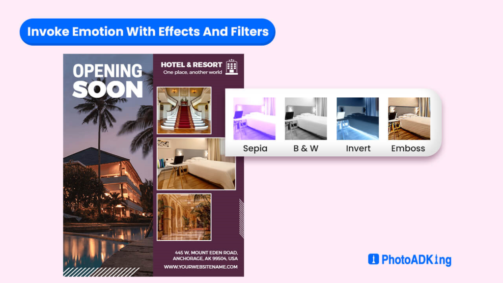
While the raw materials—your images, colors, and typography—are integral, the finishing touches often lie in the subtle enhancements you can apply. Filters and effects can dramatically shift the mood of your poster, adding layers of depth to your narrative.
Consider the difference between a photograph presented in stark black and white and one bathed in warm sepia tones. The former might evoke sentiments of nostalgia or melancholy, while the latter might summon feelings of warmth, comfort, or antiquity.
Remember that effects and filters should enhance, not dominate. Overusing filters can undermine the primary message or make the poster look over-processed. The key is subtlety. If you’re promoting a vintage event, a slight grain or distressed texture might give the poster an aged look, transporting viewers to a bygone era. If it’s a summer event, gentle sun flares or a light gradient can infuse the poster with warmth.
Cultivate Consistency With Branding Elements
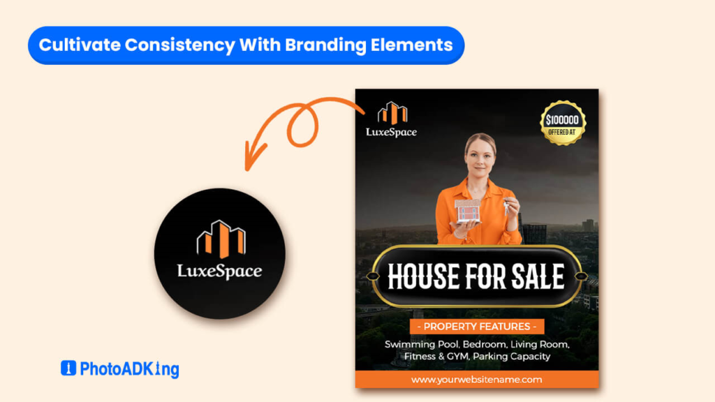
One might argue that a poster, at its core, is a standalone piece. However, the most effective posters are often those that echo a brand’s essence. They resonate with a frequency familiar to those who have encountered the brand elsewhere.
Start with your brand’s color palette. Make sure that the colors you use on your poster are in harmony with your brand’s established colors. This consistency breeds recognition and trust.
Next is typography. If your brand consistently uses a particular font or set of fonts, incorporating them on your poster can serve as a nod to that consistency. Keep in mind that fonts may carry your brand’s personality. A playful brand might employ a whimsical font, while a luxury brand might lean towards something more refined and elegant.
Lastly, think of logos and other brand identifiers. A poster for an event sponsored by your brand or directly hosted by your brand should subtly showcase the brand’s logo. You could also place your logo prominently, depending on the purpose of your poster.
It’s not just about brand visibility but about echoing a familiar symbol that resonates with the audience. This will remind viewers that the quality, values, or emotions they associate with a brand are seamlessly stitched into the poster in front of them.
I hope you’ve taken the time to go through the steps to transform poster into a masterpiece. By following these guidelines, you’ll find that the process becomes remarkably more manageable and enjoyable.
Recommended Blogs
How To Design A Poster Online With PhotoADKing
The Different Types of Posters
Common Poster Design Mistakes Made By Non-Designers
Best PosterMyWall Alternative
10 Tips For Poster Promotion In This Year
Minimalist Poster Ideas and How to Make Them
Guide For Designing Flyers And Posters
Flyer vs Poster
Patriot Day Poster Ideas
Standard Poster Size and Poster Dimensions: A Complete Guide
Wrapping Up
Designing a standout poster is a blend of aesthetics and purpose. From understanding your audience to consistent branding, every detail contributes to its story. A masterful poster doesn’t just capture attention—it speaks to the heart and mind. As you create a design, make sure each element harmoniously conveys your intended message, Now it’s your turn to transform poster into a masterpiece from a mere visual to a memorable one.
FAQs
Absolutely! Whether it’s a business poster, an event promotion, or a personal project, these steps can be applied to enhance any type of poster.
Color selection is vital, as it sets the mood and emotion of your poster. Choose colors that align with your message and resonate with your audience.
Negative space creates visual balance and prevents overcrowding. It allows the viewer’s eye to focus on essential elements.