A solid digital presence is essential for any business that wants to succeed in today’s competitive market. And one of the most critical aspects of digital marketing is making sure that your flyer design is on point.
After all, your flyers are often the first thing that potential customers will see, and they’re likely to be overlooked or disregarded if they’re not well-designed. And so, you must check all the flyer design inspiration ideas that will help you create flyers online.
This post brings your proven 12 flyer design inspiration ideas to boost your creativity.
12 Flyer Design Inspiration Ideas
Like most business owners, you know that advertising is essential to your success. But what form of advertising should you use? Flyers are an excellent option for businesses of all sizes. To create an effective flyer design, you need to develop some inspiring flyer design ideas. Use the following tips to get started.
Brand Colors
Your brand colors are an essential part of your overall branding strategy, and they help create a cohesive look for your business and can be used to significant effect in your flyer design.
When choosing colors for your flyer design, consider using your brand colors as a starting point, and this will help create a more unified and recognizable look for your business. If you’re unsure about your brand colors, look at your website or marketing materials. You should also consult with a professional designer who can help you choose the right colors for your needs.
Once you’ve decided on your brand colors, use them throughout your flyer design. Use them for the background, text, and images. You can also highlight important information, such as your contact information or call to action.
Use Different Fonts
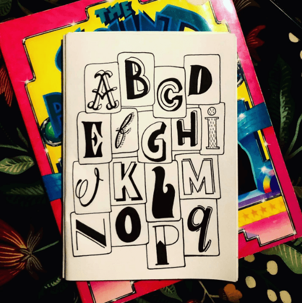
However, there are a few things to keep in mind when using multiple fonts. To begin with, make sure the fonts you choose complement each other, and you don’t want them to clash or be too difficult to read. Second, use different font sizes and styles (bold, italic, etc.) to create hierarchy and emphasis. This will help ensure that your message is clear and easy to understand.
Finally, don’t go overboard with the number of fonts you use. Two or three should be enough to give your flyer design some variety, and any more than that, it will start to look cluttered and messy.
Use Icons
Icons are a great way to add visual interest to your flyer design and help represent different services or products. However, use them sparingly, as too many icons can be confusing and overwhelming. Choose simple, easily recognizable icons that will appeal to your target audience. Place them in strategic locations on your flyer, so they are easy to see and understand.
Custom Illustration Using Icons
Custom illustrations are a great way to add personality and style to your flyer design. By using icons, you can also easily create a unique and stylish illustration. Here are some following flyer design tips for your inspiration:
1. Choose the Appropriate Icons
When choosing icons for your illustration, it is essential to select those representing the message you want to convey. For example, if you are creating a flyer for a business event, you may want to use icons that represent different aspects of the event (such as the date, location, or theme).

2. Create a Color Scheme
Once you have chosen the icons you want to use, you need to create a color scheme for your illustration. This will help to ensure that your illustration looks cohesive and professional.

3. Use Different Sizes and Shapes
When creating your illustration, it is essential to use a variety of sizes and shapes for your icons, which will help create depth and interest in your design. Additionally, consider a flyer size as it’s an important part of your marketing strategy. Choosing the wrong size will highly impact the advertising and overall look of your flyer.
4. Add Text
To complete your illustration, you may want to add some text, this can explain what the illustration is about or provide additional information about the event.
Use Interesting Design Elements
When designing a flyer that will stand out and grab attention, you need to use interesting design elements. Boring flyers just don’t cut it anymore – people are used to seeing them everywhere, and they will tune them out. But if you can make your flyer stand out with some unique design elements, you’ll have a much better chance of getting noticed.
Use Unique Imagery
Designing a flyer that is eye-catching and informative can be a good flyer design inspiration idea. However, using unique imagery in your flyer design can help to boost your advertising strategy.
Consider using images that are relevant to your product or service and that will grab the attention of your target audience. Also, be sure to use clear and concise text to convey your message.
With a bit of creativity, you can design a flyer that will get noticed. So, don’t be afraid to experiment with different images and layouts until you find something that works for you.
Use Semi-Transparent Shapes
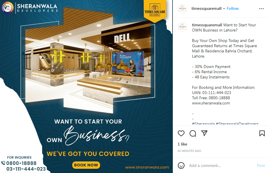
One great way to make your flyer design stand out is to use semi-transparent shapes, and this technique can make your text pop out from the background and grab attention.
To use this technique, create a shape in your design software of choice and set the transparency to around 50%. Then, place your text on top of the shape, and the result will be an eye-catching design that is sure to grab attention.
So if you’re looking for some inspiration for your next flyer design, consider using semi-transparent shapes, and it’s a great way to make your flyer stand out.
Include a QR Code
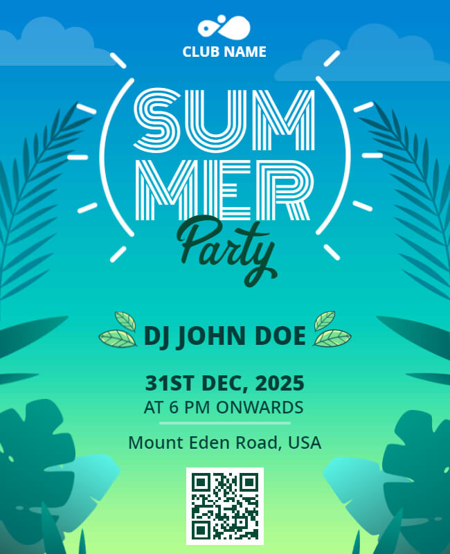
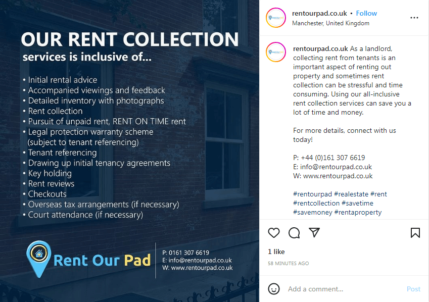
Including a QR code in your flyer design is a great way to encourage readers to take action. By including a QR code, you can provide readers with quick and easy access to additional information about your product or service.
Additionally, QR codes can direct readers to your website or social media page. Including a QR code in your flyer design is easy to increase reader engagement and boost your advertising strategy. Moreover, consider these QR code flyer examples that provide QR code flyers for every business.

Grid Layout
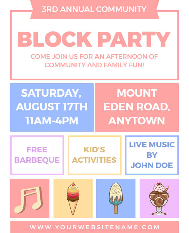
A grid layout is a great way to showcase multiple products in your flyer design. Using a grid, you can ensure that all products are evenly spaced and that each product has its distinct area. This will also make it easy for customers to scan the flyer and see all your products.
When using a grid layout, it is essential to use contrasting colors for each product. This will help make each product stand out and make it easier for customers to find the product they are looking for. You can also use different fonts for each product, which will help to create a more cohesive look.
Design an Amazing Header
Your header is the first thing people see when they come to your flyer. If it’s not eye-catching, they may keep scrolling. But if it’s creative and attention-grabbing, you’ll have their full attention.
To design a header that stops people in their tracks, start thinking about what you want your flyer to accomplish. What are you trying to promote? What feeling do you want to leave people with? Answering these questions will help you choose the right image and words for your header.
Once you know what you want to say, it’s time to get creative. Don’t be afraid to experiment with different fonts, colors, and shapes. And most importantly, make sure your header is easy to read, and that you want people to be able to understand your message at a glance.
Picture of Your Product as the Background

Designing a flyer that stands out can be tough, especially if you’re unsure where to start. One way to make your flyer pop is to use a picture of your product as the background image, and this will help draw attention to your flyer and make it more memorable.
If you’re not sure how to incorporate a product photo into your flyer design, check out these inspirational ideas:
1. Use a close-up photo for an eye-catching effect.
2. Get creative with angles and perspectives.
3. Use props or staging to add interest.
4. Think outside the traditional product shot for something unique.
5. Use color filters or effects to make your photo stand out.
You can use a product photo as the perfect background for your next flyer design with a bit of creativity. So get started and see what you can come up with!
Collage-like Flyer Design
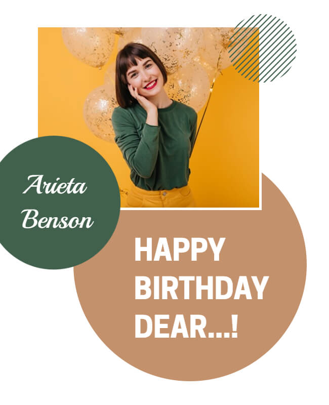
When it comes to flyer design, there are endless possibilities. Try incorporating a few photos into the design to make your flyers stand out. This will create a collage-like effect that is sure to grab attention. Plus, it’s a great way to show off multiple products or services at once. Just be sure to use high-quality images that are properly sized for your flyer. With a little bit of creativity, you can take your flyers to the next level!
Flyer Design Inspiration and Examples
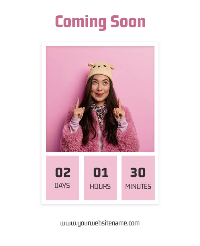
You can find a variety of flyer design examples, from simple text-based to graphics-rich. You can also use them to promote events, businesses, products, and services, and they can include images, logos, and eye-catching typography. A well-designed flyer can grab the reader’s attention and convey important information in a concise and clear manner. Using color, contrast, and imagery, a well-designed flyer can effectively convey its message and stand out. Check out the below examples and try them out online:
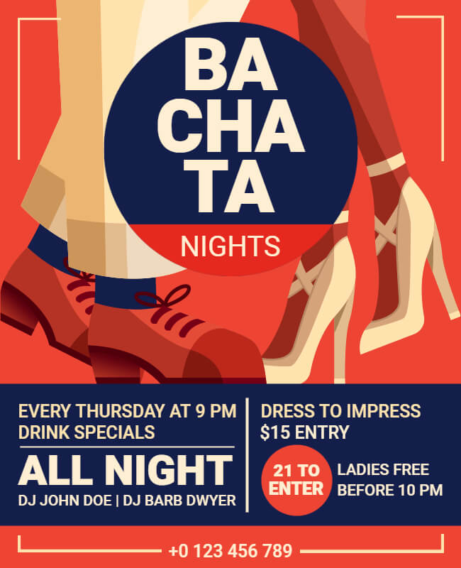
Bold Theme With Bold Text
Flyer With Pastel Shades
QR Code Flyer With Sea Blue Shades
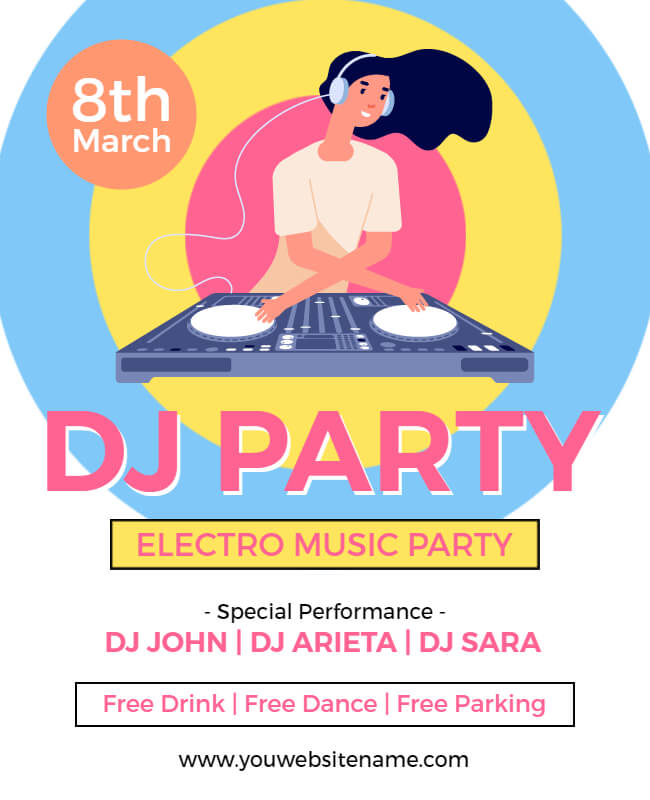
Illustrative Flyer
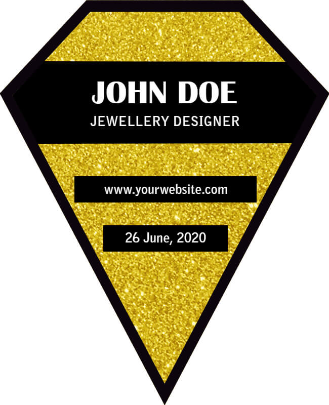
Flyer in Unique Shape
Geometric Get-Together
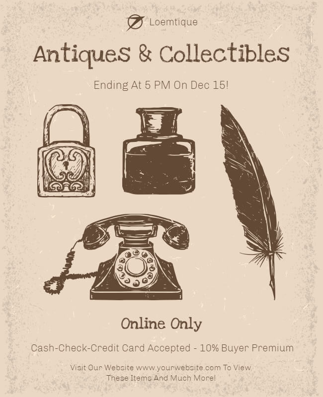
Old but Gold
Minimalist Flyer Example
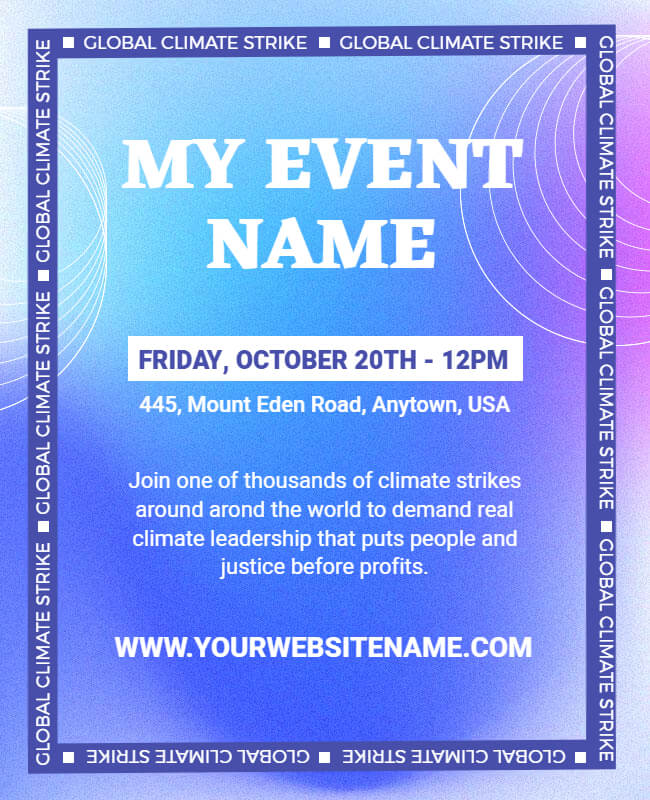
Gradient Shades
Abstract Art
Conclusion
With these flyer design inspiration ideas, you should be well on your way to creating an eye-catching advertisement for your business. Be sure to experiment with different colors and fonts to find what works best for you. You can also use customizable flyer templates to save a lot of time and do not need artistic skills to design them. And most importantly, have fun with it! After all, marketing is about getting your message out there excitingly and engagingly.

