Flyers are an excellent marketing tool for promoting events, products, and services. However, a flyer’s effectiveness depends on several factors, and one of them is the flyer’s background. A well-designed flyer background can grab people’s attention, increase brand recognition, and convey your message more effectively.
In this article, we’ll see the essential elements of flyer backgrounds and provide tips on how to choose the right backgrounds & some common mistakes that are avoided when creating backgrounds for flyers or your next marketing campaign.
1. What is a Flyer Background?
A flyer background is a visual element that serves as the foundation of a flyer design. Also, it can be a solid color, gradient, pattern, texture, or photograph. The choice of background depends on the flyer’s purpose, theme, and message. Moreover, well-designed flyer backgrounds can help catch the viewer’s attention. Also, convey the mood and tone, and guide the viewer’s eye to the most important information.
2. Understanding the Importance of Flyer Background
The background of a flyer sets the tone for the entire design. Also, it can either support or detract from the message you want to convey. Besides, an effective background should complement the text and images. Be visually appealing, and enhance the overall message of the flyer. A well-designed background can make your flyer appear professional, bold, or attractive, and it can help your marketing efforts. Also, want to get more ideas about how to make a flyer that looks attractive so check
3. Creative Samples for Flyer Background
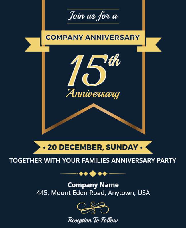
3.1. Solid Color Flyer Background
Creating a solid color flyer background is a simple process. Moreover, choose a color that complements your text and graphics and aligns with the branding. And messaging of your event or promotion.

3.2. Gradient Flyer Background
It can add depth and dimension to your design. Also, it allows you to choose two or more colors and blend them together to create a gradient effect. Moreover, experiment with different color combinations and achieve the desired effect.


3.3. Religious Flyer Background
You will need a high-quality religious image that complements your text and graphics and aligns with the branding and messaging of your event or promotion. Enhance your event with a beautiful church flyer background!

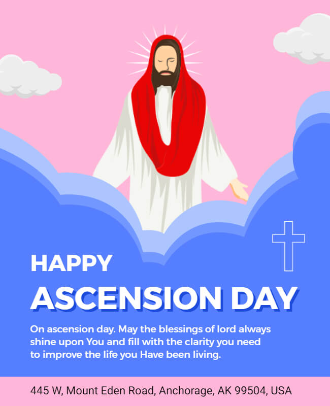
3.4. Pattern Flyer Background
A seamless pattern that complements your text and graphics and aligns with the branding and messaging of your event or promotion. Also, create your own pattern or use a pre-made flyer background design using the flyer maker tool.
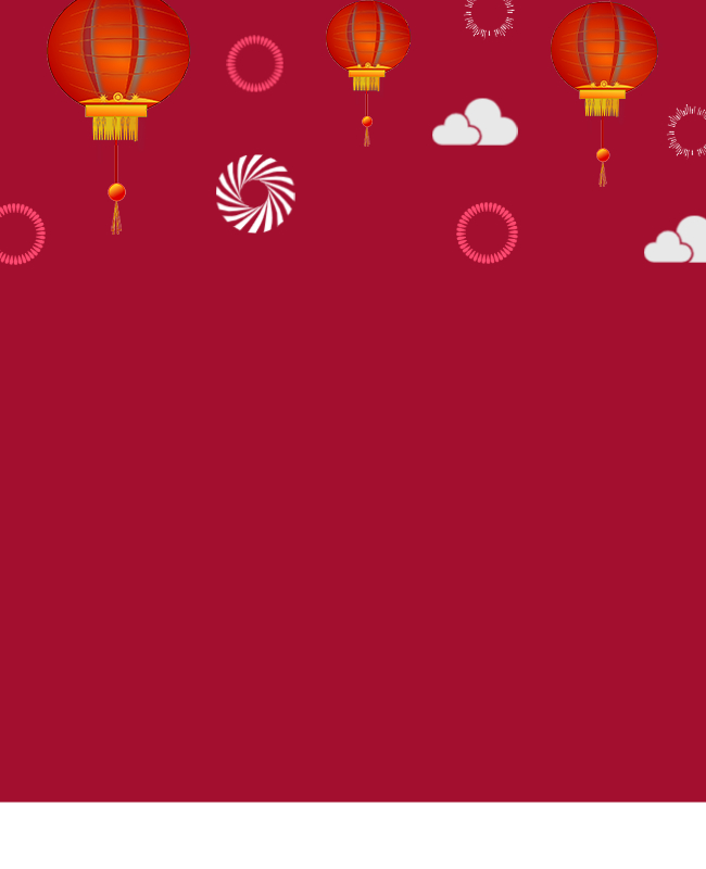

3.5. Textured Flyer Background
The visual or tactile surface is used as the background. Also, this can be achieved by using a photograph of a textured surface. Moreover, a scanned image of a physical texture, or by creating a digital texture using the software.

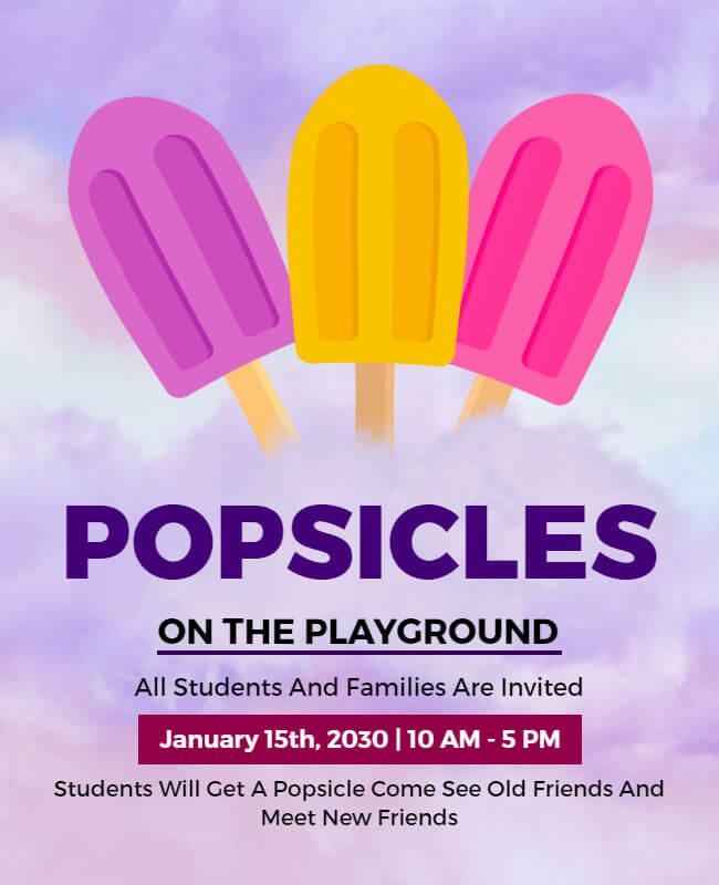
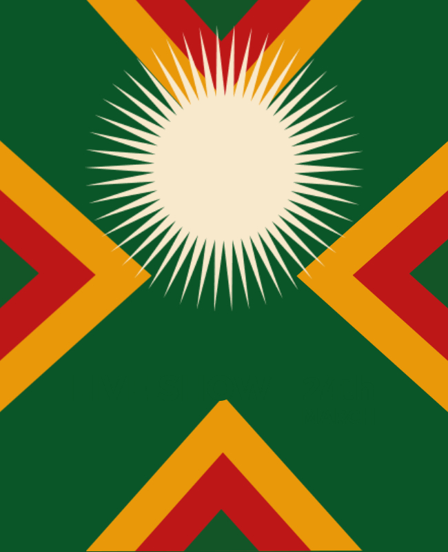
3.6. Abstract Flyer Background
This is a non-representational design and choose a color scheme that complements the overall theme of your flyer. Moreover, use shapes and lines to create an abstract design. Lastly, experiment with layering and transparency to add depth and dimension to your background.
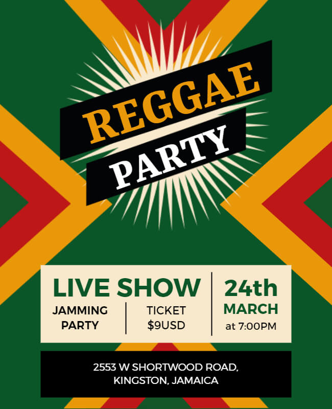
3.7. Sunset Picture Flyer Background Image
This flyer background is a breathtaking blend of warm hues and stunning scenery, perfect for creating a mesmerizing visual impact. Also, with its vibrant colors and serene ambiance, it is sure to capture the attention of anyone who sees it.


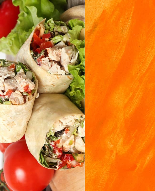
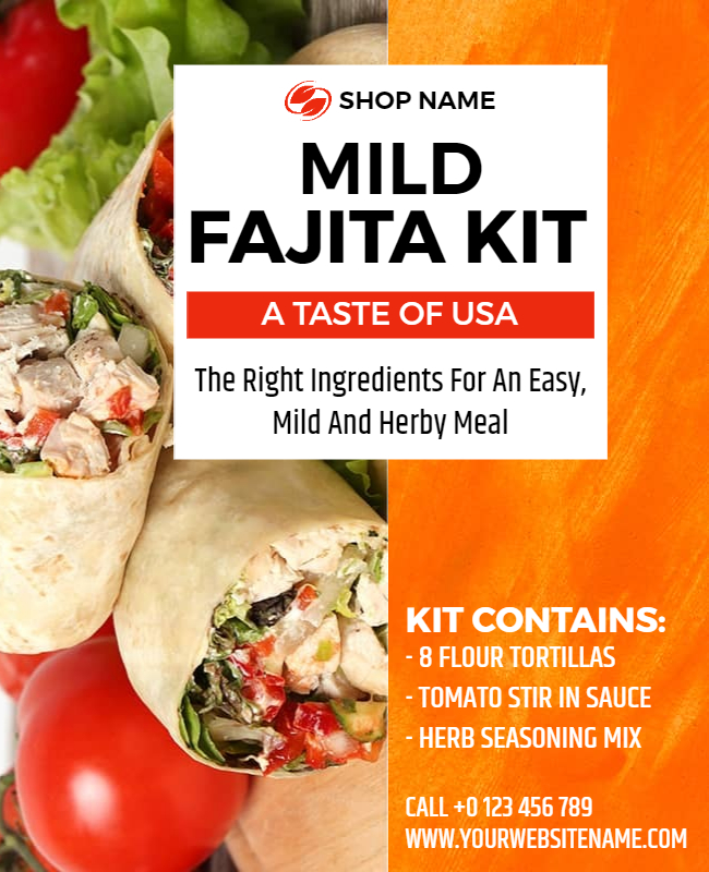
3.8. Tasty Treats Flyer Background Image
A delightful mix of mouth-watering images and colorful designs, ideal for showcasing your culinary creations. Also, its enticing visuals and inviting vibe, it is sure to entice food lovers and create a buzz for your food event.
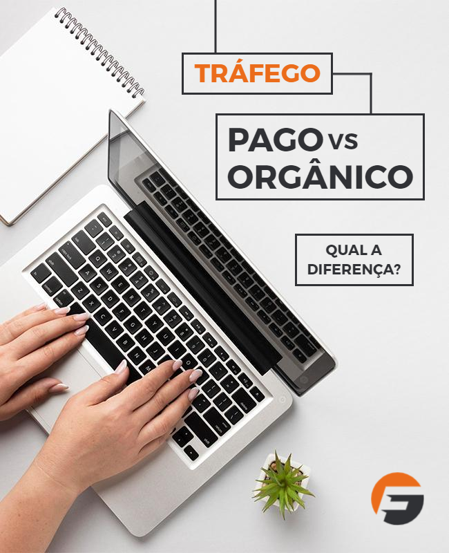
3.9. Minimal Desk Flyer Background Image
It provides a sleek and sophisticated canvas for your event information and graphics. Also, exudes an aura of simplicity and elegance, perfect for creating a modern and chic vibe. With its clean lines and minimalist design. Also, check out this business flyer background to create a more professional flyer.

3.10. Light Purple Flyer Background Image
Creates a dreamy and romantic atmosphere. Besides, with its delicate pastel hues and subtle textures, it provides a gentle backdrop for your event details, perfect for an opening party, or any elegant occasion.


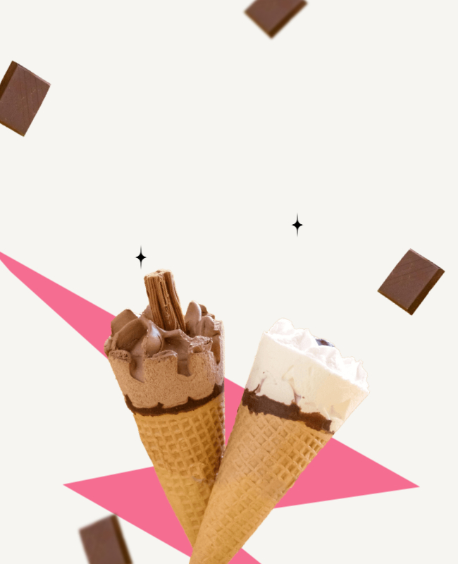
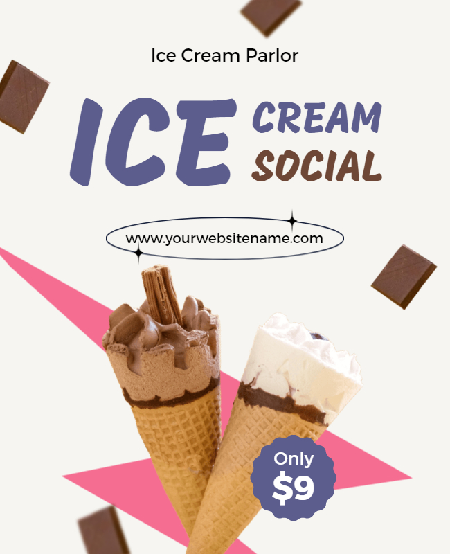
3.11. Ice Cream Flyer Background Image
With its vibrant pastel shades and cute graphics, it provides a fun and whimsical backdrop for promoting your ice cream shop or dessert event. Moreover, the playful and colorful design evokes the nostalgic charm of a classic ice cream parlor.
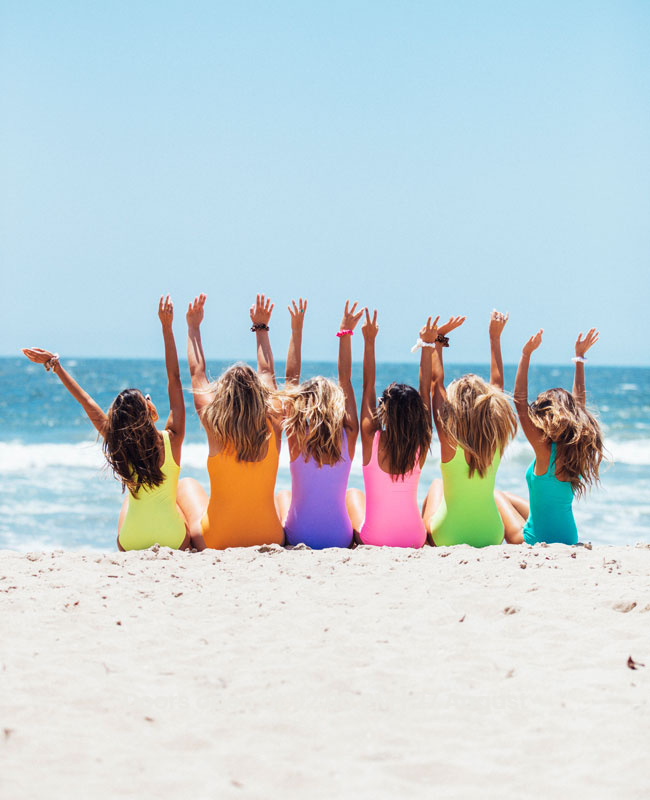
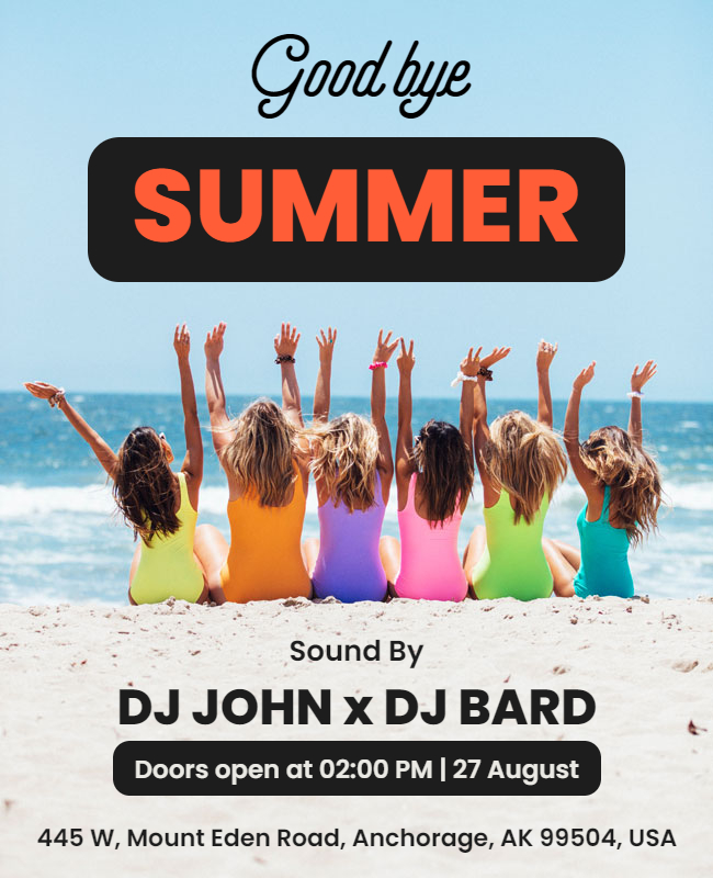
3.12. Summer Flyer Background Image
Bright and cheerful design that captures the essence of the season. Additionally, with its sunny color palette and playful graphics, it exudes a lively and festive vibe, perfect for promoting a summer party, beach event, or any outdoor celebration.
3.13. Contest Flyer Background Image
The contest flyer’s background is a dynamic and eye-catching design that commands attention and generates excitement. With its bold colors and attention-grabbing graphics, it creates a sense of urgency and competition, ideal for promoting a contest, competition, or giveaway event.


3.14. Artistic Splatter Flyer Background Image
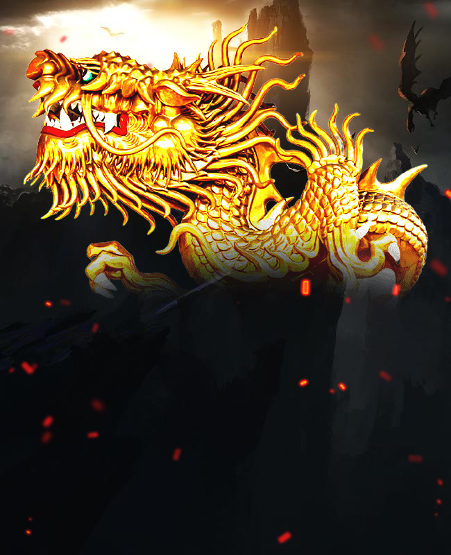
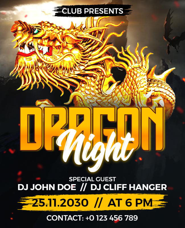
Creative and expressive design that showcases an explosion of colors and textures. Also, it has abstract splatters and brushstrokes. Besides, it creates a bold and artistic statement, perfect for an art exhibit, gallery opening, or any creative event.
3.15. Glittery Flyer Background Image
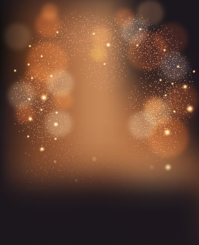
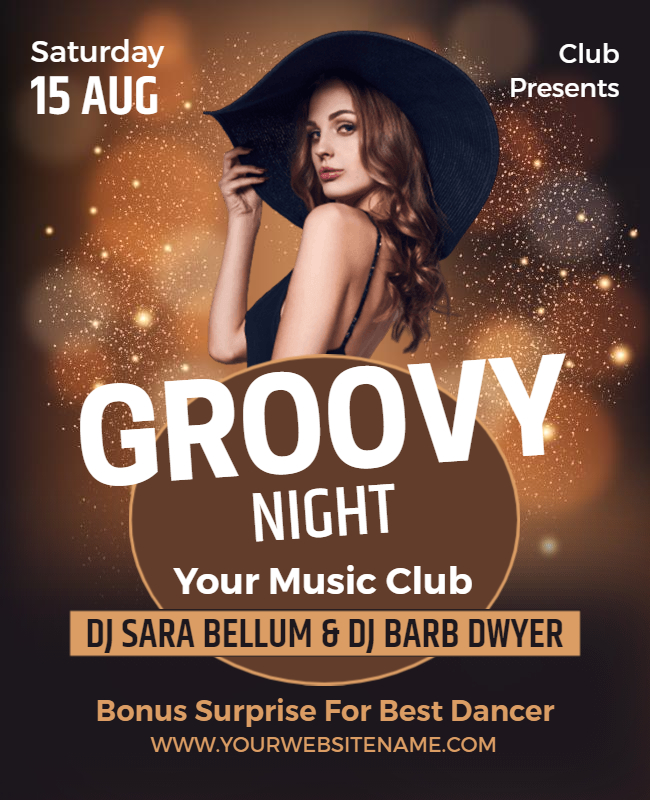
Dazzling and glamorous design that sparkles and shines with every angle. Also, it has a shimmering glitter effect and metallic hues. Besides, it provides a luxurious and high-end look, perfect for a fashion show, or beauty event.
3.16. Festive Fun Flyer Background Image
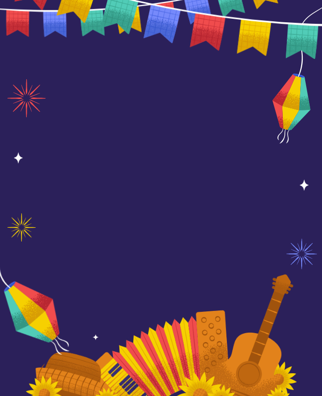
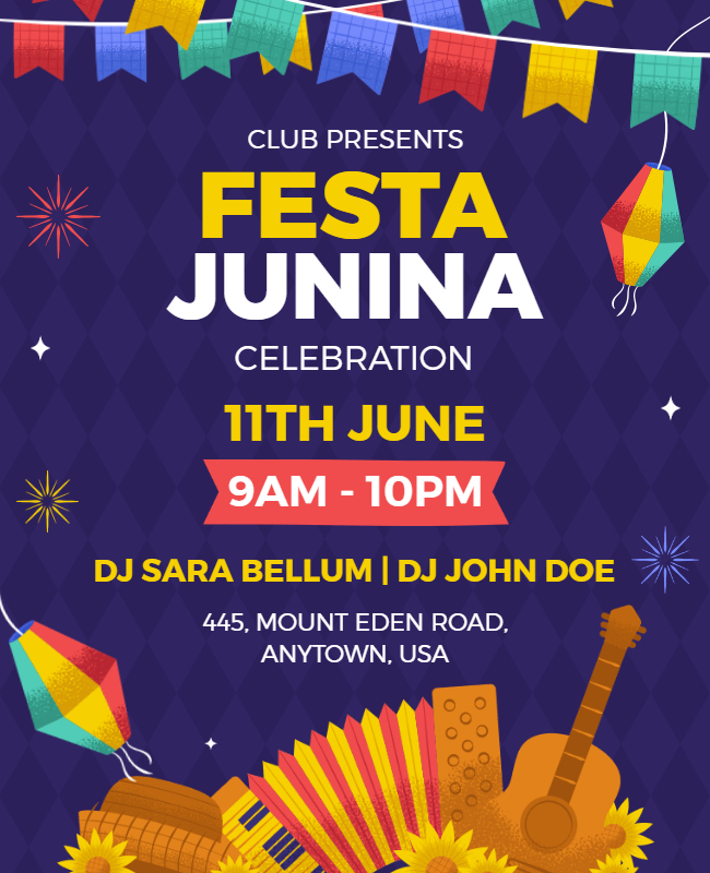
Lively and energetic design that captures the spirit of celebration and joy. With its colorful confetti and playful graphics, it exudes a sense of excitement and fun, perfect for promoting a holiday party, or birthday celebration.
Also Read: Birthday Flyer Background
3.17. Rose Pink Flyer Background Image
To create this background, start by selecting a soft pink color and adding a subtle texture, such as a watercolor effect or a light pattern. Then, consider images of roses or other floral elements to enhance the design and create a romantic and elegant atmosphere. Moreover, check out these Valentine’s day flyer ideas if you want to make them.


3.18. Republic Day Flyer Background Image
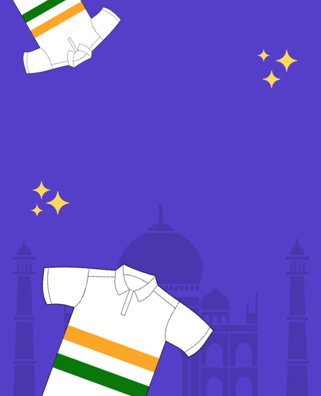
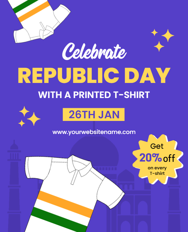
For the Republic Day flyer, use colors that represent the country’s flag, such as green, white, and saffron. Also, add images of national symbols, such as the national flag, the national emblem, or historical monuments.
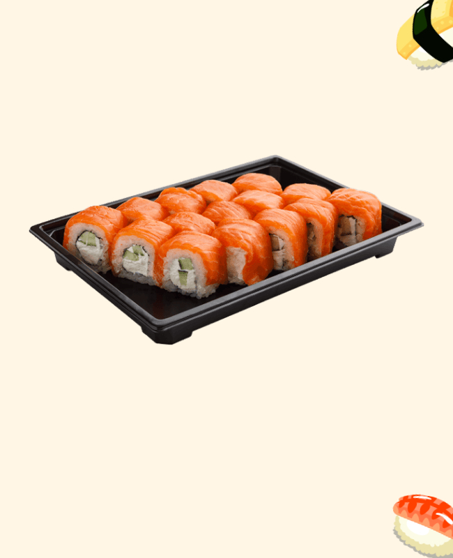
3.19. Sushi Flyer Background Image
A simple color scheme with shades of white, black, and red evokes the traditional Japanese aesthetic. Incorporate images of sushi rolls or other Japanese cuisine. such as chopsticks or soy sauce bottles, to create a visual association with the theme.

3.20. Cooking Demo Flyer Background Image
Use a light and fresh color scheme to evoke the feeling of a clean and modern kitchen. Incorporate images of cooking utensils, ingredients, or a chef in action to create a visual association with the theme. Also, create an inviting and fun atmosphere for your cooking demo event.


Looking for specific content? read Halloween card backgrounds
4. Tips for Choosing an Effective Flyer Background
- Keep it simple: A cluttered background can make it difficult for the reader to focus on the main message of the flyer. Stick to a simple and clean design that complements the content & create a flyer that stands out.
- Use high-quality images: Low-quality images can make your flyer look unprofessional. also, use high-resolution images that are relevant to your message and theme.
- Choose colors that complement your brand: Your background should contrast with the text to make it easy to read. For example, dark text on a light background or light text on a dark background.
- Utilize negative space: Negative space in the content, can be just as important as the content. Also, use negative space to create balance and attention to the main message.
- Make it memorable: Use unique and creative elements in your background design that will leave a lasting impression on the reader.
- Avoid copyrighted images: Make sure any images you use as your background are either royalty-free or that you have the appropriate permissions to use them.
- Test it out: Before finalizing your design, print out a few copies and see how they look in person. Also, this can help you identify any potential issues with the background or text.
Also Read: 10 Basic Flyer Design Principles
5. Common Mistakes to Avoid When Choosing a Flyer Background
- Overusing effects and filters: Overusing effects like gradients, drop shadows, and filters can make your flyers look dated and unprofessional. Also, use these effects sparingly, and make sure they don’t detract from the overall message.
- Overcrowding the background: A background with too many colors, patterns, or images can be overwhelming and distracting. moreover, It can also make it difficult for your message to stand out.
- Using low-quality images: Using blurry or pixelated images can make your flyer look unprofessional and unappealing.
- Ignoring brand consistency: Your flyer should reflect your brand identity. Furthermore, make sure the colors, fonts, and design elements are consistent with your brand to build brand recognition.
Conclusion
In conclusion, selecting the right flyer background is a crucial aspect of designing a successful flyer. Also, creating a visually stunning flyer for your business is a critical aspect of promoting your brand and attracting customers. Besides, a well-designed flyer can successfully capture the attention of potential customers and leave a lasting impression, thus contributing to the growth and success of your business. Also, we have a major collection of flyer templates you can check out if you want to use the predesigned flyer for your business. Lastly, by incorporating these strategies into your flyer design, you can increase the likelihood of it being discovered and engaged with by your desired audience, ultimately leading to a more successful marketing campaign.


