A design is thinking made visible. Graphic designing is beyond putting attractive elements together. You have to work on a few critical things to make it a success. Here PhotoADKing presents a beginner’s guide to flyer and poster design.
You may think that bothering is in vain when incredible flyer templates are at your disposal. What if your marketing goals aren’t defined well? What if template customization goes wrong? Instead of getting into such a mess, why not have some tips & tricks beforehand.
It may be your first attempt, but it doesn’t mean it should appear like a beginner. You can still make for a professional appeal in the first shot itself. Scan this guide & save it in your mind.
Would you like to learn how to design a flyer?
7-Step Guide For Designing Flyer And Poster
1. Do A Lot Of Research
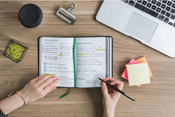
Researches now & never regret it later. Preparing yourself for a graphic design is better than designing something directly. Make your purpose clear & your graphic design will be an easy journey.
For instance, if your poster is being created for an event announcement, the poster templates should look like it. Which visual elements you’ll include? What should be your punch line? How will you verify if it is as expected?
- List out all the essentials for the poster design
- Define the type of images, fonts, and colors you will use
- What type of layout you’ll use & how you will sync the visual elements with the layout?
- What will be the size of your poster? Will you go with the standard size of a poster maker?
Have all these essentials first.
2. Customize the Layout
How to make a template that stands out? Personalize it.
Customizing a graphic design template is a responsibility. You’ll have no one to blame but yourself. It could lead to numerous failed attempts until you’re satisfied.
However, you don’t have a lifetime for customizing your graphic design. So, make sure to do this & make it a hassle-free experience:
Avoid cluttering
A lot of design elements are trending, but you cannot have them all in one template. Limit the number of items you’ll have for this template. Don’t pour all your love into one flyer or poster only. Reserve some interesting stuff for other marketing campaigns instead of cluttering this design.
What to use where?
Your graphic design is not just about images or text individually. That’s why we introduce you to the flyer and poster design guide. It’s a graceful combination of all the visual elements. Where you place your text, how you set images & the way you highlight your contact details is important.
For instance, when designing an event poster, you should know where you’ll place the logo, focus text, image, etc.
You’re now getting clear on how to design a poster, isn’t it?
Pick Layouts carefully
How to design a poster online could be an overwhelming decision for many novices. You probably like all the attractive layouts & often end up with a design with critical details missing. The default template can look wonderful, but hopeless customization ruins it.
Consider these things while picking a layout:
- Will it suit my brand personality?
- Can I include all my details in this layout?
- Will it appear attractive to my target audience?
3. Be Mindful With Fonts
One of the flyer and poster guides is, Follow the golden rule for fonts. Use two fonts per template design. It’s okay to have three if & only if you’re too good at keeping the trio subtle. Alternatively, you may change the font-weight & letter spacing to separate the header & body text. How tricky it is! You just need to know these little things.
4. The Simpler The Better
Achieving the overall clarity of design gets a lot easier when your element preferences are simple. Be it backdrop, fonts, graphics & illustrations, or something else. Keep it as simple as possible. Simplicity eliminates mess automatically & enhances your design efforts. Hitting your marketing goals becomes hassle-free too.
For instance, if we say that the key to the success of your how to design flyer for sale purposes lies in the SALE text setting only, will you believe it? Well, you can drive your target audience crazy with just your brand logo, SALE & % discount. Additional details may include the store address, website & contact details. Nothing else!
5. Let The Colour Palette Be The Show-stealer
When we say colors, we’re not just referring to the template or layout color. We’re talking about the entire color palette of your design. It includes the color tones of:
- Image
- Fonts
- Backdrop
- Shadow
- Brightness
- Border
As long as these hues are in harmony, your design will look stunning. You can either set them as contrasting or monotonous as desired. But, make sure to use stock images only. A complementary color palette contributes a lot to a great-looking design.
6. Consider Usage Too
While using a flyer maker, you should not only look out for go-to templates. Also, see printing & sharing options. After all these designing efforts, a high-quality print file should be downloaded. Also, you may be able to share your graphic design online with your community. Hence, a flyer and poster design guide will help you to make your design the best.
Sharing or printing convenience should not be a problem. So, don’t forget to check on this.
7. Break Rules To Explore
As you have gone through the above-mentioned tips, you must be thinking that there is so much to mind. However, if you are willing to go experimental, do it until you’re not hurting your design. Allow yourself to make mistakes. But, it should be limited before launching your poster or flyer. Consult someone who can guide you on how to make your template design better. If you’re interested in learning more about the differences between flyers and posters in simple terms, you can check out my blog on flyer vs poster.
Also Read: 10 Basic Flyer Design Principles
Want to know more about how to create a poster?
Design your Poster from Scratch with PhotoADKing now and transform your poster into a masterpiece!
Why fear when PhotoADKing is here. We’ll take care of your graphic design with hundreds of posters, flyers, brochures, invitation templates, and more options.
Designing your template from scratch or utilizing our premade templates is a cup of tea for all with PhotoADKing. Do you like a professional with our graphic designing tool?
Signup/Login with PhotoADKing before you start designing, so you can find all your creations in one place. Next, discover the templates in any given category you need. Edit your template with PhotoADKing’s powerful editor. Access tons of graphics, illustrations, typefaces, and more essential resources for outlining your design like a professional. Lastly, save your copy.
After you’ve finished designing, preview it. Get second opinions by sharing them online & then opt for printing.
Final Thoughts
It seems a bright day to revise whatever you’ve learned in this blog. Come, let’s proceed with PhotoADKing & test your knowledge.

