The menu design background is an integral part of the food industry, and it plays a crucial role in shaping a diner’s experience. A well-designed menu not only showcases the restaurant’s offerings but also reflects its personality and brand values. While background menu design may seem like a simple task, it involves much more than just listing dishes and prices. It requires a thoughtful approach that takes into account various factors such as visual aesthetics, typography, layout, and psychology. Restaurant menu templates can provide a helpful starting point for creating a well-designed menu that entices customers to try new dishes, increases sales, and enhances the overall dining experience.
In this article, we’ll explore the fascinating world of menu design background and take a closer look at the elements that make a menu stand out. Whether you’re a restaurant owner, chef, or just someone who appreciates good design, this article will provide valuable insights into the art of menu design background.
Importance of Menu Design Background
Visual Appeal
Having a good background design for your menu is really important because it makes it look nice and grabs people’s attention. An attractive menu design can convey the restaurant’s ambiance and style, enticing customers to try out the dishes.
Branding
The way a menu looks can make a restaurant special by using its logo, colors, and fonts. This can help people remember and recognize the restaurant, making it easier for them to come back again.
Menu Hierarchy
The menu design background can also determine the hierarchy of items on the menu. Properly categorized and arranged menu items can make it easier for customers to find what they’re looking for and streamline the ordering process.
Readability
The menu design background can affect the menu’s readability. When menus are designed with the right fonts, colors, and spacing, it can be easier for customers to read and understand what each dish is about. This makes the dining experience better overall.
Upselling
A menu design background can also be used to upsell certain dishes or promote special offers. Menus can be designed in a way that convinces customers to try new dishes or add extra items to their orders. This can be done by using pictures, buttons, and highlighting popular items in specific places.
Overall, a menu design background is a critical element in the success of any food establishment. A well-designed menu can enhance the overall dining experience, increase sales and reinforce a restaurant’s brand identity. Keeping these restaurant menu tips in mind can result in a menu that is not only visually appealing but also drives customer satisfaction and revenue.
Menu Design Background Trends
Minimalism
Designs with simple and clean layouts, using soft colors and easy-to-read fonts, are becoming more and more popular.
Dark Theme
Dark theme refers to a design choice for the background of menus, typically using dark colors or black to create a sleek and modern aesthetic.
Gradient Backgrounds
Using a gradient background in the menu makes them look 3D and interesting, but still simple. This is good because it doesn’t take away from the food choices on the menu.
Illustrations
Putting drawings or pictures on a menu can make it look more interesting and attractive to customers. It’s like adding a personal style to the menu, making it special and different from others.
Animated Backgrounds
Adding subtle animation to the background can make the menu feel more dynamic and interactive.
Geometric Shapes
Using geometric shapes as a background can create an interesting visual effect and add some texture to the design.
Textured Backgrounds
Textures such as wood, marble, or concrete can add a tactile element to the background and make it feel more realistic.
Color Psychology in Menu Design Background
When creating a menu, the psychological impact of color is crucial in shaping customers’ perceptions of food and drinks. Different colors evoke different emotions and associations and can be used to influence purchasing decisions. Therefore, it’s essential to consider color psychology in a restaurant menu to create a visually appealing and effective marketing tool for a restaurant.
Here are some common color associations that may be useful to consider when designing a menu:
Black
A black background menu design primarily uses black colors for its visual elements and interface. This creates a sleek and elegant look for the menu.
White
A menu design with a white theme mostly features the color white as the main background and for the visual components. It creates a clean and elegant look for the menu.
Orange
A vibrant and energetic color associated with warmth, enthusiasm, and creativity. It’s often used to promote healthy foods or drinks.
Yellow
A cheerful and optimistic color is associated with happiness and positivity. It can also stimulate the appetite and promote feelings of warmth and comfort.
To create an appealing menu, it’s important to choose colors that match your restaurant style, food, and atmosphere. Moreover, considering the emotional associations of different colors can help attract diners. Therefore, creating an effective menu design is crucial for enhancing the overall dining experience.
Examples of Effective Menu Design Background
Black And White Texture Background Menu
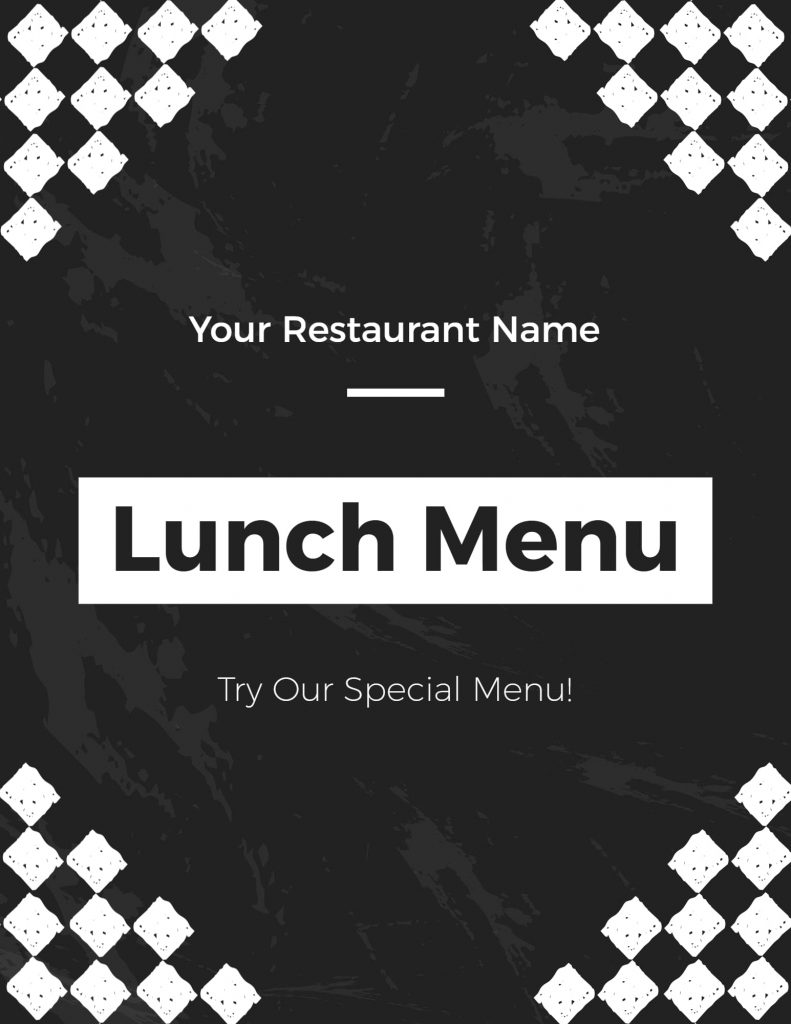
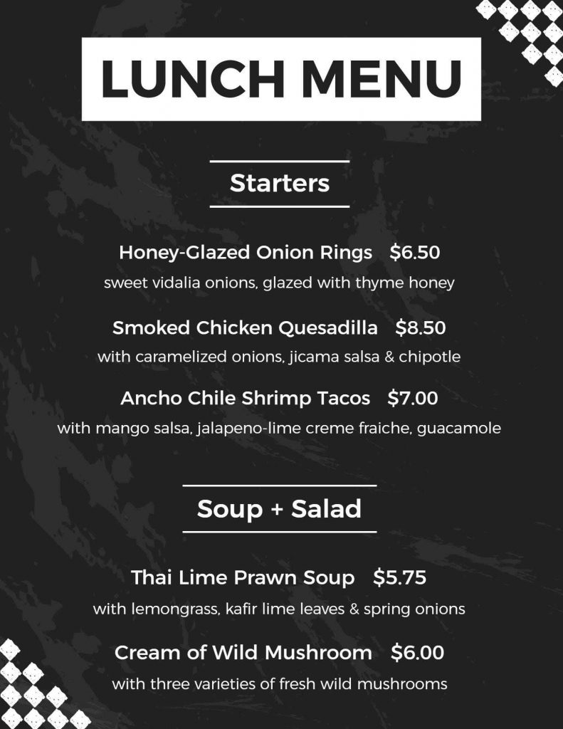
A white and black textured background menu can give a modern and sophisticated look to a restaurant. Adding texture to the menu design and using a black-and-white color scheme creates an interesting, timeless look. Looking at some restaurant menu design examples that have used this style can inspire you to create a similar design for your own establishment.
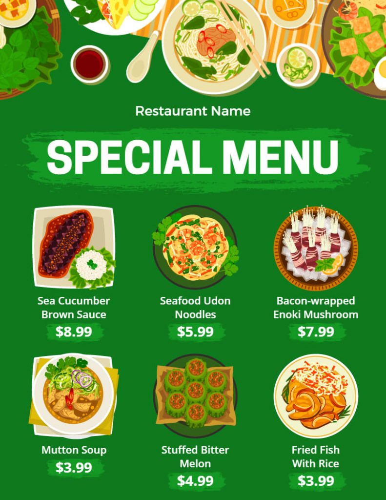
Green Animated Menu Background
A green animated menu background can add a fun and dynamic element to your restaurant menu. The movement and color can help draw attention to certain items and create a lively atmosphere for your customers.
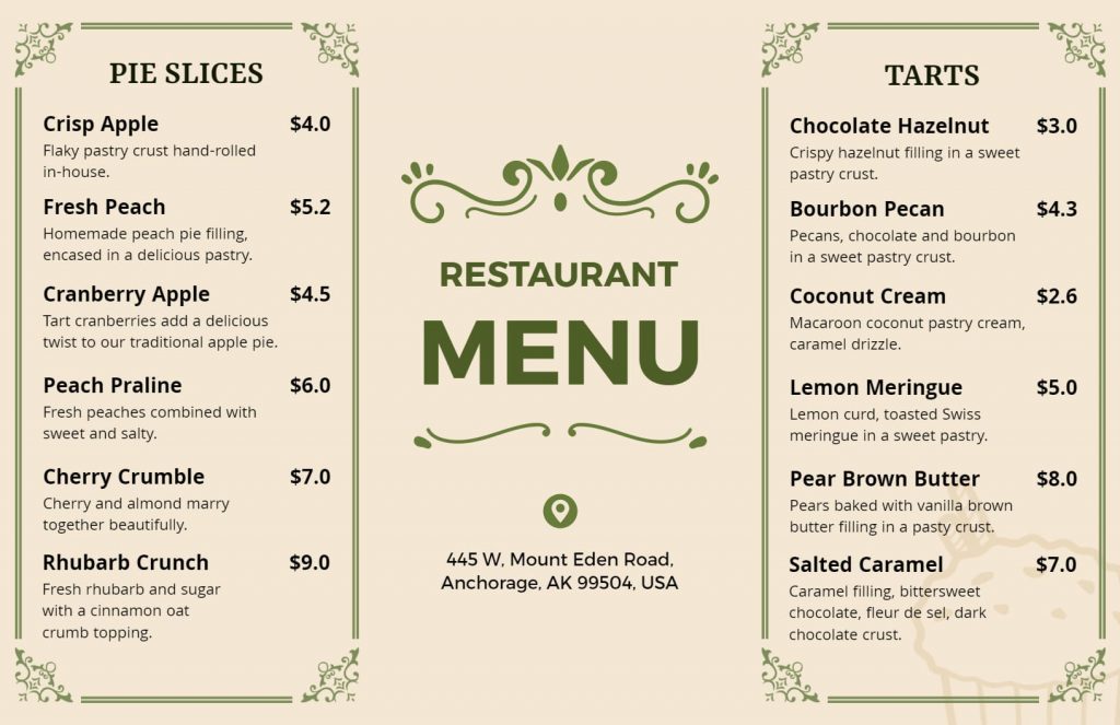
Classic Yellow Illustrative Menu Background
Using a classic yellow background with illustrations on a restaurant menu can make it look attractive and interesting. Moreover, This type of background is good for restaurants that have a traditional or family-style atmosphere.
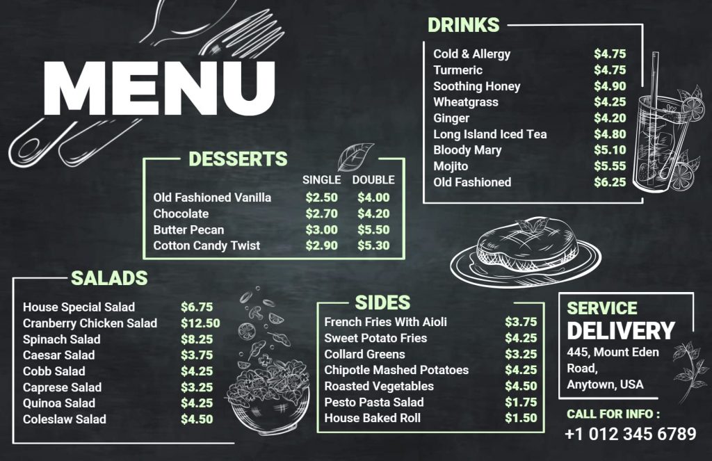
Chalky Black Menu Background
A chalky black menu background can create a modern and trendy feel. It is a great option for restaurants that want to showcase a minimalist and elegant design with a touch of texture. The chalky black texture can provide a sense of sophistication and refinement to the overall design.
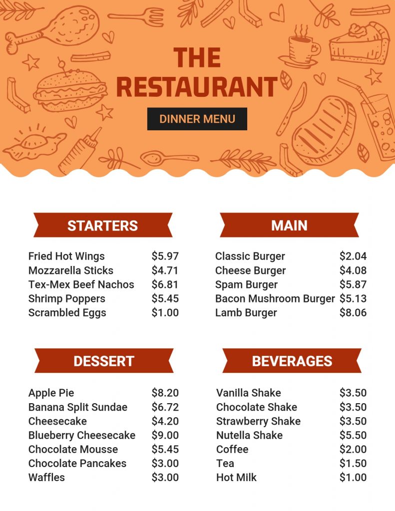
Orange White Minimalist Menu Background
A Minimalist Menu Background that is orange and white usually has a simple and neat design. It mostly uses shades of orange and white colors. This type of background creates a modern and elegant look for a menu design.
Looking for more specific content? read Halloween Card Backgrounds
Conclusion
The menu design background is an important aspect of creating an effective menu that customers will love. The purpose of the menu design background is to set the tone for the dining experience, be easy to read and navigate and showcase the brand. Using a menu maker can also help you create a professional and visually appealing design that fits your restaurant’s brand and style. With a little bit of effort, your menu design can be a standout feature of your restaurant, leaving your customers impressed and coming back for more.


