Are you struggling to find the perfect logo layouts that truly encapsulate your brand’s essence? You’re not alone. Crafting an impactful logo is a common challenge for many business owners and entrepreneurs. The right logo layout is more than just a design; it’s a visual representation of your brand’s identity and values.
Creating an effective logo involves more than choosing pretty colors and stylish fonts. The layout, or the arrangement of elements within your logo, plays a pivotal role in communicating your brand’s message.
With PhotoADKing’s logo maker tool, you can unleash your creativity and design a logo that perfectly reflects your brand identity. This user-friendly tool is equipped with a variety of logo templates and customization options, making it accessible for both design novices and seasoned professionals.

500+ Pre-designed Logo Templates from PhotoADKing
Explore our stunning logo templates! Elevate your brand with unique logo designs that capture attention.
Explore Logo Templates!In this insightful blog, we will dive deep into the world of logo layouts, unraveling the significance of a well-crafted design. We will explore different types of logo layouts, providing inspiration and guidance for your unique brand.
Table of content
Let’s delve into the world of logos and discover the significance of a well-designed logo that goes beyond just aesthetics.
Importance of a Well-Designed Logo
A well-designed logo plays a crucial role in helping people easily remember and recognize a business. It serves as a special symbol that represents a company or brand, making it stand out and stick in our minds. A good logo leaves a positive impression, fostering a sense of familiarity and comfort among customers. It acts like a friendly face for a business, enhancing its visibility and making it memorable in a crowded market.
In the business world, a well-crafted logo is akin to a strong and memorable handshake. It establishes a connection with customers, creating trust and leaving a lasting impact. A logo is not just a visual element; it’s a representation of the company’s identity and values. Therefore, investing in a thoughtful and appealing logo design is not just about aesthetics; it’s a strategic move to build a brand that resonates with the target audience and leaves a lasting impression in the competitive landscape.
So, in the end, remember that a good logo isn’t just pretty; it tells a story and sticks in people’s minds. Now, we’re going to look at different ways to arrange logos and what makes a layout work best.
Best Logo Layout Ideas
Designing a logo involves creativity and a clear understanding of the brand or company it represents. Here are some logo layout ideas to consider:
Centered Logo with Name:
A centered logo with the name exudes a sense of balance and symmetry. Placing the logo at the center draws attention to the visual element, emphasizing its importance. This layout fosters a cohesive and unified brand identity, making it easier for customers to recognize and remember. Moreover, the centered arrangement creates a harmonious design, allowing the logo and name to complement each other seamlessly.
Left-Aligned Logo with Name:
In contrast, a left-aligned logo with the name offers a more dynamic and modern feel. Placing the logo to the left provides a directional flow, guiding the viewer’s eye from the logo to the name. This layout is often employed to convey a sense of progress and movement. Furthermore, the left alignment allows for additional design elements or information to be included on the right, enhancing the overall visual appeal. In essence, the left-aligned approach is strategic, allowing for a versatile and engaging logo presentation.
Right-Aligned Logo with Name:
Similarly, a right-aligned logo with the name offers a unique twist to the conventional design. This layout invites the viewer to explore the logo first before moving on to the accompanying name. The right alignment can evoke a sense of tradition and stability. Furthermore, it accommodates additional elements on the left, contributing to a well-balanced composition. Indeed, the right-aligned logo and name layout offer a distinct visual experience, setting the brand apart with a thoughtful and deliberate design.
Logo Above or Below the Name:
Placing the logo above or below the name is a classic choice that provides flexibility in design. When the logo is positioned above the name, it commands attention, creating a strong visual impact. Conversely, placing the logo below the name offers a foundation for the brand identity, grounding it with textual information. This layout is practical for various applications, allowing adaptability across different mediums and sizes. In fact, the choice between above and below depends on the brand’s emphasis, with each position contributing to a balanced and effective logo presentation.
Circular Emblem Logo:
The circular emblem logo is a timeless choice that conveys unity and cohesion. Circular designs create a sense of continuity and inclusivity. Placing the brand elements within a circle fosters a holistic and complete visual identity. Additionally, the circular emblem can serve as a standalone symbol, making it versatile for use in various marketing materials. In conclusion, the circular emblem logo is a powerful and recognizable layout that encapsulates the essence of the brand within a compact and visually appealing form. If you’re interested in using a circle logo for your brand, you can check out these circle logo templates.
Split Logo and Name:
The split logo and name layout offers a creative and distinct approach to brand representation. By separating the logo and name, this design allows each element to shine independently. This layout is particularly effective when the logo and name have equal importance, enabling them to coexist harmoniously. Moreover, the split design opens up possibilities for unique visual effects and compositions. Therefore, the split logo and name layout is a captivating choice that allows for versatility and creativity in expressing the brand’s identity.
Logo within Geometric Shape:
Integrating the logo with a geometric shape provides a structured and organized visual presentation. The geometric shape serves as a frame, highlighting the logo and giving it a defined space. This layout is effective for conveying a sense of professionalism and order. Furthermore, the use of geometric shapes can add symbolic meaning to the logo, reinforcing the brand message. Indeed, the logo with a geometric shape is a strategic design choice that combines aesthetic appeal with symbolic significance.
Name cleverly includes the logo:
Incorporating the logo into the name itself creates a seamless fusion of visual and textual elements. This layout is a cohesive representation of the brand, where the logo becomes an integral part of the brand name. It reinforces brand recognition and simplifies the overall design. Moreover, this integrated approach is effective for conveying a unified and consistent brand identity across various platforms. As a result, the logo incorporated into the name is a strategic design choice that enhances memorability and reinforces brand cohesion.
Logo Behind Name with Shadows:
Placing the logo behind the name with shadows adds depth and dimension to the overall design. This layout creates a visually engaging composition, with the shadows adding a layer of sophistication. The logo, subtly positioned, becomes a backdrop that enhances the prominence of the brand name. Additionally, the use of shadows introduces a sense of depth, making the design visually dynamic. In fact, this layout is effective for brands looking to strike a balance between a distinctive visual presence and a touch of elegance.
Logo Blending with Name:
The logo blending with the name is a design choice that seamlessly integrates visual and textual elements. This layout emphasizes a harmonious relationship between the logo and the name, creating a cohesive and balanced brand identity. By blending the two elements, the design achieves a unified and distinctive look. Moreover, this layout is versatile, allowing for variations in color and style while maintaining brand consistency. In conclusion, the logo blending with the name is a thoughtful design approach that communicates a strong and unified brand identity.
To sum it up, a smart logo layout isn’t just about where things go; it’s about making sure people remember your brand. Check out more for easy tips on how to make a logo. Time to find out why logos come in all sorts of styles and layouts – and why it matters for a brand.
Why Do We Need Different Logo Styles and Layouts?
Logo variations and different layouts are important for a few simple reasons. First, think about where you see logos – on websites, business cards, billboards, and more. Explore website logo templates to find diverse options that suit your style and make your brand stand out! Each of these places has a different size and shape available for the logo. Check out the guide for more details on logo sizes. So, if you only have one version of your logo, it might look too small on a big sign or too big on a small business card. That’s why having different variations helps the logo fit nicely everywhere.
Secondly, colors and backgrounds matter too. A logo might have bright colors that look good on a white background, but what if it’s placed on a dark background? It might not stand out as well. So, having different layouts means having versions of the logo that work well in different situations. It’s like having a wardrobe for your logo – you want it to look good no matter where it goes! So, by having different logo variations and layouts, a company ensures its logo looks just right in any size, shape, or background.
1. Original Logo
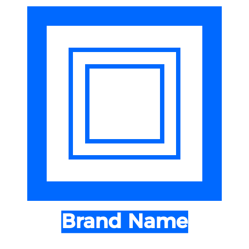
The original logo is like the main face of a brand. It usually has the company’s name and a special picture or symbol that represents it. People work really hard to make sure it looks just right, so everyone can easily recognize and read it. This logo is used in most places where the brand is shown. It’s like the official symbol of the brand.
2. Stacked Logo:
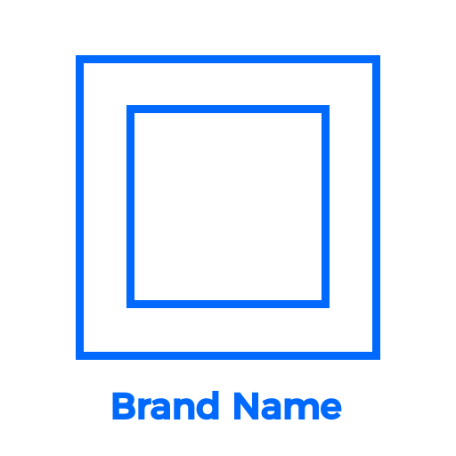
The stacked logo, also known as a secondary logo, is a special version made for certain situations or places. It still keeps the main logo’s basic look but gets small changes. For example, the company name might be arranged differently, or the picture might be resized and moved. These small changes help it fit well in different spaces without losing the brand’s identity.
3. Submark Logo:
The submark logo is a super simple and basic version of the main logo. It still shows what the brand is about, either by using the full name or just the initials. This little logo is really useful when there’s not much space, like on social media or small app icons. Even though it’s really simple, the submark still keeps the brand looking the same, so people can recognize it right away.
4. Icon Logo:

An iconic logo is a special symbol that everyone easily recognizes. It’s like a super recognizable picture that represents a company or a brand. Think of it as a visual superhero for a business. The icon is so unique and cool that people instantly connect it with a particular company or product.
Recommended Read:
Wrap Up
By exploring these logo layout ideas, you can infuse creativity and innovation into your brand’s identity. A well-designed logo is vital for a strong brand identity. Different layouts and styles, like centered or split logos, offer versatility and enhance recognition. From original to submark logos, each style serves a unique purpose, ensuring adaptability across various platforms. A thoughtful logo creates a lasting impression, strengthens the brand connection, and stands out in the competitive business world.
Ready to unlock your creativity and design a logo that captures the essence of your brand? Visit PhotoADKing’s Logo Maker tool now and take the first step towards creating a visually stunning logo that will leave a memorable impression on your audience.

Easy-to-Use Logo Maker!
Create the best logo using PhotoADKing logo maker, and elevate your brand presence today!
Try Logo Maker Now!
