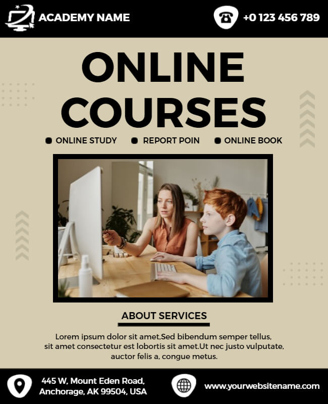
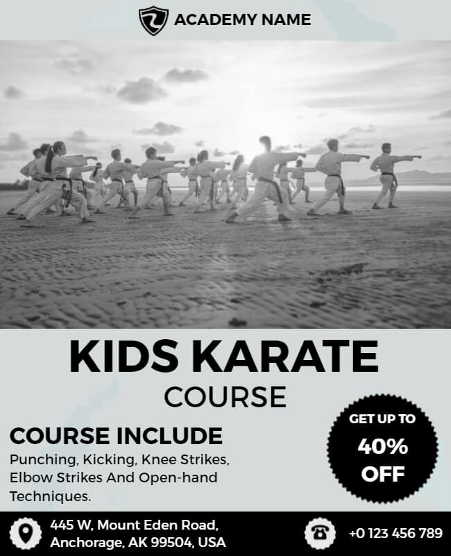
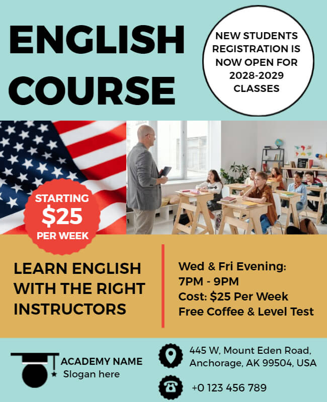
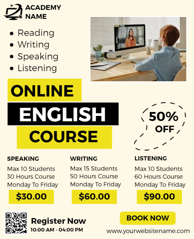
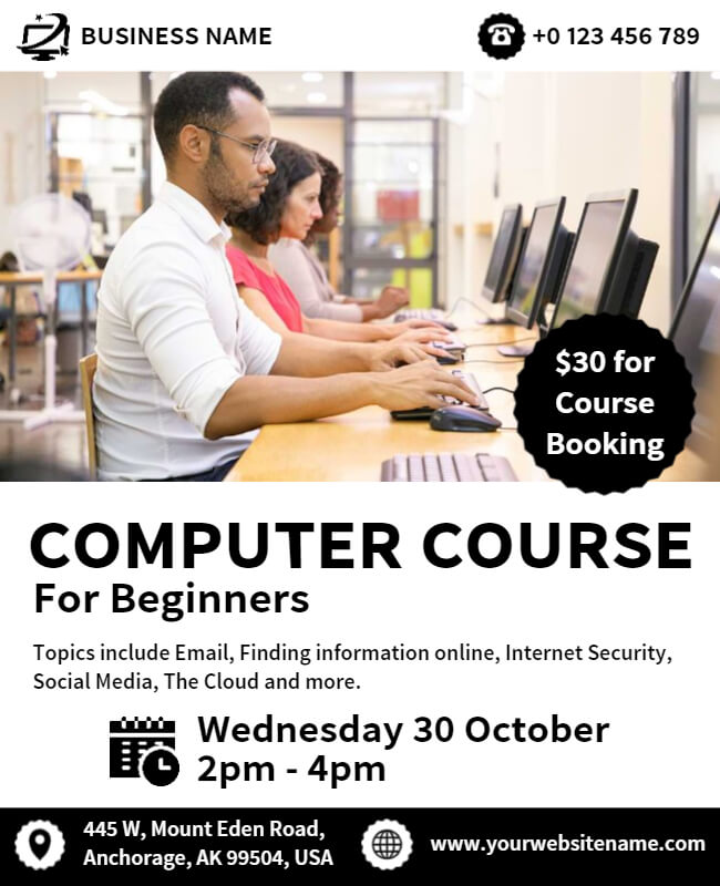
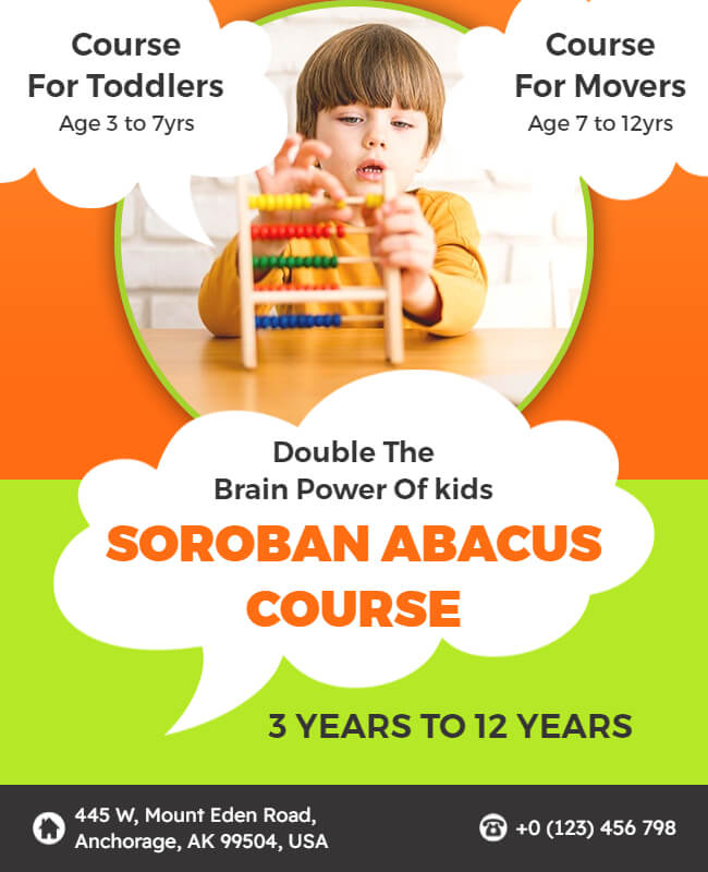
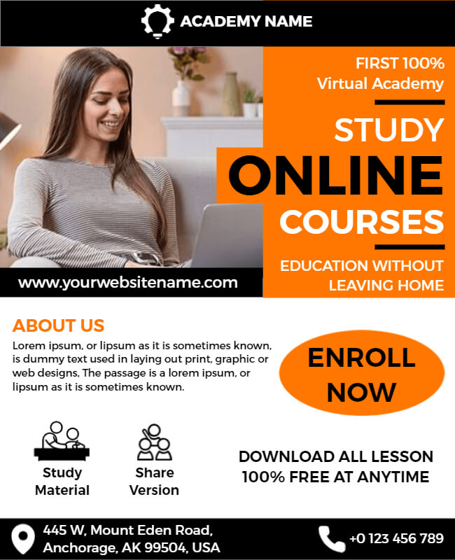
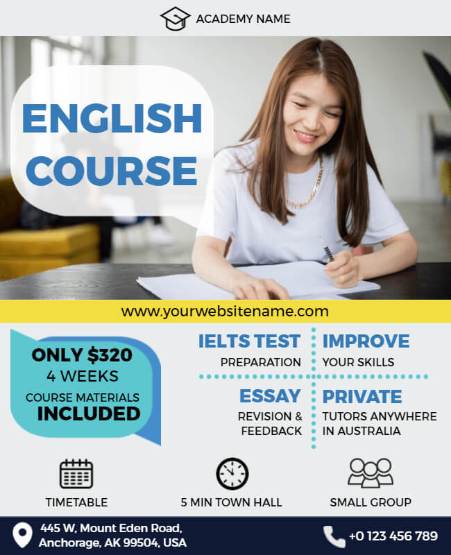
Course flyers play a crucial role in informing people about upcoming courses and workshops. But what makes a course flyer stand out from the rest? Have you ever come across a course flyer that made you stop and take notice?
Well, in this article, we have put together some course flyer examples that will inspire you to create course flyers that look great and effectively convey information about your courses. Whether you are a teacher, a trainer, or an organizer, these examples will help you design flyers that grab the attention of your target audience.
From minimalistic designs to vibrant color schemes, we have covered it all. But it’s not just about the looks. We will also discuss the key elements that you should include in your course flyers to make them informative and engaging. Not only limited to course flyers but there are also lots of flyer templates that you can use according to your needs.
Course Flyer Examples
Insert Good Headlines
A good headline can make or break the success of your course promotion. It’s the first thing potential participants will see, and it needs to grab their attention and make them want to learn more. Your headline should clearly communicate your course in as few words as possible. Don’t try to be clever or overly creative at the expense of clarity. If you want to create more education flyers, you will get exactly what you find here. Not only flyers but also amazing education brochures which perfectly match your needs.
Simple and Clean Design
When designing a course flyer, it is important to keep it simple. A cluttered flyer with too much information can overwhelm and confuse potential participants. Instead, focus on the most important details and use a minimalist flyer design to communicate them effectively.
Focusing on The Most Important Details
The most important details that should be included in a course flyer are the course title, dates, location, and instructor. These details should be prominently displayed and easy to read. Make sure to use a font that is clear and easy to read, and consider using a bold font for important information, like the course title and dates.
Be Clear With Pricing
When promoting a course, it’s important to be transparent and clear about the pricing. Potential participants want to know what they are getting into and how much it will cost them. If you are a teacher and starting a job guarantee course but confused about how to tell people about that, then you can read our education flyer examples guide. Here you will get some amazing pre-design education flyer templates, which are easy to use, and you can also customize them.
Make It Minimalist
Keep the text to a minimum and use clear, easy-to-read fonts. Avoid adding unnecessary information or design elements that may clutter the minimalist flyer. Keep it simple and focus on the key details that potential participants need to know. Besides, if you’re looking for inspiration to create a modern course flyer? Then explore this collection of flyer examples for students to get inspired. Including minimalist designs that exude elegance and simplicity, and make a lasting impression on your target audience.
Using Bold Fonts
Using bold fonts is an effective way to highlight important information and make it stand out. However, be careful not to overuse bold fonts, as this can make the flyer look cluttered and difficult to read. Use bold fonts for flyers sparingly and only for the most important information.
Using Colors Wisely
Colors can be an effective way to make a flyer more visually appealing and communicate the course content. However, it is important to use colors wisely and avoid using too many bright colors that may be distracting. Choose creative color schemes that complement each other and represent the course content. Consider using a color scheme that matches the branding of the course or organization.
Use High-Quality Images
Including images in your course flyer can make it more visually appealing and help to communicate the course content. Choose images that represent the course content and resonate with your target audience. You can use stock photos or create your own. Make sure to use high-quality images that are clear and visually appealing.
Highlight The Benefits
In addition to the most important details, including a brief course description and highlighting the key benefits that participants can expect to gain from attending is important. This can include information about what participants will learn, how it will benefit their career or personal development and any other unique selling points.
Include a Call to Action
Include a clear call to action that tells people how to sign up for the course. This could be a link to an online registration form or enroll now button for someone who can help with registration.
Create a Sense of Urgency
Encourage people to sign up by creating a sense of urgency. You could offer an early bird discount for those who sign up by a certain date or include a limited-time offer that expires soon. Offering discounts in your course flyer can help incentivize the reader to take action.
Include Contact Information
Make sure to include your contact information so potential participants can reach out with any questions.

To explore more examples of impactful flyers designed for students, check out these inspiring flyer examples!
Conclusion
In conclusion, creating an effective course flyer is crucial to attracting potential students to your program. You can capture their attention by using interactive questions and clear, concise language and encourage them to enroll in your course. If you are still confused after seeing these course flyer examples, then you can check out our flyer maker tool. Here you will get lots of the latest flyer designs which you looking for.

