As a small business owner or individual, creating a memorable logo is an essential aspect of establishing your brand. A well-designed logo can help you stand out from your competition, increase brand recognition, and build customer loyalty. However, designing a logo can be a daunting task, especially if you’re not a graphic designer. That’s why we’ve put together this comprehensive guide of the best logo design tips to help you create a logo that accurately represents your brand and captures the attention of your target audience.
In this blog, we’ll cover everything from understanding the fundamentals of logo design to choosing the right colors and typography for your logo. We’ll also explore the importance of creating a versatile logo that can used across different mediums and platforms, as well as the significance of researching your competition to differentiate yourself. By following these logo design tips, you’ll be able to create a logo that not only looks great but also effectively communicates your brand’s values and message. So let’s dive in and discover the best logo design tips that can help you establish a strong brand identity and leave a lasting impression on your customers.
- Make it unique
- Keep it simple
- Choose the Right font
- Use Suitable Color selection
- Logo sizing basics
- Use shapes to think inside the box
- Be literal with your logo
- Be Authentic.
- Use Typography
- Understanding the brand
- Use a Logo Template
- Sketching ideas and concepts
- Let your logo breathe
Make It Unique
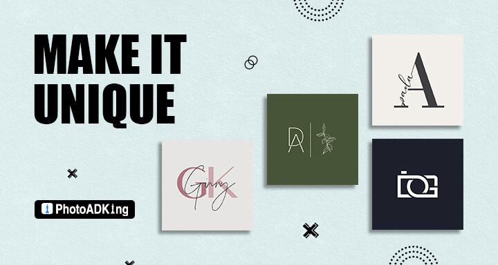
Creating a unique logo is a vital aspect of building a brand identity for any business. A unique logo can help to establish brand credibility and professionalism. A logo that is well-designed and distinct can communicate to customers that the brand takes its image seriously and is committed to delivering high-quality products or services. This can help to build trust and loyalty among customers.
A unique logo can be a powerful marketing tool. A logo that is visually appealing and eye-catching can be used across various marketing channels, such as social media, advertising, and packaging. This can help to increase brand recognition and awareness, and ultimately drive sales. A logo that is too similar to another brand’s logo can confuse customers and dilute the brand’s identity.
Keep It Simple
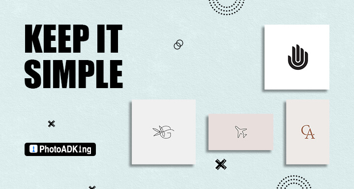
Simplicity is a key design trend when creating a logo. Remember that you want your image to be highly memorable for customers. A logo that’s too complex with a variety of design elements can be harder for customers to remember and connect to your brand when they encounter you again in the future. They might be less likely to develop an emotional connection to your business., There are some tips for creating a simple logo.
Creating Simple Logo Design Tips
1. Focus on the Essentials: Focus on the essential elements that make up your brand for creating a logo. This could be a unique color scheme or font, an iconic image, or a memorable tagline.
2. Use a Minimalistic Design: A minimalistic design can help keep your logo simple and effective. Use clean lines and simple shapes to create a logo that is easy on the eyes and easy to remember.
3. Consider Scalability: When creating a logo, consider how it will appear on different mediums. A logo that looks great on a website or a WordPress custom design login page may not translate well to a business card or billboard. By considering scalability, you can create a logo that looks great no matter where it’s displayed.
4. Keep It Timeless: A logo is an investment in your brand’s future. It’s essential to create a logo that will stand the test of time. A logo that looks dated or out of style can harm your brand’s image.
Choose the Right Font
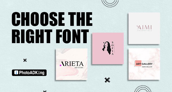
The right font can enhance readability, convey a message, and even evoke emotions. Choosing the right font is an essential part of creating a memorable, recognizable design. With so many options available, it can be overwhelming to decide which font will best represent your brand. Here are the most common types of fonts that can use:
- Serif: Serif fonts have small lines or flourish at the ends of the strokes that make up the letters. These fonts are often associated with traditional, formal, or classic designs.
- Sans-serif: Sans-serif fonts do not have small lines or flourish at the ends of the strokes. These fonts are often associated with modern, clean, and minimalistic designs.
- Script: Script fonts mimic handwriting and are often associated with elegance, sophistication, and femininity.
- Display: Display fonts are designed to be used in headlines, titles, or logos. They are often bold, creative, and attention-grabbing.
Tips for Choosing the Right Font
Simplicity
A simple logo is often more effective than a complex one because it is easier to understand and recall. By using only one or two fonts, it is easier to create a clean and simple design that is visually appealing and easy to comprehend.
Consistency
Consistency is important for creating a cohesive and professional-looking design. When too many fonts are used, it can create a cluttered and disorganized look that can be distracting for the viewer.
Brand Recognition
A recognizable logo is an important aspect of any brand. Consistent typography across all branding materials, including the logo design tips, it is easier for customers to identify and remember the brand.
Contrast
Contrast is the difference between two or more elements in a design. When too many fonts are used, it can be difficult to create contrast between them, which can make the logo look flat and uninteresting.
Use Suitable Color Selection
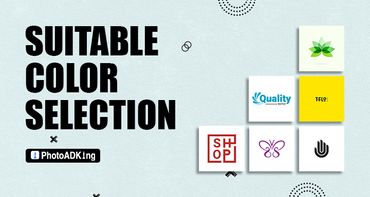
Your color palette is a vital part of your brand’s identity, and choosing the right logo colors entails much more than selecting your favorite colors. Colors have different meanings that convey an array of emotions and concepts and can influence our behavior and decision-making. Let’s break down what each logo color means and can represent in your branding efforts:
Which Logo Colors Mean What?
Red
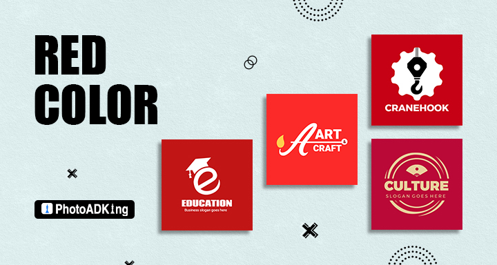
Red is a bold and energetic color that represents passion, excitement, and intensity. It is commonly used by companies in the food, entertainment, and automotive industries. Red is also associated with urgency and can be used to grab the audience’s attention. it also signifies danger, which is commonly used as a warning sign.
Blue
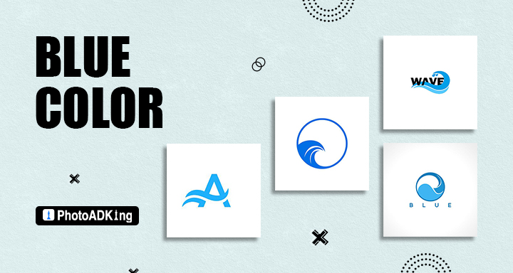
Blue is a calm and trustworthy color that represents stability, reliability, and professionalism. It is generally used by companies in the finance, healthcare, and technology industries. Blue is also associated with intelligence and can be used to convey a sense of authority. However, it can also come across as cold and uninviting if used excessively.
Green
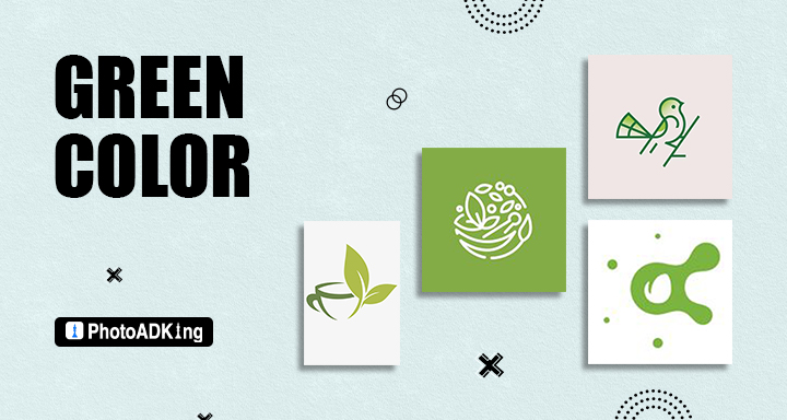
Green is a refreshing and natural color that represents growth, freshness, and harmony. It is commonly used by companies in the food, beverage, and environmental industries. Green is also associated with wealth and can be used to convey a sense of prosperity.
Yellow
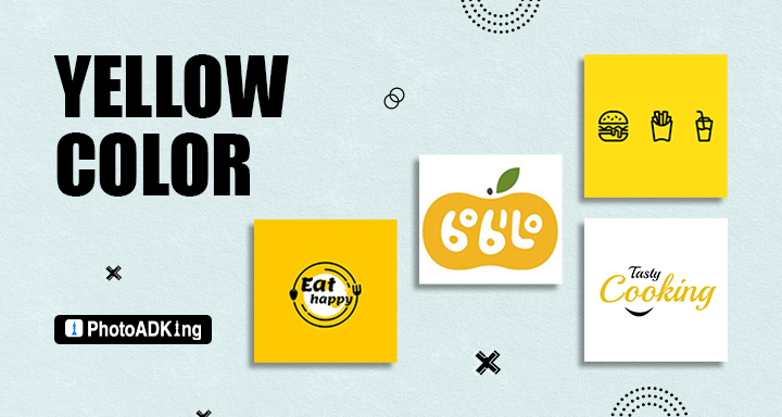
Yellow is a bright and cheerful color that represents happiness, optimism, and creativity. It is commonly used by companies in the fashion, entertainment, and technology industries. Yellow is also associated with intellect and can convey a sense of innovation. It may also appear childish or cheap.
Orange
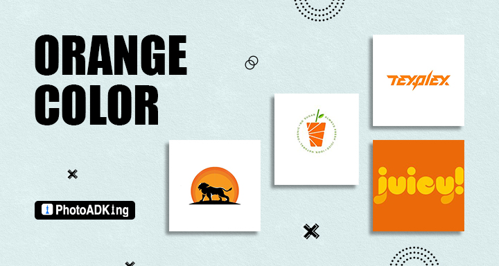
Orange is a fun and energetic color that represents enthusiasm, warmth, and playfulness. It is commonly used by companies in the food, beverage, and technology industries. Orange is also associated with friendliness and can be used to create a welcoming atmosphere. it can be seen as loud or obnoxious if used too.
Purple
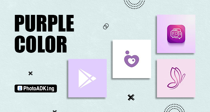
Purple is a luxurious and sophisticated color that represents creativity, wisdom, and royalty. It is commonly used by companies in the beauty, fashion, and technology industries. Purple is also associated with spirituality and can be used to convey a sense of mystique. But if used excessively, it can also come off as extravagant or pretentious.
Black
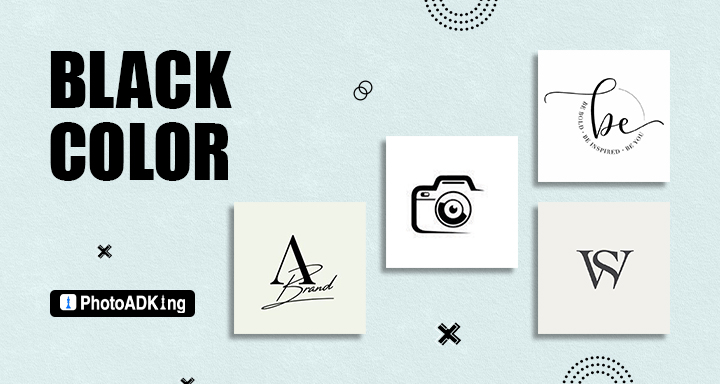
Black is a classic and elegant color that represents sophistication, power, and authority. It is commonly used by companies in the fashion, luxury, and automotive industries. Black is also associated with mystery and can be used to create a sense of intrigue. On the other hand, if utilized excessively, it might come off as dull or dreary.
White
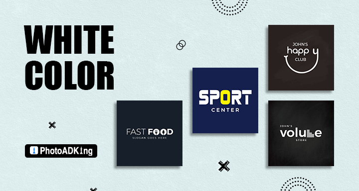
White is a clean and simple color that represents purity, simplicity, and innocence. It is commonly used by companies in the healthcare, beauty, and technology industries. White is also associated with honesty and can use to create a sense of transparency. However, it can also come across as bland or uninspired if used excessively.
Why Sticking to One or Two Colors is More Effective in Logo Design?
Using one or two colors in logo design is more effective than using more than three colors because it creates a cohesive and memorable brand identity. When a logo has too many colors, it can be overwhelming and confusing for the audience. A simple and clean logo design with one or two colors is more likely to be memorable and easily recognizable. Additionally, a logo with a limited color palette is easier to reproduce across different mediums, such as print, digital, and merchandise.
Logo Sizing Basics
The size of a logo is a significant aspect of its design. A logo that is too small may be difficult to read or recognize, while a logo that is too large can be overwhelming and take away from the overall design. When it comes to logo sizing, there are a few basic logo design principles to keep in mind:
Consider Its Usage
Before deciding on a size for your logo, it is important to consider where logo design tips will be used. Logos that will be printed on small items such as business cards or pens will need to be smaller in size, while logos that will be displayed on larger items such as billboards or trade show displays will need to be larger. Consider the different sizes and mediums in which your logo will use to determine an appropriate size.
Maintain Proportions
When resizing a logo, it is important to maintain its proportions. Resizing a logo disproportionately can distort its shape and make it difficult to read or recognize. Maintaining the proportions of a logo will ensure that it looks the same, whether it is displayed in a large or small size.
Size Variations
Horizontal, vertical (also known as stacked), icon (sometimes called sub marks or brand marks), or favicon.
Use Shapes to Think Inside the Box
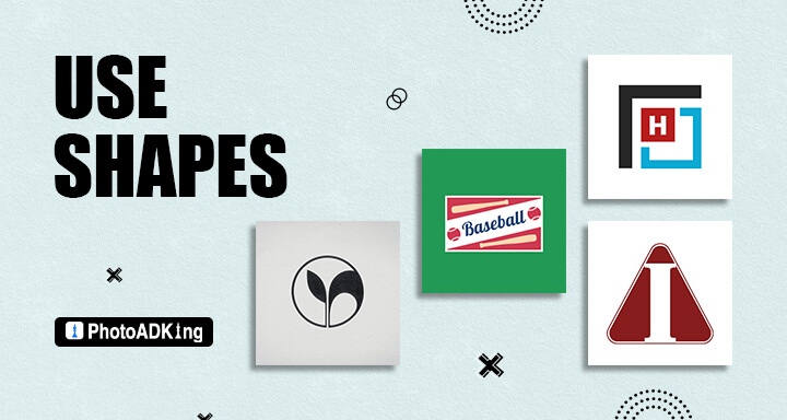
Logo shapes are one of the most important elements of a logo. They can convey meaning and emotion, and they can help your logo stand out from the crowd. Here are some of the most common logo shapes and what they can represent:
Circle: A circle represents unity, completeness, and infinity. Homeware It can also represent protection, as it has no beginning or end. Circle logos ideas are often used to convey a sense of wholeness, continuity, and inclusivity.
Square: A square represents stability, balance, and structure. It can also represent strength and reliability.
Triangle: A triangle represents creativity, energy, and direction. It can also represent growth and progression.
Rectangle: A rectangle represents professionalism, organization, and stability. It can also represent comfort and familiarity.
When using shapes to design a logo, there are several key considerations to keep in mind:
Using Logo Shapes to Tell Your Story: When creating a logo, it’s important to choose the right shape to represent your brand. Here are some tips for using logo shapes to tell your story:
Start With Your Brand Values: Think about what your brand represents and what values are important to you. Then, choose a logo shape that best represents those values.
Think About Your Industry: Consider your industry and what logo shapes are commonly used. Then, choose a shape that sets you apart while still fitting in with the industry.
Experiment With Combinations: Don’t be afraid to combine shapes to create something unique. For example, a circle inside a square can represent balance and stability with a touch of creativity.
Be Literal With Your Logo
A company’s logo is often the first point of contact between the brand and its potential customers. It is the face of the business and communicates its values, message, and mission. A well-designed logo can make a lasting impression, increase brand recognition, and contribute to the success of the business.
A literal logo represents the business, product, or service it represents clearly and directly. It uses elements such as images, symbols, and typography to convey the message of the brand. Literal logos are easy to understand, recognizable, and memorable, making them an effective tool for brand recognition.
Be Authentic
Your logo should reflect the values of your company, product, or service. You are the brand, you are the source of the authenticity, and the logo’s job is to be a vessel for delivering those qualities to your public.
Use Typography
A logo represents a brand’s identity and conveys its message to its target audience. There are various types of logos, but typography-based logos are becoming increasingly popular these days. Typography-based logos are logos that are created using only text or typography.
When using typography to design a logo, there are several considerations to keep in mind:
- Readability: The most important factor when choosing a font for a logo is readability. A font that is difficult to read will not be effective in communicating the message of the brand.
- Personality: Different fonts have different personalities. Some fonts are elegant and refined, while others are more playful or bold. Consider the personality of the brand when choosing a font.
- Originality: A unique font can help a brand stand out from the competition. Consider customizing a font or using a lesser-known typeface to create a more original logo.
- Versatility: A logo will be used across a variety of platforms and media, so it’s important to choose a font that is versatile and works well in different contexts.
- Pairing: If using multiple fonts in a logo, it’s important to choose fonts that pair well together and create a cohesive design.
Understanding the Brand
The brand is essential for creating an effective logo design. A brand is more than just a logo; it is the overall perception that people have of a business or organization. It is the combination of the company’s values, personality, reputation, and visual identity.
Before creating a logo design, businesses should take the time to understand their brand and its target audience. They should ask questions such as:
- What are the values and mission of the business?
- What makes the business unique and different from its competitors?
- Who is the target audience, and what are their needs and preferences?
- What emotions and feelings does the brand want to evoke in its audience?
- What are the desired outcomes and goals of the brand?
By answering these questions, businesses can gain a better understanding of their brand and how it should be represented in the logo design.
The logo should designed to reflect the personality and values of the brand. For example, a business that values simplicity and minimalism may choose a clean and straightforward logo design. A business that values creativity and innovation may choose a more intricate and visually appealing logo design.
The logo should also designed with the target audience in mind. It should appeal to their needs and preferences and evoke the desired emotions and feelings. For example, a business targeting a younger audience may choose a logo design that is more playful and vibrant, while a business targeting a more professional audience may choose a logo design that is more formal and elegant.
Overall, understanding the brand is essential for creating a logo design tip that accurately represents the business and resonates with its target audience. By taking the time to understand the brand and its values, businesses can create a logo that is not only visually appealing but also effective in communicating the brand’s message and values to its audience.
Use a Logo Template
Starting from scratch can be a daunting task, especially if you’re not familiar with design software. By using a logo template, you can save time and get your logo up and running quickly. When selecting a logo template, it’s important to consider your brand’s identity, target audience, and industry. Choose a template that reflects your brand’s personality and values, and one that resonates with your audience. It’s also important to ensure that the template is customizable so that you can make any necessary tweaks and adjustments to make it truly unique and reflective of your brand.
Sketch Your Ideas
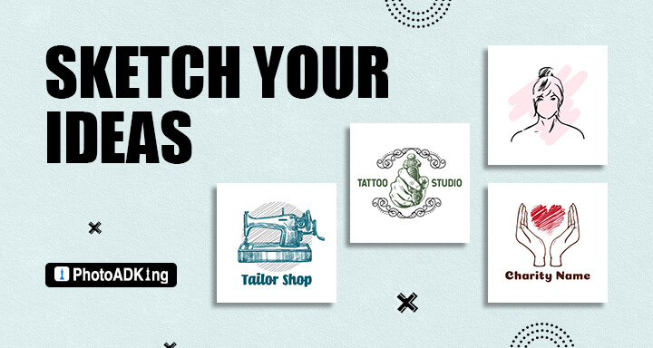
Sketching your ideas is an important part of the logo design tips and process. Here are some logo design tips for sketching your logo ideas:
- Brainstorm: Before you start sketching, brainstorm some ideas and concepts for your logo. Think about what your brand represents and what message you want to convey.
- Start With Simple Shapes: Begin by sketching simple shapes and symbols that represent your brand. Use basic geometric shapes like circles, squares, and triangles to create a simple and recognizable logo.
- Iterate and Refine: Don’t be afraid to sketch multiple versions of your logo. Iterate on your designs and refine them until you find the perfect balance of simplicity and uniqueness.
- Get Feedback: Show your sketches to friends, family, and colleagues to get feedback on your designs. Use their feedback to refine your ideas and create a logo that accurately represents your brand.
- Digitize Your Sketches: Once you have a few solid logo tips, it’s time to digitize your sketches using design software. Refine your designs and experiment with different color schemes until you have a final logo that you’re happy with.
Let Your Logo Breathe
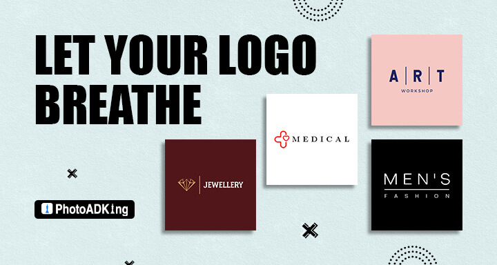
Letting your logo breathe” refers to the practice of giving your logo enough space and padding around it, so it stands out and is easily recognizable. When designing a logo, it’s important to consider how it will be used and displayed and to make sure it’s legible and impactful in any context.
One of the most common mistakes in logo design is not leaving enough space around the logo. When a logo is cramped or crowded, it can become difficult to read or recognize. This is especially true the logo is displayed in smaller sizes, such as on social media profiles or business cards.
To avoid this problem, it’s important to consider the spacing around the logo when designing it. One general rule of thumb is to leave at least as much space around the logo as the height of the logo itself. This ensures the logo has enough breathing room to stand out and be easily recognized.
Also Read:
100+ Best Logo Design Examples
10 Best Logo Layout Ideas
Conclusion
Designing a memorable and effective logo is a crucial aspect of building a successful brand. By following this logo maker tool, you can create a logo that represents your brand, resonates with your target audience, and helps establish your credibility in the marketplace.


