To provoke any online/offline business, whether it is a start-up or a well-established one, digital advertising or Google Ads to be a newer & endorsed trend adopted by one and all is on the rise, which is escalating rapidly.
Spilling it otherwise requires a deep knowledge of the ideology behind crafting a Google Ads campaign, most specific to your business, and highlighting the product features & what the user will benefit from it.
It is vital to be knowledgeable about all the tactics so that you can make sure you are paid off multiple times what you are investing in your Ad getting published on Google and other social media platforms.
Display Ads specifications
Types of Ad Banners & Sizes:
Cutting straight to the chase, Google prevails with the following available ad banner sizes:
300 x 50 (Mobile Leaderboard)
- Smallest ad size
- Not much recommended
- Doesn’t cost much
468 x 60 (Banner)
- Small, usually located at the bottom
- Not much recommended
- Doesn’t cost much
728 x 90 (Leaderboard)
- A standard & prevailing size
- Much recommended
- Costly a bit
- Performance = Investment
250 x 250 (Square)
- Can fit into small areas
- Not
much recommended - Sub-optimal
performance
100 x 100 (Small square)
- Limited supply
- Can fit into small areas
- Not much recommended
336 x 280 (Large Rectangle)
- Much recommended
- Good performance
- Little costly
300 x 250 (Inline rectangle)
- Better than 336 x 280
- Most recommended
- Performance > Investment
120 x 600 (Skyscraper)
- Long-lasting over the web
- Less recommended
- Performance < Investment
160 x 600 (Wide Skyscraper)
- Better than 120 x 600 (skyscraper)
- Not much recommended
- Performance < Investment
What types of ad banners exist?
To be contingent on Ad banner sizes, here are the types of Ad banners in the frame. It accentuates the way an Ad would prefer to appear on any hosting site.
It typically measures the Click Through Rate(CTR) based on the Ad performance of which types of Google ads banner serves for.
1. Static banner
Revolving around simple & single frames with an image & catchy line/phrase, this banner concludes with.
It is not very profound to use this kind of banner as compared to Flash & animated, as it just sticks around a static text & graphic format.
Regardlessly, they don’t annoy users, also they don’t fail to showcase the right amount of text & images.
2. Flash banner
Animation & other special effects conserve creative essence through the existence of contrasting colors, good quality graphics, etc.
These drive higher CTR than other banner types. Since the behavior of the banner vitally contemplates the actionable concept to magnetize visitors, it works well.
3. Animated GIF banner
The sequential accumulation of frames forms a GIF. Animated GIF banners are motion-oriented with the filthy blending of interactive graphics and text surrounding the texture.
To disparity, the GIF banner is cool yet with an engaging prospect. It stimulates the CTR to the highest extent. However, the decent composition of typography and graphics will only be able to increase the probability of higher Click-Through Rates.
These are annoying to users at times, in case of any outrageous vibe, it is hailing for.
Most interactive Ad Sizes that Google prescribed:
Amidst all sizes, here are some proven dimensions that actually drive more leads. A strategic Google display Ad size matters to draw the attention of frequent visitors and web users.
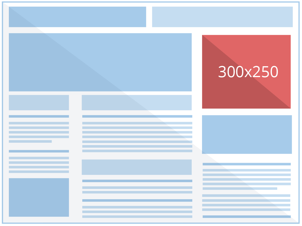
300 x 250:
This is verbally termed as an Inline rectangle banner. A pictorial representation is showcased here, which, for no reason, hits the user mentality rightly in terms of the portrayal of determining product features and benefits.
It usually belongs to the rightmost upper-half portion. To be precise, somehow this location works well due to the human mentality of looking over the right side of the page, and most of the users are right-handed and slip in the right direction first before turning left.
It can be composed of images and text i.e., both or otherwise.
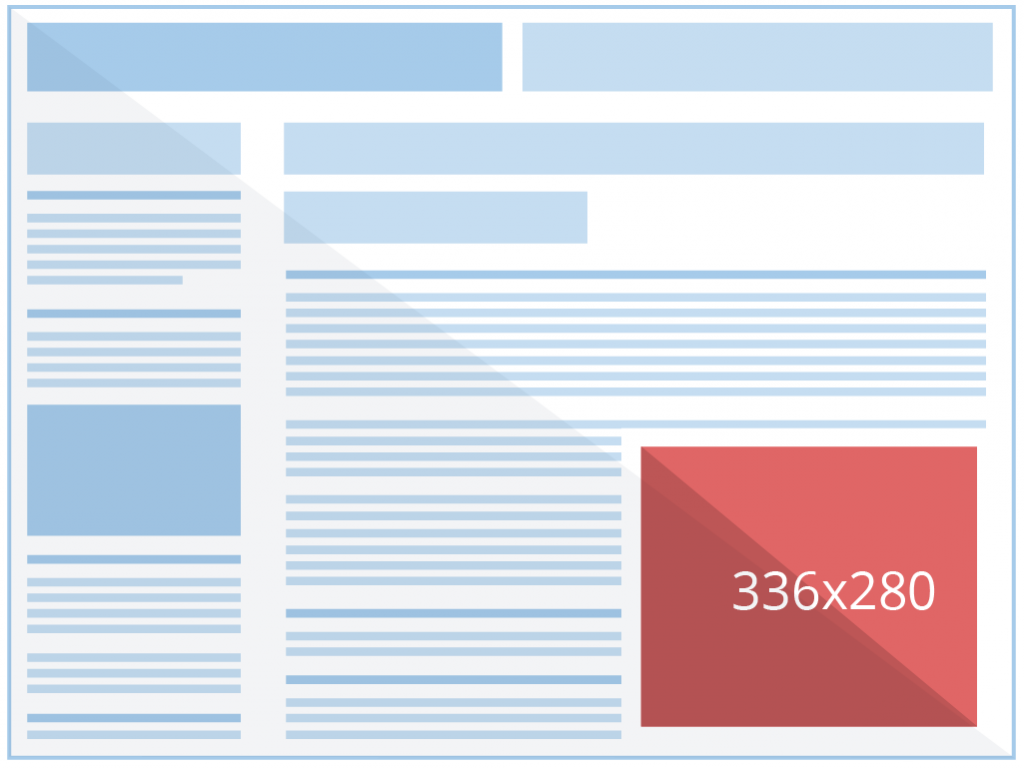
336 x 280:
This dimension is verbally termed as a large rectangle. A pictorial representation is here. Which is usually located in the rightmost bottom area.
Striking for it is easy. Particular to every human tendency, we do reach down to every web page. This criterion works well, as while reading the whole content, there is a high probability of you clicking the Google ads banner just beneath where your cursor is.
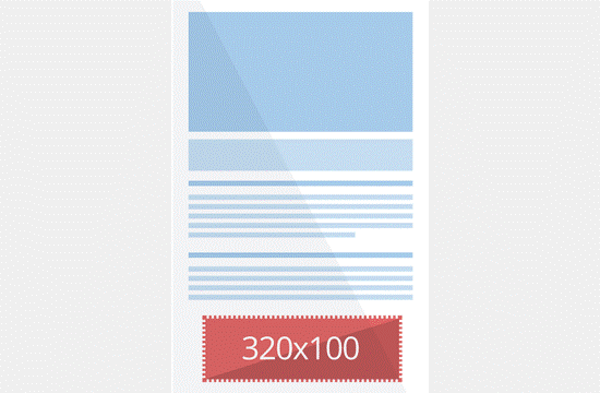
320 x 100:
It is a smaller yet clear dimension, namely a large mobile banner. The distinction to the previous dimension, this resembles a striking performance as it ascends the ideology of hitting right unto the user’s ad-click strategy. Why? Because it includes a clear and concise display of graphics and text, to be at ease.
728 x 90:
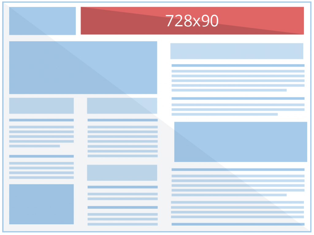
Particularly, it is verbally known as the Leaderboard Ads banner. This kind of covers the catchy text, for example, ‘50% off on products, ‘Shop more/Learn more, etc.
This is demographically located on the topmost right corner of the web page. True to the game of ‘First come, First serve’, it settles down straight to the point.
It comprises fewer graphics and little text in Bold. The engagement possibility is less, depending on the display of text and on which aspect the emphasis is placed.
Ideology to consider before composing an Ad:
All of the efforts spent in composing an Ad is excavating the fact that tomorrow always follows today, which makes sense to the theory that the appropriate choice of Google ad formats is a prerequisite to creating a full-fledged advertisement.
Here are some of the ways to get Google ads specific to your niche created:
- Hire a designer, and instruct him to frame your requirements.
- Create Banners from scratch using a software/tool (with a yearly package for a few.
- Customize as per your need from a wide range of templates with all-inclusive typography styles and graphics, images, etc.
Apprehensive of the array of templates PhotoADKing comes up with is much more profitable and self-sustaining. You will not want to have second thoughts about considering the other options mentioned above.
Call to Action is quite essential with regard to the Ad campaign created, as its visitors can be converted into leads.
Ad essentials are:
→ It has to be visually appealing
→ Bullet points, Relatable text assuring clickbait
→ To consider the visual aspect & Impact
→ Able to drive more leads
All the theory on the usage of customized templates for google ads is now harmonized and detailed. To any of your assistance, share it with us! We will shortly get back to you.
Please, don’t forget to check out the detailed and amazing blog on social media image size to get bonified.


