
Tri-fold brochure designs are one of the commonly preferred choices for business promotions.
Effective visual communication with cut-short details & call-to-action is the basics of tri-fold brochure template designs. Thanks to the versatility of the design & power of the web, you can easily distribute digital brochures online or get them printed for one-to-one advertisements.
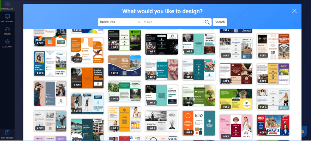
Now let’s talk about how you can showcase tri-fold brochures and what are the most important things to keep in mind while you create a tri-fold brochure. With these amazing tri-fold brochure examples, you will surely get the complete idea of an impactful tri-fold brochure.
Key Takeaways
- What are tri-fold brochures used for?
- Tips on how to design a tri-fold brochure
- Best tips for tri-fold brochure designs
- Tri-fold brochure ideas
What Are Tri-fold Brochures Used for?
To Reach Potential Customers
The major purpose of creating a tri-fold brochure is to provide maximum details to potential customers. For instance, you can easily promote tour packages; describe facilities provided by your school/college, list out the latest color palette launch, brief real estate projects, and so on.
To Provide Useful Information About Your Company
In a nutshell, you may choose to leave a clue by sprinkling helpful information that drives inquiries using a professional tri-fold brochure. Regardless of your business type or niche, you can utilize tri-fold brochures seamlessly.
You must be jumping in your seat to know how you can design a graceful brochure that increases your sales count, isn’t it? We’re here with a complete guide, go on!
How to Design a Tri-fold Brochure on-point!
Are you a newbie on the hot seat, making a tri-fold brochure for the first time? Worry no more! It’s no rocket science to make a tri-fold brochure & you can surely do it like a pro with an appealing brochure maker and highly engaging & easy-to-customize brochure designs by your side. You can also use an AI tool like Venngage to generate brochures that are easy to customize and ready for print or digital sharing.
- Pick the best tri-fold brochure design (we’re sharing more than a dozen examples next)
- Edit & personalize the entire brochure template according to your brand, concept, and products/services to advertise using simple drag-and-drop tools at PhotoADKing
- Adopt a foolproof brochure-designing technique
Best Tri-fold Brochure Design Tips to Implement
Summary:
- Select a size first
- Make at least one partition a “key section”
- Add CTA on the brochure cover
- Better share it with icons
- Use high-resolution images only
- Choose images that don’t break the theme
- Adjust contrasts to focus & defocus images & text
- Include timeline, wherever possible
- Be consistent about typefaces throughout the brochure
- Don’t cover every inch, have whitespaces too
- Go for a unique & contemporary tri-fold brochure style
- Make a simple tri-fold brochure template stunning
- Have any processes? Explain it brilliantly
- Maintain continuity, if necessary
1. Select a Size First
3 folding brochure templates alone can be created in exaggerated sizes other than the standard size. Also, you can have the template in a distinct fold pattern & that defines how your entire brochure will be designed. We strongly recommend selecting size before crushing over anything else that forms the base after.
2. Make at Least One Partition a “key Section”
If you have only noticed, every tri-fold brochure will have one main section seeing that the readers understand its purpose. We call it a ‘key section’.
To do so, don’t look at the brochure as 3 folds but consider it as 3 sections on each page. What would you like to display in section-1, 2, and so on? Think about this! Here is an instance of a better understanding:
As you can see, the design has minimal text (thus not making the brochure crowdie) & has bold & attention-grabbing headers too.
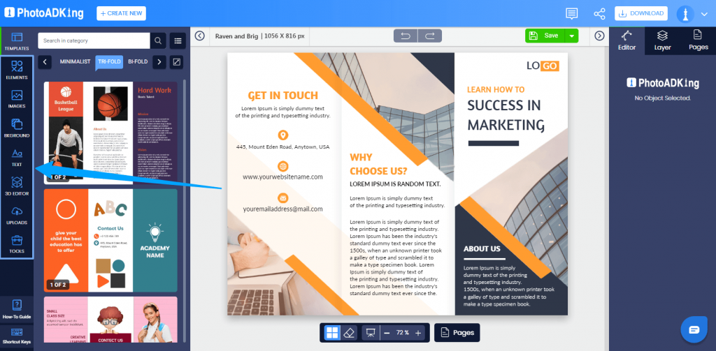
3. Add CTA on the Brochure Cover
Best tri-fold brochure designs aren’t only beautiful but the ones that trigger user actions i.e. highlights CTA (call to action). After all, you must be willing for users to take certain actions after reading your brochure & it could be anything like:
- Enroll Now
- Book your Flat before (date) & get (%) Discount
- Call Us for Inquiries
The such action-triggering text should be highlighted properly, just as this template does. Moreover, you can also include QR codes or add social profile codes for users to get in touch by scanning them instantly.
4. Better Share It With Icons
Like it is always believed (and indeed true), pictures always make for better representation. Take this as one of your default tri-fold brochure examples to always have graphics included in brochure templates.
Icons make it easy to understand, right? Without reading what’s next, icons make the signals clear for what’s ahead. They’re a win-win for upgraded brochure designs giving a sass touch. Here are a few instances where you can use them without fail:
- Social media icons
- Contact Details (telephone no, email id, company website, etc)
5. Use High-resolution Images Only
The images that you use on tri-fold brochure designs introduce your brand. It will be the worst nightmare if they look amazing on-screen but fail to make it when printed. Come on, who will look at a brochure with blurry images?
You can save multiple designing roundups using high-resolution images from FreePik or Stock Images instead of right-clicking to save from Google. Make it a rule of thumb: “I will use HD images only”.
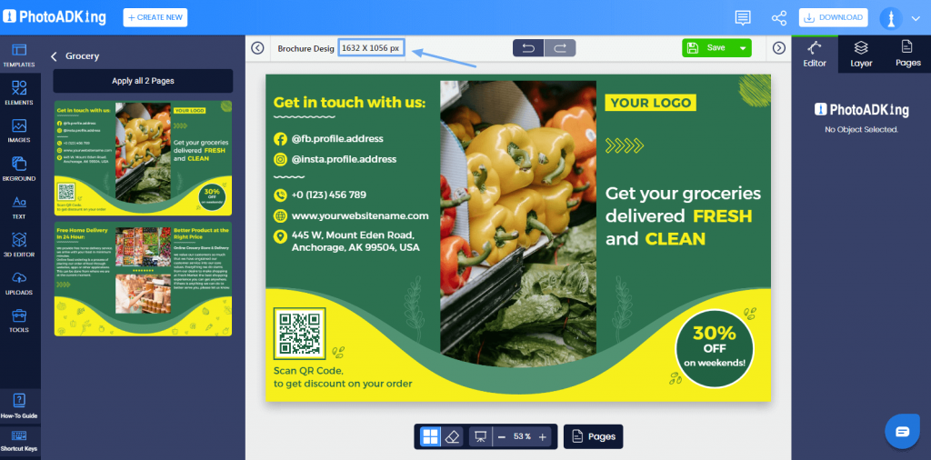
6. Choose Images That Don’t Break the Theme
Images are inevitable for any promotional stuff, be it a brochure, flyer, or banner. Well, the type of images you use should make sense with the theme. The images should sync with the hues & tones of the brochure. Let us help you out with an instance:
You can always find similar images that match the visual context of the brochure design & make it look marvelous, don’t you agree?
7. Adjust Contrasts to Focus & Defocus Images & Text
You may not want to highlight images/text all the time. Sometimes, you may need to put images in the backdrop & bring features & functionalities to the forefront. Are you wondering how to do this?
Simply apply color filters. It will only mute background images & throws light on content. Without any designing knowledge, you can apply it with a selector, as follows:
8. Include Timeline, Wherever Possible
Remember how resumes have transformed into a compact timeline display? Likewise, you can always use a timeline as a go-to feature to reflect the company’s history, product success, and so on.
Even complicated ideas can be explained smoothly with a pictorial timeline. Much information can be included without looking messy.
You can club text, graphics & illustrations to feature the stuff that steals the show. When done well, a timeline structure can be the heart of your tri-fold brochure design.
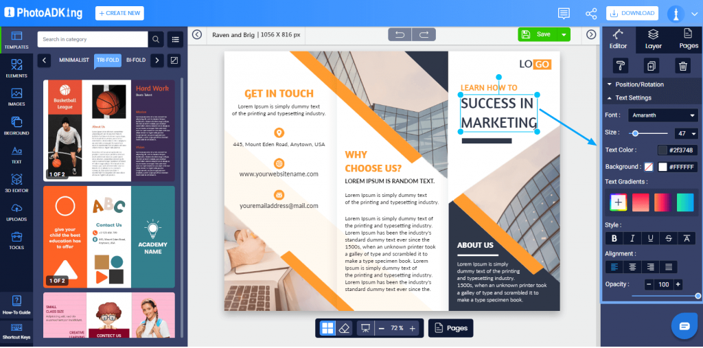
9. Be Consistent About Typefaces Throughout the Brochure
Remember why you’re creating these tri-fold brochures – to be readable. Make sure the purpose is fulfilled throughout the brochure design. The fonts you choose are clear and readable & headers are making sense by differentiating from the content.
Pro Tip: You can use the fonts that belong to the same family by increasing the size for headers & adding bold effects. It will reduce the time & effort to search for equivalent fonts.
10. Don’t Cover Every Inch, Have Whitespaces Too
Filling every inch is too overwhelming, eh? Leave ample whitespace that doesn’t make your brochure look like a blunder! Too much text will make it boring & non-appealing at times.
As shared in point #5, utilize spaces smartly by replacing text with icons, wherever necessary. Let us define what “whitespace” means for a brochure:
Spacing Between:
- Images & content
- Lines in the same paragraph
- Three sections of the tri-fold brochure (the most important one that allows folding to look clutter-free)
11. Go for a Unique & Contemporary Tri-fold Brochure Style
Standard size & design suggestions prevail, but who says you cannot innovate with style?
You can experiment with the way your brochure opens, how the sections are readable & do anything that’s running in your mind. You can’t imagine how powerful it is to use a tri-fold brochure maker online & design a professional brochure by yourself.

12. Make a Simple Tri-fold Brochure Template Stunning
Making the tri-fold brochure template look stunning with simplicity is an art & not everyone is an artist. Choose soft hues; pick content blocks & simple patterns that satisfy your purpose.
13. Have Any Processes? Explain It Brilliantly
All-time hit tri-fold brochure examples are evolving & loom what’s in! Sketch out the processes, or should we say “critical” elements of processes that mark down the importance of your brand.
Why should someone approach you? What makes your product/services special? Sometimes, providing such deep insights not just engages a reader but evokes interest to reach out to you.
For instance, explaining the production to the recycling process for your eco-friendly newspaper will arouse interest to contribute to green earth, right? Also, the careful process of coffee bean manufacturing until it reaches customers will show your walk-ins how you’ve strived to serve the best coffee on the table.
If it fits your business idea, you should go for it!
14. Maintain Continuity, if Necessary
Continuity refers to many things – typography, images, content, etc. Well, if your tri-fold brochure design has images on the forefront, it should make a continuous appeal.
For instance, the image on the brochure cover & backside should be continuous. As someone opens & closes your brochure, it should make a smart outlook like this…
Tri-fold Brochure Examples
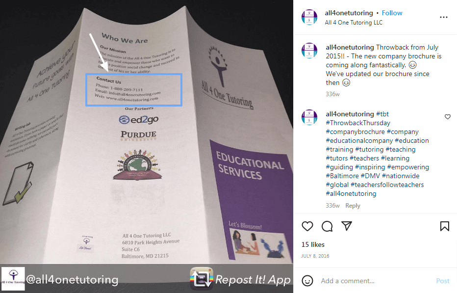
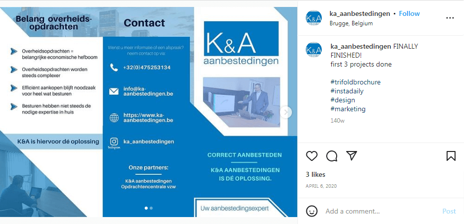
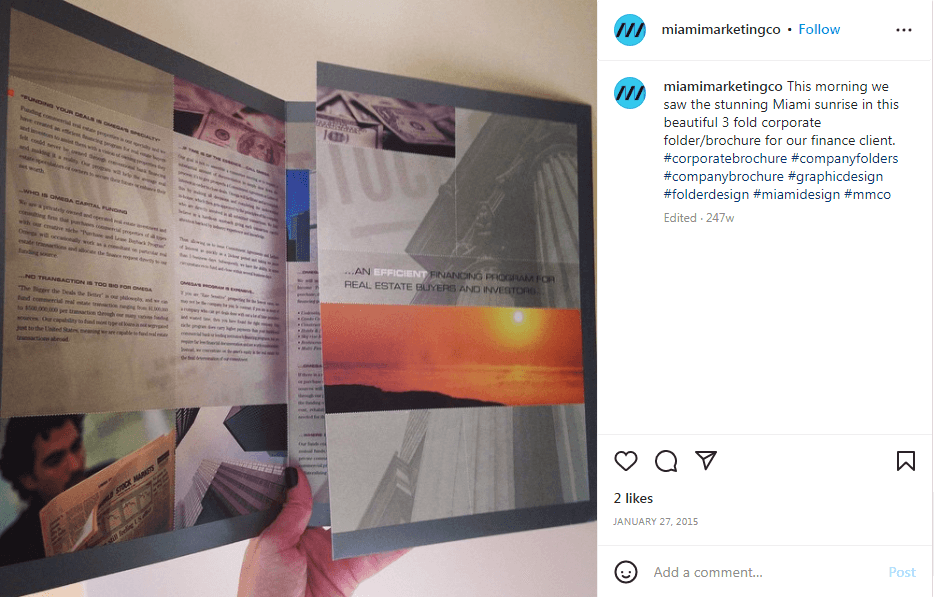
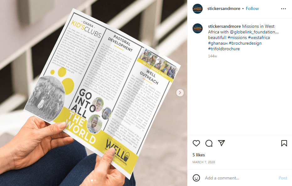
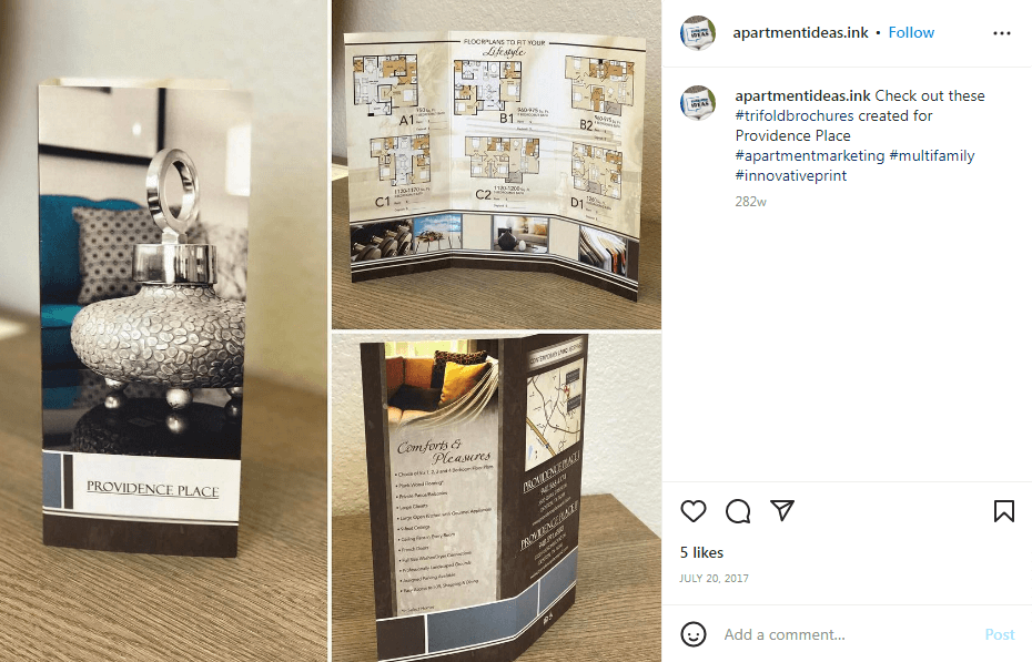
Company Tri-fold Brochure With Unique CTA

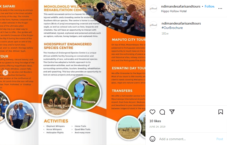
Hotel Tri-fold Brochure

Medical Tri-fold Brochure

Kids Academy Tri-fold Brochure

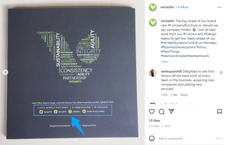
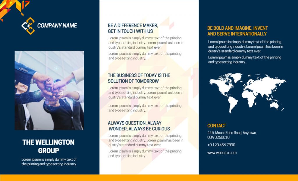
Corporate Tri-fold Brochure
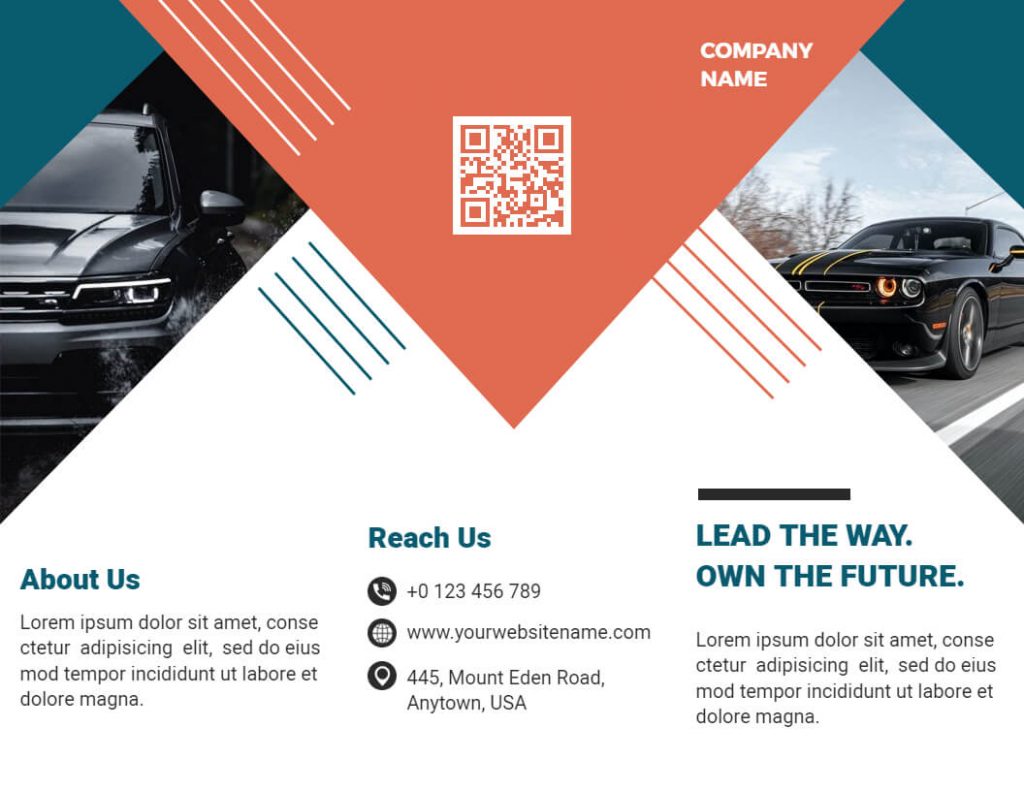
Automobile Tri-fold Brochure
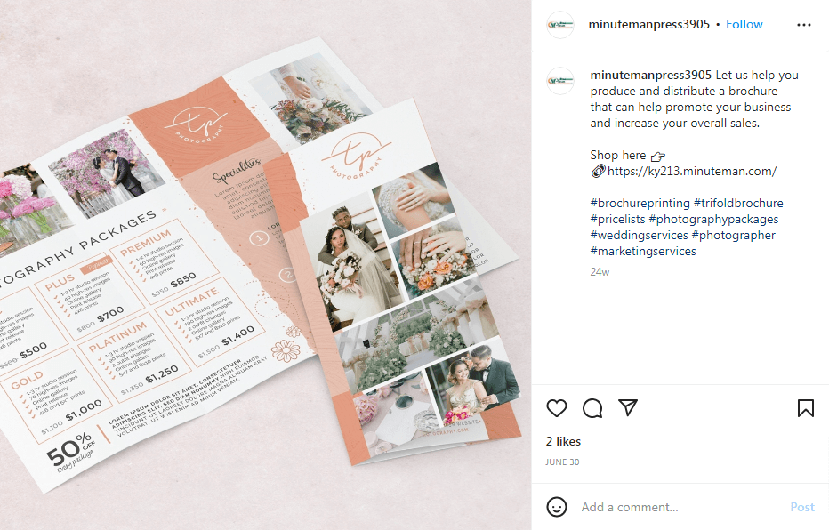
Marketing Tri-fold Brochure

Real Estate Tri-fold Brochure

Spa Tri-fold Brochure

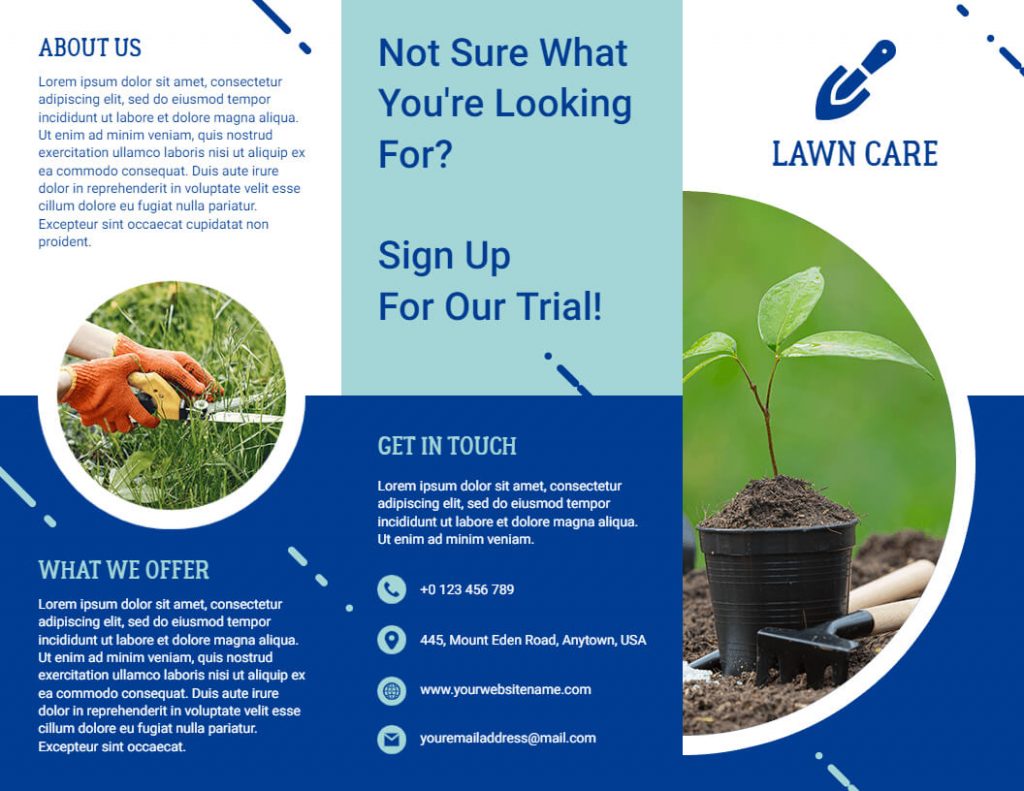
Lawn Care Tri-fold Brochure
The best way to take advantage of these tri-fold brochure examples is to get started as soon as possible after gaining an understanding of them. In a few clicks, you can design according to your specifications using PhotoADKing’s easy-to-use editor. Then what are you waiting for? Don’t miss out on this opportunity! Use these tri-fold brochure examples to get the job done!