Updating your font palette with Top Typography Design Trends 2023 is a must. When you expect a valuable addition to your design, adding some of the new & best fonts for names,
Typography Posters Templates, Typography logo Design, etc will only upgrade your kit.
Instead of juggling you through some 20 to 30 typefaces for designers, we’ve figured out a few ones that will get you ready for 2023.
You don’t need to hover over numerous fonts if you have a couple of fonts that will ROCK IT!
Best Typography Design Trends – 2023
Following the best Typography Design Trends of 2023, you’ll utilize some fresh commercial-oriented & mainstream fonts. You’ll get to learn what the market is turning into and ensure that you don’t lag. Let’s go!
Seren Script – Beautiful Handwriting Fonts
Believe it or not, some graphics can only look better when studded with beautiful handwriting fonts. No matter how many classic font styles exist, a replacement for handwriting is never found. To be frank, having perfect connecting strokes with brush or pen brought to life on the screen is what you feel with Seren Script Fonts. The text flow just goes on and on and you want to write more.
They are the most popular choices for embossing Bride & Groom names on their wedding cards or making Quote images. A touch of personalization is legit with such a font style. Not just for 2023, such fonts are timeless trends.
Variable Fonts for Resizing & Responsive Flexibility
Since technology has taken over, even fonts are not left behind by adding responsiveness. As we know, they are not only displayed on desktops but smartphone screens too (besides offline stuff).
Variable Fonts are the new font style adopted by designers & developers who care for flexible design. It is available with OpenType Font Format V 8.1 created by Adobe, Google, Apple & Microsoft together.
Expect the static impossibilities to turn into possibilities with these variable fonts. You’ll not have to install any additional font files & the fonts themselves will be smooth. Please note that some graphic software might not be ready to support them right now but we can surely expect them to be available soon.
Back To The Vintage Typography
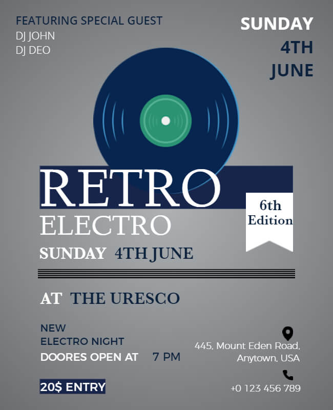
Get back to the Vintage era with some of the best typefaces like Gutenberg & Nexa Rust Slab Black Shadow. Despite the availability of innumerable innovative font styles, a replacement for Vintage Typography design is hard to find. They look amazing on Restaurant Banners, and Logos & come out as unique on Posters too.
They are modish style elements when used at Retro Theme Parties. No extra efforts are desired to create that rustic feel as Vintage typefaces are old wine in old bottles tasting heavenly whenever used.
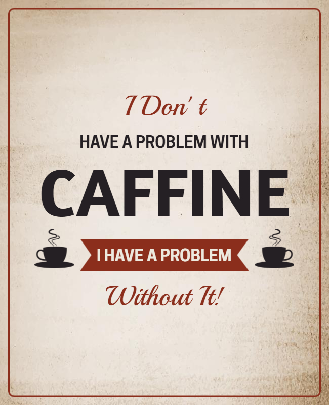
Try Typefaces That Pair The Prettiest
Not all instances want fonts to be harmonious. Sometimes you need to go overboard and form a professional typeface for the logo or website banner.
This technique is used when all of your text is important but you want a word or two to be highlighted.
To do this, you need to pick the basic fonts first. For instance, you can use primary fonts like Slab Serif, Condensed Sans, etc & pair them with Script, Serif, etc. It will keep the eyes reading attentively in either way. These are only a few examples mentioned above, So, you can create the combinations that you think will work great together.
Remember that one plain font style coupled with one stylish font makes for a proficient outlook. Using both creative fonts can ruin your idea.
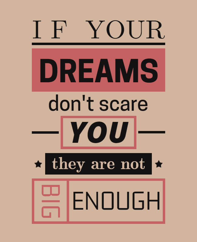
A Stunning Combination Of Large & Small
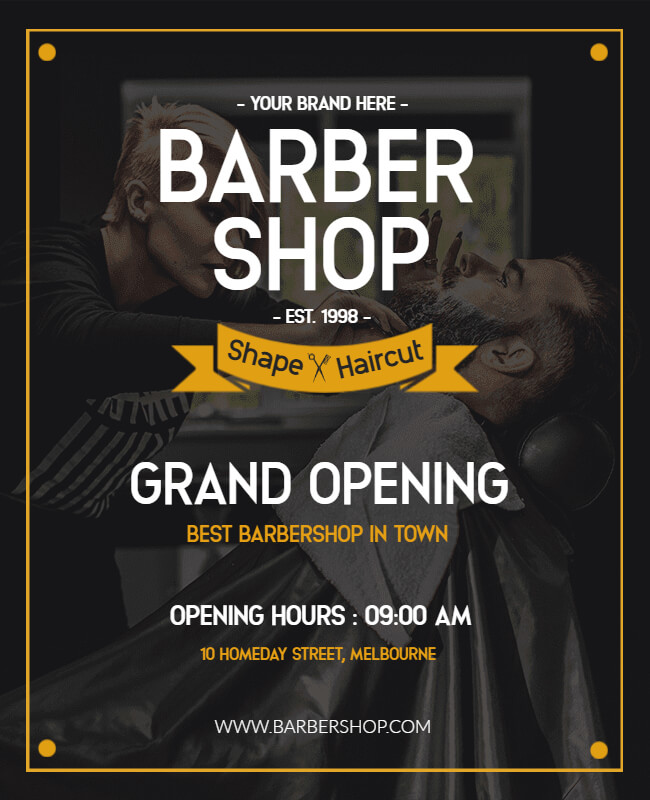
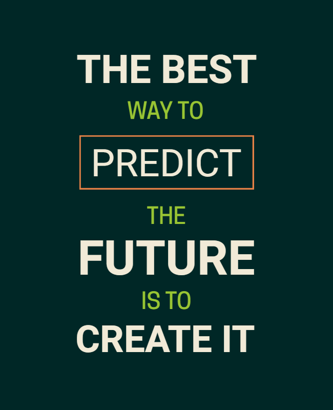
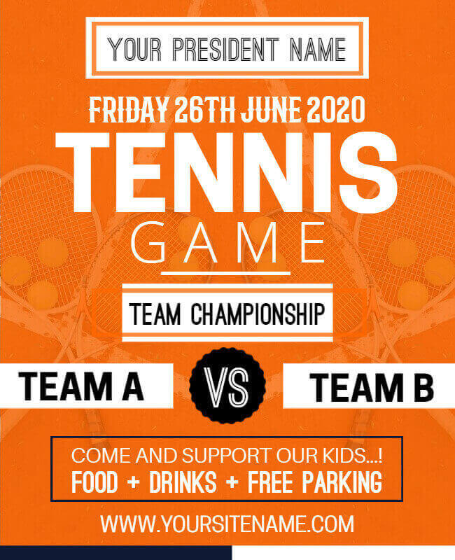
Sometimes, contrasting things can look great together. So, You can redefine visual harmony with a dash of inventiveness. Such awesomeness is ideal for magazine-like visuals & posters where you intentionally throw light on a particular text with Poster Maker.
Futura Black & Bebas Neue Bold are the recommended ones for such innovation.
Not using such fonts for a logo or something that will be visible in the microform will be a smarter decision because it may not appear as tempting as it seems in enlarged fonts. You know what I mean!
Sansterdam Fonts For The Minimalist Layouts
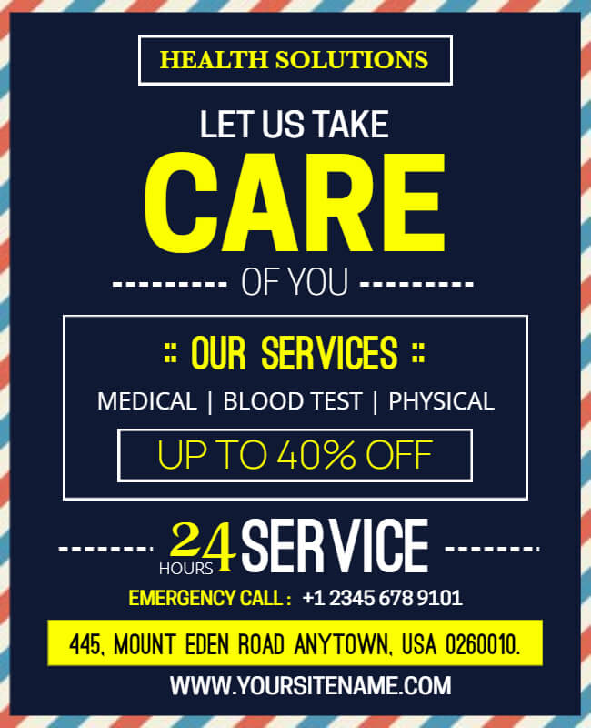
The websites which need a combination of fonts should try Sansterdam at least once. Using simple and clear-readable fonts is the basic requirement while designing a website but you can make a noteworthy banner with a minimalist font combination too.
Break the rules and create a mix by trying every possibility: Image over Text, Text over Image, small-big font combination, etc using Sansterdam. The results will leave you speechless.
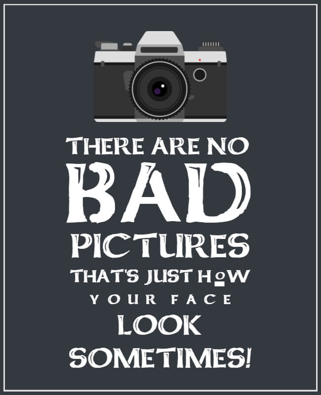
Fonts That Overshadow Dark Themes: Arbour
When you have a dark image and want to overlap it with lighter and brighter fonts, keep simplicity at bay. Arbour Fonts enhance the appearance with a contrasting effect when you combine images and text. If you are going to get this printed, be careful with the color choice. Choosing a white font color will ensure a classic & flawless finish.
These fonts are current favorites for Pre-Wedding Videos & Image texts. Only a glimpse of bringing out that ‘WOW’!
The High Tide For Geometric Feels
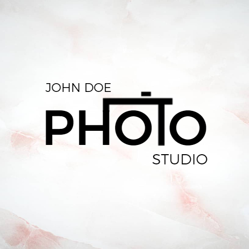
Some project work simply looks better with Geometric Typefaces. They are in use for the last couple of years. The serenity created by straight lines and brilliant round forms is beauty. In other words, such fonts are serifs-free & don’t showcase any filigree. They are the best fit for technical, science, and technology projects, The High Tide.
A futuristic vibe is triggered with such fonts as it leaves the content as clearly readable with impressive styling. This also makes them one of the best fonts for logo and branding.
Image Over Text Is The New Typography
With a plain background, the versatility of choosing fonts is more. We call this situation “Text over Image”. This is a situation when the background is less in focus than the fonts, it is usually dim. But, when both – images and fonts are important, what would you do?!
It gets a visually crowded mess when the image and fonts are equally highlighted. Here comes the middle option: ‘Image over Text’. This effect is technically termed a double exposure effect. Do you know which font family will work best here? Cufel Fonts it is!
Be extra careful in experimenting with this typography style which combines text and photography into one.
Old Story Typeface To Feature Something Special
Not everything is available readymade when you want to create a distinct personality of your brand. It takes time and effort to incorporate ideas into creativity. Also, making it clear and readable is the thing.
Do you remember Google Doodles? Take it as Custom Typography. The way they brilliantly transform any of the letters (or all) into a visual treat is sheer impressive.
This demands attention as you should not cross the bounds of simplicity and reflect individuality at the same time.
Why Do You Need To Stick To Top Typefaces?
Top typefaces or fonts are being used for websites, logo designing, banners, marketing purposes, and so on. The golden rule here is:
“The Visual Harmony of fonts is above applying Creativity”
A good combination of fonts is as important as using appropriate graphics. It lets you strategize the digital workflow, optimize your expertise, and attract new clients. So, what are you waiting for? Use your favorites of the above-mentioned ones and nail your upcoming designs.
However, you can also read more about the Typography of Flyer to know more about the typeface.
By the time you’ve learned about the trending fonts, let’s look up to – When to use What?
There Is A Hidden Motive Behind Every Typeface Choice
- Using different typefaces evokes different emotions.
- The commonly used fonts like Times New Roman, Baskerville, Georgia Italic, etc go well when a traditional and respectable feel is to be triggered.
- Elegance, affection & creativity senses are better represented by Bickham Script, Edwardian Script, and so on.
- Stability, Objectivity & Modernism is triggered with Helvetica Bold, Calibri, Franklin Gothic, etc.
- Unique & Friendly expressions are derived from Cooper, Valencia, and similar typefaces.
That’s all, folks!
You’ve seen that one better than other typefaces is available to create your magic. You may think “Where do I find them now?” No worries! We’ve already worked on them & gathered at PhotoADKing. Find all of your favorite fonts and the new ones listed above & start making your Poster Templates, Banners, Social Media Posts, and more effortlessly.
Keeping up with trends is important because…
Besides reading all this, you may think why you need to use new fonts when your existing font palette is just right?
Upgrading to something new & learning new skills don’t wash away your existing ones. There may be circumstances when you’re in hot water and there is no escape but to go overboard & you should be prepared in all ways. Think of a situation when a client demands something inspirational and distinct from the rest. If you know what’s trending, you have instant suggestions for them.
We would like to add more to your skillset with Scarlett Signature Duo Font, Abermad Brush Font, Dry Brush Font & Pontifice Font. They may be available for free or as paid fonts but if you think they are worth it, have it!

