A restaurant menu card reflects what is going to be served. If not made in a presentable way, it could leave a bad impression on your customers. It is always advisable for you to create a menu card, keeping all the aspects in mind (such as menu card size, background, color, and fonts). You should design it to increase your customers’ curiosity about what is served.
In this blog, we will brief you regarding standard menu card size and things to keep in mind while designing it.
Table of Contents
- Importance of a menu card
- Menu card dimensions
- A4 size menu card
- Pro tips for restaurant menu design
Importance of a Menu Card
The menu card indicates what is being offered in food and beverages. This also shows how a dish is going to be prepared and served, the ingredients used, and the pricing. Whether a dish is vegetarian, non-vegetarian, with eggs, vegan, etc can be indicated on the menu. It gives a picture to the customer of whether he should opt in or opt out of a particular item on the menu.
Menu Card Dimensions
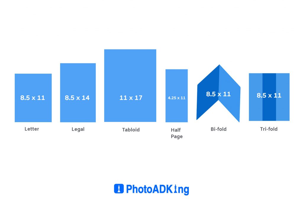
There is no hard and fast rule to menu card dimensions. But when you are just beginning to design your menu card using restaurant menu ideas, you can use the following for your reference.
The format of the menu card along with menu card size in inches, menu card size in cm, and menu card size in pixels is described in the given table.
| Format | Size in inches | Size in cm | Size in pixels |
|---|---|---|---|
| Letter | 8.5 x 11 | 21.6cm x 28cm | 816 x 1058 |
| Legal | 8.5 x 14 | 21.6cm x 35.5cm | 816 x 1342 |
| Tabloid | 11 x 17 | 28cm x 43.2cm | 1058 x 1633 |
| Half Page | 4.25 x 11 | 10.80cm x 28cm | 408 x 1058 |
| Takeout Letter Bifold | 8.5 x 11 | 21.6cm x 28cm | 816 x 1058 |
| Takeout Trifold | 8.5 x 11 | 21.6cm x 28cm | 816 x 1058 |
A4 Size Menu Card ( 8.3” x 11.7”)
You can choose an A4 size menu card for most of your utility. Restaurants pick a measurement of 210 mm by 297 mm for a print of the menu card. Cafes and restaurants who are having a folder size menu generally use this paper size. It has all the designs, images, cuisine details, and a cover image.
Pro Tips for Restaurant Menu Design
Before you know how to create a restaurant menu, you need to consider below following points :
- While choosing formats you can opt for a single page, single fold, two fold(three panels) or panels booklet according to the items to be listed on the menu card.
- Most of the menus can fit A4 size paper but in case it exceeds that you can consider having separate menus for wine, main course, starters, desserts, etc.
- The number of items should not be so large that the customers get confused while choosing. So keep minimal and appropriate items.
- While putting elements on the menu you can brand your restaurant’s name while clubbing it with the dish name and it works well.
- The name and description of the dishes to be included on the menu should give your foodies an idea of what would be served.
- Don’t clutter with too many photos and use professional photos wherever required.
- You can opt for a specific color scheme depending on the restaurant theme.
- The ideal font size on the menu should not be less than 20-30 points. Choose font size color and type wisely so that they are impressive and legible.
- Choose a simple background, and try using a neutral color scheme so that they don’t take away attention from the main menu.
Final Words
While designing a food menu you should be creative. The menu is the restaurant’s first impression and what will be served. It should be pleasing, and functional and also should go with your brand image. While designing a restaurant menu card with PhotoADKing you can leverage your sales. With this tool, you can also use standard menu card size to design your restaurant menu templates.


