How many of you have attended seminars where the slides are text-heavy, and the presenter is simply reading them off? Do you want to make stunning presentations that leave a lasting impression on your audience?
How would you feel when discussing something good about your company, your audience is busy sleeping or texting someone explaining their plight.
That’s the truth with most presentations!
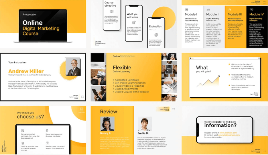
Business presentations are more than a collection of a few nice-looking slides.
Only when you create slides that can inspire your audience can it lead to desirable actions for them? Without a doubt, charisma is essential for success, but a unique visual presentation can make all the difference and can strongly influence your investors or clients to at least check your business and its offerings.
From marketing and messaging to engagement, a powerful presentation helps create a positive first impression.
How do you make stunning presentations that can have a positive impact?
In this article, we list some ways to make stunning presentations that represent your company.
Tips to Make Stunning Presentations That Best Represent Your Company
Use these steps to make stunning presentations:
Use a Presentation Maker
Whether you’re an experienced business personnel or a C-level executive, you require powerful presentations to impact your target audience.
For a long time, businesses have been relying heavily on Microsoft PowerPoint to create slides and make business presentations. Still, it has enjoyed the reputation of providing some of the worst sales and business presentations.
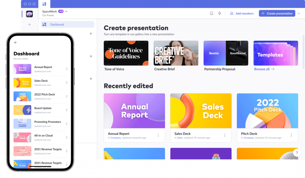
The shortcomings of PowerPoint and its inability to leave the desired mark on customers led to the innovation of presentation makers. Pitch is a comprehensive presentation maker that is fast, and flexible and helps you create presentation decks in minutes.
From offering pitch decks to project plans, conference keynotes to team meetings, pitch provides templates for every business requirement.
What makes these presentation makers so valuable is their ability to collaborate on stunning presentations that can help get diverse opinions, better outcomes, and more intuitive ideas from the team.
Haiku-deck is presentation software that allows you to make stunning presentations without struggle. It lets you choose from various fonts and layouts to make your brand come across as appealing and authentic. The presentation software helps clear the clutter, allowing you to focus on your key ideas to unlock your creative juices.
Write Before You Design

While a presentation maker can help you send your message to your audience, you need to define your message and clearly define your presentation goals.
So, before finalizing your presentation design, focus on its content. If you’re still confused about why you need to focus on your content before the design, consider your presentation’s design as your car and its content as petrol. Without petrol, your car would come to a standstill, and without a car, the petrol you purchased is a waste.
It’s not the presentation’s animation or effect that woos your audience (though it’s a contributing factor), it’s your content that does the magic. Even for AI presentations, content is the king, queen, and everything in between.
Your content dazzles your audience and takes them on a journey with you. Steve Jobs is one of the greatest presenters of our time, and what he did differently was to engage and inspire his audience with his content.
Avoid Using Bullet Points

Too many presenters are crazy about using bullets, but no one would remember 10-15 bullet points in a single slide. They’re likely to keep 10-15 interesting slides that flow well and convey the information.
Sharing one idea per slide can do the trick and help you capture your audience’s attention.
As the attention span of your audience is just 8 seconds, sharing one idea per slide can help you capture their interest and win their trust.
When it comes to presentations, edit your content ruthlessly because having piles of content on your slides can overwhelm your audience. Having more slides than the minutes you have to present your information means that you’re cramming too much information and need to rework the content you plan to share. Plus, ensuring a clean and minimalist slides design can help in conveying your message effectively without overwhelming your audience.
Find The Right Fonts

If you already use a brand font, use them in your presentation to ensure consistent branding. Choose fonts that can suit the style your brand is going for. The best fonts for blocks of text are simple and readable.
For instance, most business presentations prefer to use Arial as the default font. Arial is a super stylish and readable font.
Regardless of the font type you choose, ensure you use the right combination of fonts that go well together. You can also try Google font combinations that give your presentation an impressive look.
Your font is an essential aspect of your presentation. Before your content communicates something to your readers, your font delivers a different message.
Picking fonts is like picking an outfit. You can wear anything, and you need to trust your gut feeling on what’s practical and what can enhance your business communication. Fonts that are challenging to read can turn off your audience’s attention, and they might lose interest in what you’re presenting.
Choose The Right Colors
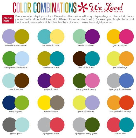
Colors are a powerful tool to set the mood for your presentation. They can greatly affect your audience’s perception and influence their actions.
While your brand might use a color palette, think about the tone and voice of your presentation and adjust your color choices slightly to incorporate them.
You might think that there is no right or wrong color in a presentation, but various studies have shown the impact of color on people and brands. For instance, black might symbolize seriousness and even courage and elegance. Green might symbolize the color of nature, life, and peace. It also shows a sense of growth and stability.
Keep in mind that people are often judged by their physical appearance, and when choosing colour in presentation, it’s the appearance of your content and presentation that can have the maximum impact.
Focus on using a color wheel to guide you in choosing the best combination of colors for your presentation.
According to research, colors in the presentation can improve your audience’s decision-making. So, focus on using the right color to ensure your audience takes the desired action.
Use Icons and Images

You’ve heard that an image is worth a thousand words, rightly so, because pictures enable you to remember things in greater detail and for a more extended period.
According to the picture superiority effect, pictures and text can help increase memory attention after three days.
Using images and icons can help you improve your audience’s retention. Focus on using infographics and photos to convey your information in a visually appealing manner.
If you’re talking about a product, focus on incorporating product photos in your presentation.
You can hire a professional photographer or get images from different free stock photography sites.
If you’re looking for something specific, look into the paid services.
Images are a great way to capture your audience’s attention and ensure you can compellingly and interestingly send the right message to your target audience.
Choosing generic images with a watermark can turn away your customers. Focus on editing your images to make them look professional.
Presentation Templates By PhotoADKing




Maintain a Contrast Between Your Text and Slide Background
To ensure your message pops out and reaches your audience, maintain a contrast between your text and background.
If your background and text use the same color, your text can be challenging to read. Also, maintain a high contrast level in your images and text to ensure your audience doesn’t get distracted.
A stylish bar of colors behind your background increases legibility while adding visual interest to your target audience.
Also, in a quest to design your presentation and maintain contrast, avoid using over five colors in a single presentation.
A harmonious palette can enhance your presentation’s overall design and look and help you get excellent results.
Ensuring contrast between your text colors and background can draw your audience’s attention and make your presentation successful.
Include Statistics in Your Presentation
Adding quantifiable and persuasive statistics to your message can help you build an argument, support an idea, and prove a statement you’re trying to convey.
Numbers and statistics are an excellent way to ground your presentation and bring reality to your presentation. Apart from making your presentation successful, statistics add realism to your presentation.
Also, including relevant statistics in your presentation enhances your credibility and shows that you’ve completed research and are knowledgeable about the subject.
Also, when you use exciting statistics, it makes your presentation memorable, and your audience is likely to remember your business for a long time.
You can use statistics that leave the greatest impact on your audience. You can do this when you know the demographics of your audience. Tableau consultants can help you know your audience, and it becomes easy to find relevant statistics. If you need foundational skills for visualizing metrics, a Tableau course for beginners can guide you through charts, dashboards, and simple calculations.
Tell a Compelling Story
Stories can help you connect with your target audience more than statistics, quotations, and academic points.
Though you can share a personal story, it can even be the story of your brand or customers. Weaving a compelling story requires presentation skills and can help instill the right audience’s emotions, helping your brand connect with potential customers.
Start your presentation by highlighting the problem your customers face and how your product or service leads your audience closer to a solution.
Telling captivating stories can ensure your audience wants to become a part of your business.
Stories appear at the start of your presentation but can set the base for your entire presentation.
Remember to keep your story short, but exciting and compelling.
The primary goal of your stories is to build an emotional connection with your audience so that your messages hit the right customer chord.
Add Business-Friendly Humor

During an extended business presentation, there is nothing more relaxing than the speaker using a joke to make the audience laugh.
When you keep talking in a serious and monotonous tone, it might seem boring and tasking to your audience because they try hard to stay attentive during your presentation.
A friendly and conversational style of jokes can ensure your audience remains active and doesn’t make your presentation an excuse for sleeping.
Focus on using humor if you’re naturally good at it. If not, never force it on your readers; otherwise, your joke might backfire.
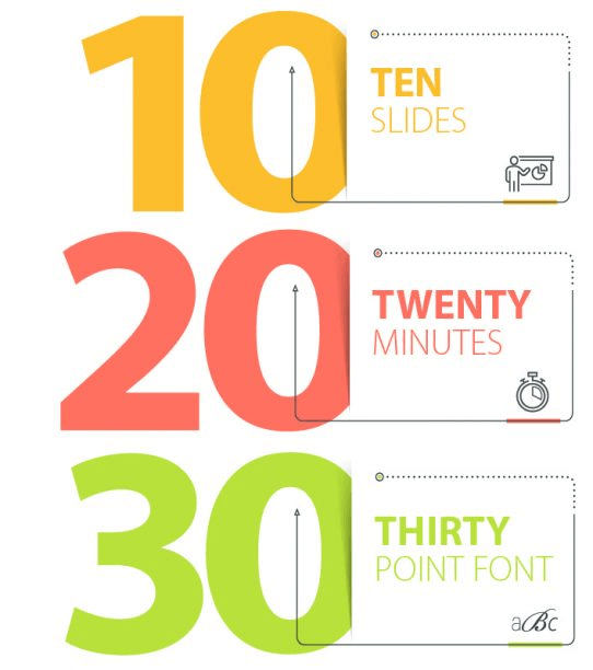
Use The 10-20-30 Rule
According to Guy Kawasaki, using the 10-20-30 rule can make your presentation pop out and ensure your audience remains interested in your content.
This rule ensures that your presentation is legible and concise, resulting in bigger wins for your team. Also, consider using an employee time tracker to make the most of your valuable time when creating impactful presentations
For presentation, less is always more. You can’t expect your audience to remember over ten concepts from one meeting. Ensure you keep your presentations to 10 slides to ensure your audience can retain the maximum value from them.
Each slide you create should have a purpose and explain the content you want to convey to your audience. This can be a good rule for proposals, internal meetings, and sales decks.
Regardless of the time, you have booked for presenting, try not to exceed the presentation time by 20 minutes. You can use your time tracking app to measure this. To keep your audience interested and engaged, ensure it’s short and sweet. After your presentation, if there’s still some time left, use it for question and answer sessions.
Additionally, if your audience has to strain their eyes, they probably won’t bother to read them at all, resulting in audience disengagement. Regardless of your audience’s age and demographics, your customers don’t want to squint their way through the entire course of your presentation.
According to Kawasaki’s rule, focus on using a 30-point font on your slide. By making your slides eligible to read, you encourage the audience to follow you while you deliver your presentation.
Conclusion
Creating an excellent presentation is like creating a compelling blog and article. Make stunning presentations that ensure your content is easy to digest and conveys a brand story.
While creating a well-designed presentation is challenging, it’s worth every effort because it can put your brand on the world map
An excellent presentation can help you communicate with your audience and introduce your business.
These eleven tips can help you accomplish your presentation goals and can take your next business presentation from something people have to sit through to something people can get excited about.

