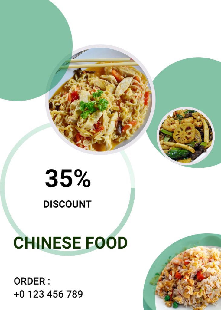
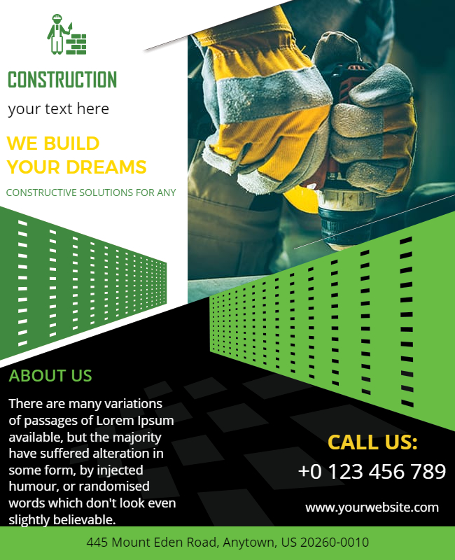
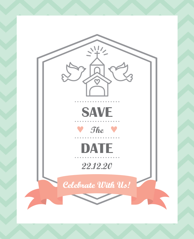
When using Poster design templates that are too convincing, one needs to act smart. What looks attractive currently may suddenly lose its charm if you don’t know how to replace the default text with yours.
Using Online Poster Maker is worthy when you know the tips and tricks to win at a first impression. After all, a poster is designed with an intention & what is the use of investing time and effort if it doesn’t turn out as an awesome creation? No wonder which emotion you want to trigger, it should be done with a short & sweet message. And, it’s a challenging thing.
It may take time to design a poster but it takes only a few minutes to make it ‘YAY’ or ‘NAY’! It’s all about the MESSAGE you pass on.
Let’s see how to get your posters ready with a compelling message.

What to highlight & what not?
A poster is designed with a purpose. Either you launch a new product, have some offer or discounts, it’s an event announcement, or brings something important for the people to notice. This equally applies to online and offline posters.
Whatever it is, the core purpose should be your focal point.
How a Poster Message should be?
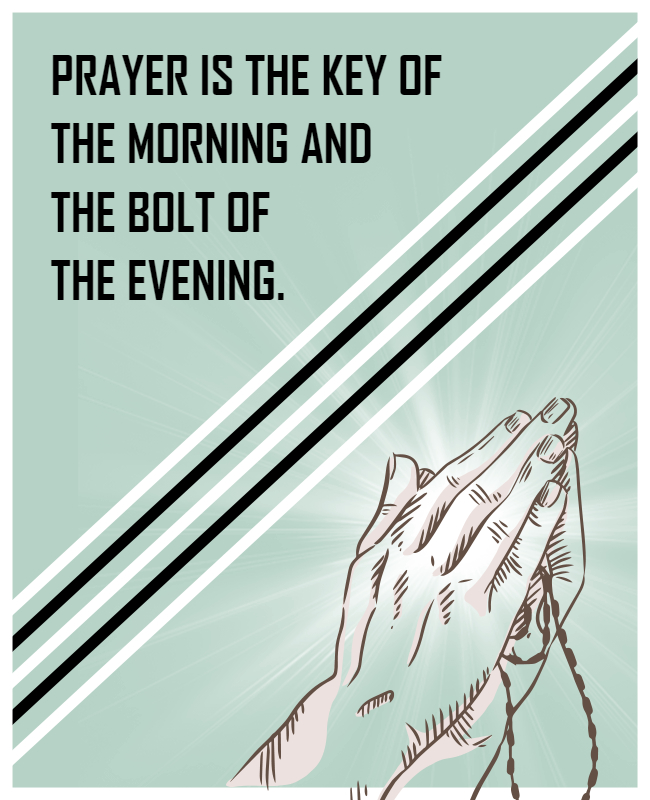
As you create poster online, there are a lot of samples you come across. Some posters have an image as a focus while for some, the image is a secondary matter such as Motivational Poster Design.
You should be clear: “Would you let your image speak or use text as the mains?”
A combination of both is a good idea too.
Message Length
Once you finalize a poster template design, the message should be ready on hand. There should be a text that is placed as enlarged fonts & it should not be too lengthy. Try to make it for 4 to 5 words. The shorter the message, the more it will be easier to read on the go.
For example, you’re making a poster for openings in your firm. What should be used as the text so that it strikes the target audience’s mind? It is “We are Hiring”, “Vacancy for XYZ Position”, or “Job Vacancy”, etc obviously. Such commonly understood terms give a clear message and the interested ones will stop by to read what’s more to know.
Other Content
Besides having the focus text, you may have more details for the users. It should be presented in a clutter-free way. Make use of bullets and keep the text to the point. This should not be left unnoticed else there will be no difference between your main text and secondary details.
Poster-Making Ideas & Design Tips You Won’t Get Elsewhere
Not all who design a poster is a graphic designer. Some are using Free Printable poster makers for the very first time. Keep this poster-making idea in mind whenever you create a poster:
- View different templates that you find suitable for your poster
- See if it can accommodate the details you want your poster to have
- See the way the default template has font settings and if you can personalize it with a different style it would still look better
- Choose whether you would like to go with a dark theme, light & bright theme, or want to use colors.
- What’s the category of your poster? Is it an occasion or a professional event? Is your selected theme match your purpose?
- See the details already mentioned in the default template. You may need to add these essential details too. Point it down in Word so you don’t have to type it in there.
- Use the selected template, add text, and high-quality image (if applicable) & see if the entire poster is color-coordinated.
- Use only 2 colors to differentiate the text on the poster. Adding more colors to the palette makes an unprofessional poster, be it a wedding event or a live concert.
- Check the alignment of the elements in your poster. This is a very important thing as non-aligned elements may ruin the final look of the poster.
- Besides using an image, graphics are important elements on a poster. Make proportional use of them and don’t let them overshadow the message you want to pass on through the poster.
Things to avoid while making Poster Design Online
Avoid the following pitfalls if you want poster design online to be successful.
- Using Mixed Fonts
- Leaving color combinations or poster themes out of sight
- Forgetting to add contact details like email, website, contact no., etc.
- Ignoring alignments of the text presentation
- The occasion and poster theme don’t coordinate, the poster is an odd one out
- Using inappropriate images that are a misfit for the poster
- The poster is missing the essential elements that must be added to the poster for a better impact. For instance, it’s a painting workshop for kids and the theme is not showcasing splashes, paint-brush, kid(s), etc.
The actual scenario can be totally different when you make a poster. These poster design tips will work as an eye-opener for you so that you know the dos and don’ts and make the most of your poster-making using Movie Poster Maker.
Use Poster Design Templates Wisely
It’s very easy to get overwhelmed while using effective poster design templates but keep calm and hold tight to your skills. Though you can alter the existing elements on the template…
Don’t forget the minimalist rule while designing Posters, Flyers, Banners, etc. Simplicity conquers all. This should always be in your mind.
To learn more about the distinctions between flyers and posters, check out our blog on flyer vs poster.
Pick the template that falls in your niche. This will reduce your efforts to half as you’ll only have to replace the default text with yours. You are free to choose any random template such as Online Art Poster Maker but you should know to maintain harmony among the text, image & the rest of the elements like color combination, font style, etc.
If You like our detailed blog on a poster then you will probably like our business card blog. It is all about the unique business card ideas to Win at First Impression.
Avoid you up for poster designing? Head over the best & Free Online Poster Maker now!

