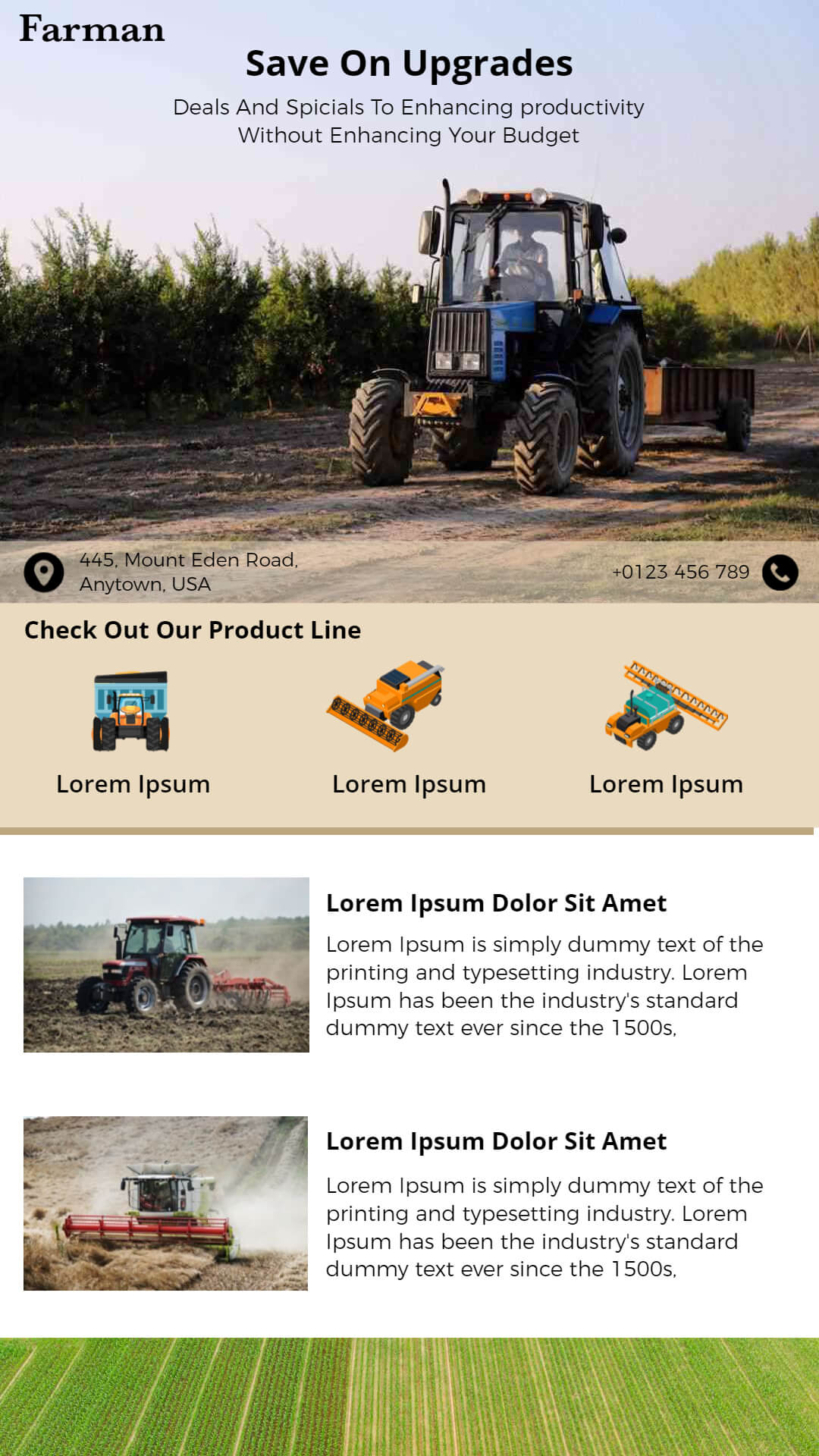
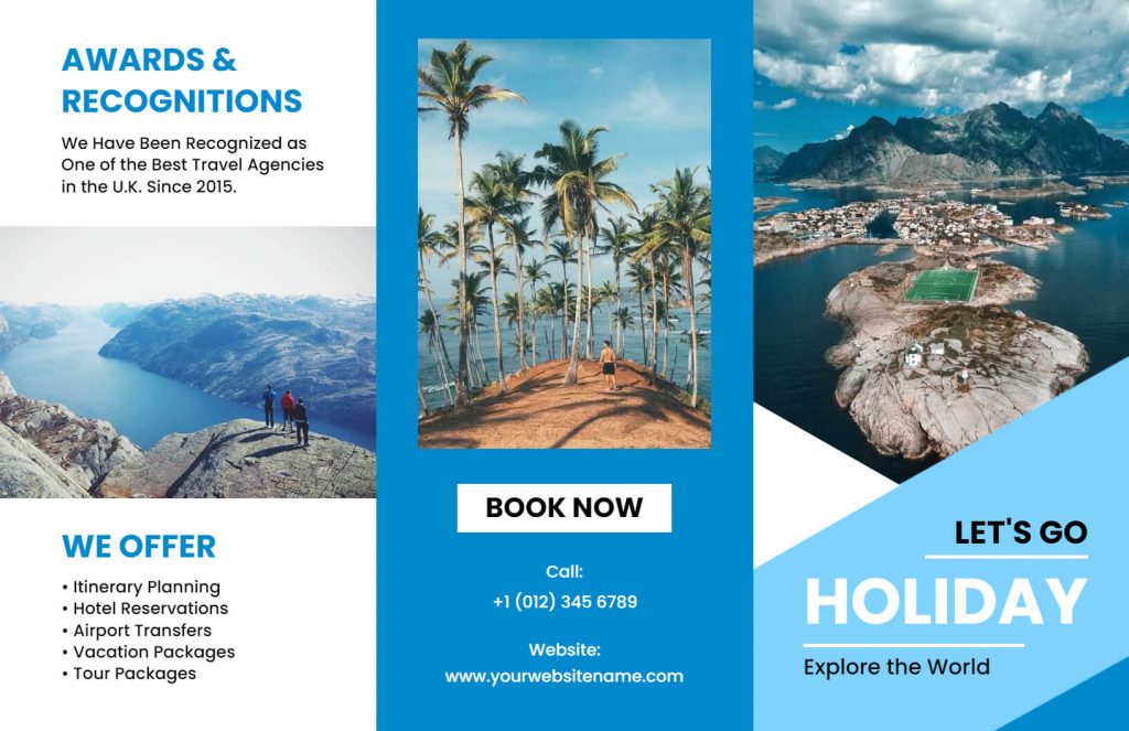
Brochures are an essential marketing tool for businesses to promote their products or services. A well-designed brochure can effectively communicate the value of your brand and help you stand out in a crowded market. One of the most important aspects of designing a brochure is the layout. A good brochure will not only be visually appealing but also make the information easy to digest for the readers. Using a brochure maker can simplify the layout process, allowing you to create a professional-looking brochure with ease. In this article, we will provide you with a comprehensive guide on designing a brochure layout to help you create an effective marketing tool for your business.
Table Of Content
- Key Elements of a Brochure Layout
- Brochure Inside Panel Content
- Tips for Designing a Visually Appealing Brochure Layout
- Benefits of a Brochure Layout
Key Elements of a Brochure Layout
Before we dive into the specifics of designing a brochure layout, it is important to understand the key elements that make up a brochure. A typical brochure layout consists of the following elements:
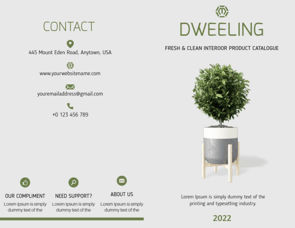
Cover Page
The cover page is the first thing the readers will see when they pick up your brochure. It is crucial to make a good first impression, so ensure that the cover page is visually appealing and reflects the brand’s personality.
Introduction
The introduction page should be brief and provide an overview of what the brochure is about. It should also highlight the main benefits of your products or services.
Headline and Sub-Headline
The headline and sub-headline are the next things a reader can see, and they should immediately grab their attention. The headline should be short, bold, and concise, and should clearly convey the main message of the brochure. The sub-headline should provide additional information and support the main message.
High-Quality Images
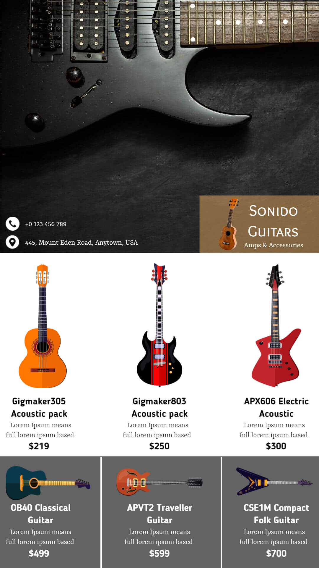
Images are a powerful way to communicate your message and grab attention. Use high-quality images that are relevant to your message and support the overall design of the brochure.
Body Text
The body text of the brochure is where you provide more detailed information about your products or services. It should be organized into sections or categories to make it easy for the readers to navigate.
Call-to-Action
The call-to-action is the final element of a layout, and it’s what persuades the reader to take action. The call-to-action should be clear and concise, and it should tell the reader what action they need to take next. Whether it’s calling a phone number, visiting a website, or making a purchase, the call-to-action should be the focus of the brochure.
Tips for Designing a Visually Appealing Brochure Layout
- Keep it Simple: When designing a brochure, it is important to keep it simple. A cluttered layout can be overwhelming and make it difficult for the readers to absorb the information. Use a minimalistic design that highlights the key features of your products or services.
- Use Color: Color is a powerful tool in designing a brochure layout. Choose colors that complement your brand’s personality and create a visual hierarchy that guides the readers’ eyes to the most important information.
- Incorporate Images: Images can make a brochure more visually appealing and help to convey your message effectively. Use high-quality images that are relevant to your products or services.
- Use White Space: White space is the empty space between the elements in a brochure layout. It can be used to create a visual break and make the information more digestible for the readers.
- Choose Fonts Wisely: The font you choose for your brochure layout can greatly impact its effectiveness. Choose a font that is easy to read and reflects your brand’s personality.
- Consider the Fold: Brochures are typically folded, so it is important to consider the fold when designing the layout. Ensure that the most important information is visible even when the brochure is folded.
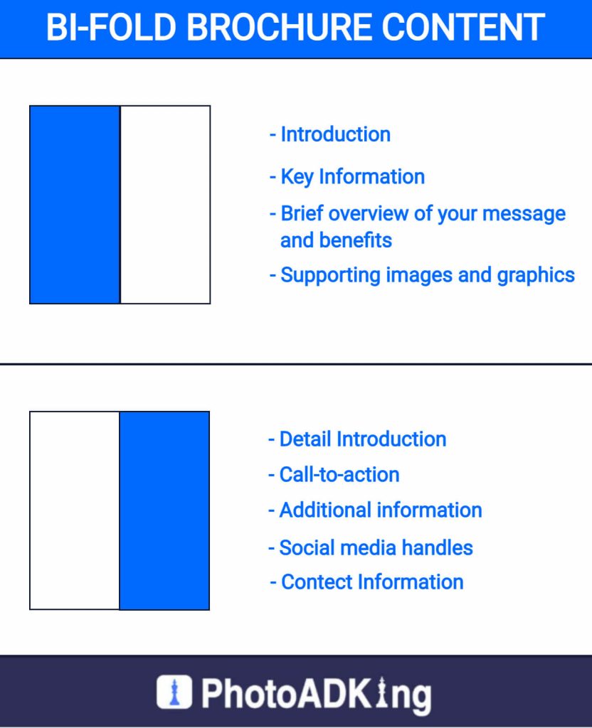
Brochure Inside Panel Content
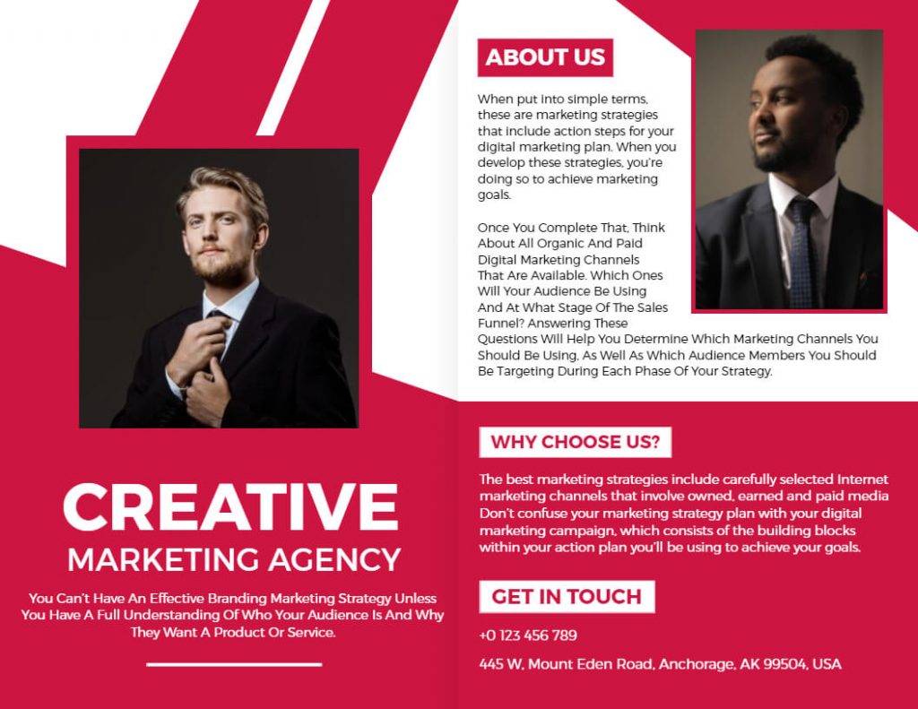
Bi-Fold Brochure Content
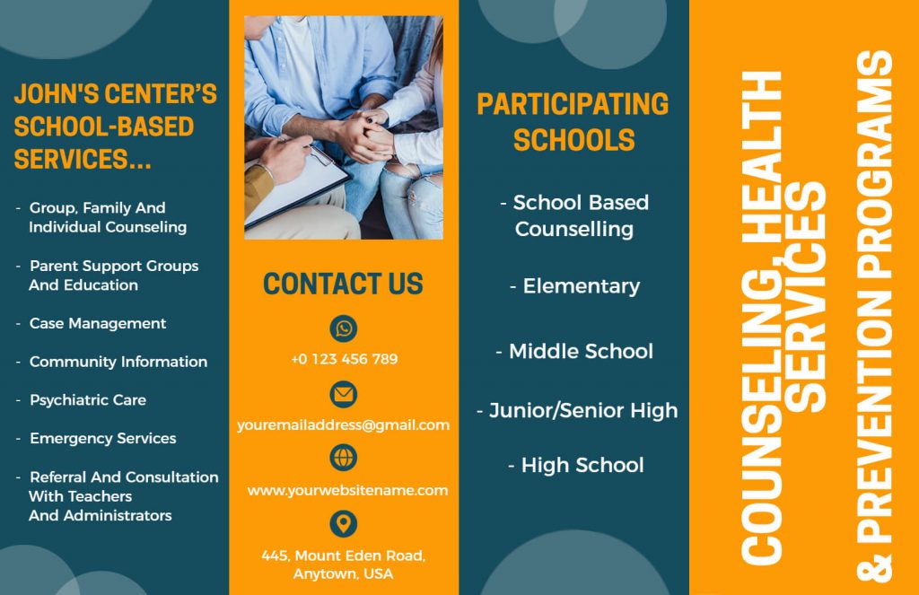
Tri-Fold Brochure Content
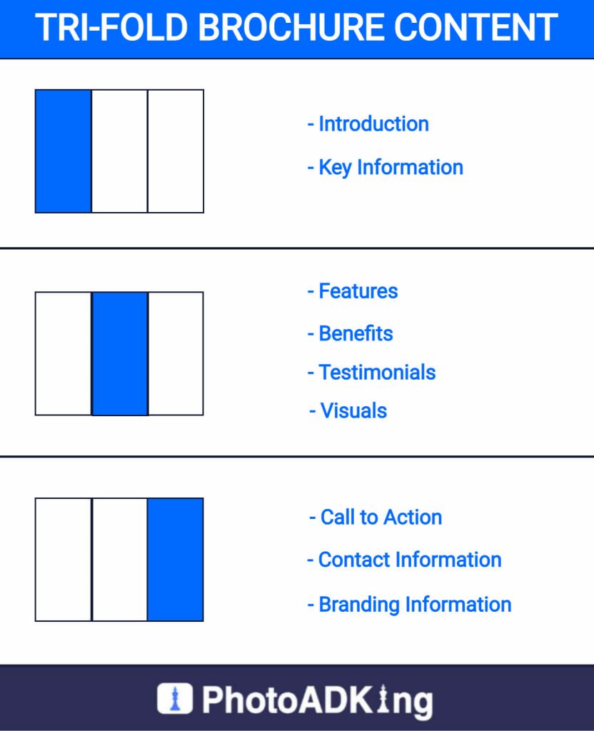
If you know more about tri-fold layouts, then check out our article on tri-fold brochure layouts to make your brochure creative.
Benefits of a Brochure Layout
- Clarity: Brochure layout design to be clear and easy to read, making it easier for potential customers to understand your message. The layout helps to organize the information and make it visually appealing.
- Professionalism: Using a brochure layout can make your marketing materials look more professional and polished. It shows that you have put effort into creating a well-designed brochure and that you take your business seriously.
- Branding: A brochure layout can help to reinforce your brand by using consistent colors, fonts, and imagery. This helps to create a cohesive and recognizable brand identity that can help your business stand out from the competition.
- Flexibility: Brochure layouts can customize to fit your specific needs, whether you want to promote a single product or service, or provide information about your entire business. The layout can adapt to fit the amount of information you want to include and the style you want to convey.
- Cost-effective: Using brochure layouts is a cost-effective way to create marketing materials that look professional and engaging. Many layout templates are available for free or at a low cost, and you can customize them to fit your needs without having to hire a designer.
Conclusion
Designing a brochure layout that grabs attention and effectively communicates your message requires a combination of key elements, tips, and benefits. By following the guidelines outlined in this ultimate guide, you can create a stunning brochure layout that makes an impact and helps you achieve your marketing goals. To make the process even easier, you can use a brochure template as a starting point for your design. Brochure templates provide a framework for your content and layout, allowing you to focus on the message and visuals that will best represent your brand.

