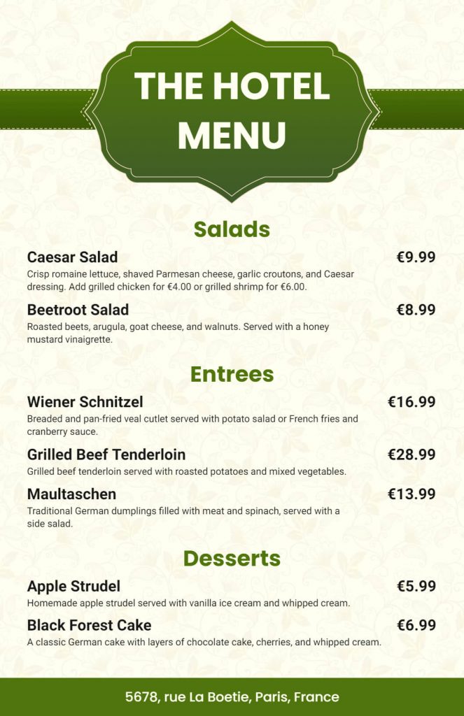
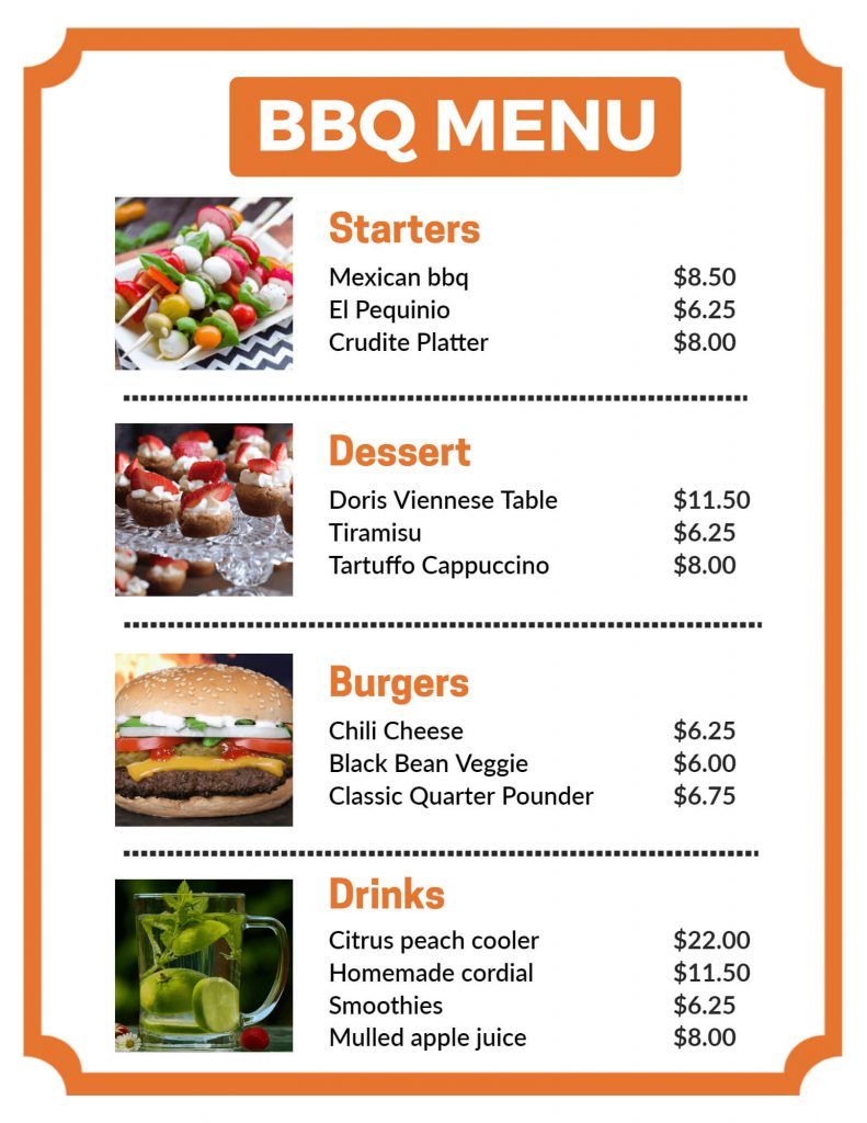
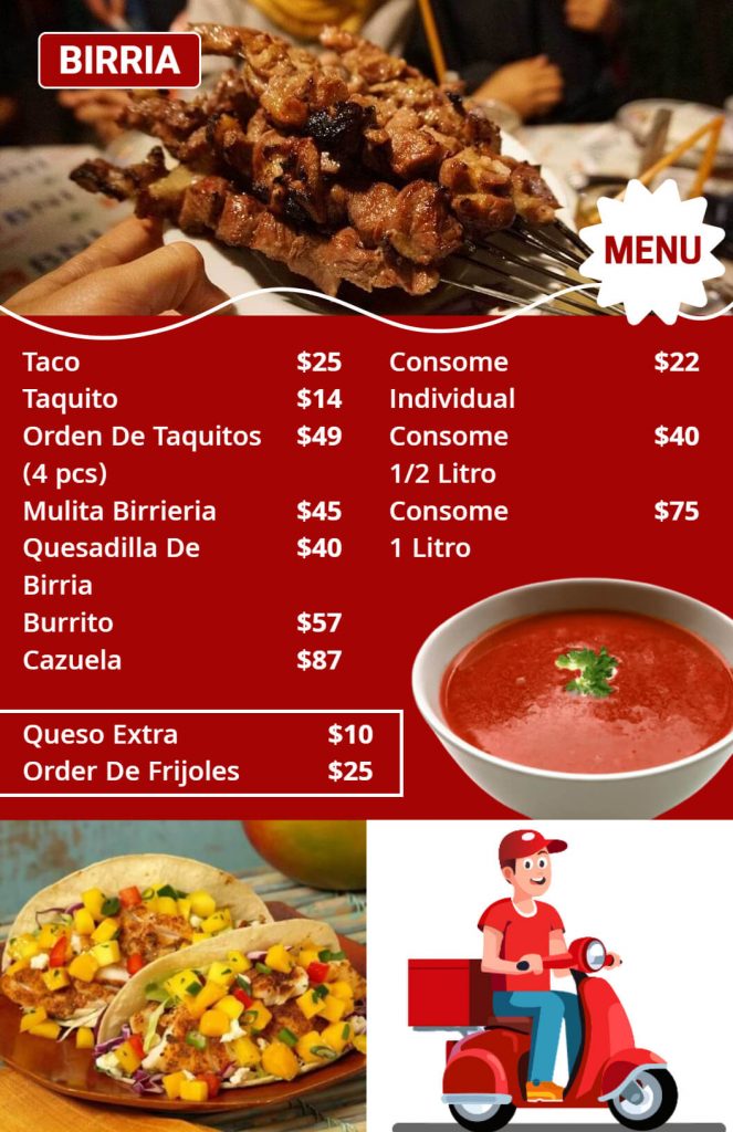
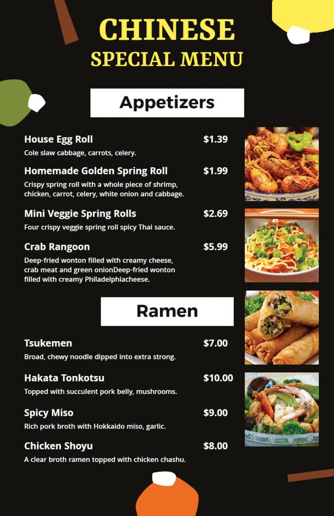
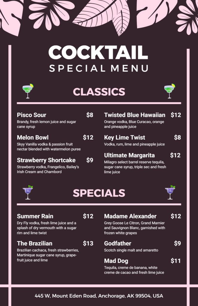
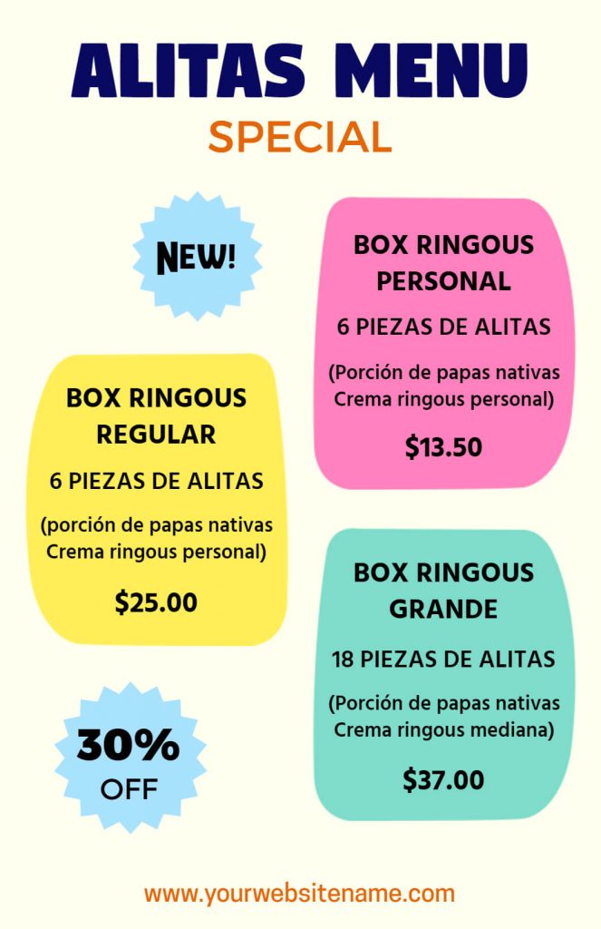
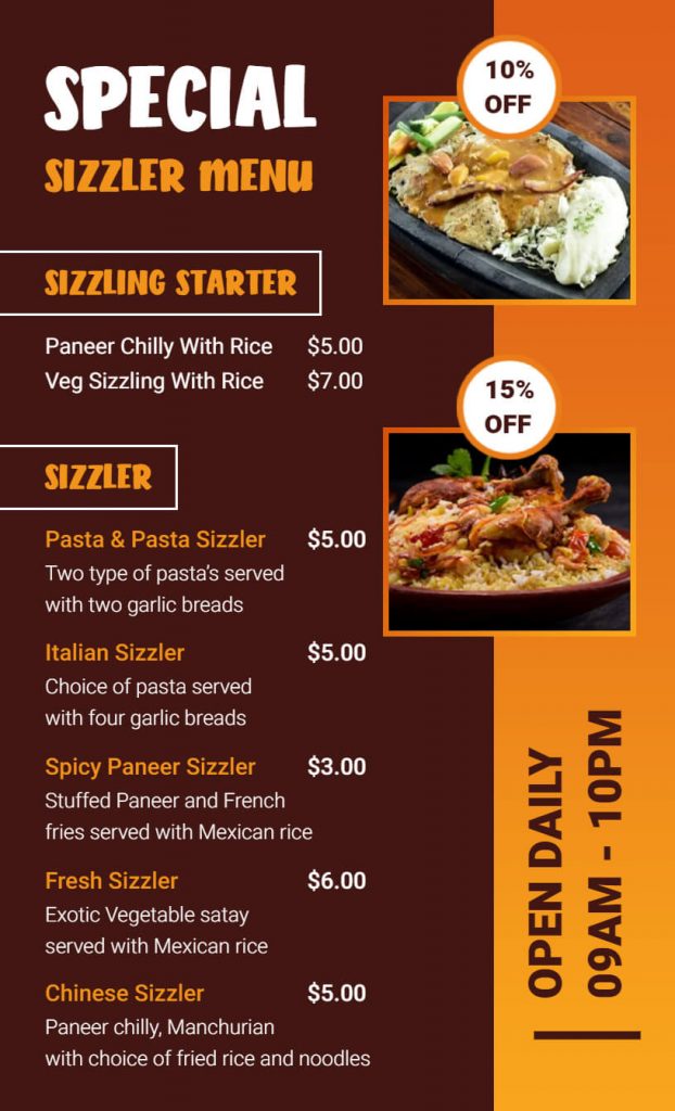
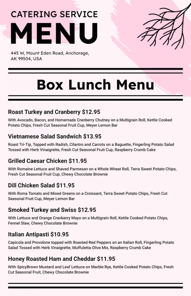
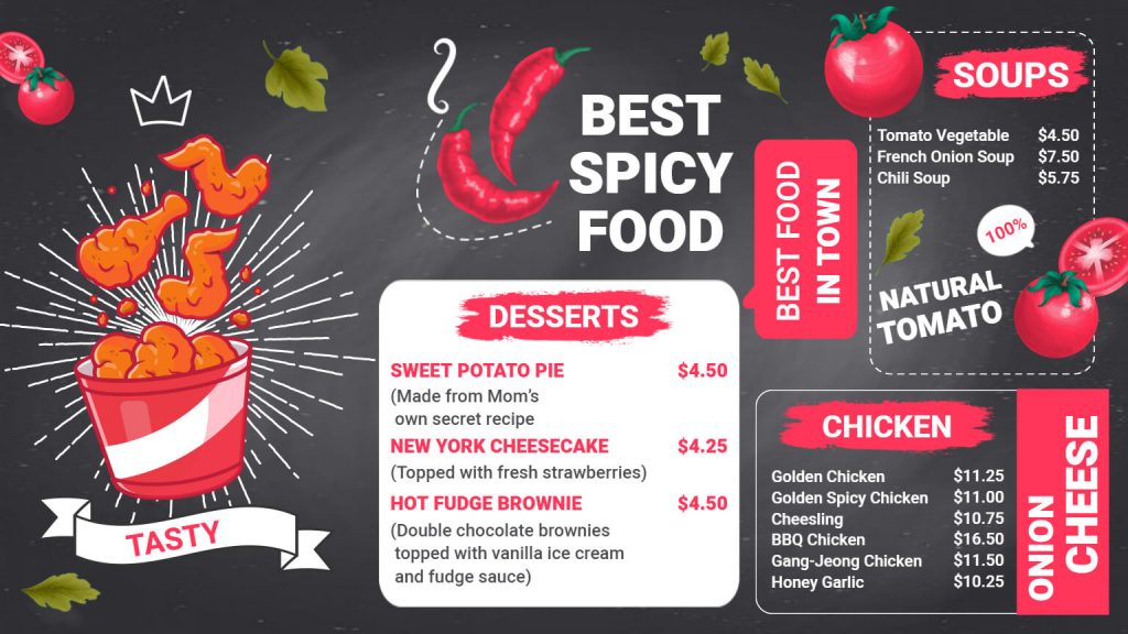
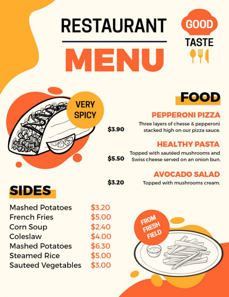
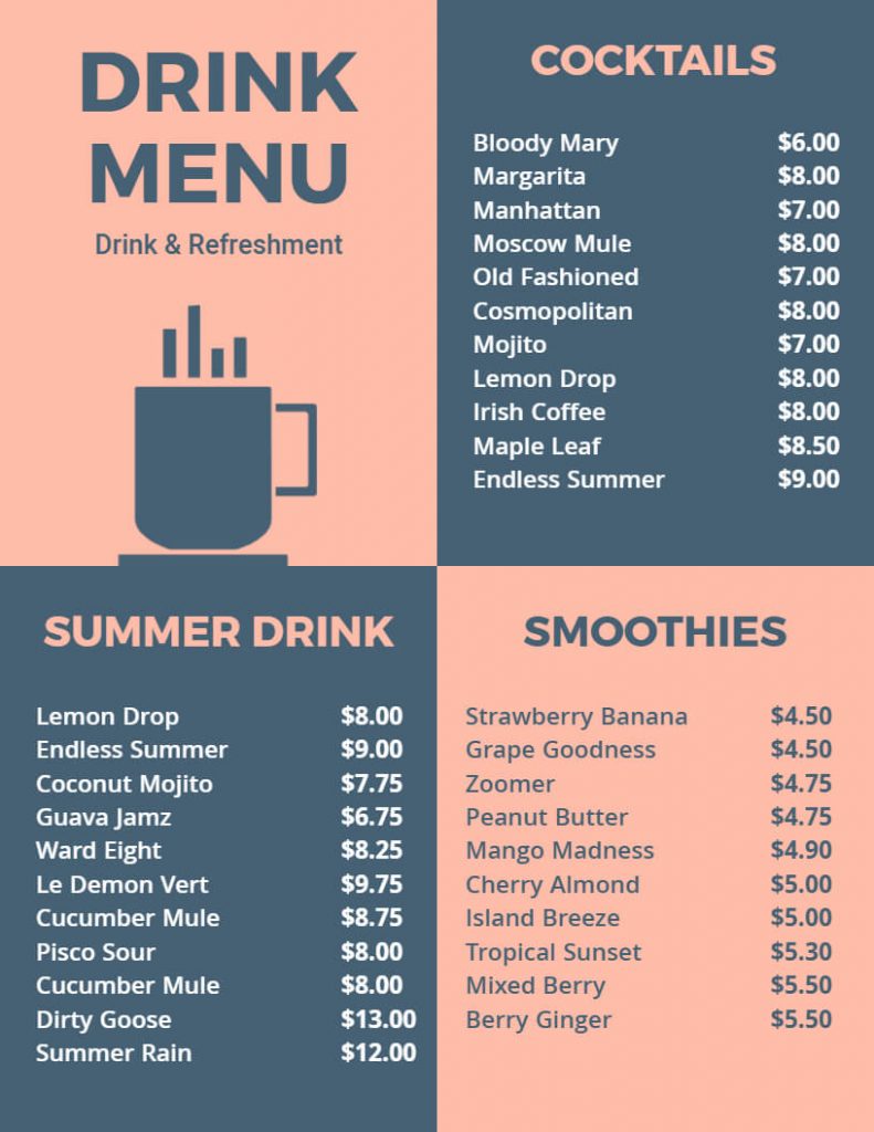
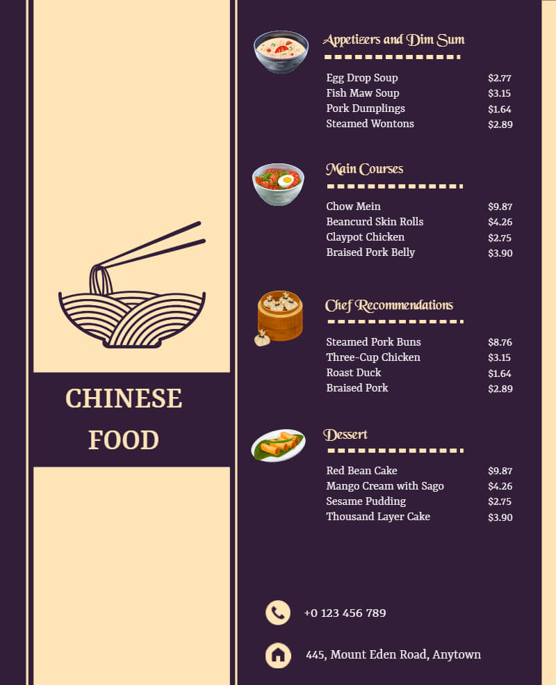
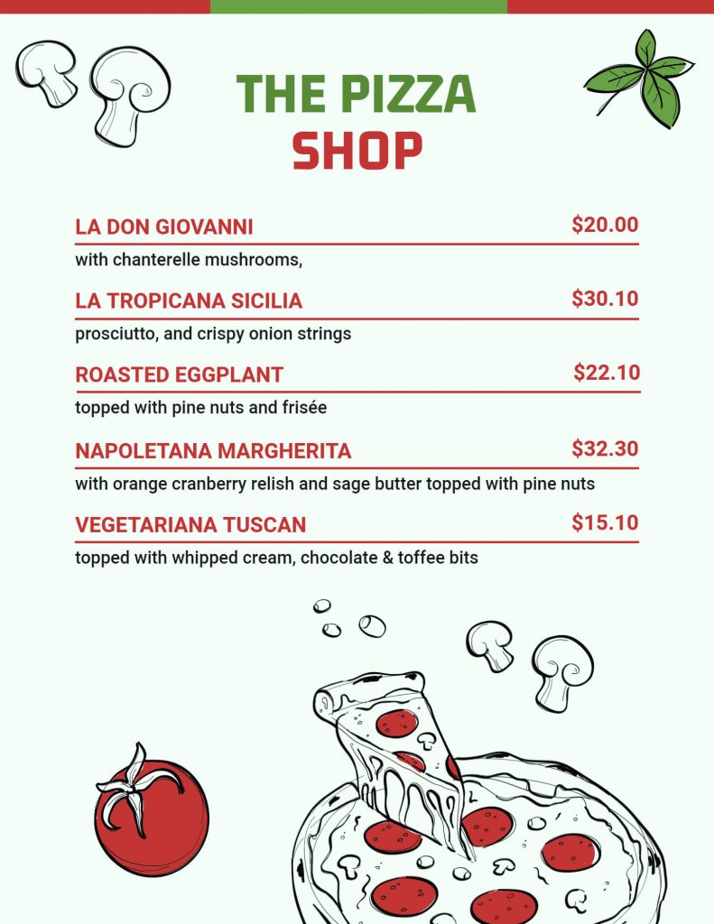
A restaurant’s menu is the first thing that guests interact with, so it is crucial to make an excellent first impression. A menu with too many items, bad photos, or bad wording can ruin a diner’s experience. On the other hand, a well-designed menu that complements the restaurant’s identity can give customers the impression that they made the right decision. So, here we discuss 14 restaurant menu tips that will give you the wholesome idea to design a perfect menu.
A well-designed menu can also boost revenue by drawing attention to profitable menu items. Therefore, these 14 restaurant menu tips are provided to help make strategic decisions about menu design and let you create a menu that appeals to the audience well.
Table of Contents
- Keep it simple
- Use high-quality images
- Highlight specials and popular dishes
- Choose the right fonts
- Choose the right colors
- Be descriptive
- Use appetizing words
- Organize your menu logically
- Use white space effectively
- Include prices
- Be creative
- Incorporate branding elements
- Use illustrative graphics and icons
- Use call-to-action phrases
1. Keep It Simple
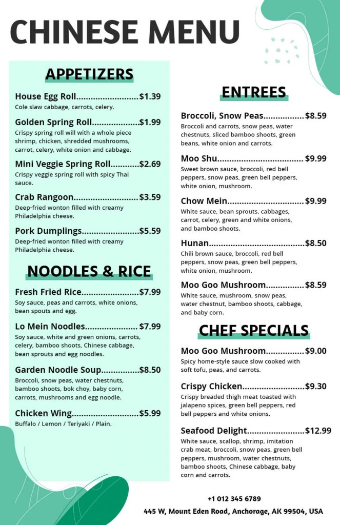
A simple menu layout is essential for customers to navigate and order easily. Avoid cluttering the menu with too many dishes or descriptions. Keep it short and sweet, with clear categories and subheadings. Moreover, make sure your customers can quickly scan and find what they want.
2. Use High-quality Images
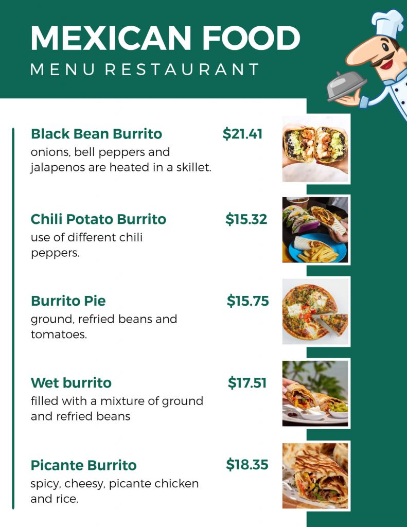
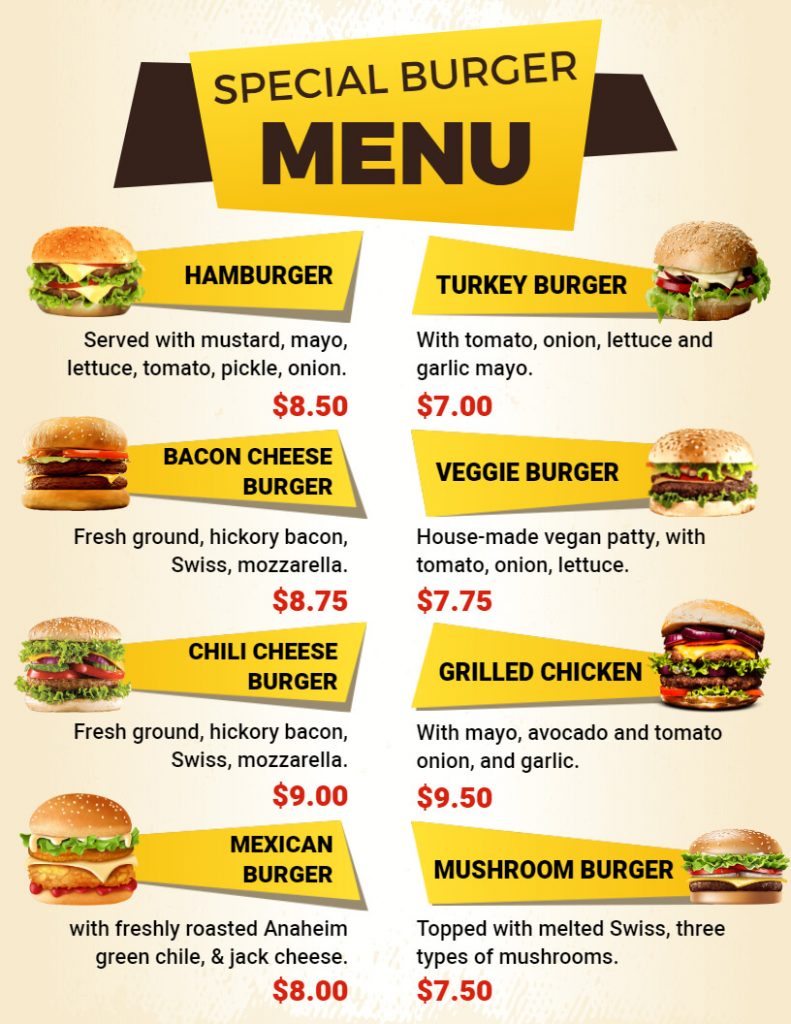
A picture speaks a thousand words, and high-quality images of your dishes can entice customers to order more. Hire a professional photographer to capture mouth-watering images of your menu items. Also, make sure the images are well-lit, and show the dish at its best angle.
3. Highlight Specials and Popular Dishes
Put your best foot forward by highlighting your specials and popular dishes. Use eye-catching graphics or icons to make them stand out from the rest of the menu. Also, use design elements such as bold text or a different color to make your specials or popular dishes stand out. This will help your customers find them quickly.
4. Choose the Right Fonts
The font used on the menu should be legible and easy to read. Avoid using too many different fonts, as this can make the menu look cluttered and unprofessional as a result.
5. Choose the Right Colors
Color can evoke emotions and influence customer behavior. Choose colors that complement your brand and create a welcoming atmosphere. Also, consider color psychology and how it can influence your customers’ appetites. Remember that certain colors, such as red and orange, can stimulate the appetite.
6. Be Descriptive
Use descriptive words to help customers understand what to expect from the dish. Include details such as the ingredients, cooking style, and flavors. This will help your customers imagine the flavor and increase their likelihood of ordering as a result.
7. Use Appetizing Words
Use words that evoke the senses and make the dishes sound delicious. Words like “juicy,” “savory,” and “crispy” can make the dish more appetizing and also make them order quickly.
8. Organize Your Menu Logically
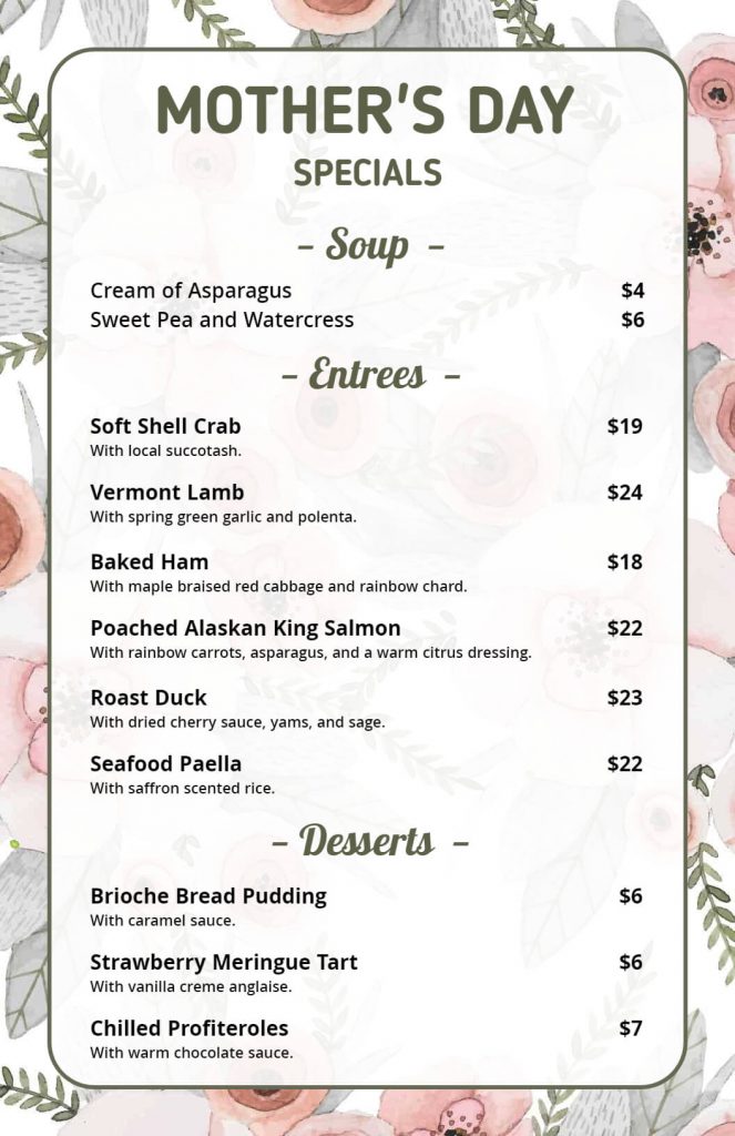
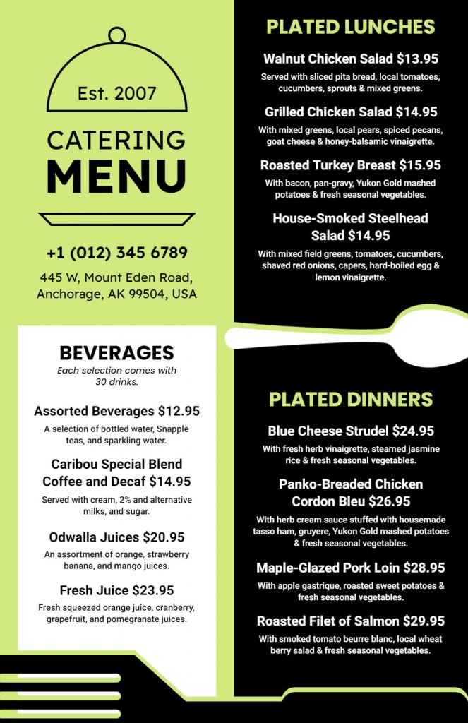
Group dishes together in a logical order, such as appetizers, entrees, and desserts. Use subheadings and dividers to make it easy for customers to navigate.
9. Use White Space Effectively
White space helps to create a clean and organized layout. Use it to separate different sections of the menu and make the dishes stand out.
10. Include Prices
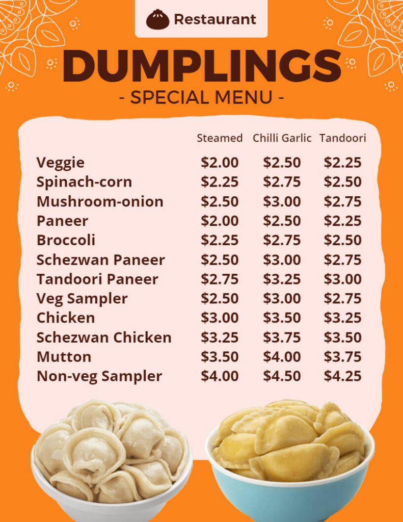
Before placing an order, customers want to know how much they will spend. Make sure to list prices for every dish on the menu, and make sure they are legible and clear. Also, to make the prices less obvious and prevent confusing your customers, think about using a smaller font size or a lighter color.
11. Be Creative
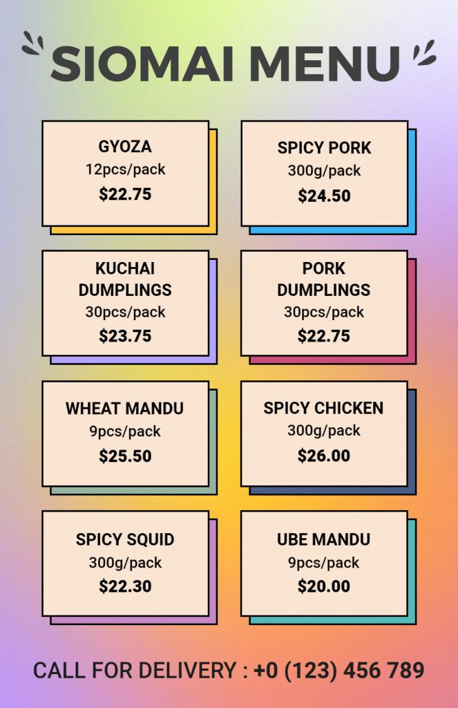
Don’t be afraid to try out new recipes or interesting menu designs. Be creative and innovative to set yourself apart from the competition. Moreover, consider using unique shapes, textures, or illustrations that complement the style of your brand.
12. Incorporate Branding Elements
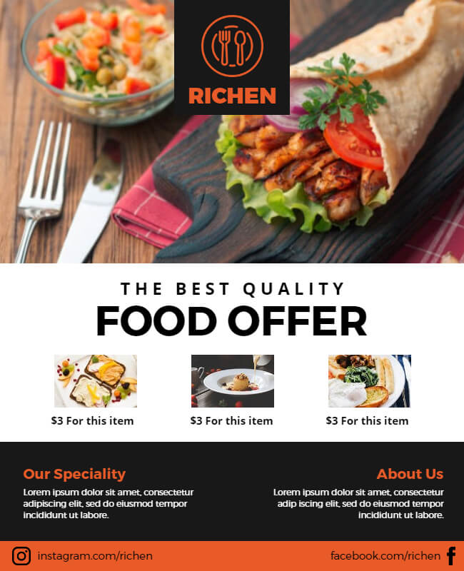
Include branding components from your company in the menu design, such as logos and colors. The brand image will become more consistent as a result.
13. Use Illustrative Graphics and Icons
Use illustrative graphics and icons to make the menu more visually appealing. Icons can also be used to represent dietary needs, such as gluten-free or vegetarian options.
14. Use Call-to-Action Phrases
Use phrases such as “try our signature dish” or “order now” to encourage customers to try new dishes or place an order.
Finally, we hope you find the above restaurant menu tips useful. Try them out and look for more restaurant menu ideas to help you stand out from the crowd. Also, don’t forget to include design layouts and your brand’s unique touch, and we guarantee you’ll succeed in your marketing endeavors.
Also, read our blog on food poster ideas and unlock a world of culinary creativity and tantalizing designs.
Conclusion
Creating a successful restaurant menu requires careful planning and attention to detail. By following these 14 restaurant menu tips, you can create a menu using restaurant menu templates that is easy to read, visually appealing, and profitable. Remember to keep the menu simple, highlight your best dishes, place them strategically, group items logically, offer a variety of options including pricing information, update the menu regularly, make it interactive, incorporate your restaurant’s brand, and solicit feedback from your customers. With these restaurant menu tips, you’ll surely be well on your way to creating a menu that will leave your customers hungry for more.

