People often say that “you eat with your eyes first”. The menu serves as a customer’s first point of contact with a restaurant. An attractive blank menu background design and a well-designed menu can set the mood for the entire dining experience. On the other hand, a poorly designed menu can give the wrong impression and have an impact on how the customer feels about the restaurant’s food and service.
The background of a menu that is empty is like a blank canvas that is just waiting for your imagination to bead it with ideas. This article will go over a blank menu background design to help you create a blank menu that accurately represents your restaurant’s identity and brand.
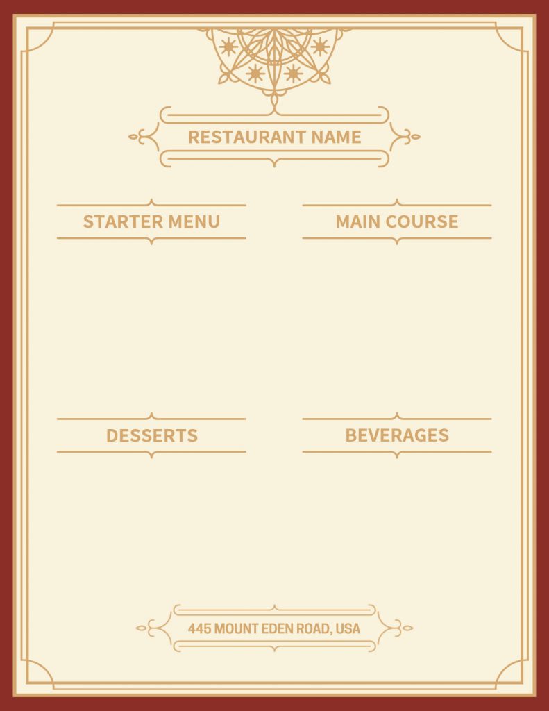
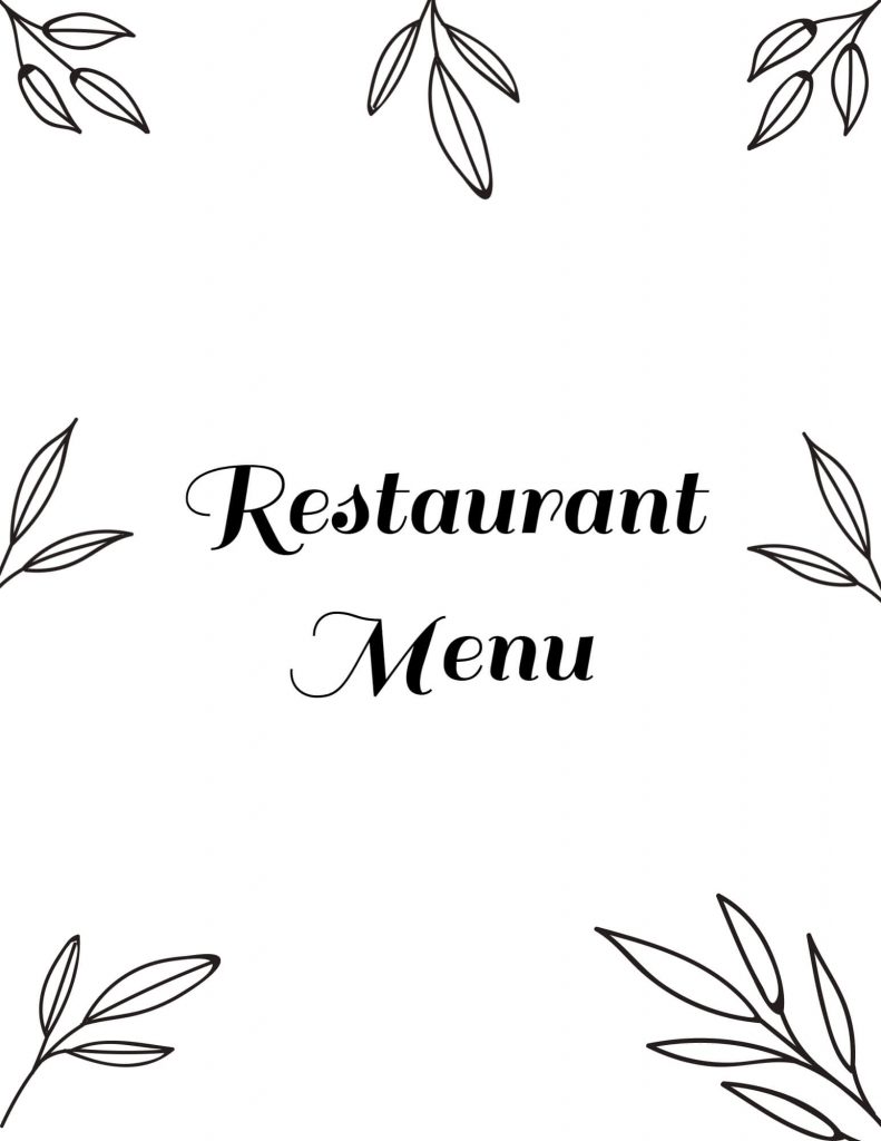
Classic Blank Menu
The versatile blank menu has a classic and elegant design for any restaurant. There is enough room for the menu items and descriptions, and it has a clear and straightforward layout. For an added touch of elegance, the traditional design components can also be improved with your restaurant’s logo or decorative accents. From fine dining to relaxed bistros, this design is suitable for all restaurant types.
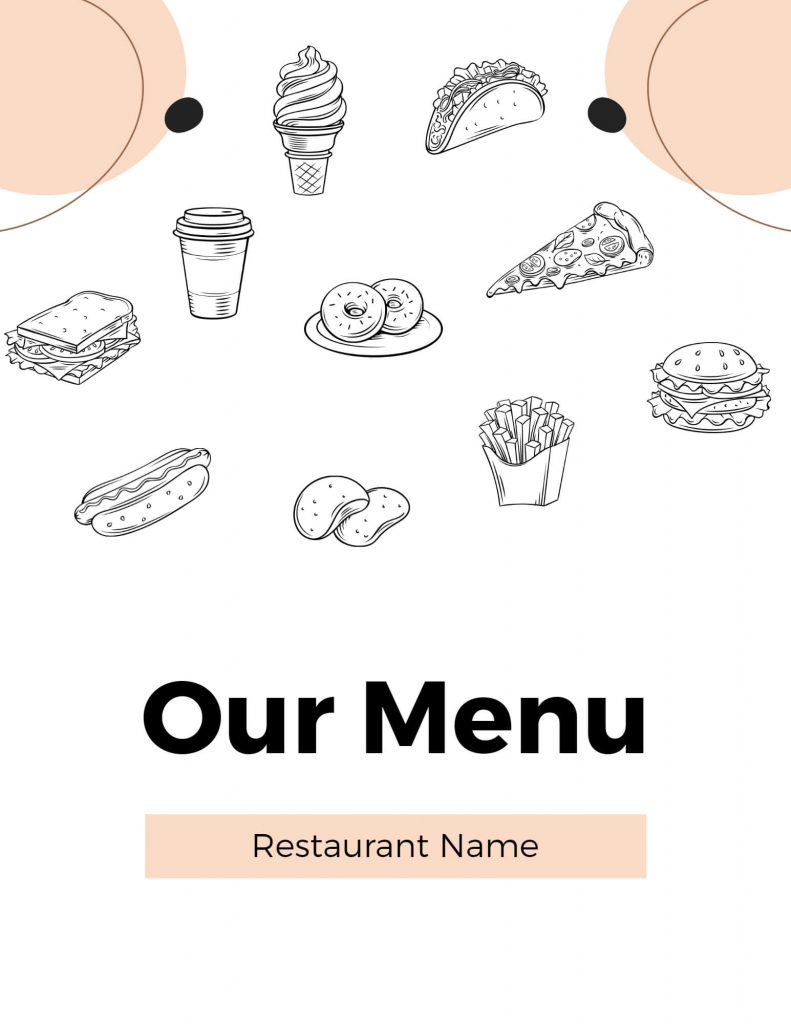
White and Quirky
The white and quirky blank menu design combines white background with quirky design elements to produce a sophisticated and lovely menu. To evoke a feeling of refinement and luxury, it often uses intricate hand-drawn food illustrations, delicate hues, and elegant fonts.
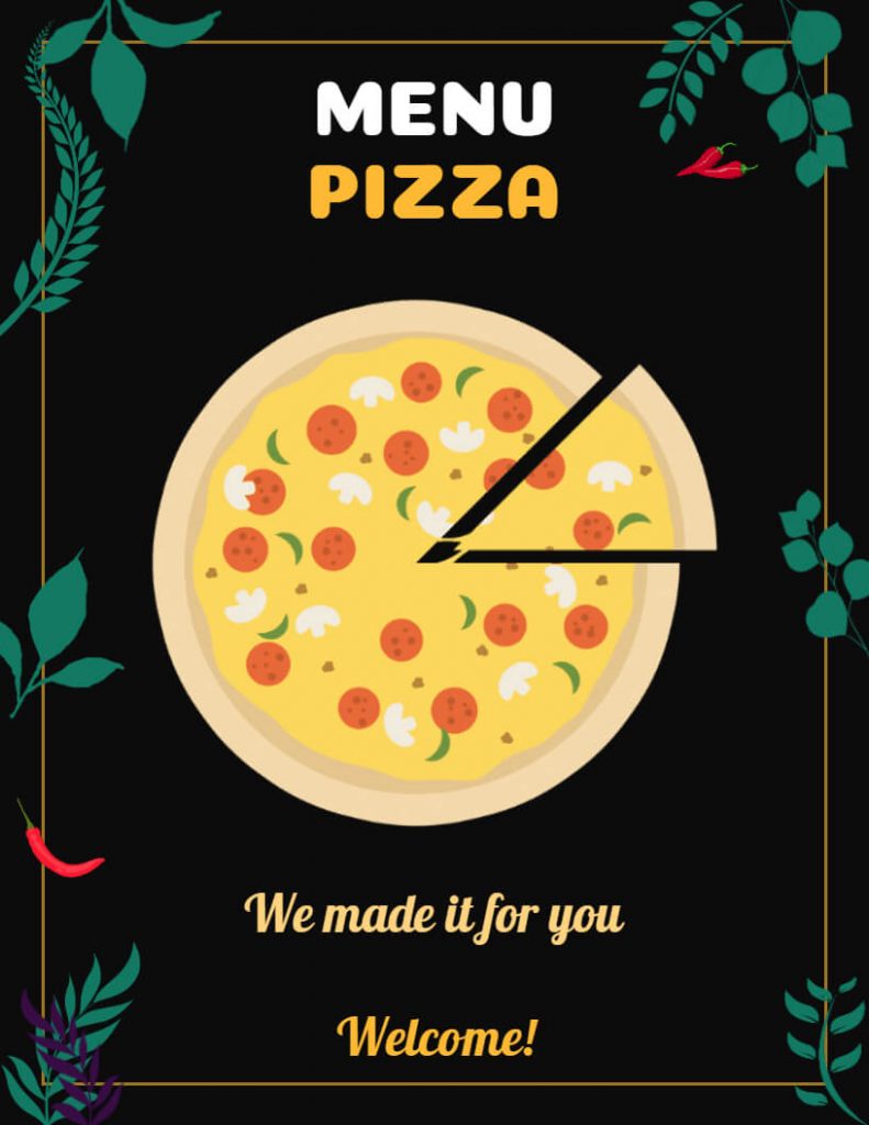
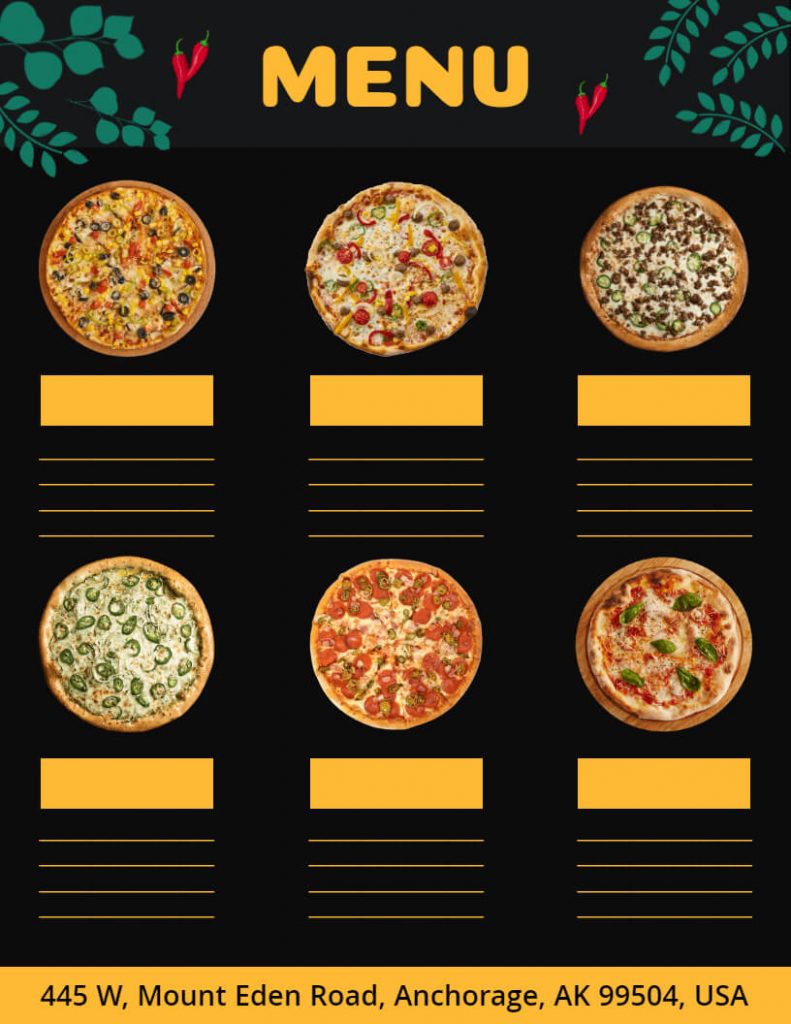
Modern Blank Menu
Restaurants with a casual and luxurious ambiance often choose the modern blank menu design. This style is distinguished by a black background, white or colored typography, and hand-drawn illustrations. It also creates a cozy and comfortable ambiance and is ideal for establishments that serve comfort food or want to add a nostalgic touch to their menu. Additionally, explore restaurant menu design examples if you’re looking for more modern restaurant menus that not just make your restaurant stand out but also increase your orders.
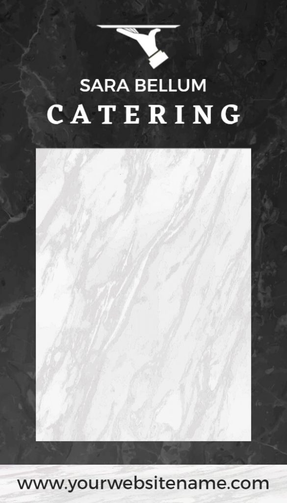
Marble
The marble blank menu design is a stylish and luxurious option with a sleek and elegant appearance. The background is typically a marble texture or pattern, with minimalist typography and simple illustrations. Moreover, this design is ideal for high-end restaurants or those looking to convey a sense of sophistication and exclusivity.
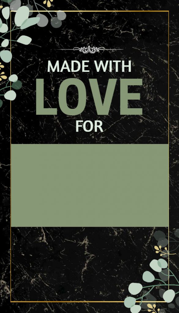
Creative Blank Menu
The creative blank menu design is an imaginative and artistic option that allows for a lot of flexibility and creativity. This design typically features unique and unconventional layouts, innovative typography, and creative illustrations. It is also perfect for restaurants that want to stand out from the crowd and make a bold and creative statement.
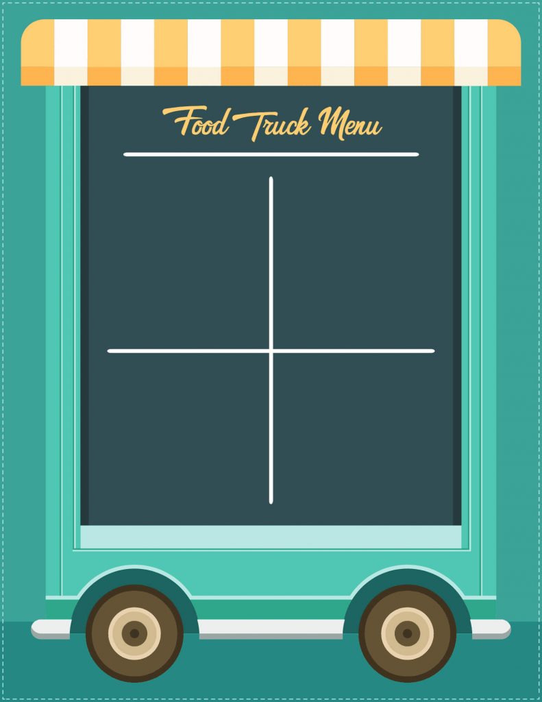
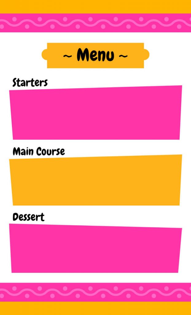
Colorful Blank Menu
The colorful blank menu design is a vibrant and fun option for adding a splash of color to your menu. To create a lively and energizing atmosphere, this design often makes use of vivid and bold colors, playful typography, and whimsical illustrations. It is also ideal for businesses that serve families or those looking to create a joyful atmosphere.
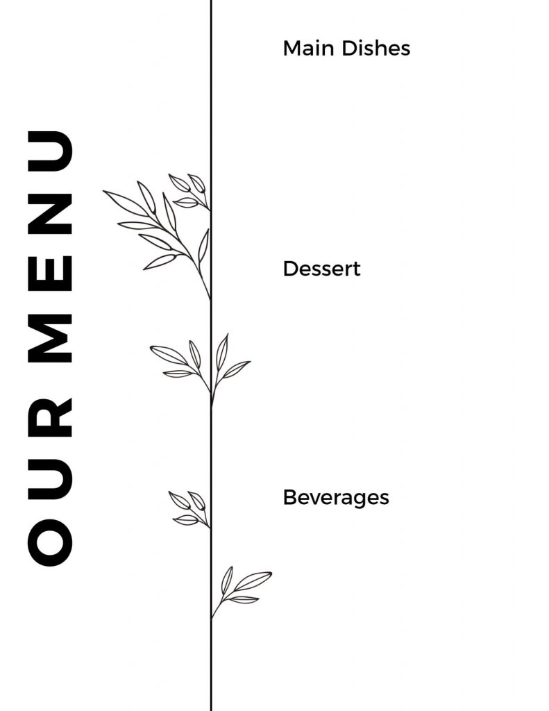
Minimalist Blank Menu
Simple and clean in appearance, the minimalist blank menu design is a chic and contemporary choice. To convey a sense of elegance and sophistication, this design also makes use of a lot of white space, minimalist typography, and subtle illustrations. It is ideal for restaurants that want to highlight the quality and simplicity of their cuisine, as well as those looking to create a minimalist and refined ambiance.
Moreover, we hope you find this blank menu background design useful. Try out more restaurant menu templates and design them online easily according to your choice.
Conclusion
Choosing the right background design for your restaurant’s menu can make or break your ability to attract customers and create a memorable dining experience. You can add some flavor and personality to your restaurant’s menu with these blank menu background designs. So, go ahead and create a menu that best represents your brand and style. Have fun designing!

