Gone are the days when default fonts used to be ‘followed’. People now believe in creating something unique. Beautiful font combinations are inevitable whether something is to be dispatched to print media or to be shared online.
You can’t create something extraordinary unless you give special attention to Fonts.
When attempting a DIY approach to font selection, a fear always remains “Am I doing it right?”, “Will it look good?”, and the most vital one is FOMO, “Am I using outdated fonts?”.
Trying hands on the new font combination is what you should not miss out on at any cost.
We have handpicked a few of the best Google Font Combinations you should try at least once. The extensive font library by Google is a pool for you to trigger emotions, reflect professionalism, promote user-friendliness, and enhance readability.
Here’s the list;
- Playfair Display + Roboto
- Alegreya + Lato
- Libre Baskerville + Open Sans
- Zhi Mang Xing + Raleway
- Montserrat + Merriweather
- Oswald + EB Garamond
- Open Sans + Open Sans Condensed
1) Playfair Display + Roboto
Playfair Display is typography inspired by the letterforms of the 18th Century when the transition from quills to steel-tipped pens was observed. Extract the Vintage charm to your work and present it in a wow-full way with Playfair Display.
How about combining Old world fonts with futuristic ones? Here comes an Arial look-alike. It’s an Uber combination that brings your Taglines under the spotlight.
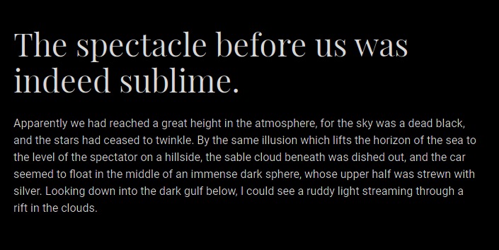
Where to use?
Whenever you want to personalize something like taglines or product descriptions, Playfair Display + Roboto is a popular choice. Its wild card characters are heart-winning and you won’t realize it until you have tried ampersand and currency symbols.
2) Alegreya + Lato
Trust me, you’ll look out for Alegreya + Lato with your text Logo Generator once you finish this read. Born from a creative mind, it spells magic by making a fancy impression. They’re one of the most pragmatic fonts you would ever use.
Pro Tip: Never combine more than two fonts. It destroys elegance. Try adjusting the style of the chosen fonts to highlight something in your text, it will work better than a mishmash of 3 or more fonts.
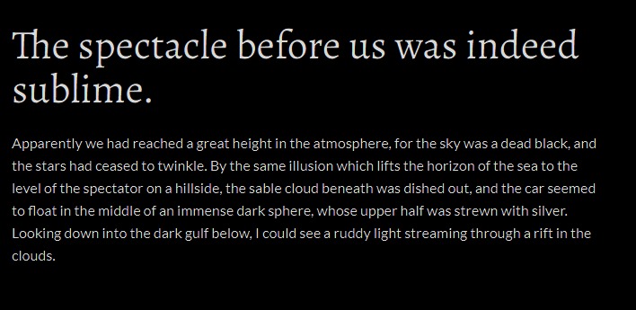
Where to use?
If you want the distinct appearance of your text creation, use this exciting font combination.
Creating Pre-School Logo or representing anything that is down-to-earth and lovely can be done best with Alegreya + Lato combination. It creates an effortless reading experience that keeps viewers stuck to it.
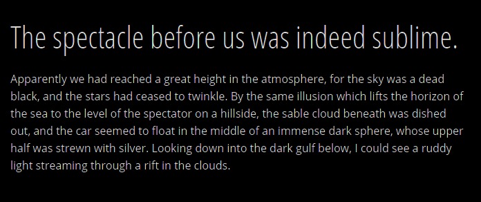
3) Libre Baskerville + Open Sans
The Best Font combination 2020 list would be incomplete without this one. Indeed, you would be in awe of Libre Baskerville + Open Sans that’s stylish and decent at the same time. The remarkable outlook achieved by these superb fonts will make your day, no matter wherever it is used.
Libre Baskerville + Open Sans is thus one of the most versatile combinations of fonts not to be missed by millennials.
Where to use?
You can put it to the best use wherever you want. It would justify Magazine Covers, poster designs, and similar places where you want to draw attention to headers & use minimal text along.
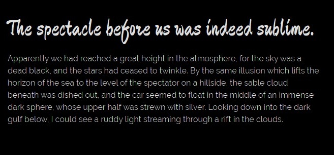
4) Zhi Mang Xing + Raleway
Are you looking for a brand-new font combination? Here is something new for you!
When there is a calling to get a little playful, nothing can be better than Zhi Meng Xing. The catchy font style is so unique.
Where to use?
It’s just right to implement this combination with your Instagram Post Maker. This typography style drives equal attention to both – header and body text without making you seem ‘extra’. Brochures, Flyers, and Restaurant Menu card designs should not refrain from experimenting with this typography.
5) Montserrat + Merriweather
If you have only noticed, beautiful font combinations are born of thought that the header compels the reader to read more while the body text keeps them gripped.
Designers who opt for simplicity and versatility will be fans of Montserrat in no time. I find it a logo-perfect font if your niche is less formal.
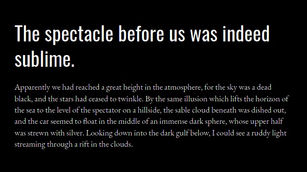
The readability floats like anything when you combine it with Merriweather. Both of them are eligible to be header and body text so you can apply them as you desire. Your work will turn out to be dashing for sure!
Where to use?
Blog Banners and Cover Letters can accommodate this modern and classic combination.
6) Oswald + EB Garamond
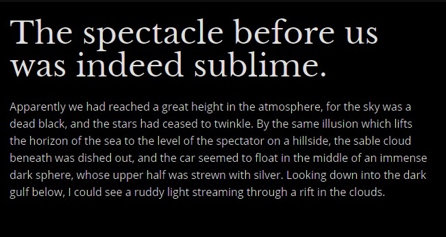
Impactful headlines can be depicted well with Oswald. With 6 styles to choose from, it has the pleasant look and feels that you seek. You can add a distinct essence of professionalism in typography by opting for EB Garamond.
A fine blend of both eliminates drama and gives a clear message to the reader. It sets your standards high.
Where to use?
This combination works great for attorneys, real estate agencies, and boutiques. You may use it for Magazines, hoardings, or Portfolio Design. It can be chosen for product descriptions, either online or for leaflets along with the physical product.
7) Open Sans + Open Sans Condensed
Be it a formal document or personal notes, this font combination is an all-rounder. Open Sans Font Family has so far given one of the most versatile fonts. You may search for it with your Banner Maker or choose it for Flyers and websites, it will be clearly readable. It will make you stand out!
Go for headers in Open Sans and leave the rest of the text style in Open Sans Condensed. It will occupy less space and still be simple and sophisticated.
Experts’ Secrets from Font-Pairing Diaries
- One needs to be very careful while combining fonts. It’s quite tricky to finalize one when you’re too overwhelmed by decorative fonts and your output should be the opposite.
Alert! It’s an oops if your font combination is giving mixed signals. The niche & purpose should be at the core whenever finalizing fonts. Going stray will mess up the theme.
- Your choice should justify the concept it is being used for. Happiness, excitement, sophistication, professionalism, etc are some of the major purposes for utilizing font combinations. Narrow your choice of fonts so that re-work is avoided.
- Besides handling all this, uniformity must be maintained. For instance, if you’re using a font combination for a website then make sure that all the headers belong to the same font family while the body text inherits similar typography.
- Always create outputs with a different variation of fonts. It will make it easy for you to choose which one will work better. However, this could only be accomplished if you have a deep understanding of typography styles and know when to use what?
What should you do to choose the right font combinations?
Trying and testing the method is all you should do first. Ask the concerned individuals if what you have chosen fits your purpose. Be open to suggestions and feel free to try more combinations, maybe you find something better during filtering.
These are a few things you can do to make it an effortless try.
The Bottom Line
If you own a business or just creating a social media post, font style can be the twist you seek to make your stuff look interesting. One thing you should always keep in mind is to keep your font kit updated with the latest font families.
This way, you can impress your clients with unique creations that highlight fonts or create something for your own & leave everyone wondering how you did it?!
Are you still scratching your head? It’s a good time to make graphics to test their vulnerability. You’ll be exposed to innumerable styles that are ready to implement. You would also find bundles of mesmerizing templates that you can implement straight away.
Have fun with your font combinations!


