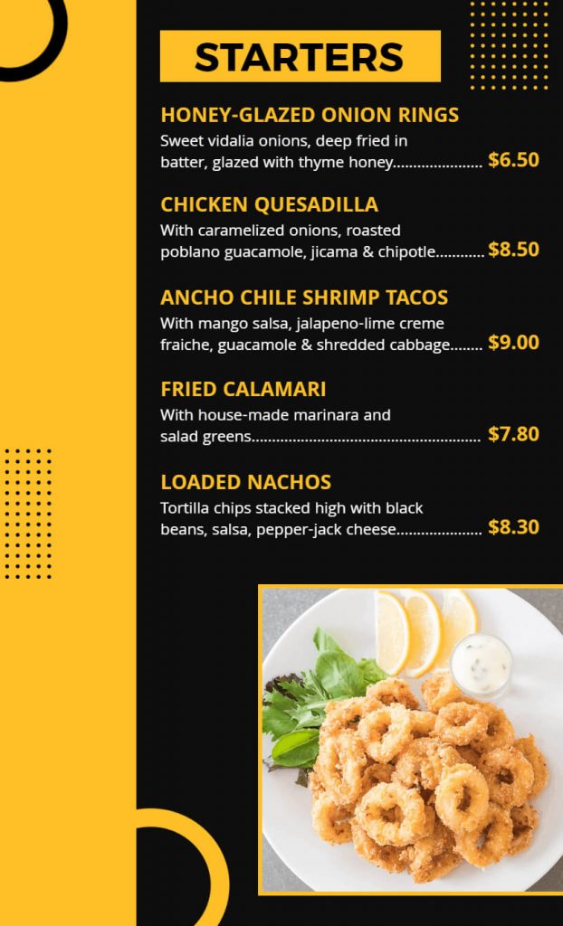
As a restaurant owner, creating a visually appealing menu is essential to attract and retaining customers. One way to achieve this is by choosing the perfect color scheme for your restaurant menu. The right color scheme can influence a customer’s appetite, mood, and overall dining experience. In this article, we will guide you through the process of choosing the perfect color scheme for your restaurant menu.
Understand the Psychology of Colors
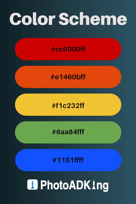
Before diving into the specifics of color schemes, it’s important to understand the basics of color psychology. Colors can elicit emotions and feelings, which is why it’s crucial to choose the right color scheme for your menu. Here’s a brief overview of how different colors can impact people:
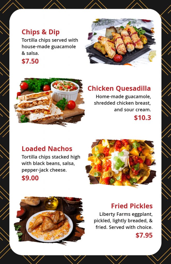
Red
This color is known to stimulate appetite, excitement, and passion. It’s a popular choice for menus as it can help to create a sense of urgency and increase sales.
Orange
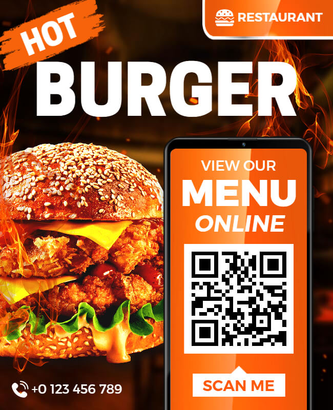
This color is known to create a sense of energy, enthusiasm, and excitement. It’s often used for fast-food restaurants, as it can help to create a sense of urgency and encourage quick decision-making.
Yellow
This color is associated with happiness, friendliness, and optimism. It can help to create a welcoming and inviting atmosphere, making it a great choice for family-oriented restaurants.
Green
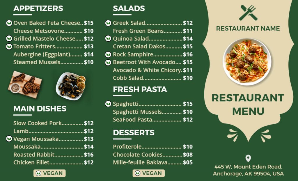
This color is associated with nature, health, and freshness. It’s often used for vegetable dishes and salads, as it can create a sense of well-being and health.
Blue
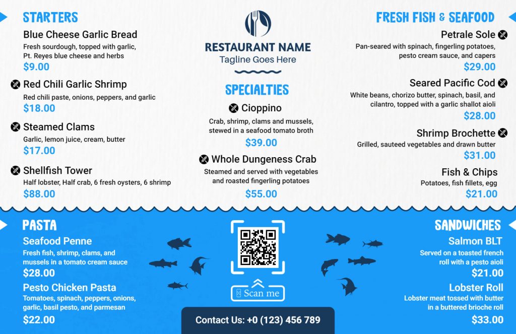
This color is known to create a calming and relaxing atmosphere. It’s often used for seafood restaurants, as it can create a connection to the ocean and create a sense of tranquility.
Restaurant Menu Color Scheme
The colors used in a restaurant menu can greatly influence the dining experience for customers. The right color scheme can create a specific atmosphere and convey the personality of the restaurant. Mainly, restaurants are constantly looking for ways to stand out from the competition and attract new customers. Enter the world of restaurant menu templates, where restaurants can customize their menus with unique designs that reflect their brand identity and aesthetic.
These menu templates are not just limited to traditional paper menus but also extend to digital menus that can be displayed on screens or even on customers’ mobile devices. With customizable options for font, color, layout, and graphics, restaurants can create menus that are not only visually appealing but also easy to read and navigate. When a restaurant suggests last-mile delivery, incorporating QR codes into digital menus can seamlessly connect customers with online ordering platforms, enhancing convenience.
Warm and Rustic
A warm color scheme of browns, oranges, and yellows can evoke feelings of comfort and homey charm. This scheme could work well for a restaurant that wants to create a cozy atmosphere.
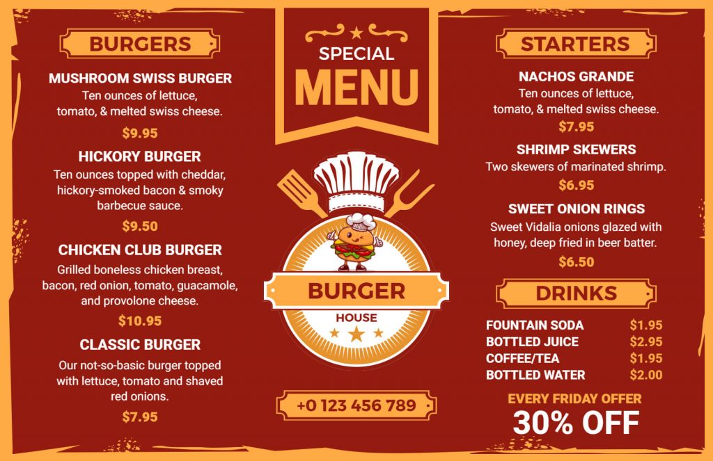
Fresh and Vibrant
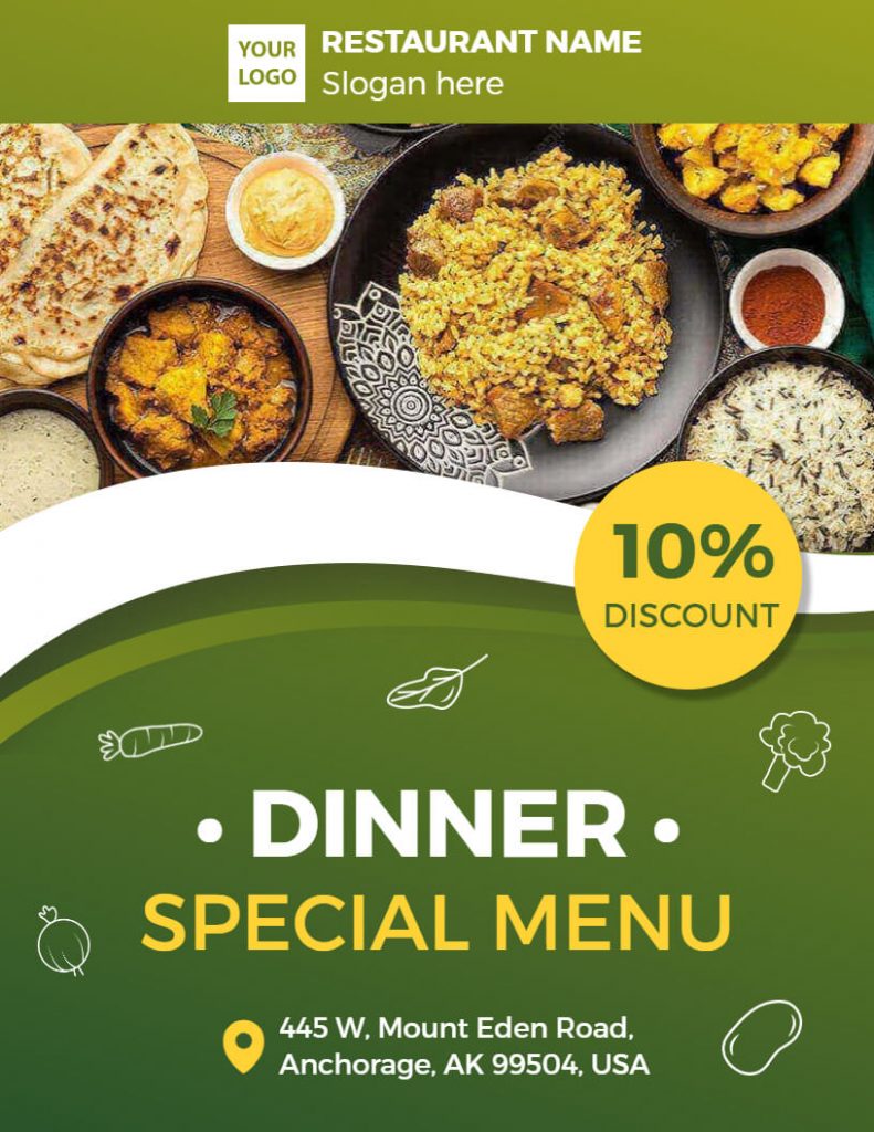
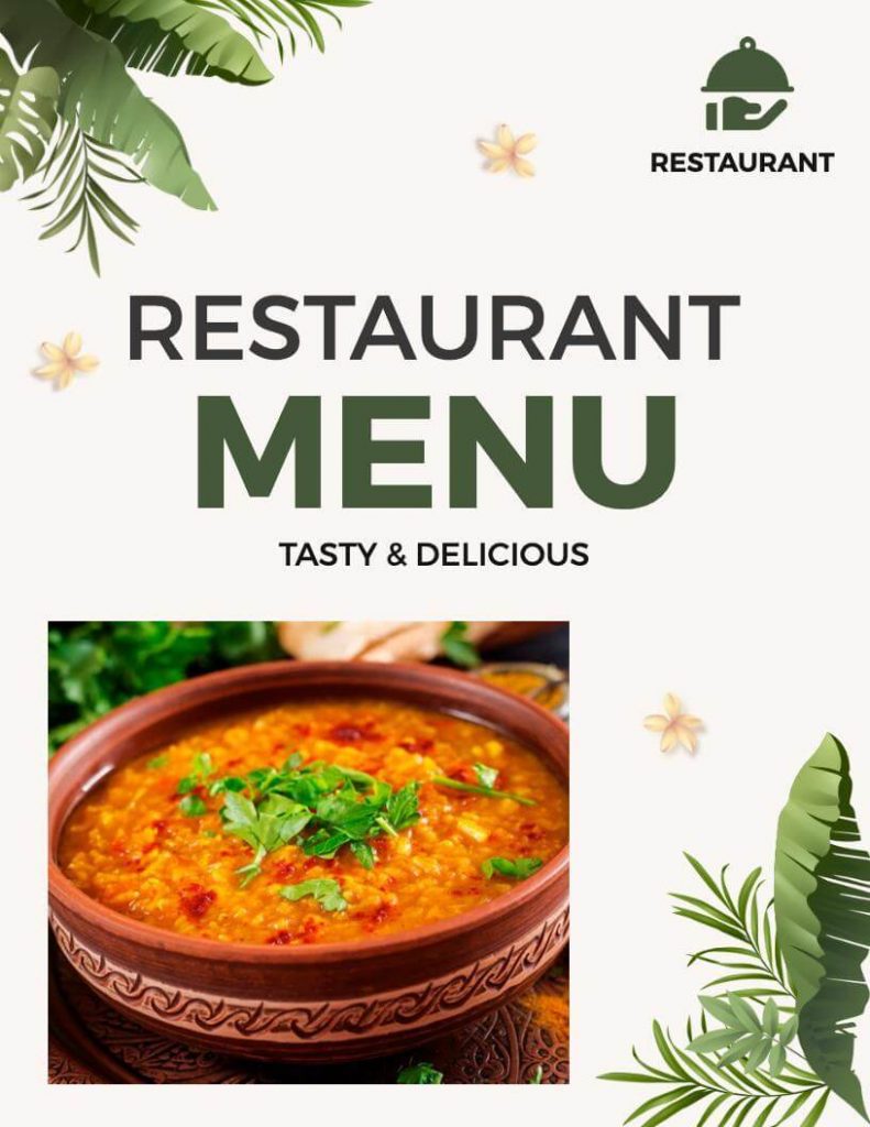
A color scheme of bright greens, yellows, and oranges can create a feeling of freshness and vibrancy. This scheme could work well for a restaurant that specializes in healthy, fresh food.
Elegant and Sophisticated
A color scheme of deep blues, blacks, and grays can create an elegant and sophisticated atmosphere. This scheme could work well for a fine-dining restaurant or a steakhouse.
Coastal and Beachy
A color scheme of blues, whites, and sandy tones can create a coastal and beachy atmosphere. This scheme could work well for a seafood restaurant or a restaurant located near the ocean.
Bold and Eclectic
A color scheme of bright pinks, purples, and greens can create a bold and eclectic atmosphere. This scheme could work well for a restaurant that wants to stand out and create a unique atmosphere.
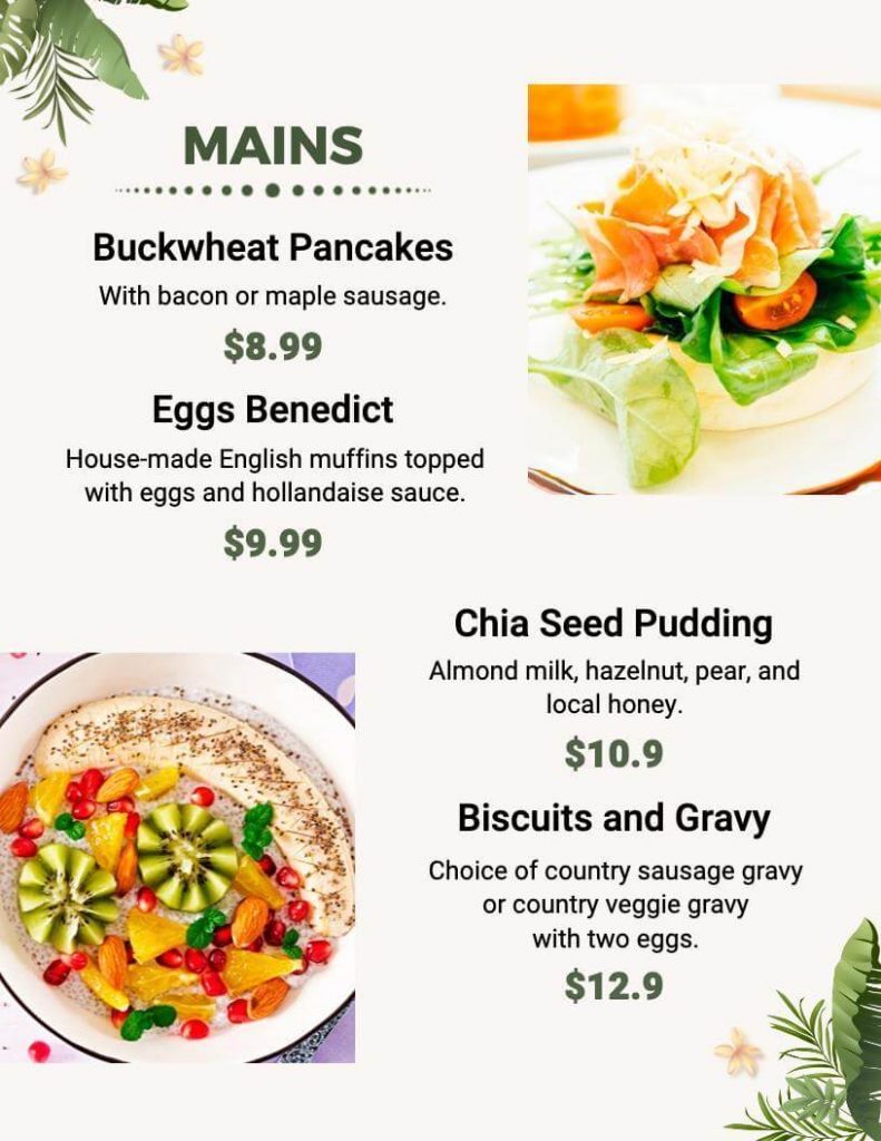
Rustic and Natural
A color scheme of earthy greens, browns, and oranges can create a rustic and natural atmosphere. This scheme could work well for a farm-to-table restaurant or a restaurant located in a rural area.
Traditional and Classic
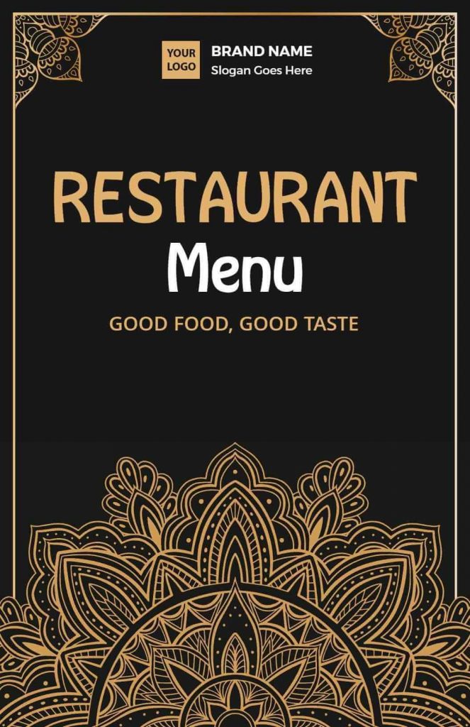
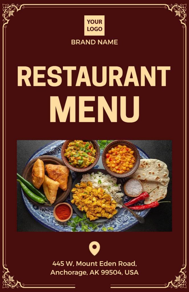
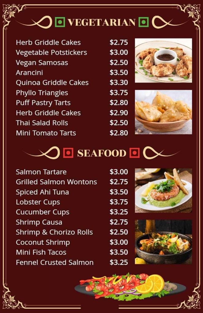
A color scheme of reds, golds, and blacks can create a traditional and classic atmosphere. This scheme could work well for a restaurant that specializes in classic cuisines, such as Italian or French.
Bright and Cheerful
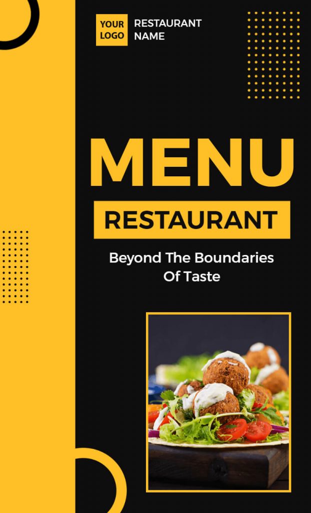
A color scheme of yellows, oranges, and greens can create a bright and cheerful atmosphere. This scheme could work well for a family-friendly restaurant or a restaurant that specializes in brunch. You also include black with bright colors.
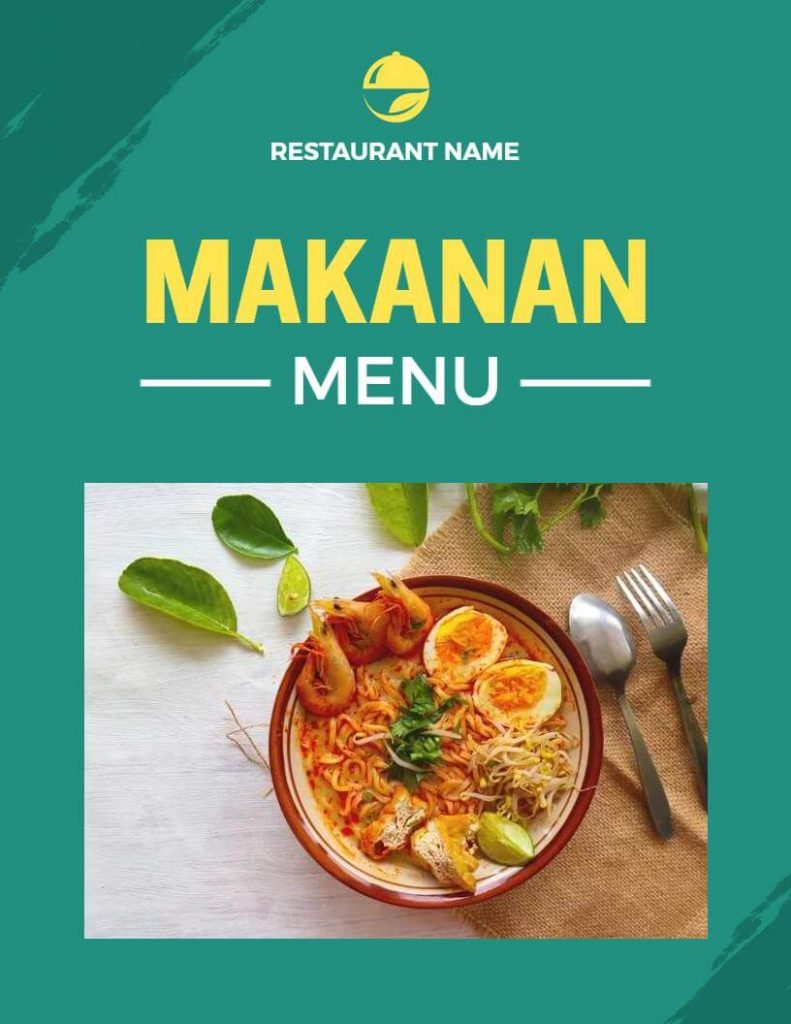
Modern and Minimalist
If you’re aiming for a modern and minimalist atmosphere in your restaurant, using a color scheme of whites, grays, and blacks can be effective. This particular color palette can work especially well for a restaurant that desires a sleek and sophisticated ambiance. Moreovery incorporating these colors, you can create a clean and contemporary design that appeals to a wide range of customers.
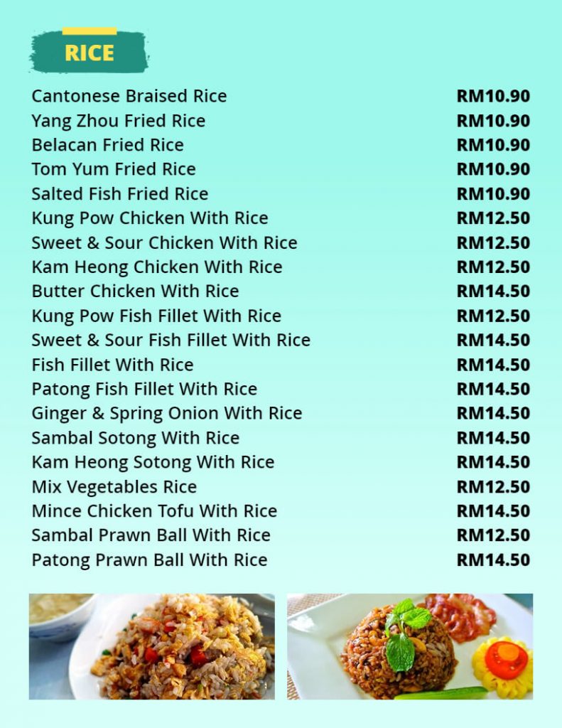
Romantic and Intimate
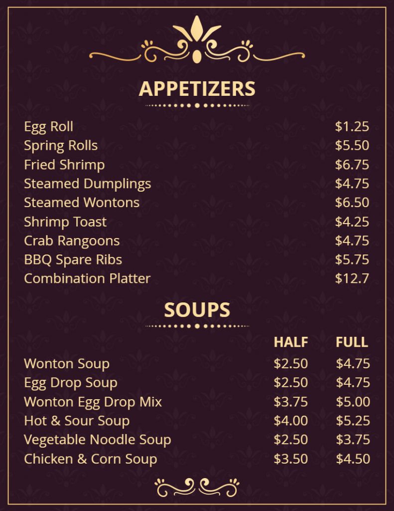
If you’re looking to create a romantic and intimate atmosphere in your restaurant, consider using a color scheme of deep reds, purples, and pinks. This particular color combination can work especially well for a restaurant that specializes in romantic dinners or couples’ nights out. Further, by utilizing these colors, you can create a warm and inviting ambiance that will appeal to your target audience.
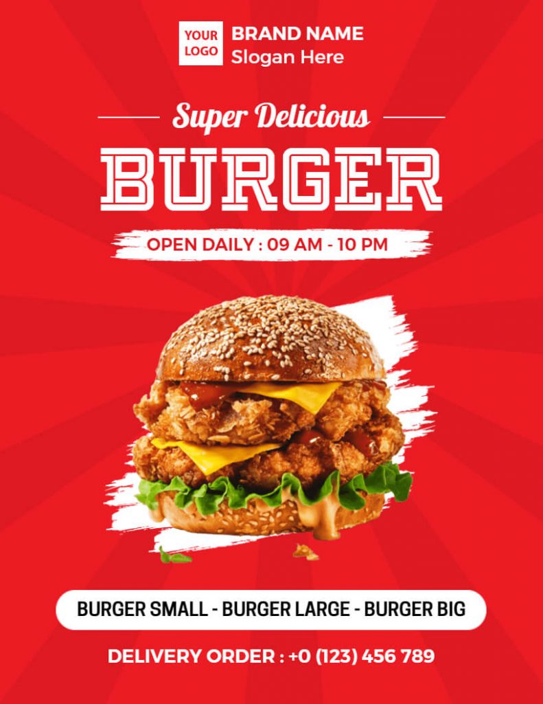
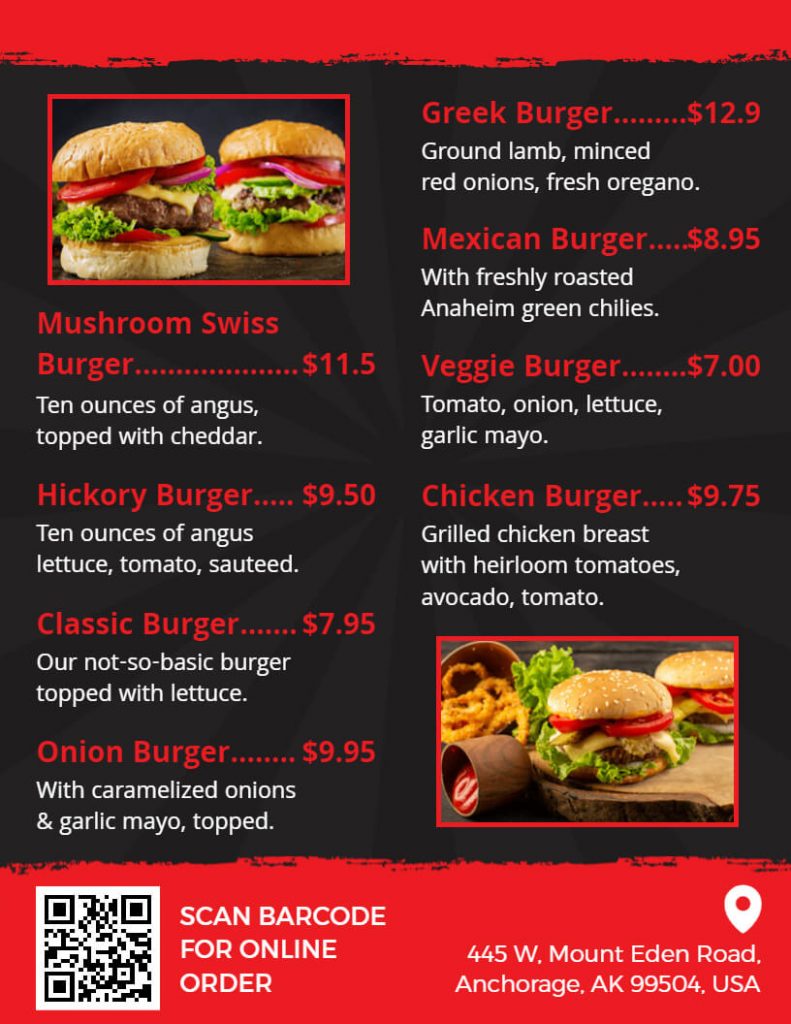
Choosing the Right Color Scheme
Now that you understand the basics of color psychology, and have seen some restaurant menus it’s time to choose the right color scheme for your restaurant menu. Here are some key factors to consider:
Consider Your Restaurant’s Branding
Your restaurant’s branding should be consistent throughout all aspects of your business, including your menu. Consider your restaurant’s logo, decor, and overall theme when choosing your color scheme. If your restaurant has a specific color palette, consider incorporating those colors into your menu. This will help create a cohesive and visually appealing dining experience for your customers. For example, if your restaurant has a rustic theme, choose warm, earthy colors.
Choose Colors That Complement Each Other
When choosing a color scheme for your restaurant menu, it’s important to choose colors that complement each other. This will help create a visually appealing and easy-to-read menu. One way to achieve this is by using a color wheel. Colors that are opposite each other on the color wheel, such as blue and orange or red and green, complement each other well.
Consider the Mood You Want to Create
The color scheme of your menu can help create a certain mood or atmosphere in your restaurant. For example, if you want to create a warm and inviting atmosphere, consider using warm colors such as reds, oranges, and yellows. If you want to create a calming and sophisticated atmosphere, consider using cool colors such as blues and greens.
Use Contrasting Colors for Emphasis
Using contrasting colors for emphasis can help draw attention to specific items on your menu. For example, if you have a daily special or a new dish you want to promote, consider using a contrasting color for that item. This will help make it stand out and draw the customer’s attention.
Consider the Lighting in Your Restaurant
The lighting in your restaurant can also influence the way your menu colors appear. Natural lighting can make colors appear brighter and more vibrant, while artificial lighting can make colors appear duller. Consider the type of lighting in your restaurant when choosing your color scheme.
Test Your Color Scheme
Before finalizing your color scheme, it’s important to test it in different lighting conditions and with different people. Print out a sample menu and show it to your staff and customers to get their feedback. Make adjustments as necessary to create the perfect color scheme for your restaurant menu.
The Type of Dishes
The color scheme of your menu should complement the type of dishes you serve. For example, if you serve mainly seafood, use shades of blue and green to create a connection to the ocean and nature.
Readability
To ensure readability and legibility, it’s important to choose colors that provide enough contrast. Therefore, it’s best to avoid using dark colors on dark backgrounds or light colors on light backgrounds. Instead, opt for colors that have a noticeable contrast to create an effective and easily readable menu.
Your Target Audience
Consider the age, gender, and interests of your target audience. Choose colors that will appeal to them and create the right atmosphere for your restaurant.
Implementing the Color Scheme
Once you have chosen the right color scheme for your restaurant menu, it’s time to implement it. Here are some tips to keep in mind:
Use the color scheme consistently
Make sure to use the same colors throughout your menu to create a cohesive and professional look.
Use color sparingly
Don’t overuse colors, as it can create a cluttered and overwhelming look. Use color to highlight important sections of your menu, such as headings and special offers.
Use white space
In order to achieve a clean and uncluttered look, utilizing white space is crucial. This design technique not only creates a sense of elegance but also draws attention to your dishes. Additionally, incorporating white space into your menu design can enhance the overall sophistication of your restaurant’s branding.
Conclusion
Choosing the perfect color scheme for your restaurant menu can have a significant impact on your customer’s dining experience. To achieve this, there are several factors to take into account. Firstly, it’s important to understand the psychology of colors, considering your restaurant’s branding, choosing colors that complement each other, creating a certain mood, using contrasting colors for emphasis, considering the lighting in your restaurant, and testing your color scheme, lastly you can create a visually appealing and effective menu.
By following these tips, you can create a menu with menu maker that not only looks great but also enhances your customer’s overall dining experience. Remember to always consider your restaurant’s brand and theme, and don’t be afraid to experiment with different color schemes until you find the perfect one. If you need inspiration for a restaurant menu then here are restaurant menu ideas for you. Have a happy restaurant menu-making with tons of customizable templates and menu maker.

